"HOW DO THE ELEMENTS OF YOUR PRODUCTION WORK TOGETHER TO CREATE A SENSE OF BRANDING?"
Branding consists of the features that the has in unique compared to other artists, this in turn makes the artist distinct from the already existing artists and the audience can identify with. Branding is created through following a theme basically a house style which is then used in all mediums of the artists work. All the already existing products made us realize that success of a product and increase in the sales is because of the branding of the product.
Our Advanced Portfolio required us to construct a Music Promotion Package. We produced a music video, a digipak and a website. Our products were similar to each other in the sense that they created a brand image for Acoustic Cheesecake.
Here are some already existing products of "Taylor Swift" and "One Direction" have a brand image and this is used to promote their sales and create hype within the audience, the audience this way could also identify their products easily in the market.
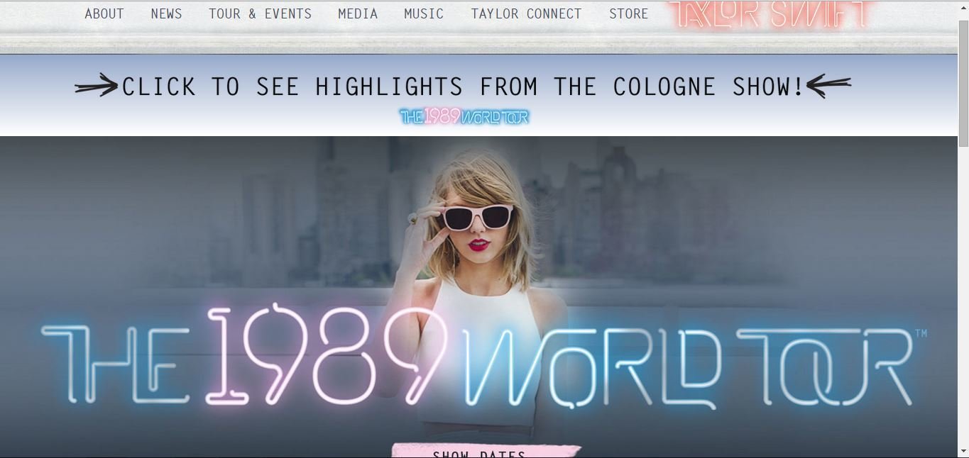
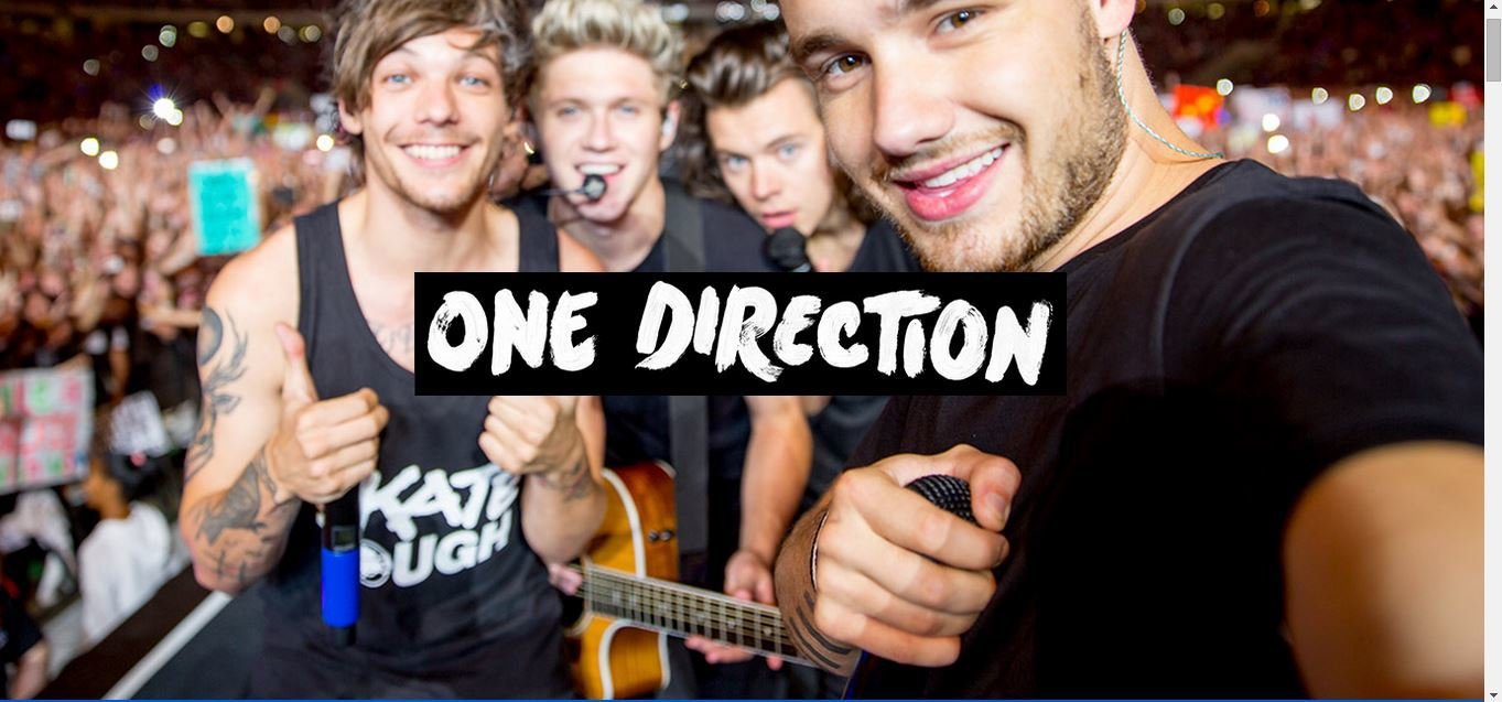
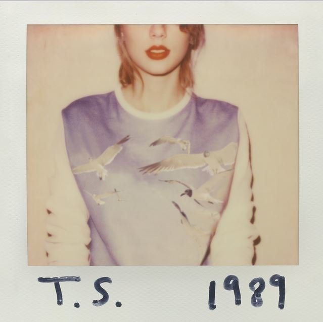
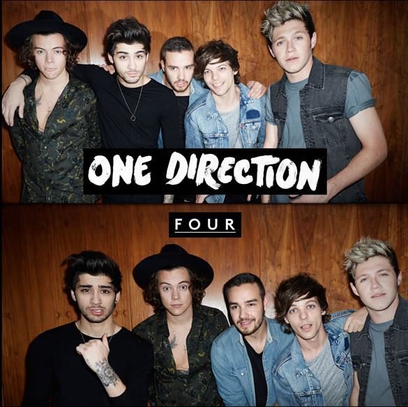
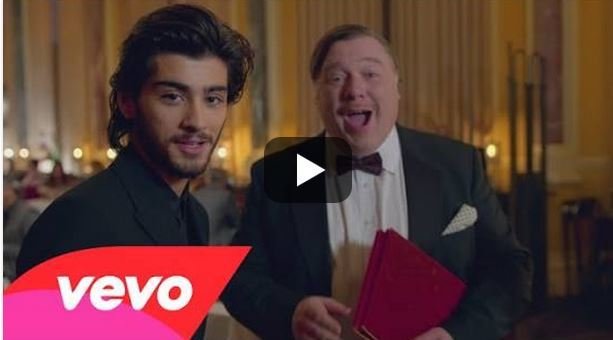
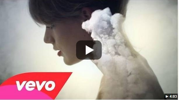
When I look at these products I notice that both have created a separate theme for themselves and this is used as their brand image for the music they are promoting. For example Taylor Swifts products which follow a color palette of pink, white and blue mostly femine colors wheras One Directions products use more natural colors. The different music they play and their age all contribute towards the brand image.
THEY ARE THE BRAND.
Which bringe me to the conclusion that some of the major features after analyzing existing products that contribute towards the brand image are:
- Genre of the music
-Style of the artist
-House style created
-Age of the artists
-Type of music videos
Here are the 3 products we created as per requirement for the Music Promotion Package:
Music Video
Digipak
Website
These 3 products contain some of the key features mentioned before that together create a sense of branding of our band.
Music Video
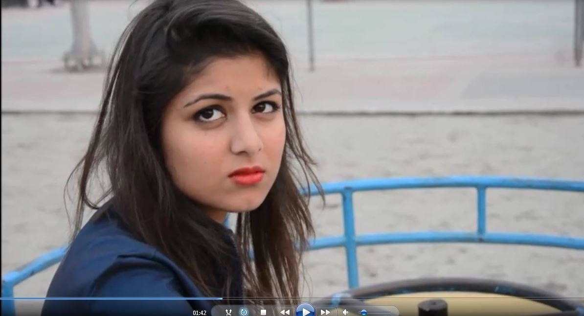
Narrative
The narrative of our music video follows the issue bullying. This is an issue that the target audience is familiar with and would be able to relate too. The narrative also allows the audience to see that friends are there to support you just like in our music video.

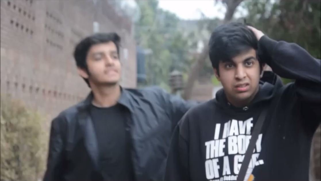
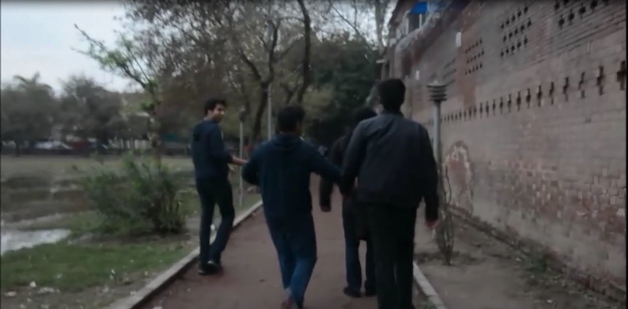
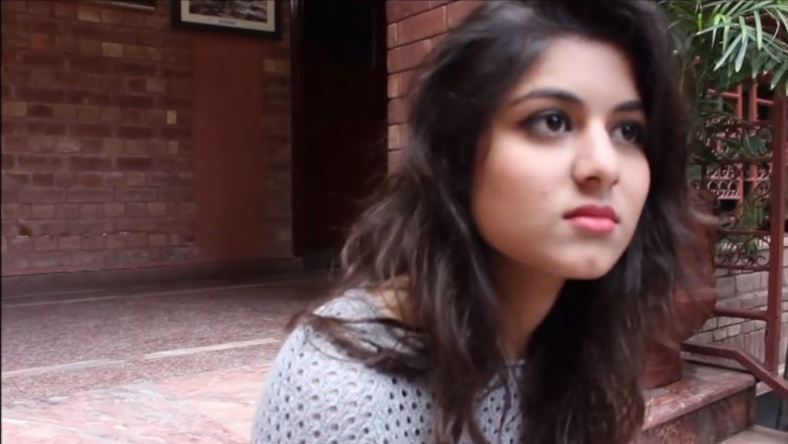
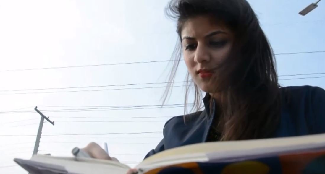
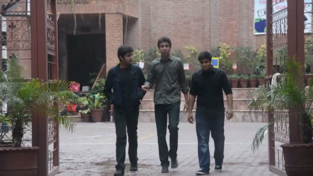
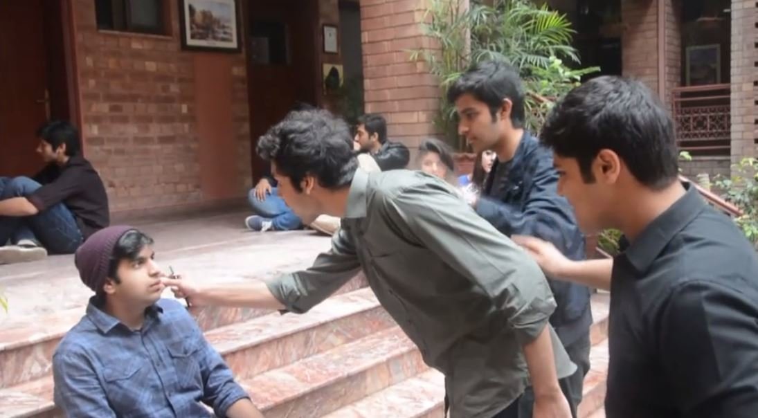
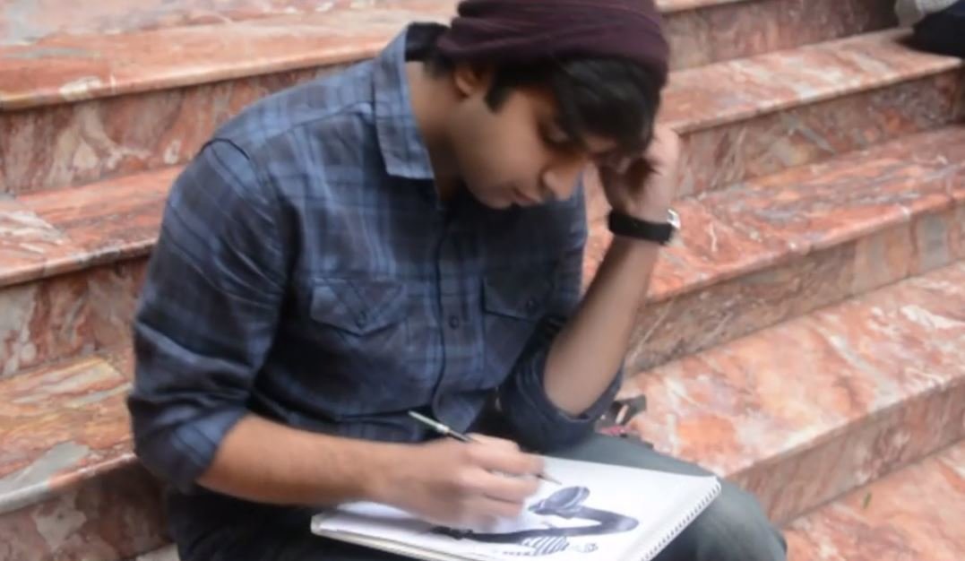
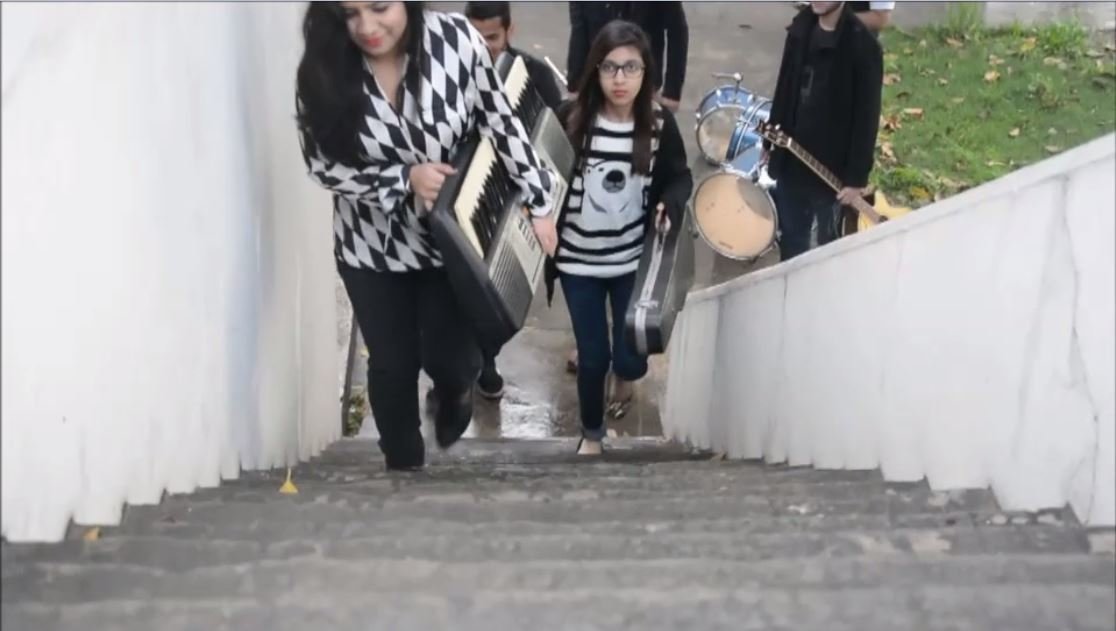
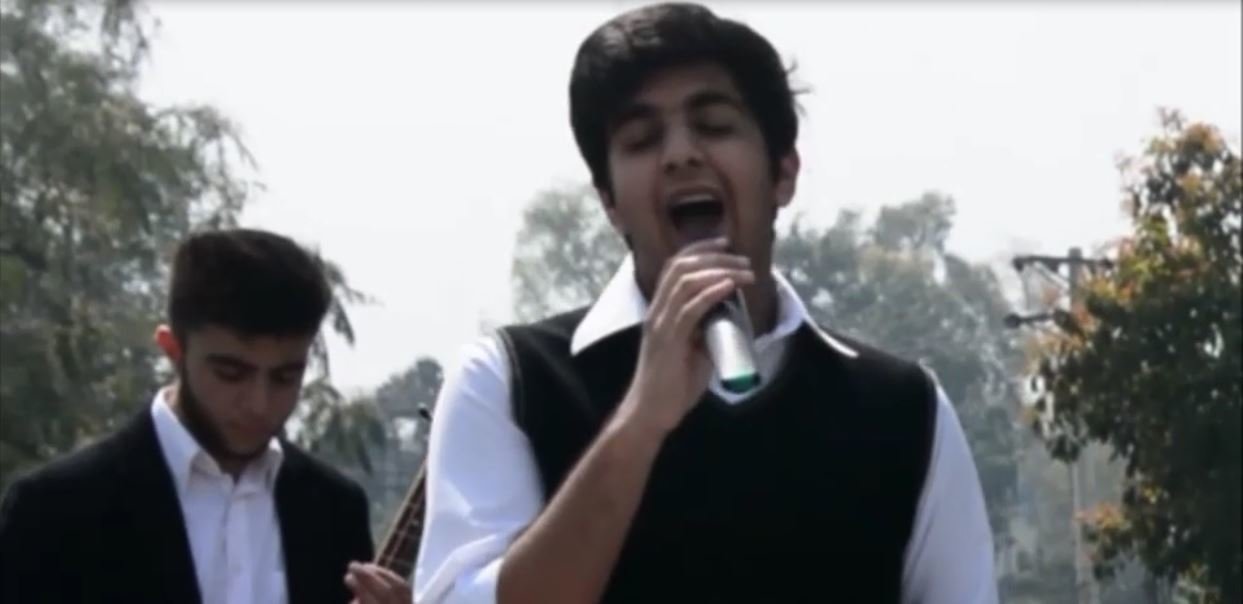
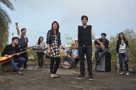
The Band
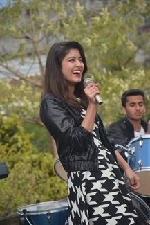
The audience will be able to relate with the band because of the friendly relationship they share with each other. Which is represented through the actions of the band member such as performing and their pleasant facial expressions.

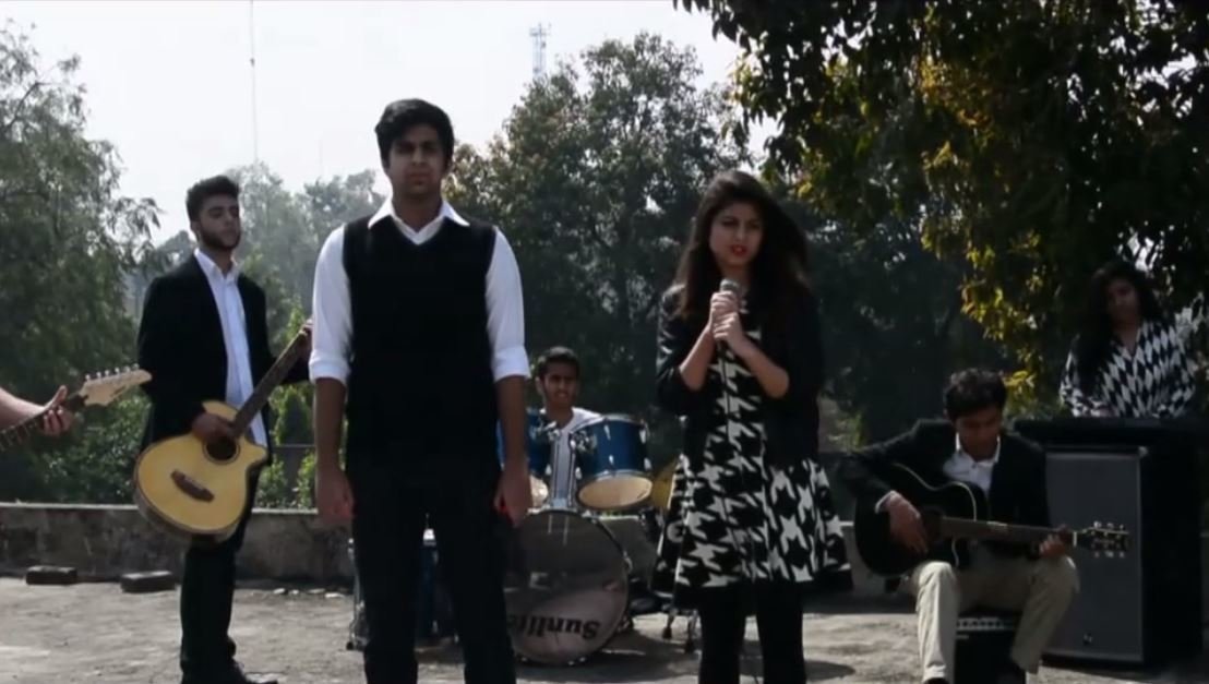
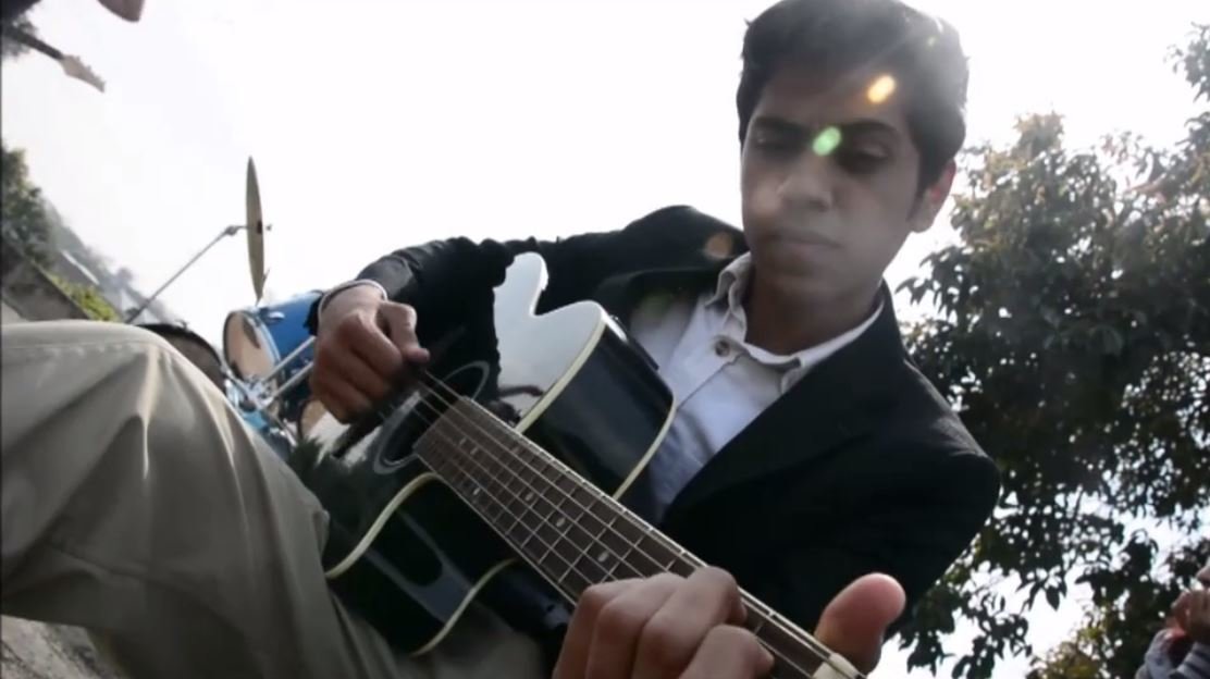
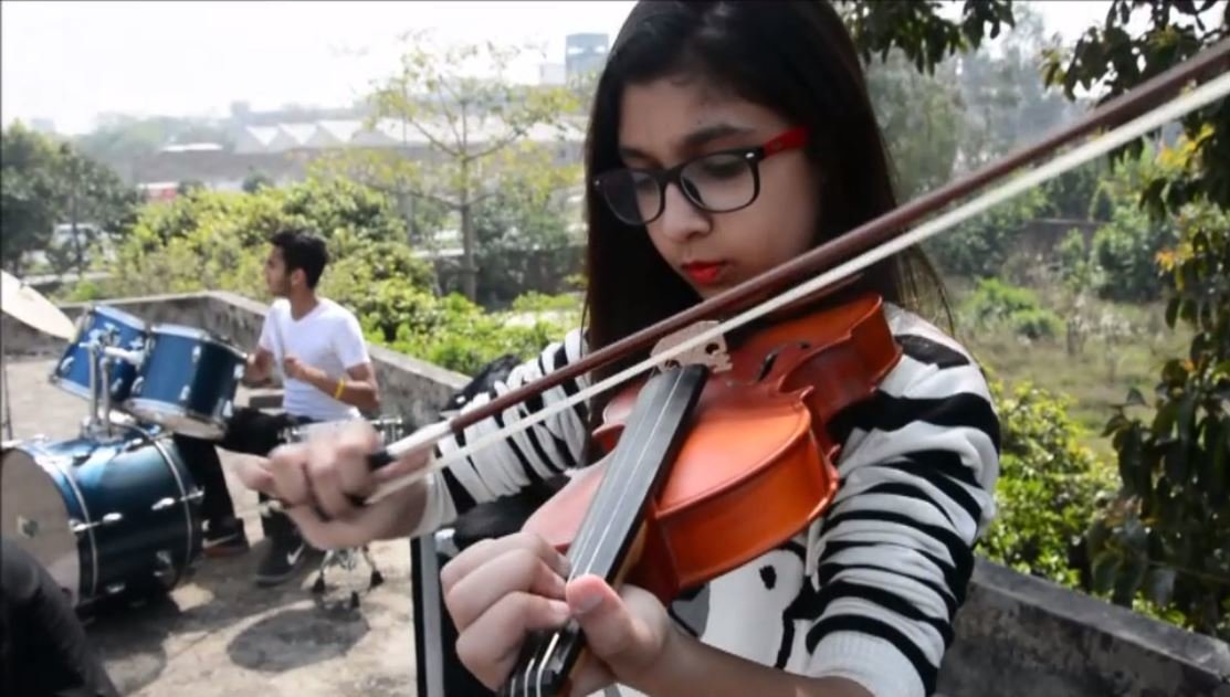
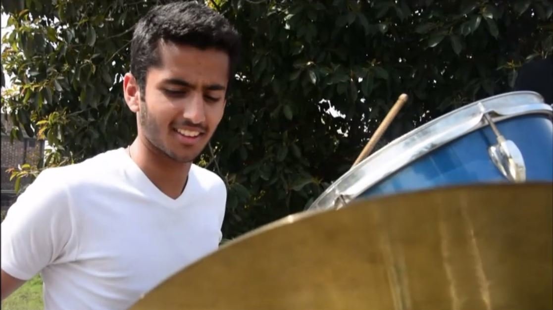
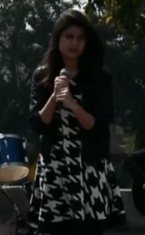
Star Image
The star image also is an impotant feature when it comes to branding. The star image is used to increase sales of the product. The star image is developed through using mid close ups and close ups of the band members in the narrative and performance.


Mise en scene
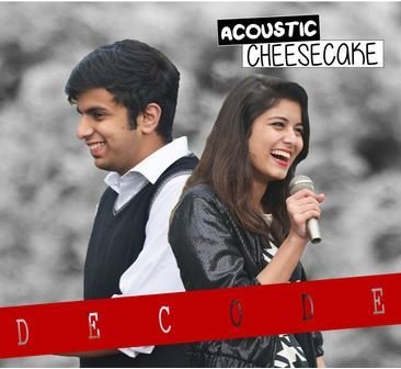
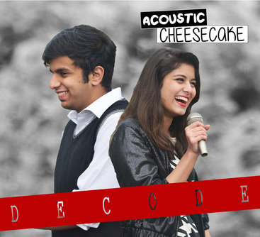
The clothes worn by the characters follow the latest fashion but at the same time helps to distinguish them the roles they are playing in the narrative. The band is following a color code which is black and white therefore we made it one of the basic color palettes on which the website and digpak will be constructed.
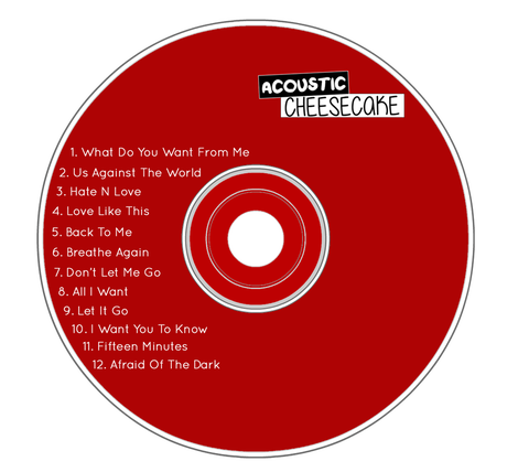
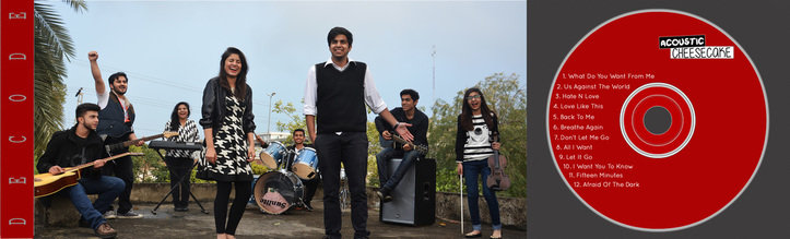
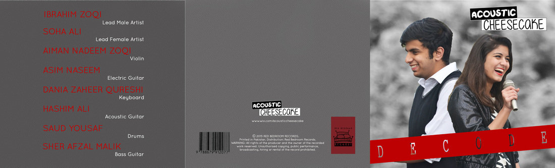
Digipak

Digipak
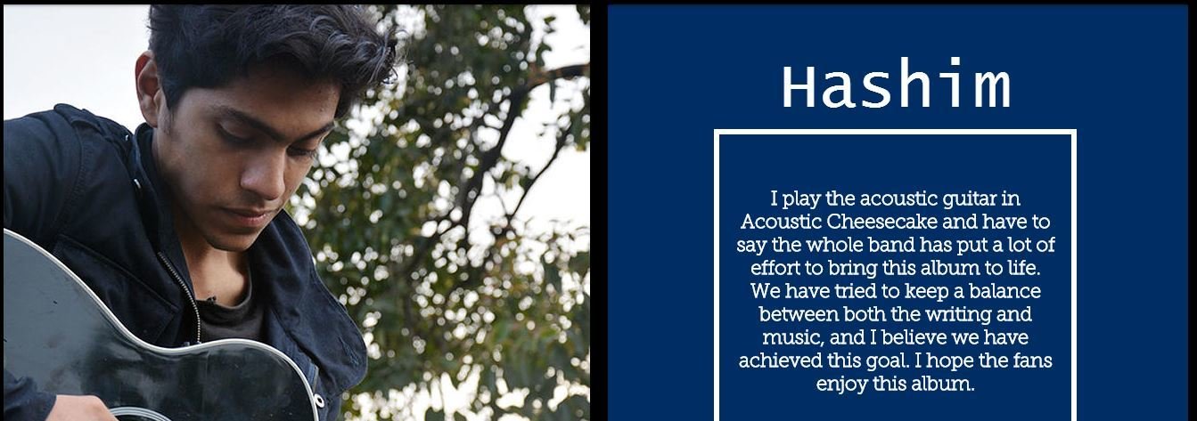
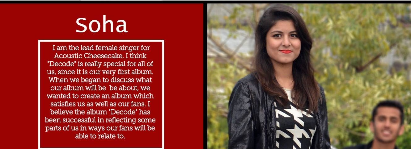
This way the young audience will be able to relate themselves with the band members. This also makes them approachable. Furthermore the star image is used by using images of the band to promote their music.
Housestyle
The color palette used is red and grey and the merged image of the two lead singers will attract the audience as it is something innovative. Images are also used to make the digipak attractive. On the side the pop genre is also represented by using such color schemes and layout.

Website
Color Palette
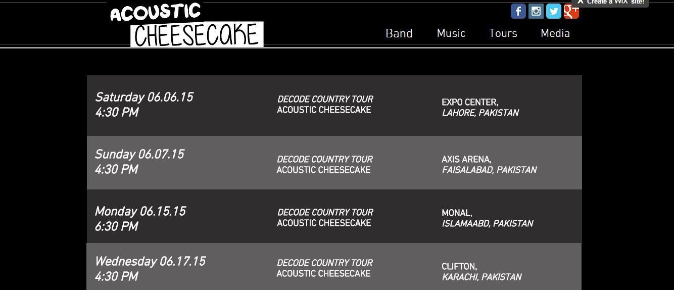
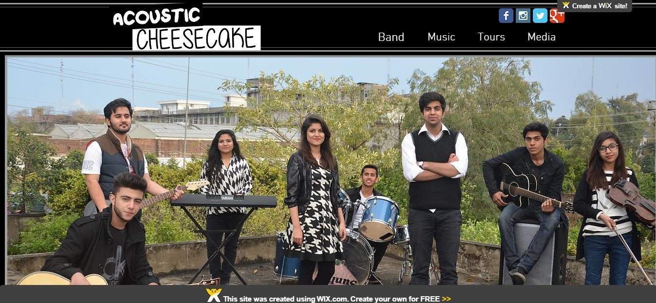
The website follows the color palette of red, black and grey and white which makes the website interesting and different and the audience this way will want to go through the website and would like to know about the band more.

Header/Menu
Its a one page website and the header remains on the top of every page. It contains buttons which will provide insight to the personal views of the band, their music of the album, tour dates and images and behind the scene footage. Therefore it will be easy for the audience to navigate through the website. We have also placed their social media links so that they can connect with the band member more on a personal level.
The band follows a color palette of shades of black, white and red. Also the band represents their youth by engaging in music which the audience can relate too. Moreover the clothes also follow a theme. All of these features are represented in the music video, the digipak and website and help to create a brand image.
In coclusion the color palette and the mis en scene all combined together are present in the main task and two ancillary task and portray the band as Acoustic Pop Rock band.
THE END