CSS Methodologies
Overview
Tanya Pasiuk (D7) & Yahor Vaziyanau (D7)

Greetings

Tanya Pasiuk
Departament: D7
Technologies: .NET, Frontend.

Contact information:

Yahor Vaziyanau
Departament: D7
Technologies: JS, Frontend.
Contact information:
Checklist

Overview
- What is a CSS Methodology ?
- Organization
- Naming Convention
- Why to use CSS Methodology ?
- Maintainability
- Scalability
- Automatization
- Which CSS Methodology to use?
- BEM
- Atomic
- ...
- Summary
- Useful links
Purpose?
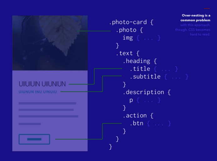
To kill a CSS's Spaghetti Monster or not to be like this developer :)

BEM
Block, Element, Modifier
BIO
Origin: Yandex
The start of development - 2005.
In March of 2009, Lego 2.0 (BEM in future) had been released.
BEM (Block, Element, Modifier) is a modular approach to web development that divides a user interface into independent blocks.
Yandex uses BEM for frontend development.
Block
A functionally independent page component that can be reused. In HTML, blocks are represented by the class attribute.
Features:
-
The block name describes its purpose ("What is it?" — menu or button), not its state ("What does it look like?" — red or big).
-
The block shouldn't influence its environment, meaning you shouldn't set the external geometry (margin) or
positioning for the block. -
You also shouldn't use CSS tag or ID selectors when using BEM
<!-- Correct. The `error` block is semantically meaningful -->
<div class="error"></div>

<!-- Incorrect. It describes the appearance -->
<div class="red-text"></div>
Element
Features:
-
The element name describes its purpose ("What is this?" — item, text, etc.), not its state ("What type, or what does it look like?" — red, big, etc.).
-
The structure of an element's full name is block-name__element-name. The element name is separated from the block name with a double underscore (__).
<!-- `search-form` block -->
<form class="search-form">
    <!-- `input` element in the `search-form` block -->
    <input class="search-form__input">

    <!-- `button` element in the `search-form` block -->
    <button class="search-form__button">Search</button>
</form>
Modifier
An entity that defines the appearance, state, or behavior of a block or element.
Features:
-
The modifier name describes its appearance ("What size?" or "Which theme?" and so on — size_s or theme_islands), its state ("How is it different from the others?" — disabled, focused, etc.) and its behavior ("How does it behave?" or "How does it respond to the user?" — such as directions_left-top).
-
The modifier name is separated from the block or element name by a single underscore (_).
<!-- Boolean modifier -->
<!-- The `search-form` block has the `focused` -->
<form class="search-form search-form_focused">
    <input class="search-form__input">

    <!-- The `button` element has the `disabled` Boolean modifier -->
    <button class="search-form__button search-form__button_disabled">Search</button>
</form>

<!-- Key Value modifier -->
<!-- The `search-form` block has the `theme` modifier with the value `islands` -->
<form class="search-form search-form_theme_islands">
    <input class="search-form__input">

    <!-- The `button` element has the `size` modifier with the value `m` -->
    <button class="search-form__button search-form__button_size_m">Search</button>
</form>
+
- Easily support the code structure as your project grows.
- Re-use existing code.
- Make point-by-point changes: minimize the cost to update your design, add functional elements, and so on.
- Easy to see in the markup which classes are related to one another
- Very good preprocessors support
- Good modular structure
- No name collisions
-
- Class names are too long and ugly
- "Bad" to use for open source projects (libs, etc.)
Used by ...

Example

Useful links:
Atomic CSS
BIO
Origin: Thieryy Koblentz (Yahoo)
The term "Atomic CSS" was coined by Thierry Koblenz in his foundational article "Challenging CSS Best Practices" in October 2013.
Atomic CSS (also known as Functional CSS) is the approach to CSS architecture that favors small, single-purpose classes with names based on visual function.
There are other projects that use the term Atomic, including Atomic Web Design by Brad Frost.
Atomic CSS is a completely separate concept from these.
Atomic classes
Atomic classes are simple, single-purpose units of styling.
Much like inline styles, Atomic styles only apply a single style declaration.
Unlike inline styles, Atomic styles have a lower specificity, making them easier to override, and can be modified through the use of pseudo-classes, media queries, and more.
[<context>[:<pseudo-class>]<combinator>]<Style>[(<value>,<value>?,...)][<!>]
[:<pseudo-class>][::<pseudo-element>][--<breakpoint_identifier>]
Class syntax
For more syntax definitions info go here
Aliases
Atomic CSS provides aliases for most properties that rely on Functional Notation:
| Aliases | Styles |
|---|---|
| Brightness(.5) | filter:brightness(.5) |
| Contrast(200%) | filter:contrast(200%) |
| Grayscale(50%) | filter:grayscale(50%) |
| Invert(50%) | filter:invert(50%) |
And many more ...
Longhand/Shorthand
/* Shorthand Atomic CSS Examples */

.bg-blue { background-color: #357edd; }
.f1 { font-size: 3rem; }
.ma0 { margin: 0; }

/* Longhand Atomic CSS Examples */

.bgr-blue { background-color: #357edd; }
.background-blue  { background-color: #357edd; }
.backgroundcolor-blue  { background-color: #357edd; }
.text-h1 { font-size: 3rem; }
.text-3rem { font-size: 3rem; }
.text-huge { font-size: 3rem; }
.fontsize-1 { font-size: 3rem; }
.marg-0 { margin: 0; }
.margin-0 { margin: 0; }

/* Programmatic Shorthand */

Bgc(#357edd) { background-color: #357edd; }

/* Programmatic Longhand */

bgrBlue(#357edd) { background-color: #357edd; }
backgroundBlue(#357edd) { background-color: #357edd; }
backgroundColorBlue(#357edd) { background-color: #357edd; }
+
- Extremely easy to write and read CSS and make changes
- Reusable CSS
- Very good for large frameworks
- Design becomes very flexible
- Good automatization
- Moves specificity out of the way
- Improves performance
- And more
-
- No semantics, visual design as specified in HTML
- Every style change requires HTML change
- If added responsivity need to add an extra large number of classes
- also 27 problems with it
Used by ...
At least Yahoo 😅
Example

Useful links:
Suit CSS
3.3k GitHub ⭐️
BIO
Origin: released under the an MIT licence by Nicholas Gallager in June 2014.
Birthdate: Oct 3, 2012, according to by "Initial commit" in repo
SUIT CSS is a reliable and testable styling methodology for component-based UI development.
A collection of CSS packages and build tools are available as modules. SUIT CSS plays well with React, Ember, Angular, and other component-based approaches to UI development.
Design Principles
- Modularity
- Cohesion
- Composable and configurable
- Loose coupling
- Soft encapsulation
- Documentation
For deep info about this go here
Components
Components in SUIT CSS are written in pascal case giving them a clear semantic separation from all other rule definitions.
.ComponentName {}

/* The class name will sit at the root node of the component itself */
/* in HTML markup <aside class="ComponentName">...</aside> */

/* Also it is recommended to use lower case for namespaces */
.namespace-ComponentName {}
Modifiers
Modifiers, denoted by a prefixed double dash (--), are written in camel case and form the suffix of the component to be modified, or the component descendent to be modified.
<!-- They must always be used in addition to the
base component class (multi-class pattern), hello BEM :) -->

<button class="Button Button--primary">...</button>
Descendants
A component descendent is a class that is attached to a descendent node of a component.
It's responsible for applying presentation directly to the descendent on behalf of the component.
Descendent names must be written in camel case and are prefixed with a single dash (-).
.ComponentName-descendentName {}<!-- Hello BEM (element) -->
<aside class="SideDrawer">
<a href="#" class="SideDrawer-link">...</a>
</aside> /* Bad! */
.ComponentName-descendentName-anotherDescendent-andAnotherDescendent {}
/* Good! */
.ComponentName-andAnotherDescendent {}Component State
States are written in camel case as adjoining classes and should never be styled directly.
This allows the same state names to be used in multiple contexts, but every component must define its own set of styles for that state, as they are scoped to the component.
.ComponentName.is-stateOfComponent {}<aside class="SideDrawer is-open">
<a href="#" class="SideDrawer-link is-active">...</a>
<a href="#" class="SideDrawer-link">...</a>
<a href="#" class="SideDrawer-link">...</a>
</aside> Utilities
Utilities provide low-level structural and positional traits and can be applied to any element within a component.
Utilities are prefixed with u-and should focus typically achieving only one thing.
.u-utilityName {}<img src="..." class="Post-img u-alignLeft" />
+
The same as for BEM
-
Used by ...
Twitter, BBC Three, Cloud Four, Segment.io and many others.
Example

Useful links:
Object-oriented CSS
OOCSS
5.7k GitHub ⭐️
BIO
Origin: Nicole Sallivan (2009).
What is a CSS object?
Basically, a CSS “object” is a repeating visual pattern, that can be abstracted into an independent snippet of HTML, CSS, and possibly JavaScript. That object can then be reused throughout the site.
Main Principles of OOCSS
Separate structure and skin
means to abstract the structure and positioning styles of an object from the presentational styles, or skin.
Separate container and content
means to break components’ dependency on their containers. Any object should be able to be placed in another container and still look and behave the same.

+
- Emphasis on reuse
- Keep selectors clean
- Extend classes
- Emphasis on 'Style' separate from content
- Emphasis on 'Content' separate from container
-
- Heavy use of presentational classes
- Requires application of presentational classes to the markup
- Coupling of CSS(skin) to markup(structure)
- Requires updates to the CSS and markup for design changes
- Argument: creates thousands of lines of CSS that may never be used.
Used by ...
😭
Example

Useful links:
Scalable and Modular Architecture for CSS
SMACSS
BIO
Origin: Jonathan Snook (2011).
SMACSS stands for Scalable and Modular Architecture for CSS. The main goal of the approach is to reduce the amount of code and simplify code support.
Basics

- CSS rules categories (5 categories)
- Simpler than BEM
- Modules have own unique names, sub-components are prefixed with the name of their parent module name
CSS Rule Categories
|
BASE No class/ids |
html tags, reset.css, normalize.css |
|
LAYOUT Page-level selectors |
Grids, pages, containers [.l-header, .l-footer, .l-main-nav, .l-inline or using #id, here we use position, float, display rules |
|
MODULE Reusable components |
.button, .form, .figure |
|
STATE Overrides defaults |
.is-hidden, .is-mobile |
|
THEME optional |
Context styles, like borders, paddings, the styles that will change, example: the New Year’s colours of the page |
Used by ...
😭
Example

Useful links:
Attribute Modules for CSS
AMCSS
169 GitHub ⭐️
BIO
Origin: Glen Maddern.
AMCSS is "Attribute Modules for CSS"

Main principles
using HMTL attributes and their values rather that classes for styling elements.
modules - blocks and elements (like in bem) - are decribed by html attributes
variations - modificators (like in bem) - override default module's styles
traits - special styles, moved into separate namespace (e.g. mobile-, print-, typogr-)
+
- Good readable and maintainable code
- Easy to override classes
- Attributes has more permitted characters than class names(':', "-")
- The syntax is very nice for projects based on Modules & Variations models
-
- Using custom attributes
Used by ...
😭
Example

Useful links:
Reasonable system for CSS
RSCSS
BIO
Origin: Rico Sta. Cruz.
Reasonable System for CSS Stylesheet Structure.
A set of simple ideas to guide your process of building maintainable CSS.
Main principles
Extend BEM's principles with more strict rules for creating better-structured code
- Components - like a block in BEM (at least two words)
- Elements - like element in BEM (one word)
- Variants - like modifier in BEM (can apply to the element of the component)
- Helpers - holds utility styles (often used with !important)
Components

Components will be named with at least two words, with a dash between each word. Examples of components:
- A like button (.like-button)
- A search form (.search-form)
- A news article card (.article-card)
- A namespaced component (.rico-custom-header)
Elements

.search-form {
  > .field { /* ... */ }
  > .action { /* ... */ }
}

.article-card {
  .title     { /* okay */ }
  > .author  { /* ✓ better */ }
}

.profile-box {
  > .firstname { /* ... */ }
  > .lastname { /* ... */ }
  > .avatar { /* ... */ }
}
Variants
.like-button {
  &.-wide { /* ... */ }
  &.-short { /* ... */ }
  &.-disabled { /* ... */ }
}

.shopping-card {
  > .title { /* ... */ }
  > .title.-small { /* ... */ }
}
Helpers
._unmargin { margin: 0 !important; }
._center { text-align: center !important; }
._pull-left { float: left !important; }
._pull-right { float: right !important; }
For general-purpose classes meant to override values, put them in a separate file and name them beginning with an underscore. They are typically things that are tagged with !important. Use them very sparingly.
<div class='order-graphs -slim _unmargin'>...</div>Layouts
.article-list {
  & {
    @include clearfix;
  }

  > .article-card {
    width: 33.3%;
    float: left;
  }
}

.article-card {
  & { /* ... */ }
  > .image { /* ... */ }
  > .title { /* ... */ }
  > .category { /* ... */ }
}
+
- Good for preprocessors
- More flexible than BEM
-
- Long class names
Used by ...
😭
Example


Useful links:
And many others ...
P.S. Honestly, you can create your own CSS methodology :) At least you can try.
They are (more hipsters):
- Tachyons (6k GitHub ⭐️ & Fb, Airbnb, Tesla, egghead, IBM, Salesforce, Heroku use it)
- Marvel Style Guide
- Basscss (Almost 5k GitHub ⭐️)
- Tailwind CSS (3.3k GitHub ⭐️ & hello Atomic CSS)
- CSS Guidelines (mix of methodologies with badass documentation)
- Solid (Buzzfeed's CSS Style Guide)
- Maintainable CSS (hello BEM)

Summary

We talked about:
- What is a CSS Methodology?
- Why use CSS Methodology?
- What CSS Methodology to use?

But more specifically
- Every new methodology shares the same principles and tries to achieve the same goals - organized, clean, better-structured code
- Every methodologies web site has a list of advices that you can follow to write better code
- It's better to use any css methodology than not to use
- It's not necessary to follow all the rules the methodology provides
- You can create your own rules and methodologies, the main idea is to keep code clean and maintainable
Now you know it

Useful links

Hope your brain is still active ???

You don't need a CSS methodology if you don't have a CSS
We are done. Thank you.

Questions?