CSS Custom Properties –– all'ennesima potenza
Francesco Improta
I'm a product designer
with a love for mountains, astronomy and code.

@zetareticoli


Head of Design @ Citynews
francescoimprota.com
What are Custom Properties?
Add variables to CSS 🥳
Properties or variables?
CSS a programming language?
CSS preprocessors
did the job
// $VARIABLES ---------------------------------------------------------------//

// COLORS ======================================================================

// Base colors -------------------------------------------------------------- //
$color-black: #151010;
$color-steelblue: #274b7b;
$color-white: #fff;

// Gray --------------------------------------------------------------------- //
$color-gray-10: #fafafa;
$color-gray-20: #f5f5f5;
$color-gray-30: #eee;
$color-gray-40: #e0e0e0;
$color-gray-50: #bdbdbd;
$color-gray-60: #9e9e9e;
$color-gray-70: #757575;
$color-gray-80: #616161;
$color-gray-90: #424242;
$color-gray-100: #212121;

// Slategray -----------------------------------------------------------------//
$color-slategray-10: #eceff1;
$color-slategray-20: #cfd8dc;
$color-slategray-30: #b0bec5;
$color-slategray-40: #90a4ae;
$color-slategray-50: #78909c;
$color-slategray-60: #607d8b;
$color-slategray-70: #546e7a;
$color-slategray-80: #455a64;
$color-slategray-90: #37474f;
$color-slategray-100: #263238;

// Accent Colors -------------------------------------------------------------//
$color-accent-magenta: #e91f63;
$color-accent-mint: #00bfa5;
$color-accent-orange: #ffa000;
$color-accent-gold: #edce8e;
$color-accent-firebrick: #ff3030;

// Social colors -------------------------------------------------------------//
$color-facebook: #3b5998;
$color-twitter: #1da1f2;
$color-youtube: #ef450f;
$color-telegram: #2ca5e0;
$color-whatsapp: #25d366;

// Themes --------------------------------------------------------------------//
$color-theme-black: #3b3b3b;
$color-theme-blue: #3277c7;
$color-theme-cyan: #2a9ddb;
$color-theme-green: #50ae55;
$color-theme-purple: #b75dc7;
$color-theme-pink: #f291b2;
$color-theme-red: #f2463d;
$color-theme-ruby: #d92121;
$color-theme-yellow: #ffbe26;

$color-theme-black  : lighten($color-black, 10%);

// Other colors
$color-forestgreen : #228b22;
$color-blue        : #01579b;

// Brand colors selection ----------------------------------------------------//
$color-black-selection: rgba($color-theme-black, .3);
$color-blue-selection: rgba($color-theme-blue, .3);
$color-cyan-selection: rgba($color-theme-cyan, .3);
$color-green-selection: rbga($color-theme-green, .3);
$color-purple-selection: rgba($color-theme-purple, .3);
$color-pink-selection: rgba($color-theme-pink, .3);
$color-red-selection: rgba($color-theme-red, .3);
$color-ruby-selection: rgba($color-theme-ruby, .3);
$color-yellow-selection: rgba($color-theme-yellow, .3);


// UI ------------------------------------------------------------------------//

$global-background-primary : $color-theme-blue;
$background-overlay : transparentize($color-slategray-100, .15);
$background-overlay2 : transparentize($color-slategray-100, .05);

// Background
$color-ui-bg-base: $color-white;
$color-ui-bg-inverse: $color-black;
$color-ui-bg-light: $color-gray-20;
$color-ui-bg-overlay: transparentize($color-black, .45);
$color-ui-bg-secondary: $color-slategray-100;

// Borders
$color-ui-border: $color-gray-40;
$color-ui-border-link: $color-gray-40;
$color-ui-border-dark: $color-black;

// Body
$color-ui-body: $color-black;
$color-ui-body-inverse: $color-white;
$color-ui-body-secondary: $color-gray-70;
$color-ui-body-light: $color-gray-50;

// Buttons
$color-ui-button-primary: #337ab7;
$color-ui-button-secondary: $color-gray-60;

// Forms
$color-ui-form-label: $color-gray-50;
$color-ui-form-input: $color-gray-50;

// Icons
$color-ui-icon: $color-black;
$color-ui-icon-active: $color-black;
$color-ui-icon-inverse: $color-white;
$color-ui-icon-light: $color-gray-60;

// Links
$color-ui-link: $color-steelblue;

// Sponsor
$color-ui-sponsor: $color-accent-orange;


// TYPOGRAPHY ==================================================================

// Line height
$lineheight-base: 1.25;
$lineheight-extra: 1.5;
$lineheight-body: 1.8125rem; // 29px - use along with 'greatprimer' type size

// Type Sizes
$type-canon: 3rem; // 48px
$type-canon-medium: 2rem; // 32px
$type-canon-small: 1.5rem; // 24px

$type-doublecolumbian: 2rem; // 32px
$type-doublecolumbian-small: 1.5rem; // 24px
$type-doublecolumbian-xsmall: 1.25rem; // 20px

$type-doublepica: 1.5rem;// 24px
$type-doublepica-small: 1rem;// 16px
$type-doublepica-small: .875rem;// 14px

$type-english: 1.15rem; // 18px
$type-english-small: .875rem; // 14px
$type-english-xsmall: .75rem; // 12px

$type-paragon: 1.25rem; // 20px
$type-greatprimer: 1.15rem; // 18px
$type-columbian: 1rem; // 16px
$type-pica: .75rem; // 12px
$type-primer: .625rem; // 10px

// Font size
// $TODO : REMOVE
$font-size-big    : 2.25rem; // 36px
$font-size-xhigh  : 1.75rem; // 28px
$font-size-xbase  : 1.125rem;// 18px
// $END TODO

// Font Weight
$font-weight-normal: 400;
$font-weight-medium: 500;
$font-weight-bold: 700;
$font-weight-black: 900;

// Font Family
$font-serif-stack: Georgia, "Times New normal", serif;
$font-sans-stack: Helvetica, Arial, sans-serif;

$font-serif: 'PublicoText', $font-serif-stack;
$font-serif-display: 'Publico', $font-serif-stack;
$font-sans-display: 'NeueHaasGroteskDisp Pro', $font-sans-stack;
$font-sans: 'NeueHaasGroteskText Pro', $font-sans-stack;
$font-sans-narrow: 'NovecentoNarrow', $font-sans-stack;

// MEASURES ====================================================================
$baseline: .5rem; // 8px
$space: 1rem;
$gutterwidth    : $space;
$baselineheight : 1.5rem;

// Sizes -------------------------------------------------------------------- //
$size1x: $baseline; // 8px
$size2x: $size1x * 2; // 16px
$size3x: $size1x * 3; // 24px
$size4x: $size1x * 4; // 32px
$size6x: $size1x * 6; // 48px
$size8x: $size1x * 8; // 64px
$size9x: $size1x * 9; // 72px
$size12x: $size1x * 12; // 96px

$size-fluid: 100%;


// Grid ----------------------------------------------------------------------//
$gutter: $size2x;
$gutter-large: $size3x;

// Use $space to set vertical space between elements
$space: $gutter;
$space-large: $gutter-large;
$space-small: $gutter / 2;
$space-xlarge: $gutter * 3;

// Icons ----------------------------------------------------------------------//
$icon-small: $size2x;
$icon-base: $size3x;
$icon-large: $size4x;


// SHAPES ======================================================================

$border-style: solid;
$border-size-base: 1px;
$border-size-medium: 2px;
$border-size-large: 4px;
$border-size-xlarge: 6px;

$radius: 3px;
$radius-rounded: 50%;

// ANIMATIONS ==================================================================

$default-timing: .3s;
$transition-function: ease;


// COMPONENTS ==================================================================

// Header --------------------------------------------------------------------//
$header-small   : 3.5rem; // 56px
$header-medium  : 4rem; // 64px
$header-large   : 4.5rem; // 72px

// Navbar --------------------------------------------------------------------//
$navbar-size: 3.5rem;
$navbar-spacing: 1rem;
❤️ Sass
Preprocessors Flow
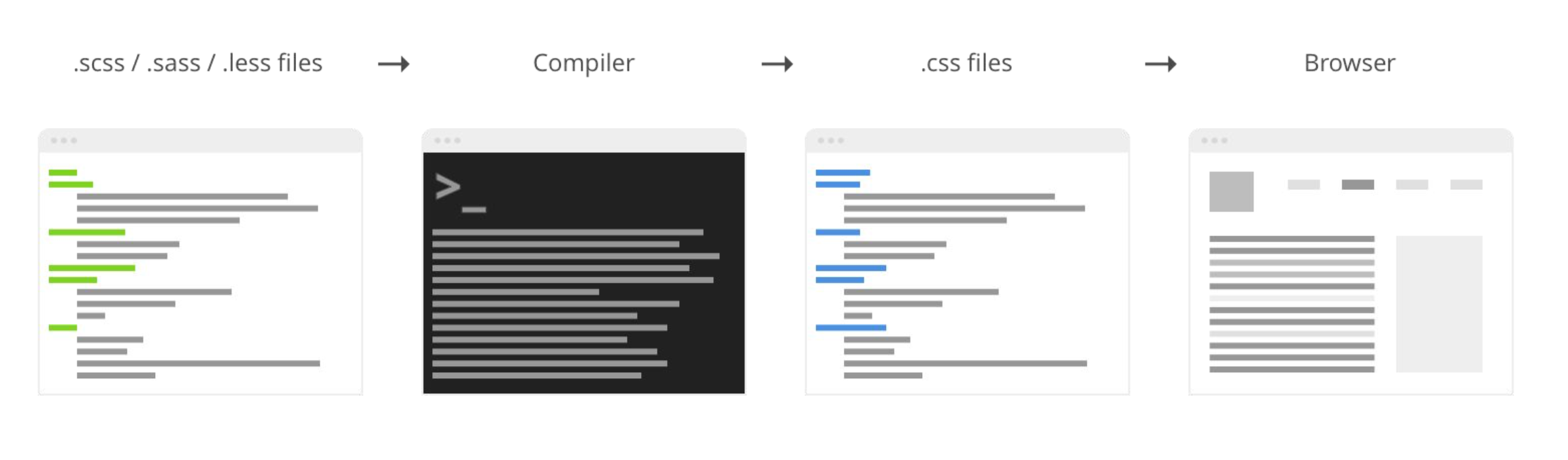
Preprocessors variables only have one value at a time
Preprocessors Limits 👎
Each preprocessor has own syntax
Additional setup
Recompilation after changes is required
Compilation takes time
No interaction with the browser
We'll cover
-
The basics
-
Strategy guide
-
Pratical Patterns
-
Project architecture
-
Tips & Tricks
The Basics
Specs says...
Custom properties define variables
Variables are referenced with var( ) notation
Participate to cascade
The Basics
Tied to selector
Inherited
Dynamic
Live in the browser
:root {
  --link: purple;
}

a {
  color: var(--link);
}
Tied to selector & Inheritance
Simple link
Nav Link
Nav Link
Nav Link
<a> </a>
<nav> <a> </a> ... </nav>
:root {
  --link: purple;
}

a {
  color: var(--link);
}

nav a {
  --link: salmon;
}

nav a:hover {
  --link: teal;
}
Dynamic & Live in the browser
Simple link
Nav Link
Nav Link
Nav Link

Cascade
&
Inheritance
Strategy Guide
Dynamic vs Static
1
$background: red;
.box {
  background: $background;
}
.box {
background: red;
}/* Waiting to compile */Preprocessors are static
Compiled variables
Preprocessors are static
$background: red;
.box {
background: $background;
}
$background: blue;
.box--blue {
background: $background;
}.box {
background: red;
}
.box--blue {
background: blue;
}/* Waiting to compile */Update the value of a variable at different points
$background: red;
.box {
$background: blue;
background: $background;
}
.box {
background: $background;
}
.box {
background: blue;
}
.box {
  background: red;
}
/* Waiting to compile */Preprocessors are static
Scoped changes
CSS Custom Properties are dynamic
Global vs Local
2
Global Elements
Colors
Brand colors
Spacing
Typography
Global Elements
Colors
Brand colors
Spacing
Typography
Global variables
Identity
Tend to be static
Shared by components
// COLORS
//
// Base colors
$color-black: #151010;
$color-white: #fff;
$color-gray-light: #eee;
$color-gray: #9e9e9e;
$color-gray-dark: #757575;
$color-primary: #e91f63;
$color-secondary: #00bfa5;
/* COLORS */
/*
/* Base colors */
:root {
--color-black: #151010;
--color-white: #fff;
--color-gray-light: #eee;
--color-gray: #9e9e9e;
--color-gray-dark: #757575;
--color-primary: #e91f63;
--color-secondary: #00bfa5;
}
Global variables: Preprocessors vs CSS
Local Elements
Re-usable objects
UI Components
Local Elements
Re-usable objects
UI Components
Local variables
Tend to be dynamic
Scoped to the component
Local static variables are OK (sometimes)
.button {
  --button-background: var(--color-primary);
  --button-color: var(--color-white);
  --button-radius: 2rem;
  --button-spacing: 1rem;
  background: var(--button-background);
  color: var(--button-color);
  padding: var(--button-spacing);
  border: 0;
  border-radius: var(--button-radius);
  cursor: pointer;
}
Component Button
// _buttons.scss
//
//
$button-radius: 2rem;
//
.button {
  --button-background: var(--color-primary);
  --button-color: var(--color-white);
  --button-radius: 2rem;
  --button-spacing: 1rem;
  background: var(--button-background);
  color: var(--button-color);
  padding: var(--button-spacing);
  border: 0;
  border-radius: $button-radius;
  cursor: pointer;
}
CSS custom properties
are local by default 😎
Change the value,
not the variable
3
:root {
  --header-background: blue;
  --header-dark: black;
}

.header {
  background-color: var(--header-background);

  &--inverse{
    background-color: var(--header-dark);
  }
}
.header {
--header-background: blue;
background-color: var(--header-background);
&--inverse{
--header-background: dark;
}
}:root {
--header-background: blue;
}
.header {
background-color: var(--header-background);
&--inverse{
--header-background: dark;
}
}Change the value, not the variable
Custom Properties and Responsive Design
4
Custom Properties and
Responsive Design
Media query changes
Logic first, design next
// LOGIC

.title {
  --title-size: 1rem;
  @media screen and (min-width: 740px) {
    --title-size: 1.5rem;
  }
  @media screen and (min-width: 1280px) {
    --title-size: 2rem;
  }
}

// DESIGN

.title {
  font-size: var(--title-size);
}
/** LOGIC **/

.title {
  --title-size: 1rem;
}
@media screen and (min-width: 740px) {
  .title {
    --title-size: 1.5rem
  }
}

@media screen and (min-width: 1280px) {
  .title {
    --title-size: 2rem
  }
}

/** DESIGN **/

.title {
  font-size: var(--title-size);
}
Vanilla CSS
The Sass way
Logic first, design next
Practical Patterns
Practical Patterns
Variables
Cascading Values
Scoped Ruleset
Mixins (or multiple values)
Variables
:root {
  --primary-color: orange;
  --background-color: white;
}

body {
  background-color: var(--background-color);
}

header {
  background-color: var(--primary-color);
}

footer {
  background-color: var(--background-color);
}

.button {
  background-color: var(--primary-color);
}
Variables
Define a variable, use it as needed
Cascading Values
Cascading Values
Change the style of an element based on different conditions.
Themes
User preferences
Dark mode

// Variables
// ========================================================================

$subheader-nav-line-height: 6px;
$subheader-height-logo: 40px;
$subheader-animation: all .1s cubic-bezier(.39, .575, .565, 1);

// ========================================================================

.c-subheader {
  border-bottom-width: 1px;
  border-bottom-style: solid;
  border-bottom-color: var(--subheader-border);
  background-color: var(--subheader-background);
  background-image: var(--subheader-background-image);
  background-repeat: no-repeat;
  background-position: center center;
  background-size: var(--subheader-background-size);
  transition: $subheader-animation;

  // Category color variations
  // Default colors are applied to 'notizie' or '/' data-channel

  [data-channel*="notizie"] &,
  [data-channel="/"] & {
    --subheader-border: var(--divider-color);
    --subheader-background: var(--background-color);
    --subheader-text: var(--body-color);
    --subheader-text-hover: var(--hover-02);
  }

  @each $category, $name in $categories {
    @if ($category!="notizie"){
      [data-channel*="#{$category}"] & {
        --subheader-border: var(--category-color-base);
        --subheader-background:  var(--category-color-lighter);
        --subheader-text:  var(--category-color-darker);
        --subheader-text-hover:  var(--category-color-base);
      }
      @media (prefers-color-scheme: dark) {
        [data-channel*="#{$category}"]:not([data-color-scheme*="light"]) & {
          --subheader-background: var(--category-color-darker);
          --subheader-text: var(--color-white);
          --subheader-border: var(--category-color-darker);
        }
      }
    }
  }
Scoped Ruleset
Scoped Ruleset
Scope Custom Properties and use them to streamline our boilerplate CSS.
Links
Buttons
Interactive Elements
Scoped Ruleset
💪 Avoids specificity and inheritance issues
🤟 Separates logic from design
🤙 Works well with components
Scoped ruleset: button
Mixins
A mixin is a function declared as Custom Property value.
⭐️ Reuse values and logic throughout stylesheets
Mixins
Project Architecture
It's all about the structure
A good structure prevents specificity issues 😎

settings
tools
elements
objects
components
themes
trumps
settings
tools
elements
objects
components
themes
trumps
global settings
mixin, functions, maps
unclassed HTML elements
raw class-based selectors
specific UI objects
theme-based styles
utility classes, states
settings
tools
elements
objects
components
themes
trumps
Global static variables
Global dynamic Custom Properties
design tokens
grid gutters
colors
// Global custom properties
//
// Dependencies: 'tools/v7/mq'
//               'settings/v7/spacing.tokens'
// ========================================================================

:root {
  --outer-gutter: #{$gutter-small};
  --grid-gutter: #{$gutter-medium};
  --grid-divider-gutter: calc(calc(var(--grid-gutter) / 2) * -1 );
  @include bp(lg) {
    --outer-gutter: #{$gutter-medium};
  }
  @if $font-custom {
    --font-serif-display: #{$system-serif};
    --font-serif-text: #{$system-serif};
    --font-sans-grotesk: #{$system-sans};
  }
}
Settings
// UI Tokens
// ========================================================================
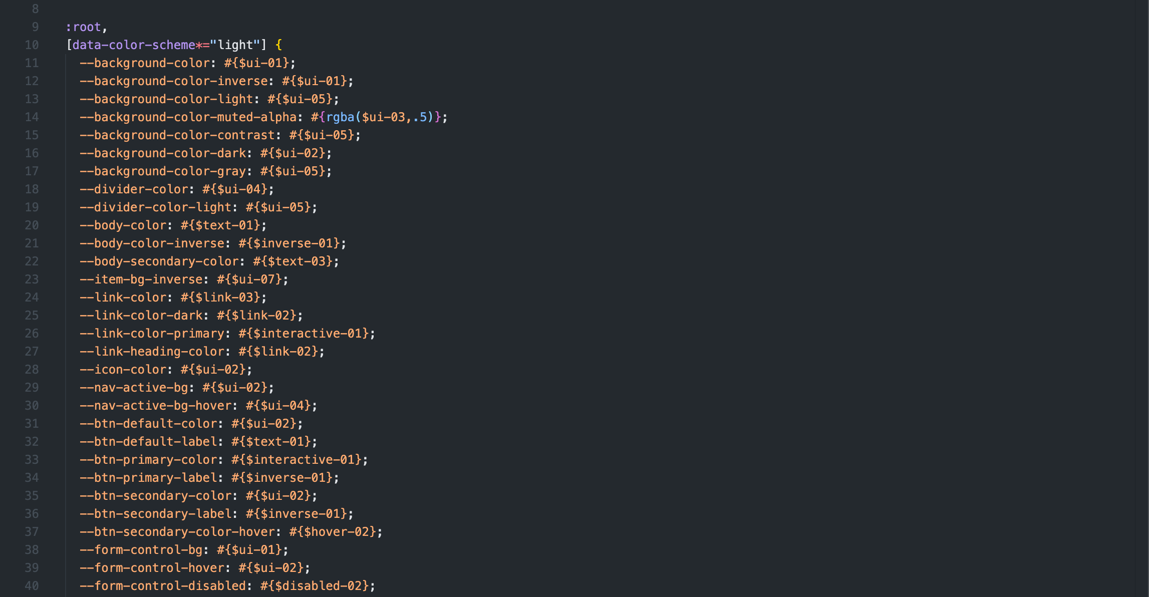
$ui-01: $color-white;
$ui-01-50: rgba($color-white, .5);
$ui-01-10: rgba($color-white, .1);
$ui-02: $color-black;
$ui-03: $color-gray;
$ui-04: $color-gray-light;
$ui-05: $color-gray-lighter;
$ui-06: $color-gray-dark;
$ui-07: $color-gray-darker;
// Text Tokens
// ========================================================================
$text-01: $color-black;
$text-02: $color-gray;
$text-03: $color-gray-dark;
$text-04: $color-gray-light;
$inverse-01: $color-white;
$inverse-02: $color-offwhite; Settings
settings
tools
elements
objects
components
themes
trumps
Local static variables
Local custom properties
.c-btn {

  // Custom properties
  // ======================================================================

  --btn-radius: #{$global-radius};
  --btn-color: #{$ui-02};
  --btn-label: #{$text-01};

  // ======================================================================

  padding: $padding-xsmall $padding-base;
  border: none;
  border-radius: var(--btn-radius);
  background-color: var(--btn-color);
  box-shadow: 0 0 0 1px var(--btn-color);
  color: var(--btn-label);
  transition: $global-interactive-transition;

  //
  // States - Disables
  //

  &:disabled {
    cursor: not-allowed;
  }
Components
settings
tools
elements
objects
components
themes
trumps
Global custom roperties
Local custom properties overrides
// THEME TODAY
// ========================================================================

// Tools
// ========================================================================

@import 'tools/v7/utils';
@import 'tools/v7/colors';
@import 'tools/v7/mq';
@import 'tools/v7/spacing';
@import 'tools/v7/typography';
@import 'tools/v7/zindex';

// Settings
// ========================================================================

@import 'settings/v7/colors.tokens';
@import 'settings/v7/global';
@import 'settings/v7/sizes.map';
@import 'settings/v7/spacing.tokens';
@import 'settings/v7/typography.tokens';
@import 'settings/v7/visibility.map';

// ========================================================================

// Category news colors

[data-channel="/notizie/"] {
  --nav-border: #{$category-01};
}

[data-channel="/lifestyle/"] {
  --nav-border: #{$category-02};
}

[data-channel="/cultura/"] {
  --nav-border: #{$category-03};
}

[data-channel="/opinioni/"] {
  --nav-border: #{$category-04};
}

//
// Specific custom properties for Today edtion
//

[data-theme="today"] {

  // Theme Colors list

  --theme-color: #{color( $themes, today, base)};
  --theme-color-light: #{color( $themes, today, light)};
  --theme-color-dark: #{color( $themes, today, dark)};
  --theme-color-darker: #{color( $themes, today, darker)};
  --theme-color-darkest: #{color( $themes, today, darkest)};

  // Category kicker color text

  [data-channel*="notizie"],
  .c-story {
    --story-kicker-text: #{$category-01-dark};
    --story-kicker-bg: #{$category-01-dark};
    @media (prefers-color-scheme: dark) {
      body:not([data-color-scheme*="light"]) & {
        --story-kicker-text: #{$category-01};
      }
    }
  }

  &[data-color-scheme*="dark"][data-channel*="notizie"],
  &[data-channel*="video"] .c-story,
  &[data-channel*="foto"] .c-story,
  &[data-color-scheme*="dark"] .c-story,
  &#{$global-background-dark} .c-story,
  &#{$global-background-primary-dark} .c-story {
    --story-kicker-text: #{$category-01};
  }

  @each $category, $name in $categories {
    @if ($category!="notizie"){
      &[data-channel*="#{$category}"],
      .c-story[data-channel*="#{$category}"],
      &[data-channel*="#{$category}"] .c-story {
        --story-kicker-text: #{color($categories, $category, dark)};
        --story-kicker-bg: #{color($categories, $category, dark)};
        --story-header-border: #{color($categories, $category, dark)};
        @media (prefers-color-scheme: dark) {
          body:not([data-color-scheme*="light"]) & {
            --story-kicker-text: #{color($categories, $category, base)};
          }
        }
      }

      &[data-color-scheme*="dark"][data-channel*="#{$category}"],
      &[data-color-scheme*="dark"] .c-story[data-channel*="#{$category}"],
      &[data-color-scheme*="dark"][data-channel*="#{$category}"] .c-story,
      &[data-color-scheme*="dark"] [data-channel*="#{$category}"] .c-story,
      &[data-channel*="#{$category}"] #{$global-background-dark} .c-story,
      .o-bg-primary-dark [data-channel*="#{$category}"].c-story,
      #{$global-background-dark} .c-story[data-channel*="#{$category}"] {
        --story-kicker-text: #{color($categories, $category, base)};
      }
    }
  }

  // Custom properties for each component, light and dark mode version

  .c-brand--resize-medium {
    @include bp(md) {
      --brand-height: 4.5rem;
    }
  }

  .c-menu {
    --menu-background: var(--theme-color);
    @include bp(md) {
      --menu-divider-color: #{rgba($ui-01, .30)};
    }
  }

  &[data-color-scheme*="dark"]{
    @include bp(md) {
      .c-menu {
        --menu-background: var(--theme-color);
      }
    }
  }

  .c-header {
    --header-background: var(--theme-color);
  }

  .c-header__channel {
    --channel-link: #{$ui-01};
  }

  &[data-color-scheme*="dark"]{
    .c-header {
      --header-background: var(--theme-color);
    }
  }

  .c-searchbar {
    @include bp(md) {
      --searchbar-background: var(--theme-color);
    }
  }

  &[data-color-scheme*="dark"]{
    .c-searchbar {
      --searchbar-background: var(--theme-color);
    }
  }

  .c-toolbar {
    --toolbar-border-color: var(--theme-color);
  }

  &[data-color-scheme*="dark"]{
    .c-toolbar {
      --toolbar-border-color: var(--theme-color);
    }
  }

  .c-menu__link {
    --menu-link: #{$link-01};
  }

  .c-navbar__item {
    --item-link-color: #{$link-01};
  }

  .c-navbar__search,
  .c-navbar__controller {
    @include bp(md) {
      color: #{$ui-01};
    }
  }
}


Themes
Tips & Tricks
Using :root { }
Using :root{}
All properties scoped to :root {} in one place / file
Multiple :root {} are OK sometimes but mind the cascade
Avoid code fragmentation
Naming
Naming things is freaking hard
Naming things is freaking hard
/* Naming structure */
--component-property

/* Example */
--header-background
--header-color
--header-background-image
--header-font-size
--header-width
--header-height
Naming things is freaking hard
--button-size
--button-spacing
Custom Properties
and calc() 🎉
Custom Properties and calc() 🎉
:root {
  --spacing: 1rem;
}

.box {
  padding: calc(var(--spacing) * 2);
}
Custom Properties and calc() 🎉
:root {
  --spacing: 1rem;
  --spacing-small: calc(var(--spacing) / 2);
}

.box {
  padding: var(--spacing);
}

.box--small {
  padding: var(--spacing--small);
}
Negative values
Negative values
Probably get trying this....
.class {
  margin-bottom: -var(--margin);
}
$margin-md: 10px;
.class {
margin-bottom: -$margin-md;
}Negative values
..because of this...
:root {
  --outer-gutter: 24px;
}


// Reset page padding

.o-page-reset {
  margin-top: calc(var(--outer-gutter) * -1);
}
Negative values
...but, you should multiply for -1 🤨
Escaping
Escaping
/* Escape Sass rgba function */
--background: #{rgba(0,0,0, .25)};


/* Escape Sass function + maps */
--background: #{color($categories, $category, darker)};


/* Escape Sass variable */
--background: #{$ui-01};
Fallback (default) values
Fallback (default) values
.c-btn {
  border-radius: var(--btn-radius, 2px);
}
Fallback values
.c-header {
  --header-background: var(--theme-color, #f60);
  background-color: var(--header-background);
}
currentColor
currentColor
The currentcolor keyword refers to the value of the color property of an element.
This value was first supported by Opera in 2009, since then, Firefox 3.5+, Chrome 1+, and Safari 4+.
.o-icon {
  vertical-align: middle;
  fill: none;
  stroke-width: 2;
  stroke-linecap: round;
  stroke: currentColor;
  stroke-linejoin: round;
  display: inline-block;
  pointer-events: all;

  &--fill {
    fill: currentColor;
    stroke-width: 0;
  }
}
Final Thoughts

Sass variables
Custom Properties
Change?
It's a custom property
Global static, local dynamic
Thank you! 🙏
@zetareticoli
francescoimprota.com