Naming & Using Design Tokens –
a strategy guide
01 Naming
02 Using
01 NAMING LEVELS
Naming Levels
- Namespace (theme, Design System, product)
- Object (component, group)
- Category
- Property
- Modifier (scale, variant, state)
$ds-color-background-primary
$button-text-size-lg
[system]-[category]-[property]-[variant]
[component]-[category]-[property]-[scale]
The more levels, the more descriptive
Just the necessary levels
--color-specific-data-entry-border-color-default
😱
Base Level
Category Level
- Tokens exist within a category like color, font or space
- Categories may overlap, sometimes
- Avoid homonyms
Categories
- color
- font
- space
- size
- elevation
- breakpoints
- depth (or shadow)
- radius (or radii)
- time (or animation)
Property Level
Property Level
- Pairs with a Category
- Category + Property not purposefully alone
- Tend to exchange due to CSS syntax
Properties
- Color Text
- Color Background
- Color Border
- Font Size
- Font Weight
- Font Family
Properties are in bold
Modifiers Level
Modifiers Level
- Used independently or together
- Always paired with Category or Property
- Could describe a state, variant or scale
Modifier / Variants
- Primary
- Secondary
- Tertiary
- Success / Confirmation
- Error / Danger / Alert / Critical
- Warning
- Info
$button-danger
$color-background-info
Modifier / State
- hover
- active
- focus
- disabled
- visited
- error
Modifier / Scale
- Numeric scale 2x, 3x, 4x
- Proportions xsmall, small, default, medium, large, xlarge
- Ordered 100, 200, 300, 400 or 10, 20, 30, 40
- T-Shirt (xs,sm,base,md,lg,xl,xxl)
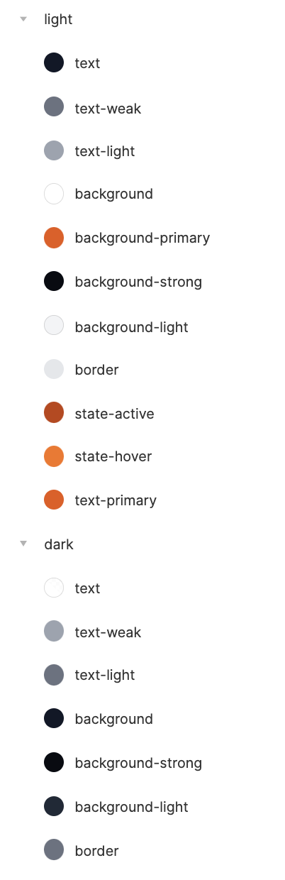
How to deal Light/Dark mode
Light / Dark mode
- Use light/dark at Modifier Level 🤓
- Use light/dark at Namespace Level 🤨
- Keep the token name the same 🤩
light/dark at modifier level
$color-text-strong-dark
$color-background-primary-on-light
light/dark at modifier level
Using the modifier level impose you to specify both light and dark variant
light/dark at namespace level
$dark-color-text-strong
Easy to align with design tools like Figma
02 PRIMITIVES
vs TOKENS
Primitives are the backbone of design tokens, they are immutable
Primitives Characteristics
- Immutable
- Raw
- Bullet Three
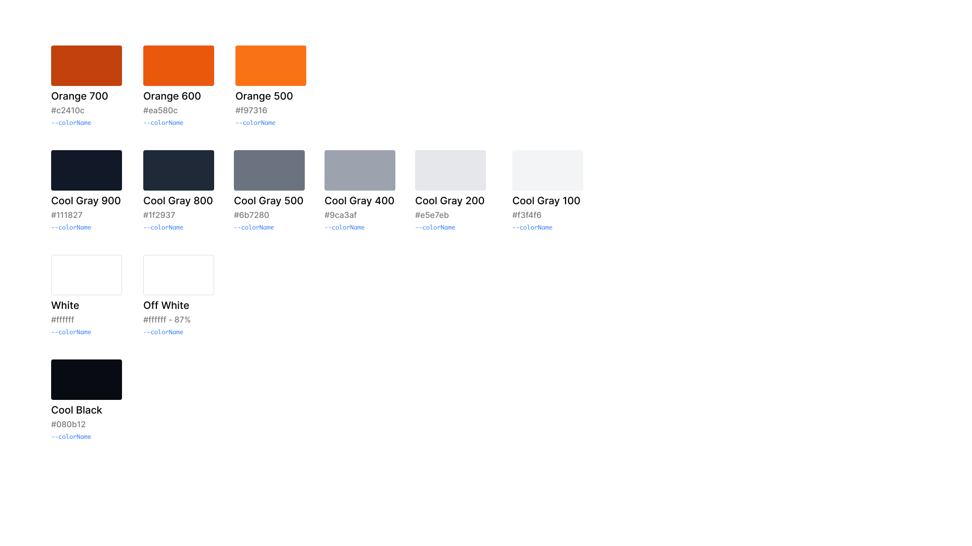
Three Groups of Primitives
- Colors
- Text
- Space
Color Primitives
Assign a color primitive to a design token in Figma
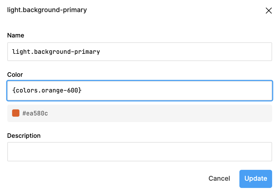
Don't use primitives as direct token in your CSS
Design tokens should point to global/primitives
CONTEXT DILEMMA
Within a component we will not use the global design tokens directly
Add a middle layer
LESSONS LEARNED
A limited, well-know set of tokens guides designers and devs to make choices
No single token includes all potential levels
Some levels are rarely needed
Others, tend to be mutually exclusive
Avoid dogmatically including all levels possible
// Good
$card-radius
$card-shadow-offset

// Bad, redundant
$card-tile-corner-radius-default-on-light
$card-corner-radius-default-on-dark
$card-shadow-offset-default-on-light
$card-shadow-offset-default-on-dark
Flexibility
or Specificity ?
The right name
- Descriptive
- Semantic
- Memorable
- Flexible enough
Comprehensive + concise
Using tokens inside CSS classes
Class name should reflect the scope, not only the usage. For utility class too.
.spacing-stack {
  margin-bottom: var(--spacing-stack-xl);
  @media screen and (min-width: 768px) {
    margin-bottom: var(--spacing-stack-xxl);
  }
}
.spacing-stack tell us about the vertical space alignment, nothing more. But we use two tokens inside it
.spacing-sections {
  margin-bottom: var(--spacing-stack-xl);
  @media screen and (min-width: 768px) {
    margin-bottom: var(--spacing-stack-xxl);
  }
}
.spacing-sections tell us more about the scope - spacing a page section > more defined range > not a utility because two tokens usage > object class (ITCSS)
Spacing tokens
Space rivals color in frequency of use within a library’s style rules
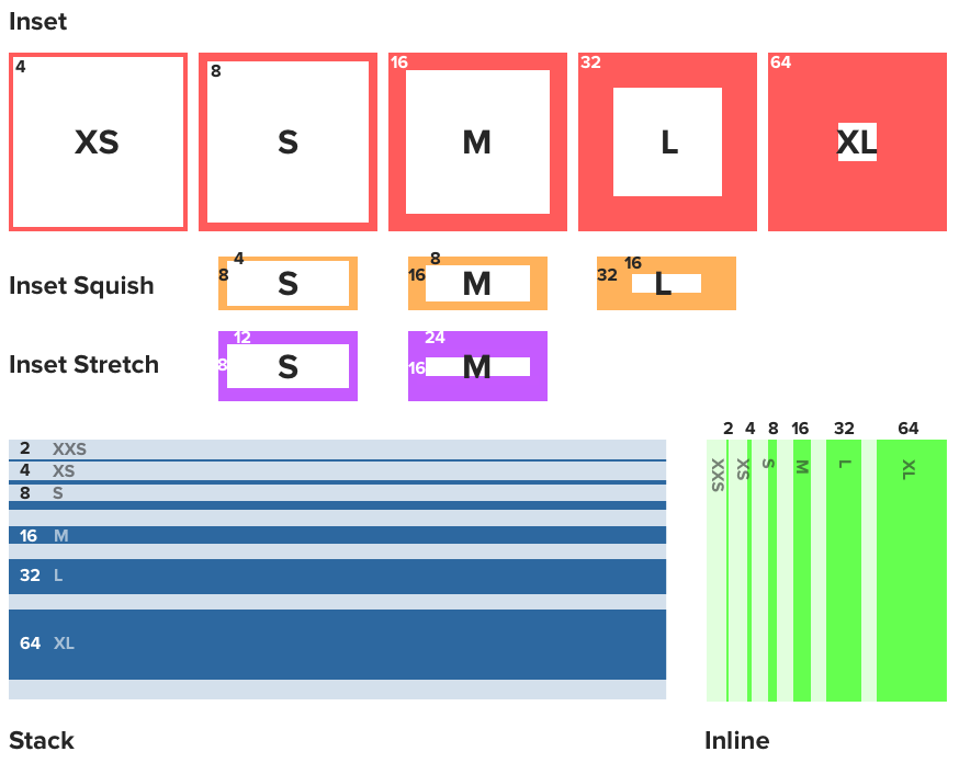
A visual reference, akin to a cheatsheet, of spatial concepts
CSS classes aren't tokens
Space Divide Us
Space epitomizes the “I design this way, you build that way” gap between design and dev
Design Tokens are more related to design and the architecture of a DS rather than code.
Gonzalo Vásquez on Design Tokens