Fuxin Chen
Intel XDK PRC Team
Dive into CSS
CSS(Cascading Styles Sheets) enables us to change the style of the content. It controls how the content is rendered.
It's a simple language with a lot of depth.
Source: Dive into CSS, Advanced CSS
Layout
The Display Property
Display is CSS's most important property for controlling layout. All HTML elements are naturally displayed in one of the following ways:
Block
Takes up the full width available, with a new line before and after (display:block;)
Inline
Takes up only as much width as it needs, and does not force new lines (display:inline;)
Not displayed
Some tags, like <meta /> and <style> are not visible (display:none;)
Block-level Elements
A block element is an element that has, but may not be limited to, the following characteristics:
- If no width is set, will expand naturally to fill its parent container
- Can have margins and/or padding
- If no height is set, will expand naturally to fit its child elements (assuming they are not floated or positioned)
- By default, will be placed below previous elements in the markup (assuming no floats or positioning on surrounding elements)
- Ignores the vertical-align property
Examples of Block Elements
<div>, <p>, <form>, <ul>, <li>, <h1>, <header>, <footer>, <section>, <nav>.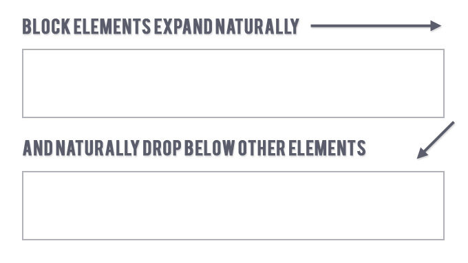
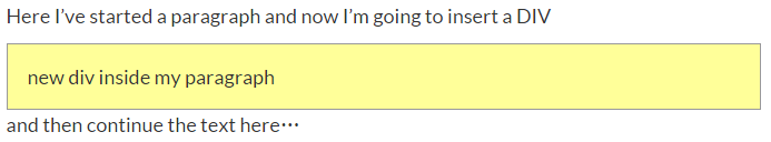
<p>Here I’ve started a paragraph and now I’m going to insert a DIV </p>
<div style="...">new div inside my paragraph</div>
<p>and then continue the text here…</p>
Inline Elements
An inline element has, but may not be limited to, the following characteristics:
- Flows along with text content, thus
- Will not clear previous content to drop to the next line like block elements
- Is subject to white-space settings in CSS
- Will ignore top and bottom margin settings, but will apply left and right margins, and any padding
- Will ignore the width and height properties
- If floated left or right, will automatically become a block-level element, subject to all block characteristics
- Is subject to the vertical-align property
Examples of Inline Elements
<a>, <span>, <b>, <em>, <i>, <cite>, <mark>, and <code>.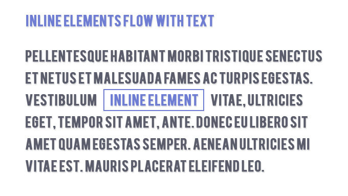
Inclusion of these Elements
- You can put any block element inside another block element.
- You can also put any inline element inside a block element, as well as any inline element inside any other inline element.
- But you cannot put a block element inside an inline element— with one exception: You can wrap an <a> element around any content, whether it be block elements, or inline elements, or a mixture of both.
Note
Display:none;
Some specialized elements such as script use this as their default. It is commonly used with JavaScript to hide and show elements without really deleting and recreating them.
This is different from visibility.
Setting display to none will render the page as though the element does not exist.
visibility: hidden; will hide the element, but the element will still take up the space it would if it was fully visible.
Source: the "display" property
Change Display Property
Although each HTML element has its natural display style, you can override it in CSS. This can be very useful when you want your page to look a particular way while using semantically-correct HTML.
Put an <h2> element inside of a paragraph style it to look like regular text——Not a good idea, that’s what <em> is for.
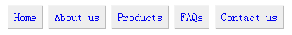
A common example: make li elements for horizontal menus.
<style type=”text/css”>
.toolbar li { display:inline; }
</style>
<ul>
<li><a href=”#”>Home</a></li>
<li><a href=”#”>About us</a></li>
<li><a href=”#”>Products</a></li>
<li><a href=”#”>FAQs</a></li>
<li><a href=”#”>Contact us</a></li>
</ul>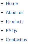
=
The box model applies to block-level elements.
Any block-level element can be considered as a box.
It defines how a box and its attributes relate to each other.
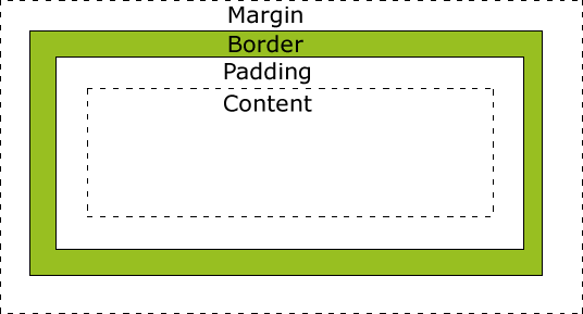
Box Model
Source: The Box Model For Beginers
A box is made up of four distinct parts:
-
Margin: completely invisible, not obstruct elements behind it.
-
Border: outlines the visible portion of the element.
-
Padding: defines the space between content area and border.
-
Content area: Relate to width(height) properties of an element.
Box Model
Source: The Box Model For Beginers
CSS Box Model
.box {
  width: 300px;
  height: 200px;
  padding: 10px;
  border: 1px solid #000;
  margin: 15px;
}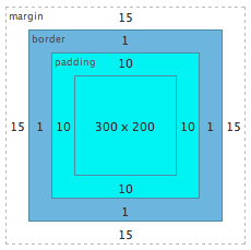
Total width = 15 + 1 + 10 + 300 + 10 + 1 + 15 = 352px
Total height = 15 + 1 + 10 + 200 + 10 + 1 + 15 = 252px
Total width = left margin + left border + left padding + width + right padding + right border + right margin
Total height = top margin + top border + top padding + height + bottom padding + bottom border + bottom marginWhat if space available smaller than this?
Element will misplaced, or overflow its containing block
Source: The CSS Box Model
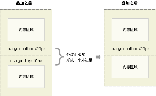
Collapsing Margins
Although margins are included in the calculations for the total space required to place the element, note that vertically adjacent margins on static (non-positioned) elements would collapse into the bigger margin of the elements that are adjacent above and below.
Sources: Collapsing Margins
Note
More about Margin
Applies to all elements, but vertical margins will not have any effect on non-replaced inline elements(span, strong, i, b, em).
Margin is always transparent.
margin: top right bottom leftmargin-top:value;
margin-right:value;
margin-bottom:value;
margin-left:value;Shorthand Notation:
- margin: top right bottom
- margin: top right
- margin: top
Shorthand Rules:
- left = right
- left = right, bottom = top
- left = right, bottom = top, right = top
*The shorthand apply to border and padding also.
Sources: Dive into CSS Margin
More about Margin
margin-width: auto | length | percentage
length:
Specifies a fixed width.
percentage:
calculated with respect to the WIDTH of the generated box's containing block. Note that this is true for 'margin-top' and 'margin-bottom' as well.
auto:
make elements horizontally centered. vertical zero.
Negative values for margin properties are allowed, but there may be implementation-specific limits.
Sources: Box Model
Margin or Padding?
Margin is on the outside of block elements while padding is on the inside.
Use margins when:
- Space outside the border.
- No background color or image invade the space.
- Like collapsible space on top or bottom of the element.
Use paddings when:
- All space inside the border.
- Need background color/image continue into the space
- Want top and bottom space to behave more rigidly
Positioning
The Position Property
The position property specifies the type of positioning method used for an element.
There are four different position values:
-
static
-
relative
-
fixed
-
absolute
Elements are then positioned using the top, bottom, left, and right properties. However, these properties will not work unless the position property is set first. They also work differently depending on the position value.
Position: static;
HTML elements are positioned static by default.
Static positioned elements are not affected by the top, bottom, left, and right properties.
An element with position: static; is not positioned in any special way; It is always positioned according to the normal flow of the page.
Normally you wouldn't specify this unless you needed to override a positioning that had been previously set.
#div-1 {
 position:static;
}Position: relative;
An element with position: relative; is positioned relative to its normal position.
Setting the top, right, bottom, and left properties of a relatively-positioned element will cause it to be adjusted away from its normal position. Other content will not be adjusted to fit into any gap left by the element.
Let's move div-1 down 20 pixels, and to the left 40 pixels:
#div-1 {
 position:relative;
 top:20px;
 left:-40px;
}
*Notice the space where div-1 normally would have been.
Position: fixed;
An element with position: fixed; is positioned relative to the viewport , which means it always stays in the same place even if the page is scrolled. The top, right, bottom, and left properties are used to position the element.
A fixed element does not leave a gap in the page where it would normally have been located.
div.fixed {
    position: fixed;
    bottom: 0;
    right: 0;
    width: 300px;
    border: 3px solid #8AC007;
}
*Notice the fixed element in the lower-right corner of page. Here is the CSS used:
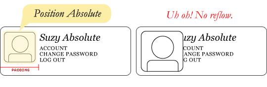
Position: absolute;
An element with position: absolute; is removed from the document and positioned relative to the nearest positioned ancestor.
However, if an absolute positioned element has no positioned ancestors, it uses the document body, and moves along with page scrolling.
#div-1a {
 position:absolute;
 top:0;
 right:0;
 width:200px;
}
#div-1 { position:relative; }
#div-1 { }
Overlapping Elements
When elements are positioned, they can overlap other elements.
The z-index property specifies the stack order of an element, element with greater stack order is always in front of an element with a lower stack order.
An element can have a positive or negative stack order.
<style>
img {
    position: absolute;
    left: 0px;
    top: 0px;
    z-index: -1;
}
</style>
<h1>This is a heading</h1>
<img src="w3css.gif" width="100" height="140">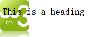
*If two positioned elements overlap without a z-index specified, the element positioned last in HTML code will shown on top.
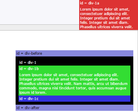
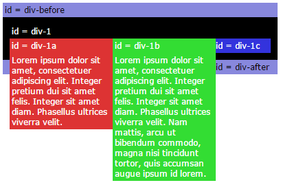
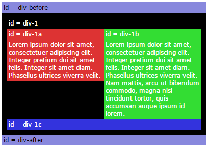
Example: two column div
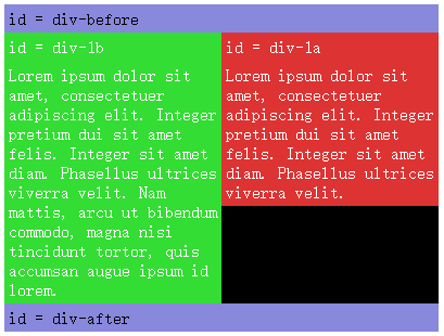
#div-1 {
 position:relative;
}
#div-1a {
 position:absolute;
 top:0;
 right:0;
 width:200px;
}
#div-1b {
 position:absolute;
 top:0;
 left:0;
 width:200px;
}
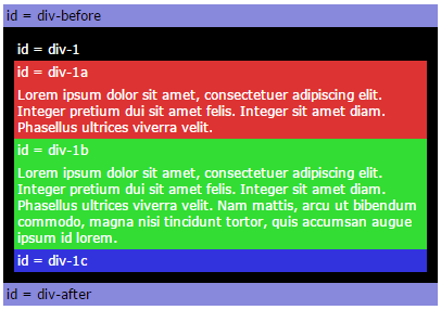
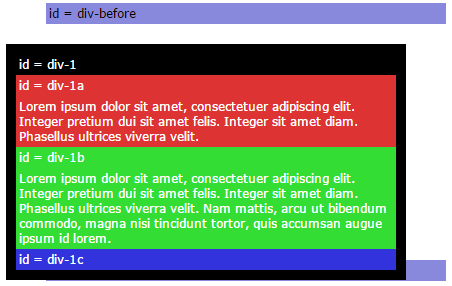
What we want
CSS we write
What we get
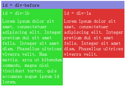
Example: two column div
One solution is to set a fixed height on the elements.
But that is not a viable solution for most designs, because we usually do not know how much text will be in the elements, or the exact font sizes that will be used.
#div-1 {
 position:relative;
 height:250px;
}
#div-1a {
 position:absolute;
 top:0;
 right:0;
 width:200px;
}
#div-1b {
 position:absolute;
 top:0;
 left:0;
 width:200px;
}Float
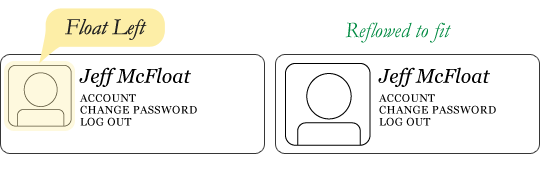
We can "float" an element to push it as far as possible to the right or to the left, and allow text to wrap around it.
This is typically used for images:
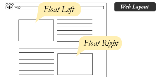
Floated elements remain a part of the flow of the web page. (different from absolute positioning)
Source: All About Floats
What are floats used for?
Aside from the simple example of wrapping text around images, floats can be used to create entire web layouts.
Floats are also helpful for layout in smaller instances.
Source: All About Floats
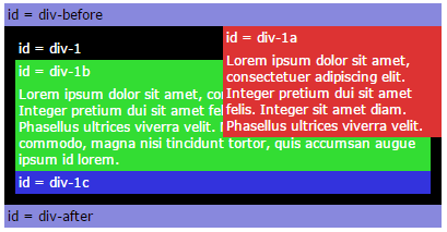
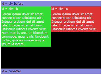
Example: two column div
#div-1a {
 float:left;
 width:150px;
}
#div-1b {
 float:left;
 width:150px;
}
If we float one column to the left, then also float the second column to the left, they will push up against each other.
The Great Collapse
If parent element contained nothing but floated elements, the height of it would literally collapse to nothing.
This isn't always obvious if the parent doesn't contain any visually noticeable background, but it is important to be aware of.
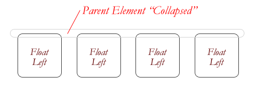
It can be fixed by clearing the float after floated elements in the container but before the close of the container.
Source: All About Floats
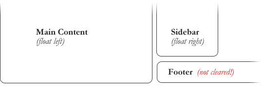
Clearing the Float
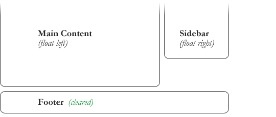
Elements after a floating element will flow around it. To avoid this, use the clear property.
An element that has the clear property will not move up adjacent to the float like the float desires, but will move itself down past the float.
#footer {
  clear: both;
}
Source: All About Floats
Example: two column div
#div-1a {
 float:left;
 width:190px;
}
#div-1b {
 float:left;
 width:190px;
}
#div-1c {
 clear:both;
}
Exactly what we want
Cascading Order
The CSS Cascading Order
The term "cascading" refers to the order of importance the browser should follow when it encounters conflicting style rules.
Styles are read in three ways: browser default, style sheets and inline styles. The default priority order:
- Browser default
- External style sheet (@import or <link>)
- Internal style sheet (in the <head>)
- Inline style
CSS styles can be specified in many ways, but they will all cascade into one style sheet in the end.
If two rules have the same weight, the latter wins.
Internal Priorities
<style type="text/css">
    .grape
    {
        color: Blue;
    }
    H1
    {
        color: Red;
    }
</style>
<h1 class="grape">
    Meerkat <em>Central </em>
</h1>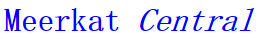
Styles are read in three ways: browser default, style sheets and inline styles. The default priority order:
- element (tag)
- .class
- #id
Source: CSS规则的执行顺序
Internal Priorities
<style type="text/css">
LI            {...}
UL LI         {...}
UL OL LI      {...}
LI.red        {...}
UL OL LI.red  {...}
li#list       {...}
ul #list      {...}
</style>
Uses a three-digit numbers: abc to calculate the weight
- a represents the number of #id attributes in the selector
- b represents the number of class attributes
- c represents the number of tag names
Combining these into a number will give you the actual weight. It’s all about counting.
/* a=0 b=0 c=1 -> specificity =   1 */
/* a=0 b=0 c=2 -> specificity =   2 */
/* a=0 b=0 c=3 -> specificity =   3 */
/* a=0 b=1 c=1 -> specificity =  11 */
/* a=0 b=1 c=3 -> specificity =  13 */
/* a=1 b=0 c=1 -> specificity = 101 */
/* a=1 b=0 c=1 -> specificity = 101 */
Inheritance Priorities
<style type="text/css">
#ID01{color:Red;}
EM{color:Gray;}
</style>
<h1 id="ID01">
    Meerkat<em> Central</em>
</h1>
Inheritance Priorities = 0 !
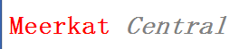
Source: CSS规则的执行顺序
!important
Putting !important after the declaration, but before the semicolon will simply override all previous cascade and give it the highest priority.
If !important specified more than once for same element, they will fall back to the normal cascading rules.
h3 {color: red !important;}<style type="text/css">
P#warn
{
color: Red !important;
}
EM
{
color: Black;
}
</style>
<p id="warn">
This text is red,but <em>emphasized text is black.</em>
</p>
Source: CSS规则的执行顺序
Exercises
<p class="pclass" id="pid"><span class="sclass" id="sid">text</span></p>span#sid { color: red; }
#pid span { color: green; }The text will be rendered green. Both styles carry the same weight (one id, one tag) but the green value is last defined.
#pid #sid { color: red; }
p.pclass span#sid.sclass { color: green; }
The text will be red. The first one has two id’s (weight 200) and second has one id, two tags and two class (122).
#pid { color: red !important; }
span { color: green; }Green. Even first definition with !important and inherited, targeting elements further down the document tree wins.
#pid { color: blue; font-size: 10px; }
#pid span { color: red !important;}
p #sid { color: green; font-size: 150%; }
Red in 15px size. Red for its !important rule. Span will inherit #pid defined and combine with it’s own 150%.