2) How effective is the combination of your main product and ancillary texts?
Our group
Introduction
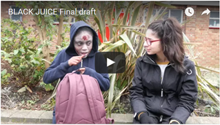
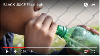
We had to create a trailer and then together we created a poster and a magazine cover for this trailer.
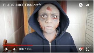
The trailer I made was a comedy/horror and it was about a drink that would turn you into a zombie if you drank too much of it.
This trailer was advertised by TotalFilm and a poster. The aim was to get all three products to link
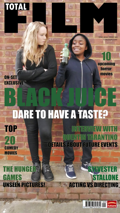
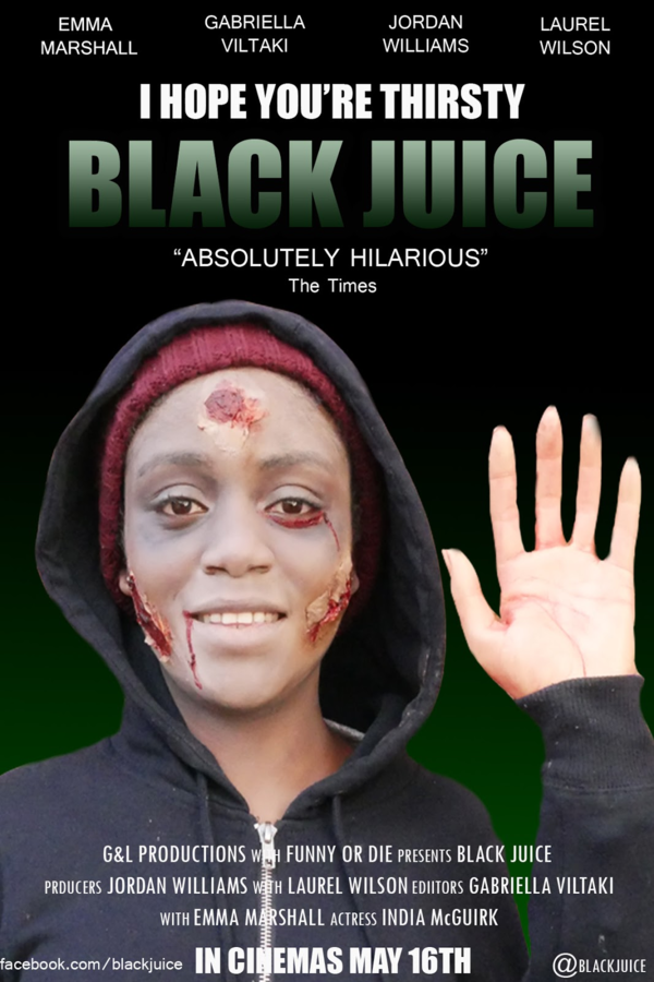
Colour: Green
In all three forms the colour green is being used. Green is associated with being a toxic colour and the drink turns you into a zombie, hence why we used the colour green.
Green is used in the magazine for the title and the subtitles and is used in the poster for the title and background.
Green is also used in the trailer as it is the colour of the bottle that the black juice comes in. The green is used effectively on all three platforms as it hints to the audience some kind of toxicity.
Font Style
For the poster and magazine cover, the main font that was used was called 'impact' and for the trailer we used 'Gaz' for the titles. Also the green to white gradient was used on the poster and for the titles in the trailer. Using similar font styles and colours will help the audience recognize the product at a quick glance as they will associate the specific font style with the film. We tried the gradient on the magazine cover as well, however it clashed too much with the brick wall, so we decided to keep it green which is still part of the
Main Image
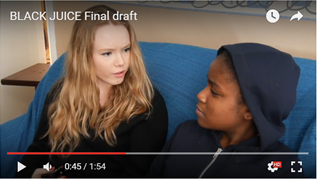
In all three platforms the main character that is shown is Kieran (the zombie) therefore a main image of him gives the audience a clue that he is going ti be the main character. On the magazine there is also lily standing there with a long shot to hint to the audience some type of relationship. In all platforms Kieran is wearing the same clothes and has his hood up, so the audience will recognise him and he helps all the platforms link together. In the trailer Kieran is given more close ups and more screen time which will help show that the story revolves around him.
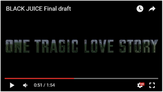
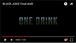
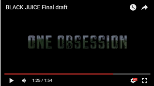
First Theme: Obsession
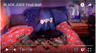
The first theme that is going on is the fact that Kieran is obsessed with the drink which is why he turns into a zombie. On the magazine cover obsession is shown by the smile on his face whilst he is holding the drink. In the poster it is shown by the tag line 'I hope you're thirsty' which represents the fact that he is always drinking the drink. Lastly, obsession is shown in the trailer through the various scenes of him drinking the drink and then the part where he goes 'insane' with all the bottles around him. It is also shown in the titles 'ONE OBSESSION'.
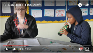
Second Theme: Relationship
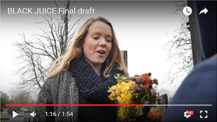
The second theme that is going on is the relationship between Kieran and Lily. The reason we chose this theme is to add to the comedy aspect of the trailer instead of it just being too much on the horror side. Their relationship is shown on the magazine cover as both of them are together. It is shown a lot when she tells him to stop drinking the drink, when he buys her flowers, and then when she decides to drink the drink. It is also shown in the title'ONE TRAGIC LOVE STORY'. We didn't really show their relationship in the poster as we wanted to leave some mystery and not give away much.