Inertia Scrolling
@garryyao
A touch scrolling implementation in JavaScript that compares to native experience
The most frequently used interaction on the planet is perhaps...

Scroll!
The basis of Scroll
- Scroll with mouse wheel
- Scroll by touching
- Inertia scrolling
- Pull to refresh
The elements that makes a comprehensive native scrolling experience :
Where the native scroll fails


Where the native scroll fails
Q: How to avoid page from scrolling on a mobile device?
html, body {
  height: 100%;
}

body {
  overflow-y: hidden;
}
Where the native scroll fails
Q: How to avoid page from scrolling on a mobile device?
<meta name="viewport"
 content="width=device-width, user-scalable=no">
Where the native scroll fails
Q: How to avoid page from scrolling on a mobile device?
This will ONLY disable the pinch–and–zoom effect as expected.
but if you swipe vertically...you’ll end up seeing a random bar
Where the native scroll fails
Q: How to avoid page from scrolling on a mobile device?
document.addEventListener('touchmove', function(e) {
	e.preventDefault();
}, false);
But it also prevent any other overflowed element from scrolling!
Where the native scroll fails
Q: How to avoid page from scrolling on a mobile device?
$(document).bind('touchmove', function(e) {
  if(!$(e.target).parent('.content').length){
    e.preventDefault();
  }
});
It works until you have reached the end of the inner scroll, then it will scroll the window!
Where the native scroll fails
Q: how to animate along with touch scrolling on mobile device, aka. the scroll event?
Sorry you can't...
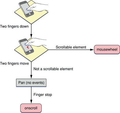
most of the mobile browsers just doesn't fire the "scroll" event the way you expect
Where the native scroll fails


Where custom scroll shines

Where custom scroll shines
You can tweak every single details of scroll:
- disable scrolling per direction
- the scrolling speed (amount of offset per movement)
- custom scrollbar look & feel
- the animation of scrolling movement
Where custom scroll shines
You can even implement features such as:
- Infinite scroll down, aka. progressive loading
- Pull to refresh the scroll list
- On-demand rendering (only render the elements that are visible in viewport)
- Scrolling parallax
box-model revisited

A custom scroll implementation is actually
all about figuring out:
scrollTop/scrollLeft
1. track the dimension properties
changes over time
this.state = {
  // aka. scrollTop
  topPosition: 0,
  // aka. scrollLeft
  leftPosition: 0,
  // aka. scrollHeight
  realHeight: 0,
  // aka. clientHeight
  containerHeight: 0,
  // aka. scrollWidth
  realWidth: 0,
  // aka. clientWidth
  containerWidth: 0,
  // if content has horizontally overflowed
  scrollableX: false,
  // if content has vertically overflowed
  scrollableY: false
};
2. figure out the delta of how much
it has been scrolled
handleWheel(e) {
  var newState = this.computeSizes();
  var deltaY = e.deltaY * this.props.speed;
  var deltaX = e.deltaX * this.props.speed;

  if (this.canScrollY(newState)) {
    newState.topPosition = this.computeTopPosition(-deltaY);
  }

  if (this.canScrollX(newState)) {
    newState.leftPosition = this.computeLeftPosition(-deltaX);
  }

  this.setState(newState);
}
3. actually carry out the scrolled amount
render() {
  var style = {
    marginTop: this.state.topPosition,
    marginLeft: this.state.leftPosition
  };

  return (
    <div>
      <div className="content" style={style} >
        {this.props.children}
      </div>
    </div>
  );
}
That looks deadly simple, isn't it?
in condition of not to consider performance & usability
Er...but what's the performance issue that you're worrying about?

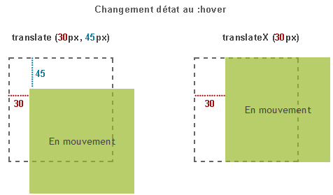
Perform the scrolling using CSS3 transform: translate(z, y, x) to makes it much faster since there's no repaint happened when you scroll

you also need a scrollbar that mimics the native look&feel
    var scrollbarY = this.canScrollY() ? (
      <Scrollbar
        realSize={this.state.realHeight}
        containerSize={this.state.containerHeight}
        position={-this.state.topPosition}
        onMove={this.handleMove.bind(this)}
        type="vertical"/>
    ) : null;

    var scrollbarX = ...

    return (
      <div onWheel={this.handleWheel.bind(this)}>
        <div className="content" style={style} >
          {this.props.children}
        </div>
        {scrollbarY}
        {scrollbarX}
      </div>
    );
Typically the scrollbar represents the current scroll offset - by it's size and position
this.state = {
  position: props.position * (props.containerSize / props.realSize),
  scrollSize: props.containerSize * props.containerSize / props.realSize,
  isDragging: false,
  isActive: false,
  lastClientPosition: 0
}
Ok, this all works so far good before we land on...again, mobile devices
The primary difference of scroll between desktop and mobile devices are the Respond/Event System
we should know how physical scrolling in reality

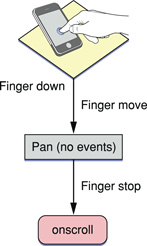
Scrolling on a touch device where respond system is primarily driven by 3 events:
- touchstart
- touchmove
- touchend
Translate the physical algorithm to make touch scrolling feel intuitive
- touchstart - start tracking, check finger num, interrupt previous
- touchmove - compute delta, bounce on edges
- touchend - stop tracking, decelerate
Deceleration and Bouncing are critical
Bouncing explained
- slow down during touchmove when we have reached the bottom
- allows for scrolling a distance outside of the bottom
- until we have decelerated the velocity down to 0, bounce back with a negative velocity
- the bouncing velocity is calculated by the amount of scrolled outside and a factor
- decelerate on the reverse direction until we eventually stopped
Deceleration explained
- it happens when a touch ends, and velocity of the finger is high enough
- the velocity is computed from the movement from the last 50ms before stopping
- high enough is measured by the threshold established by snapping
Deceleration explained
- a series of steps that each one is performed in a RequestAnimationFrame
- steps are streamlined in an animation function (typically ease-in-out)
- in each step we perform a slightly mount of scrolling ahead
- slow down the velocity on each iteration
- eventually stop the animation when the velocity is small enough
pretty ok with what we have reached so far ...
But be aware of that: any DOM layout change will break your perfect scroll!
have to re-compute on layout change
- window resize
- parent relayout
- adding/remove content
- content layout change
