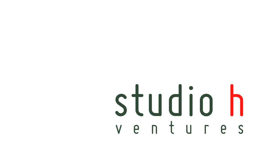
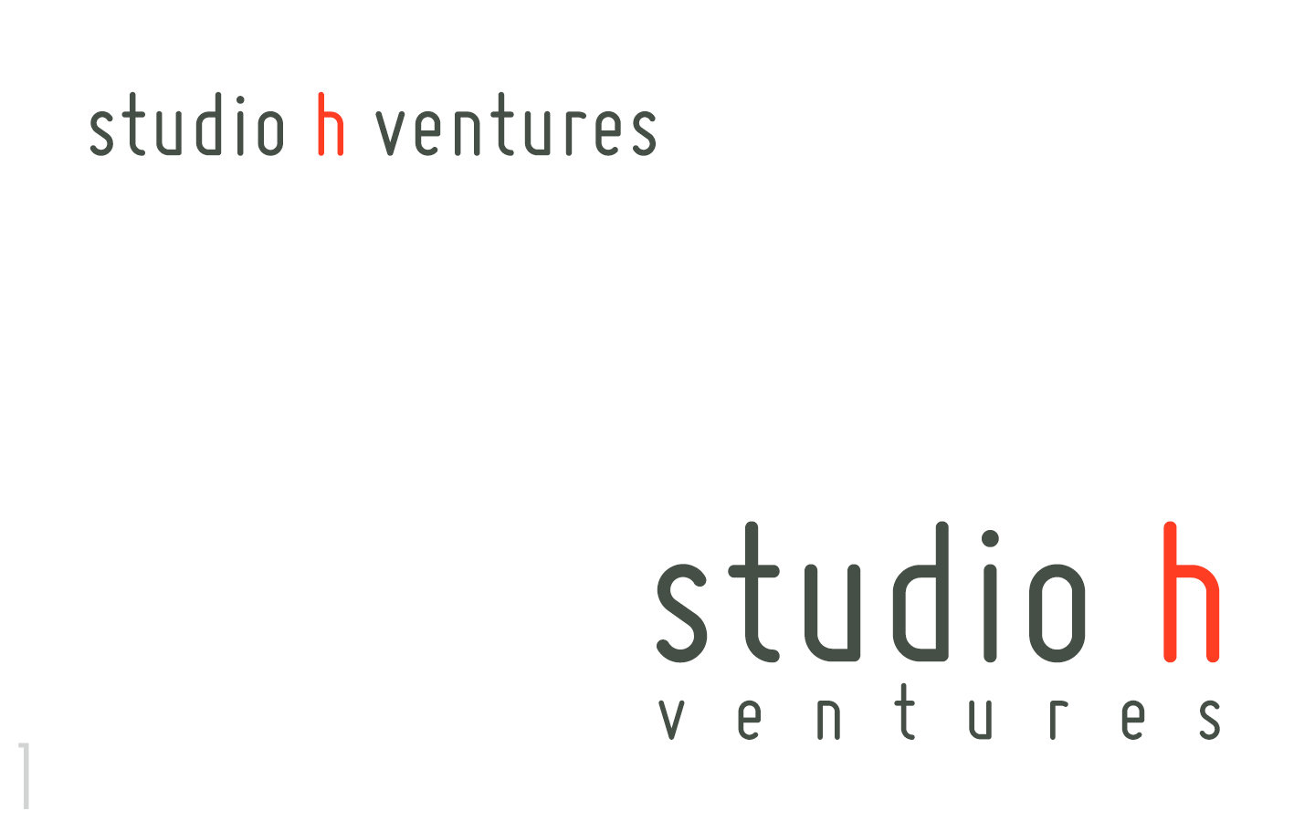
studio h ventures
branding
Overview
Studio h is a revolutionary new fund and venture creation lab that creates, seeds, and incubates highly selective new ventures focused on the internet of things.
Focus
- Vertical sector to be expert in the IoT field.
- Human factor for maximum impact on people's lives.
- Technology factor to connect everything.
Promise
- Better Insight
- Better Execution
- Better Returns
Energy
- Energetic / High-Energy
- Optimistic
- Creative
- New Roads
- Forward Looking
Hatch
- Hatch / Nest
- Incubate
- Early Stage
- Atomic / Molecule
- Package / Gift
Keywords
Technology & Human
- IoT
- Connected
- Team
- Collaboration
- Human
- People
- Warmth
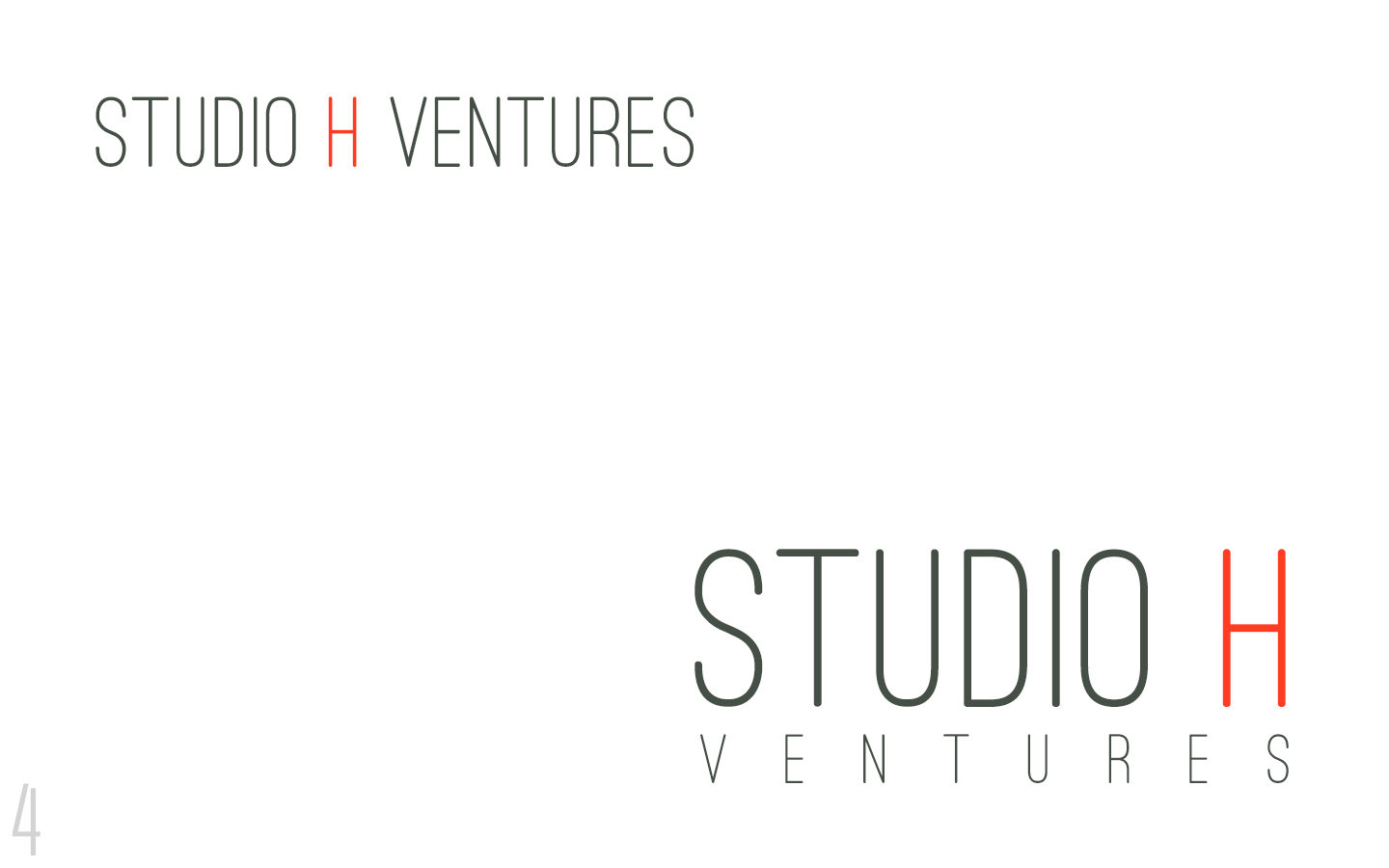
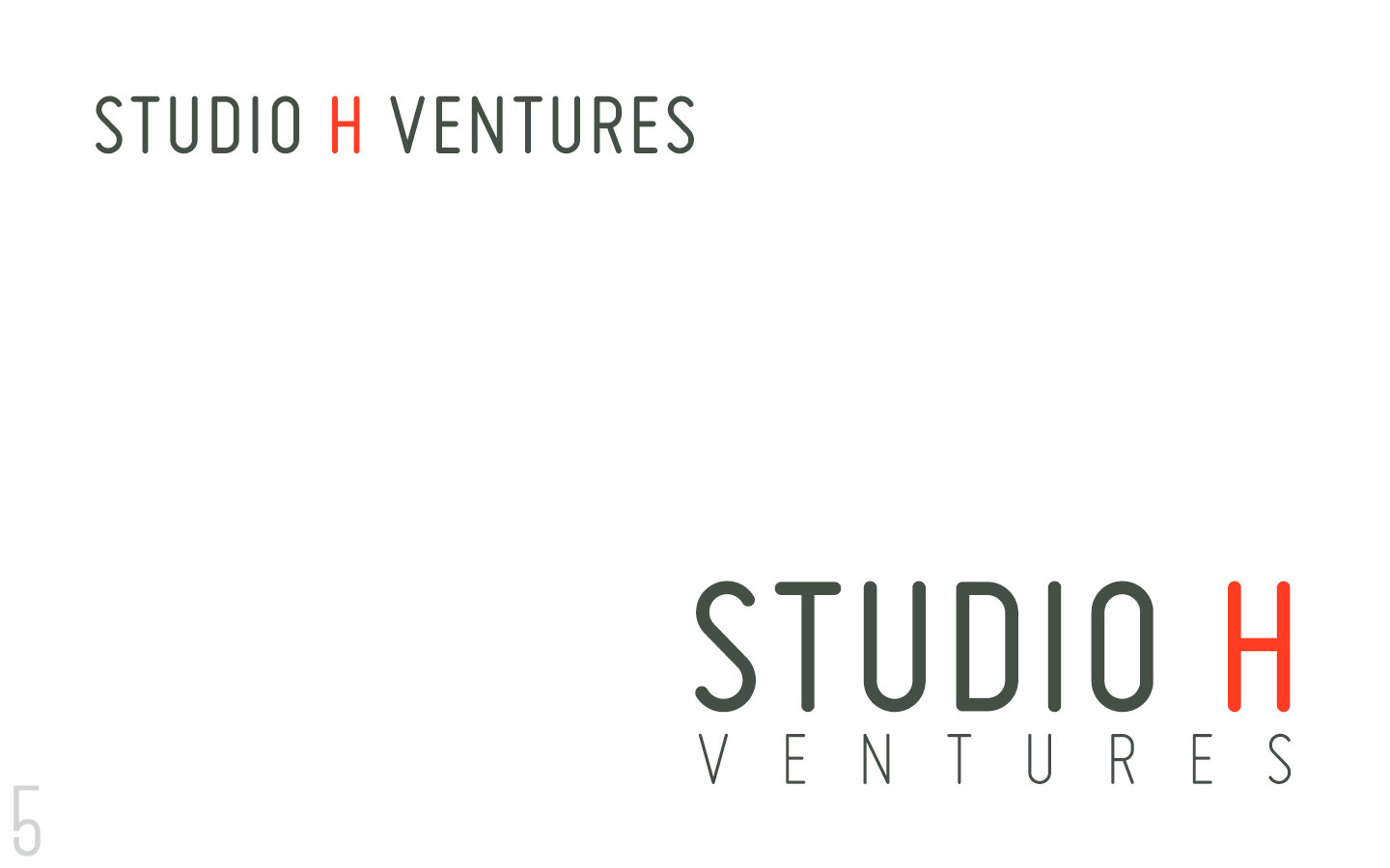
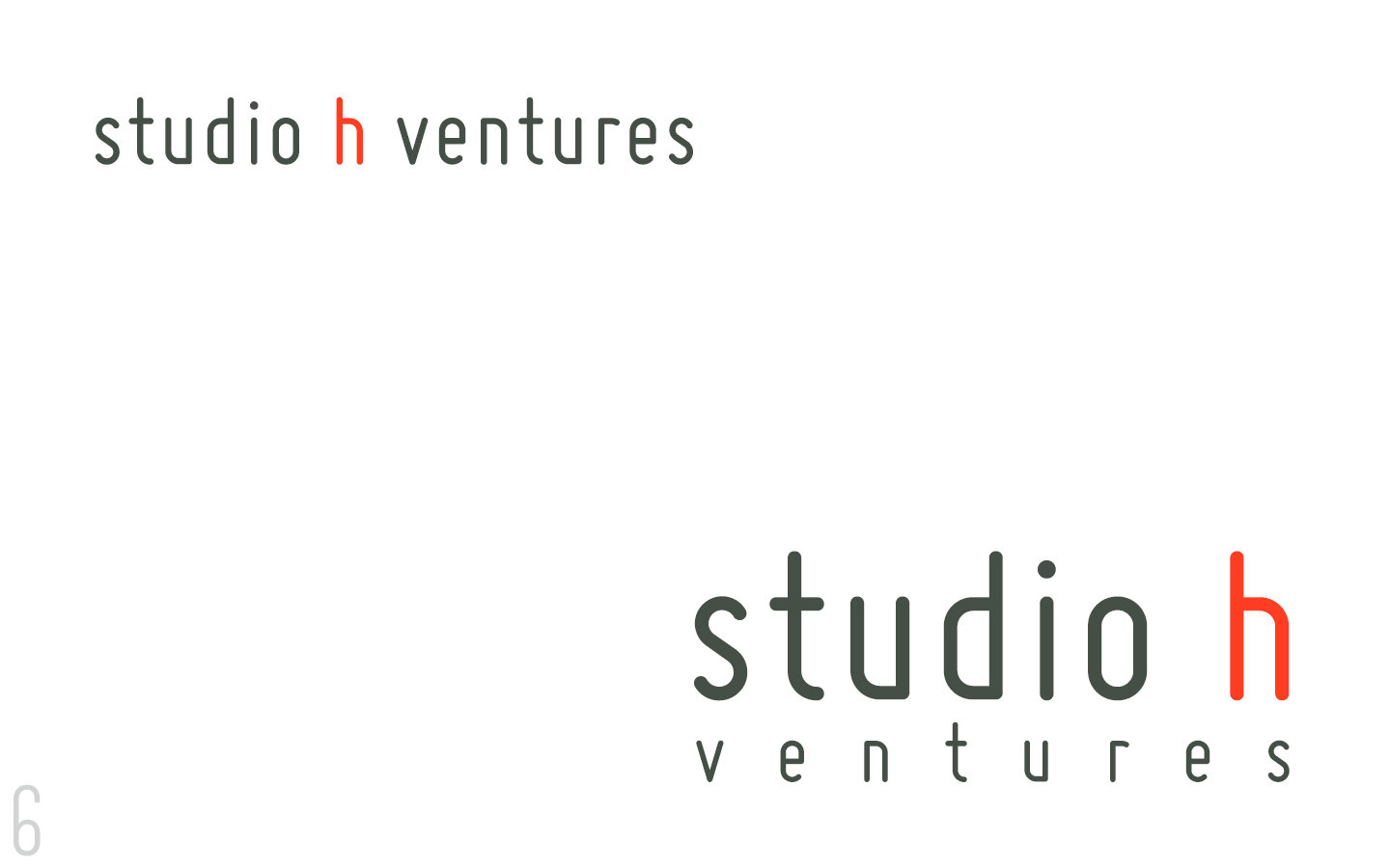
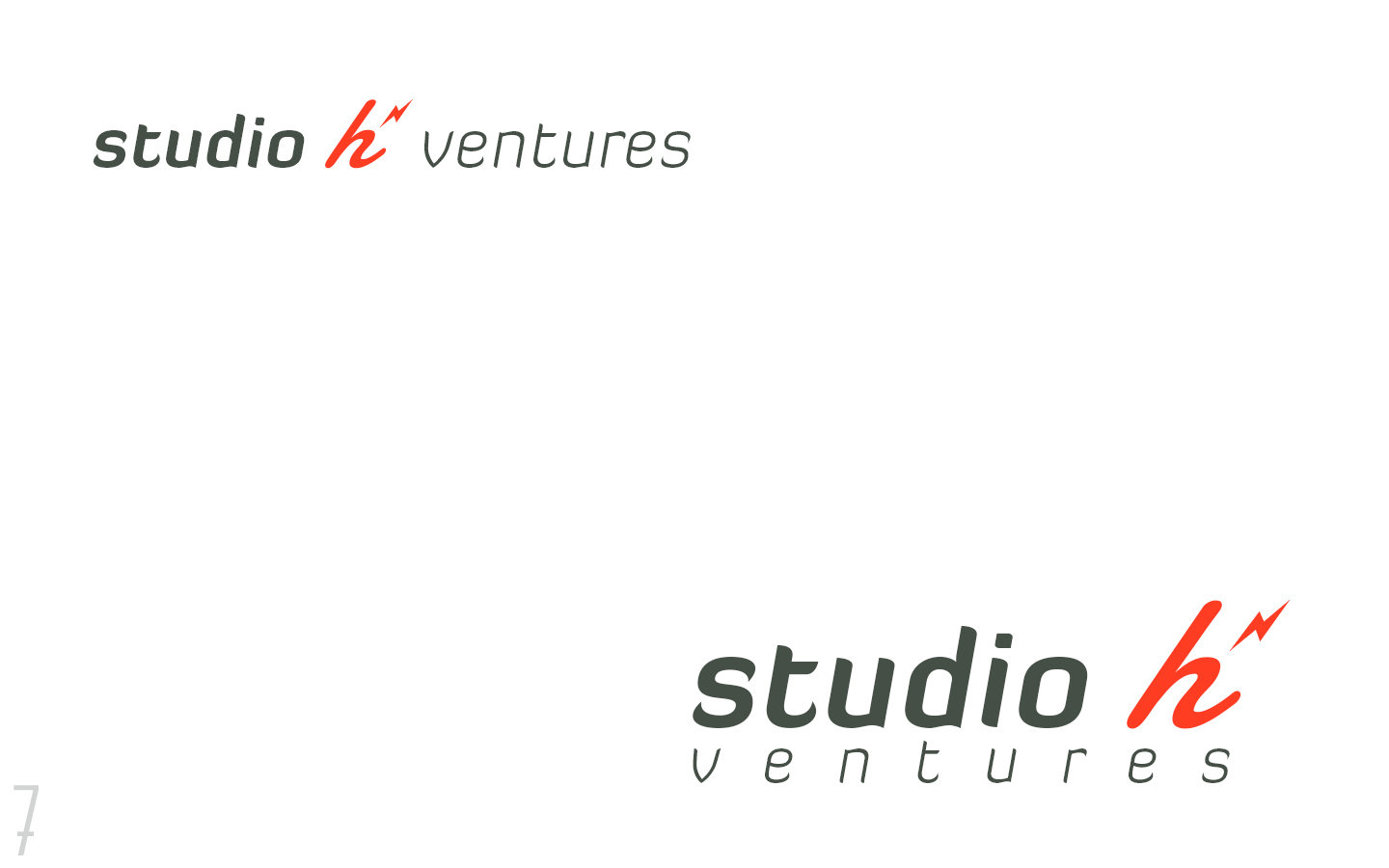
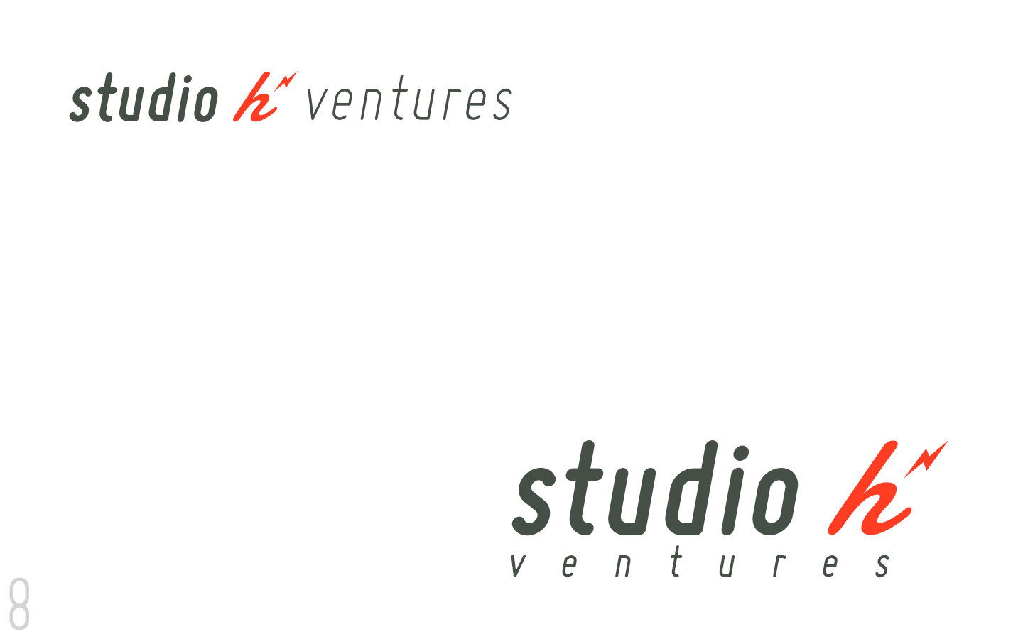
Typography Concepts
Currently 6 Options
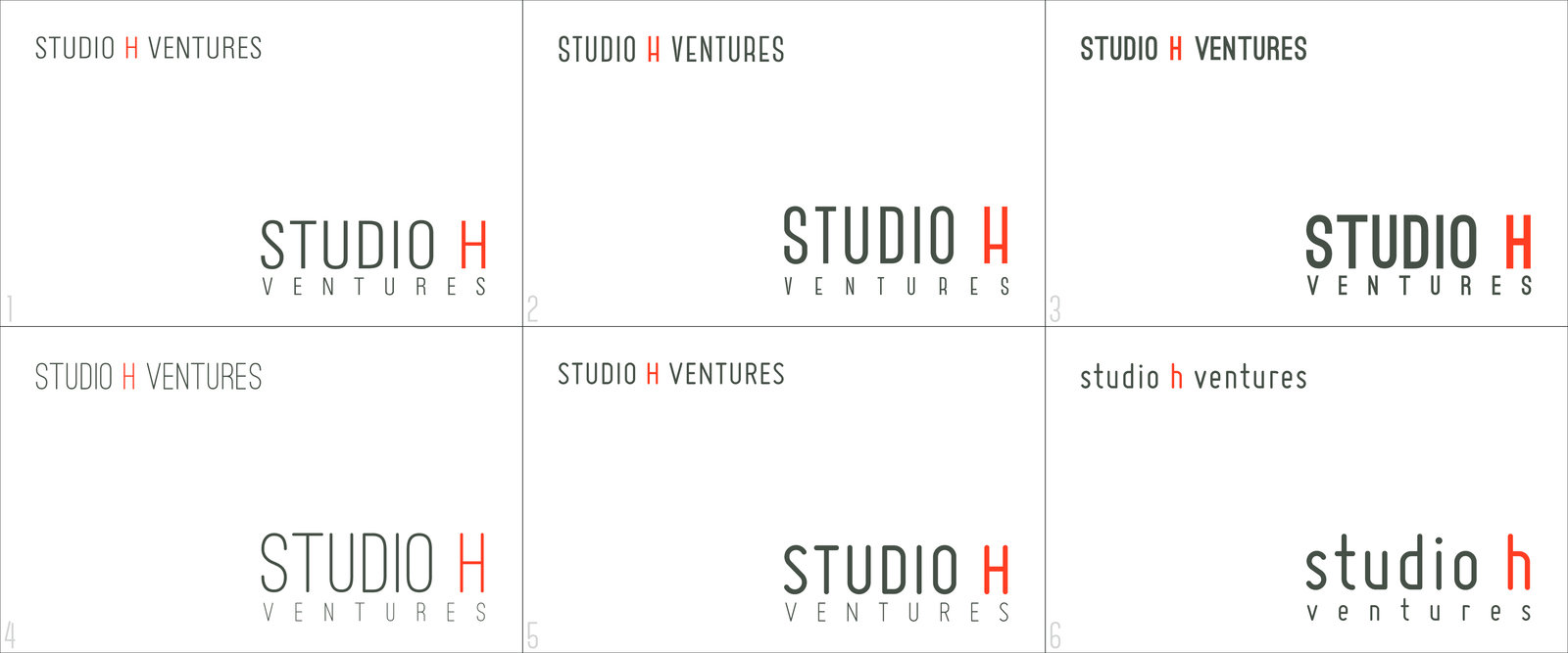
If we found the right typography.
We can explore further logo/imagery options such as modifying the H or creating a symbol that represents the brand.
Lastly, explore further color options.
If we need to explore more fonts.
Find a font from the choices that seem to work the best and discuss what we like and dislike. Present other options for typography.
Logo Concept (Round 2)
4 Concepts
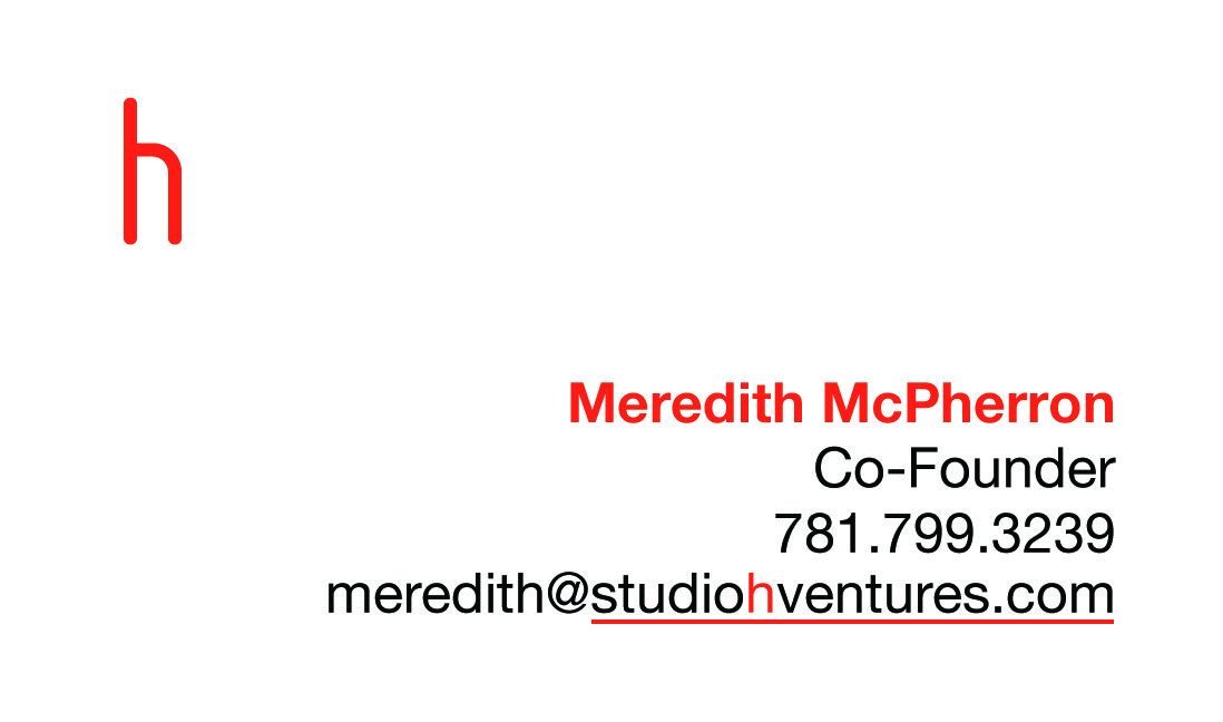
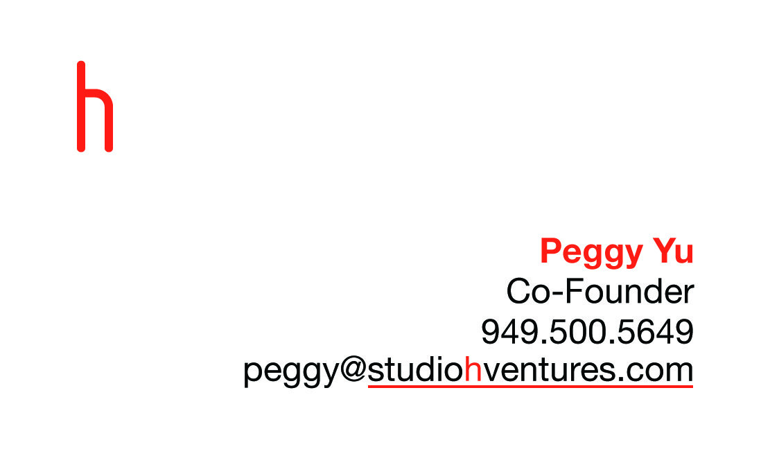
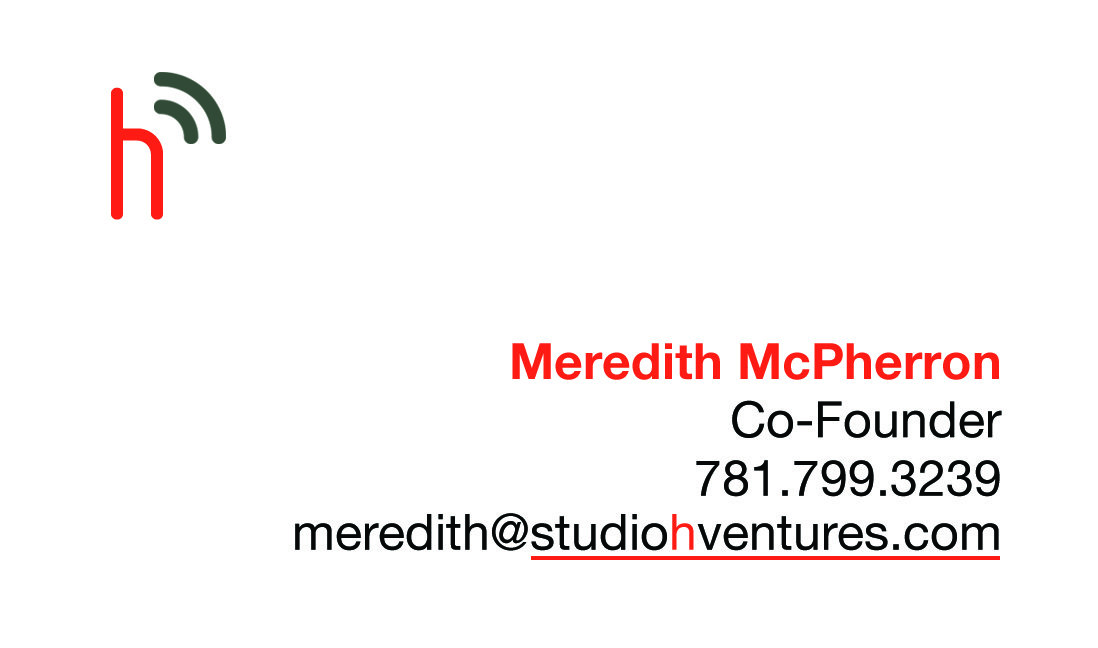
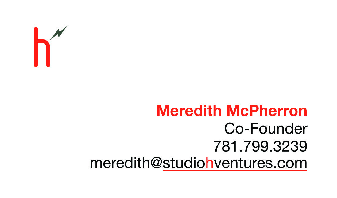
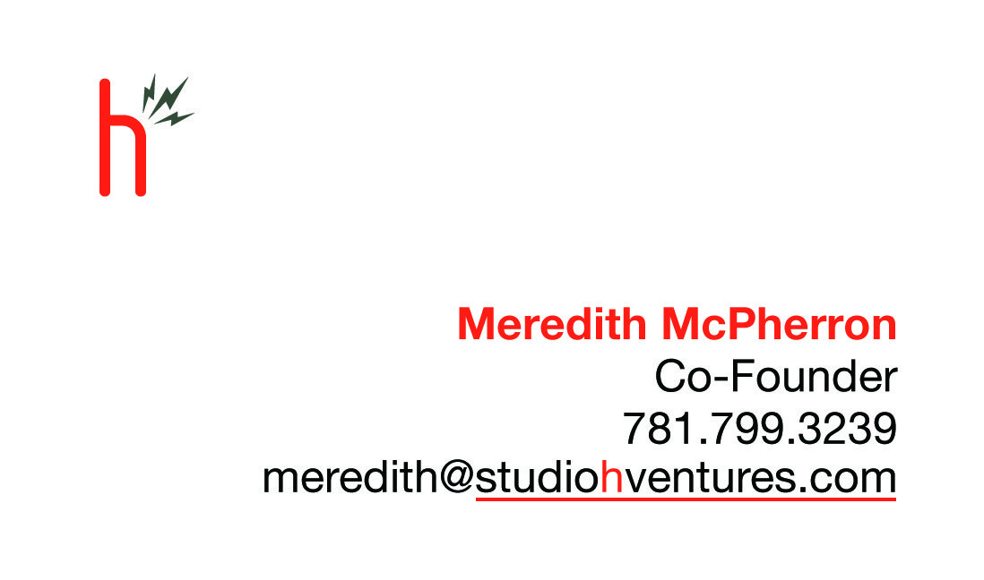
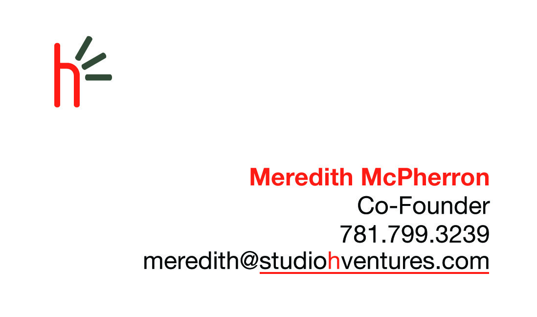
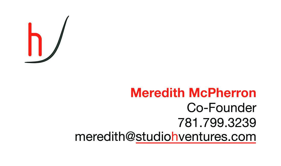
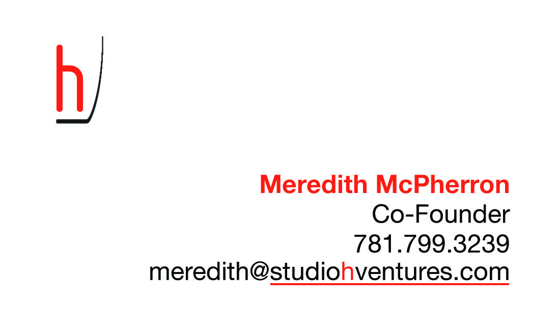
Business Cards
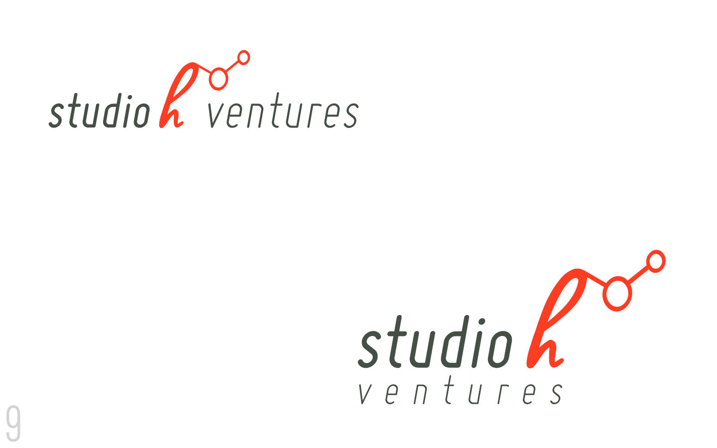
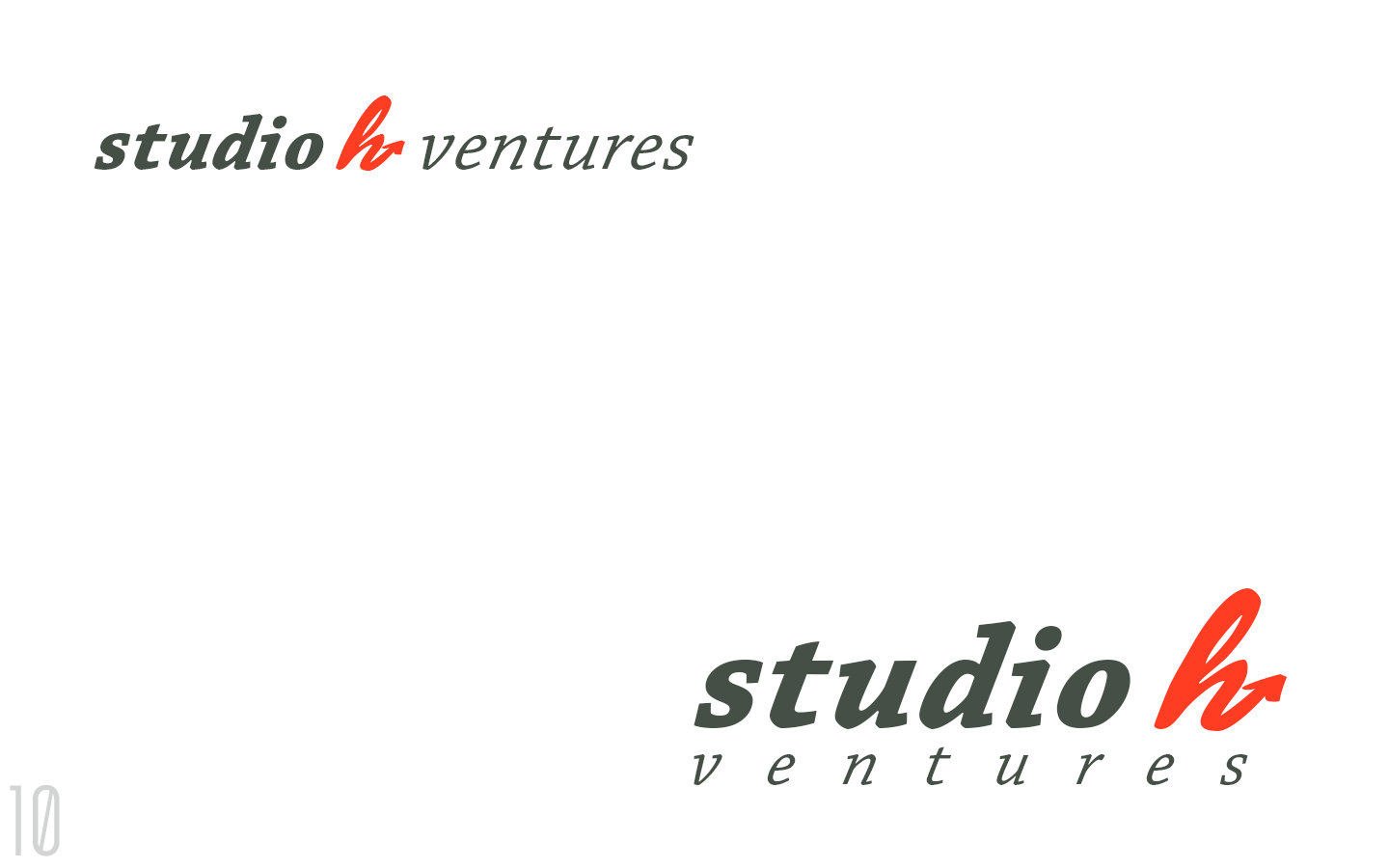
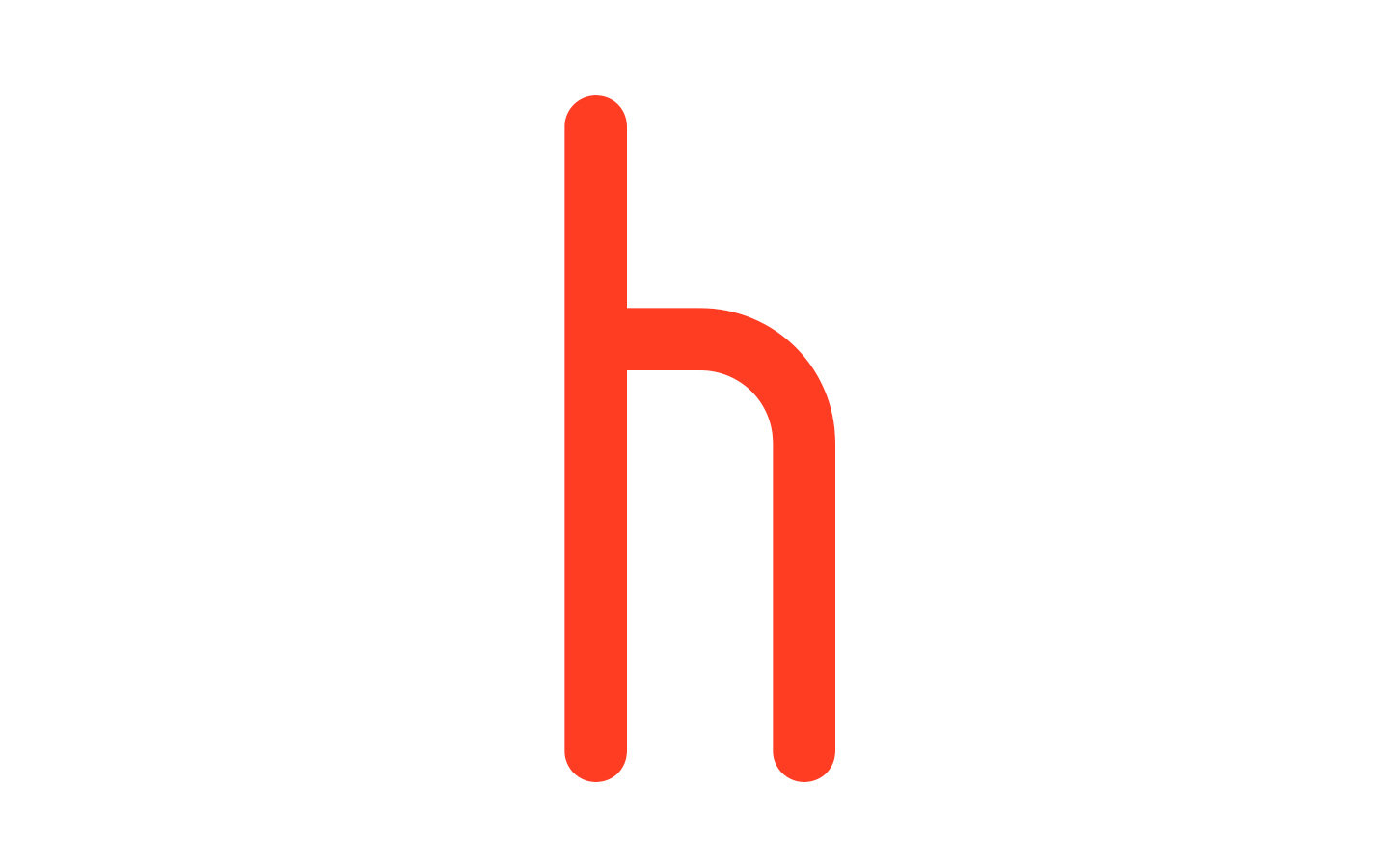
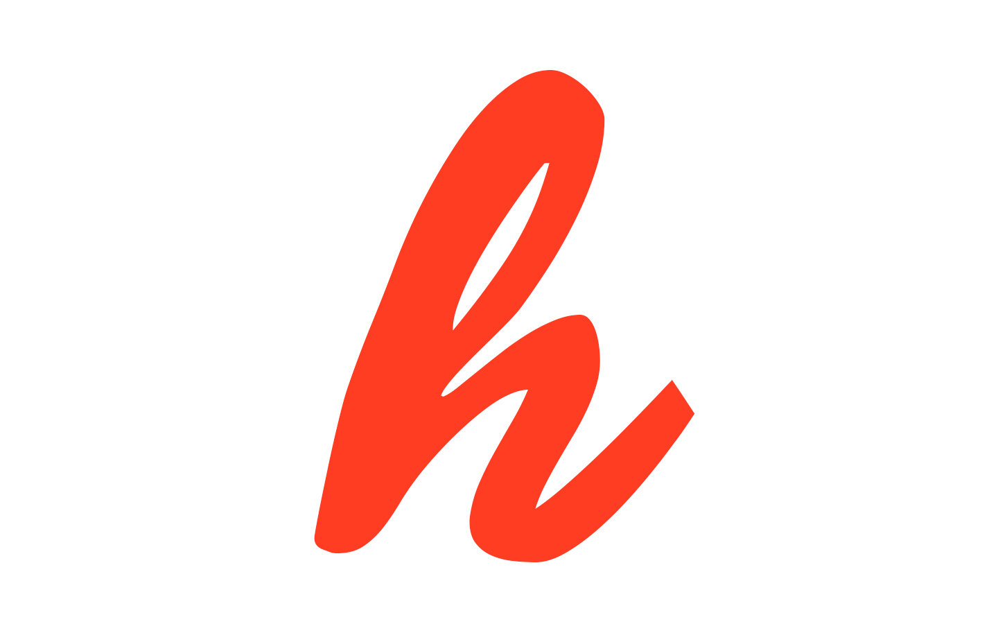
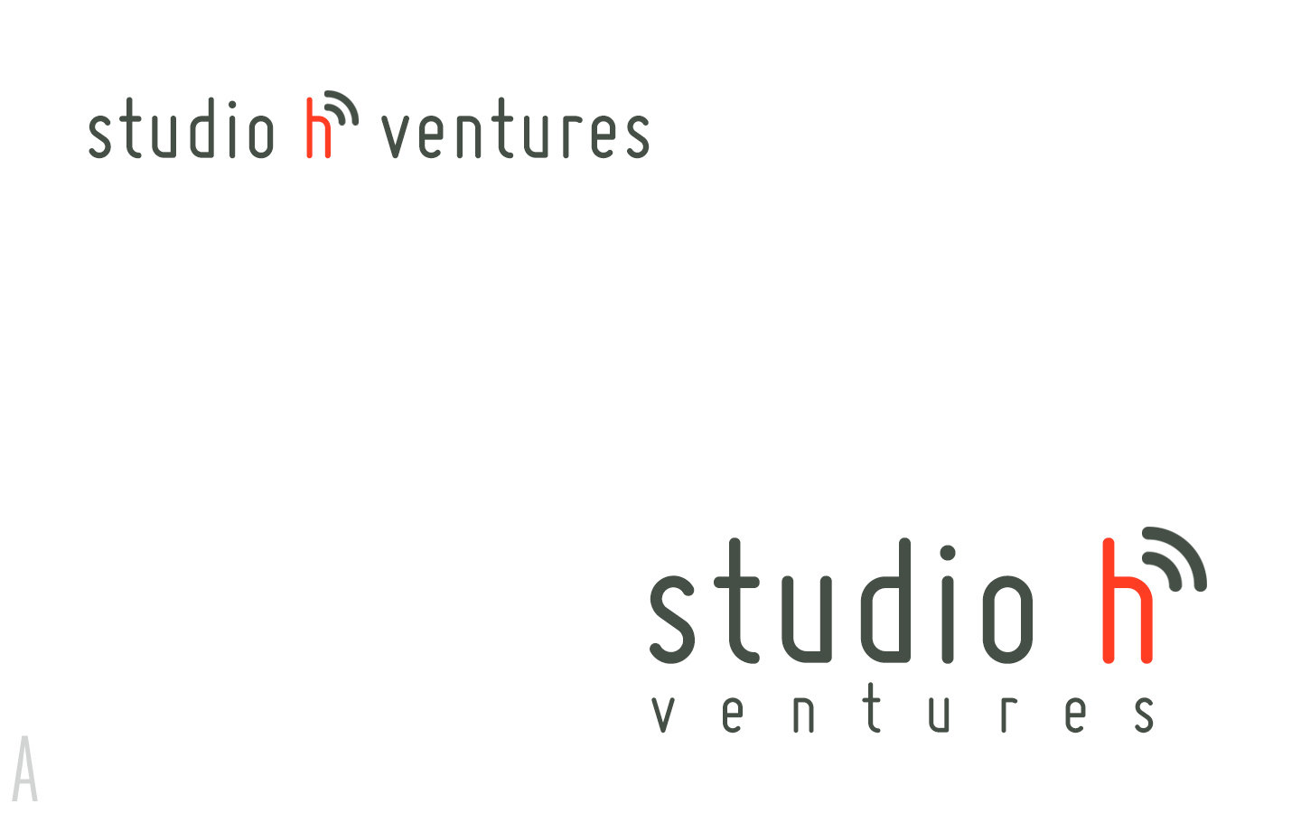
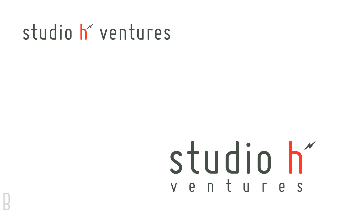
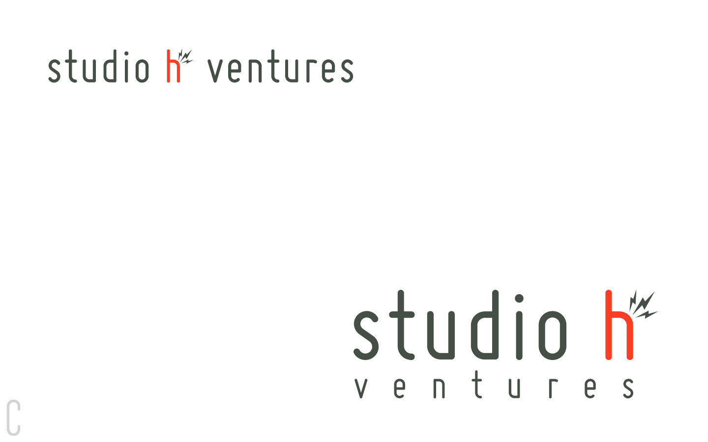
Choices for 'h'
One
Two
Three
Logo Concept (Round 3)
8 Concepts


A
B
C
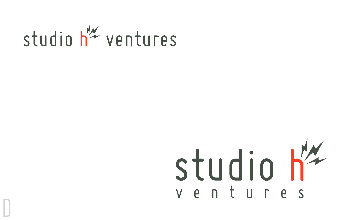
D
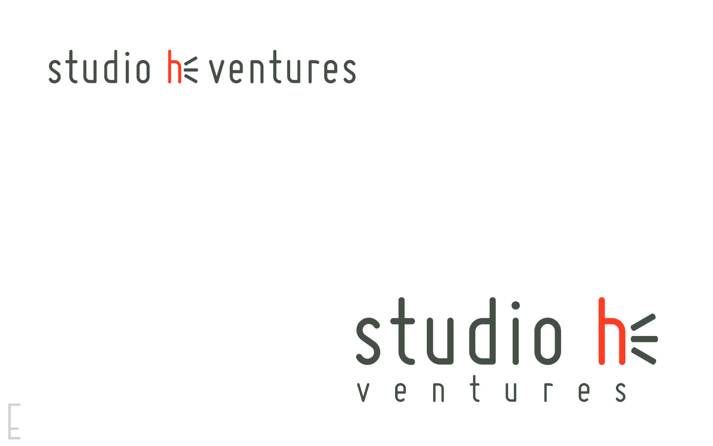
E
F
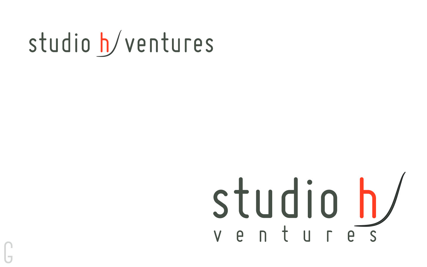
G
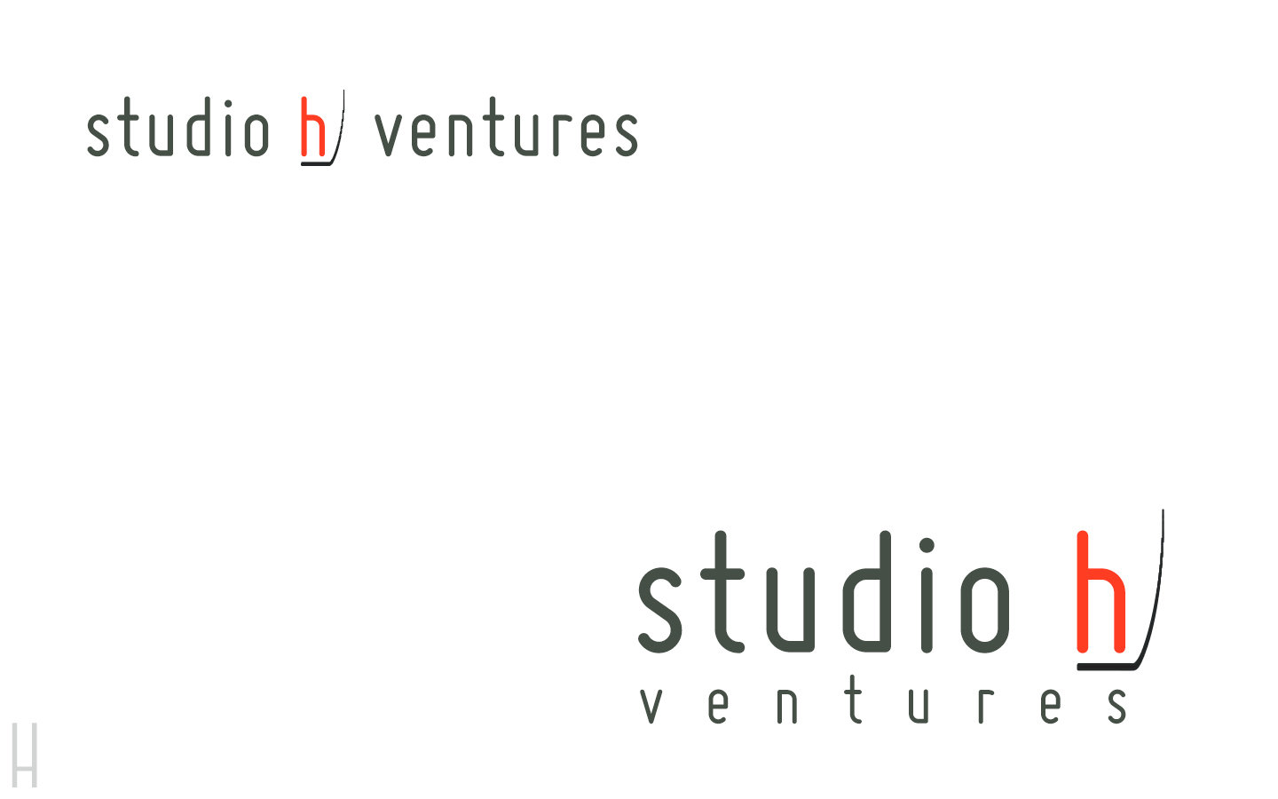
H
Final Concept Before Print
Design A vs. Design I


Concept I
Concept A
Concept I
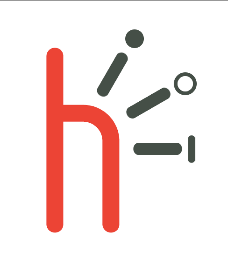
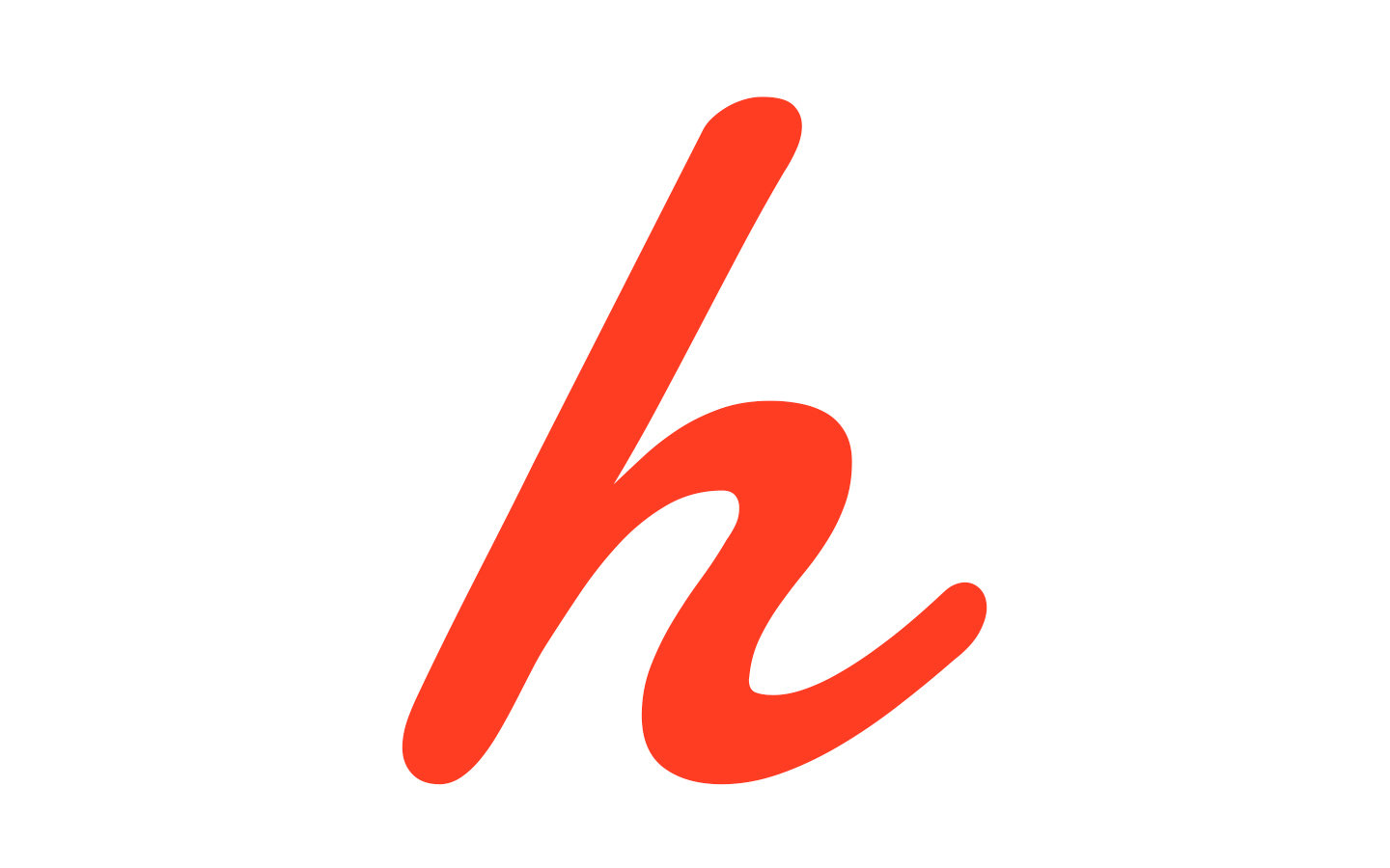
3 is a constant number that is frequent with studio h ventures.
And I believe there are 3 functions that the brand must portray in order to convey the brand message successfully.
1. Most important 'h' stands for the human factor and experience. It also represents the company and the team members that are carefully curated to function at a high level.
2. The 3 lines represent the energy coming out of studio h ventures, and also represents the bridge that connects humans with technology.
3. 3 symbols (solid circle, open circle, line). These represent various elements that IoT are able to connect to improve human lives. These symbols also represent various projects and brands that are created from studio h ventures. They are also interpreted as representing the 3 founders and 3 promises of studio h. Lastly, these symbols along with the lines spells out I, O, T.