Q.2) How effective is the combination of your main product and ancillary texts?
Main Product - Trailer
Ancillary Text 1 - Poster
Ancillary Text 2 -Magazine Cover

Our unique selling point was to portray original, quirky characters.
We also decided to create these products within the indie genre and therefore had to make sure we were appealing to and catering for a niche audience.
As a group, we aimed to create three products that were closely linked in order to achieve a successful promotional package.
![]()
This meant that we needed to make sure we were portraying the same message across all texts.

Here are some of the ways we achieved a well-linked promotional package...

Colour Scheme
-
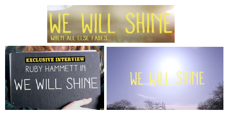
Across all texts, we establish a theme of yellow.
- Yellow was the right colour for the title 'We Will Shine' as it reflects the 'Shine' aspect of the title which is symbolic of hope and happiness. These themes run through the storyline.
- Yellow is a very bright colour, therefore it stands out and it also releases a very warm tone.
- Baring in mind our aim to achieve a 'quirky' feel, yellow was definitely the most appropriate colour.
Colour Scheme
- We could have used more yellow on the magazine cover but decided this may be too overpowering and wanted to bring out the identity of the magazine by adding more blue to the colour scheme.
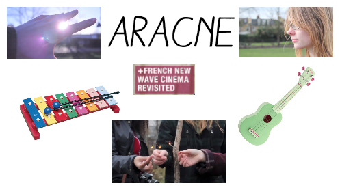
Typography
- The font-style of our title has remained consistent across all texts
- We used the style 'Aracne' from Dafont.com and I think it has been successful in establishing an identity for our film as it has a very indie, DIY design and along with the yellow colour, achieves a quirky feel.
Tagline
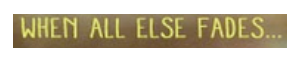
- The tagline can be found on our poster.
- It may have been better to include the tagline in the trailer too but we didn't feel this was appropriate to our genre.
- We thought '(We Will Shine) When All Else Fades looked and sounded good on the poster, but for the trailer seemed too cliche.
Iconography
- The iconography used in each text are appropriate to our film and genre but I think they portray different themes.
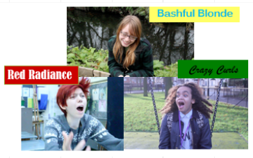
- The trailer is able to fulfil our aim to portray original, quirky characters as the video format allows us to make use of many techniques within the mise en scene such as costume and dialogue.
- However, in the poster we use just a hand and none of the characters. The poster instead suggests hope and happiness.
Iconography
- The magazine cover on the other hand represents the creative nature of our protagonist through the iconography of the sketchbook.
- The various ways we use iconography in our three texts send out different messages which may confuse our audience as to what the overriding theme is.
- It may have been better to use e.g. the camera across all texts to reflect the photography theme or include all three of our original, quirky characters in all texts.
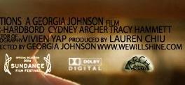
Awards
- We included the Sundance Film Festival in the trailer and poster.
- Sundance is one of the largest independent film festivals so it was important to incorporate the idea of our film being shortlisted for the award as this is something that would appeal to our audience.
- However, we could have used this idea on the magazine cover too.
 Poster
Trailer 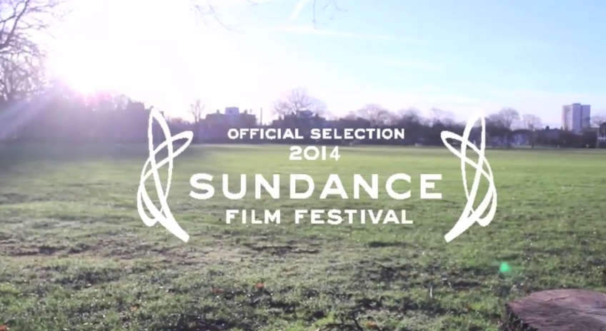
Poster
Indie Genre
- Across all texts, I think we have definitely established an indie genre.
- The trailer includes an indie-style soundtrack along with characters with quirky attributes, aesthetically pleasing visuals and handmade style titles.
- The poster includes an abstract main image, has a minimalistic feel and also includes handmade style titles.
- The magazine cover is also quite minimalistic and again includes handmade style titles, but the coverlines also suggest that the magazine focuses on the independent film genre.
Indie Genre
Overall
I feel our main product and ancillary texts:
-
Each enforce different messages and ideas within our film and may have linked together better by deciding on a central theme to express.
However,
I feel all products:
- Establish the indie genre well
- Establish a clear style and identity for our film