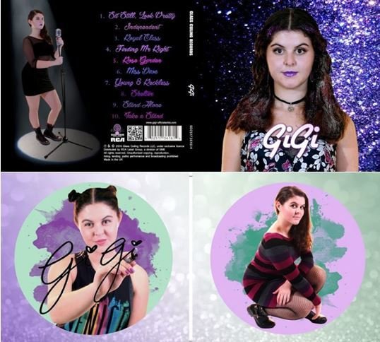
Album Cover - Forms and Conventions
Focal Image
A clear and distinct focal image is a key convention that is common in female solo artists' albums - especially in their debut albums.
We used many female pop artist's (debut) album covers for inspiration including:Taylor Swift, Selena Gomez and Dua Lipa for inspiration
Our focal image can be seen on the right:


Consistency/Synergy between panels
One of the most important conventions for an album is that there is a consistent look between the different panels both inside and out.
A key example of this is Taylor Swift's 1989 Deluxe Album

The outside panels have the same beige Polaroid colour and also, the image of Taylor almost matches up.
The CD panel links to the front cover as it has seagull similar to on Taylor's shirt.
Similarly there is another Polaroid style photo on the front inside cover creating consistency with the outside panels.

We created a consistent background that spread across the outside panels and then one that spread across the inside panels.
We continued the glitter theme established in the outside panels on the inside panels.
Clear Colour Theme
A convention of album covers is for there to be a clear colour scheme.
Ours in purple, black and white which is present in our other media texts (website and music video).

Ed Sheeran's album X has a very simple but eye-catching colour scheme which follows the convention.

To make our inside panels interesting and not too repetitive of the outside we used a lighter purple, green and white colour scheme (which also connoted GiGi's theme of empowering women through the ideas of the Suffragette colours)

Title/Logo


Our GiGi logo on the album cover
Our GiGi logo on the website- creating synergy

It is conventional to have a logo for the artist which appears on the album (and the website).
Daya's logo on her album cover

Daya's logo on her website
The name of an artist's album is usually in a different font but because that GiGi's album is eponymous we used her logo font rather than using a different font for the GiGi title.
Institutional Information

A conventional element of album covers that tends to be overlooked is the institutional information. It is conventionally at the bottom of the back outside panel which we have adhered to.

Ariana Grande's Yours Truly Album institutional information
We also included specific conventions within the institutional information such as the Record company's name and logo, the distribution company's name and logo and the bar-code.