DATASUS Data Exploration Using Small Multiples
Ryan Hafen
http://bit.ly/cidacs-vis

Context: Exploratory analysis and statistical modeling

Image source: Hadley Wickham
- Visualization is usually the driver of iteration
- It is particularly useful when working with a domain expert
- Interactive visualization often (not always) makes the process more effective
- The iteration in exploratory analysis necessitates rapid generation of many visualizations
- A lot of interactive visualization is very customized and time-consuming to create
- Not every plot is useful so we can't afford to waste a lot of time on any single visualization
- Just like using a high-level programming language for rapidly trying out ideas with data analysis, we need high-level ways to flexibly but quickly create interactive visualizations
Small Multiples
A series of similar plots, usually each based on a different slice of data, arranged in a grid
"For a wide range of problems in data presentation, small multiples are the best design solution."
Edward Tufte (Envisioning Information)
This idea was formalized and popularized in S/S-PLUS and subsequently R with the trellis and lattice packages
Advantages of Small Multiple Displays
- Avoid overplotting
- Work with big or high dimensional data
-
It is often critical to the discovery of a new insight to be able to see multiple things at once
- Our brains are good at perceiving simple visual features like color or shape or size and they do it amazingly fast without any conscious effort
- We can tell immediately when a part of an image is different from the rest, without really having to focus on it
Advantages of Small Multiple Displays
- Avoid overplotting
- Work with big or high dimensional data
- It is often critical to the discovery of a new insight to be able to see multiple things at once
- Our brains are good at perceiving simple visual features like color or shape or size and they do it amazingly fast without any conscious effort
- We can tell immediately when a part of an image is different from the rest, without really having to focus on it

Advantages of Small Multiple Displays
- Avoid overplotting
- Work with big or high dimensional data
-
It is often critical to the discovery of a new insight to be able to see multiple things at once
- Our brains are good at perceiving simple visual features like color or shape or size and they do it amazingly fast without any conscious effort
- We can tell immediately when a part of an image is different from the rest, without really having to focus on it
In my experience, small multiples are often much more effective (and easier to create) than more flashy things like animation, linked brushing, custom interactive vis, etc.
Two New Small Multiple Extensions
- If you use R or Tableau, small multiples are probably a regular part of your data analysis routine
- Here I will introduce two new useful small multiple extensions (for R), using some DATASUS datasets as a backdrop
geofacet
geographically-oriented small multiple displays
trelliscope
scalable detailed visualization using small multiple displays
Data and Analysis Environment
-
Brazil Live Births “Sistema de Informações sobre Nascidos Vivos” (SINASC) data
-
44.5 million birth records from 2001 to 2015
-
-
Brazil Census Data
-
Municipality-level data about demographics, education, income
-
Obtained data for 1991, 2000, and 2010 census
-
- Analyzed in-memory using R on 2014 MacBook Pro 2.5 GHz 16GB RAM
- Code available here: https://github.com/hbgdki/datasus
- Selected results (and information about how data was processed) available here: https://hbgdki.github.io/datasus/
geofacet
An R package that provides a way to flexibly visualize data for different geographical regions by providing a ggplot2 faceting function facet_geo()
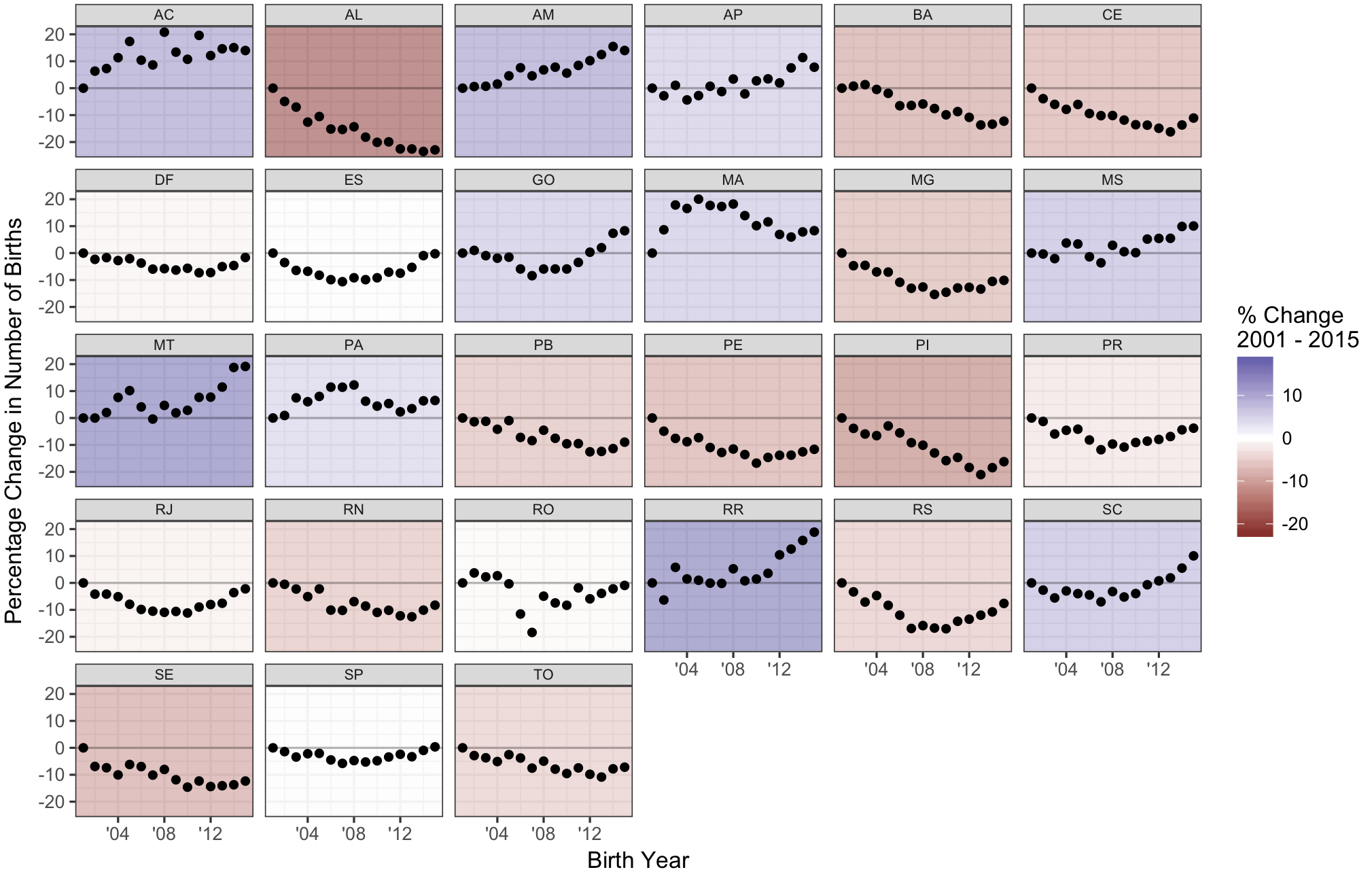
ggplot(birth_year_state2, aes(birth_year, pct_chg)) +
  geom_rect(data = birth_col, aes(fill = val),
    xmin = -Inf, ymin = -Inf, xmax = Inf, ymax = Inf, alpha = 0.5) +
  geom_point() +
  geom_abline(slope = 0, intercept = 0, alpha = 0.25) +
  scale_fill_gradient2("% Change\n2001 - 2015") +
  scale_x_continuous(labels = function(x) paste0("'", substr(x, 3, 4))) +
  facet_wrap(~ m_state_code) +
  theme(strip.text.x = element_text(margin = margin(0.1, 0, 0.1, 0, "cm"), size = 7)) +
  labs(x = "Birth Year", y = "Percentage Change in Number of Births")
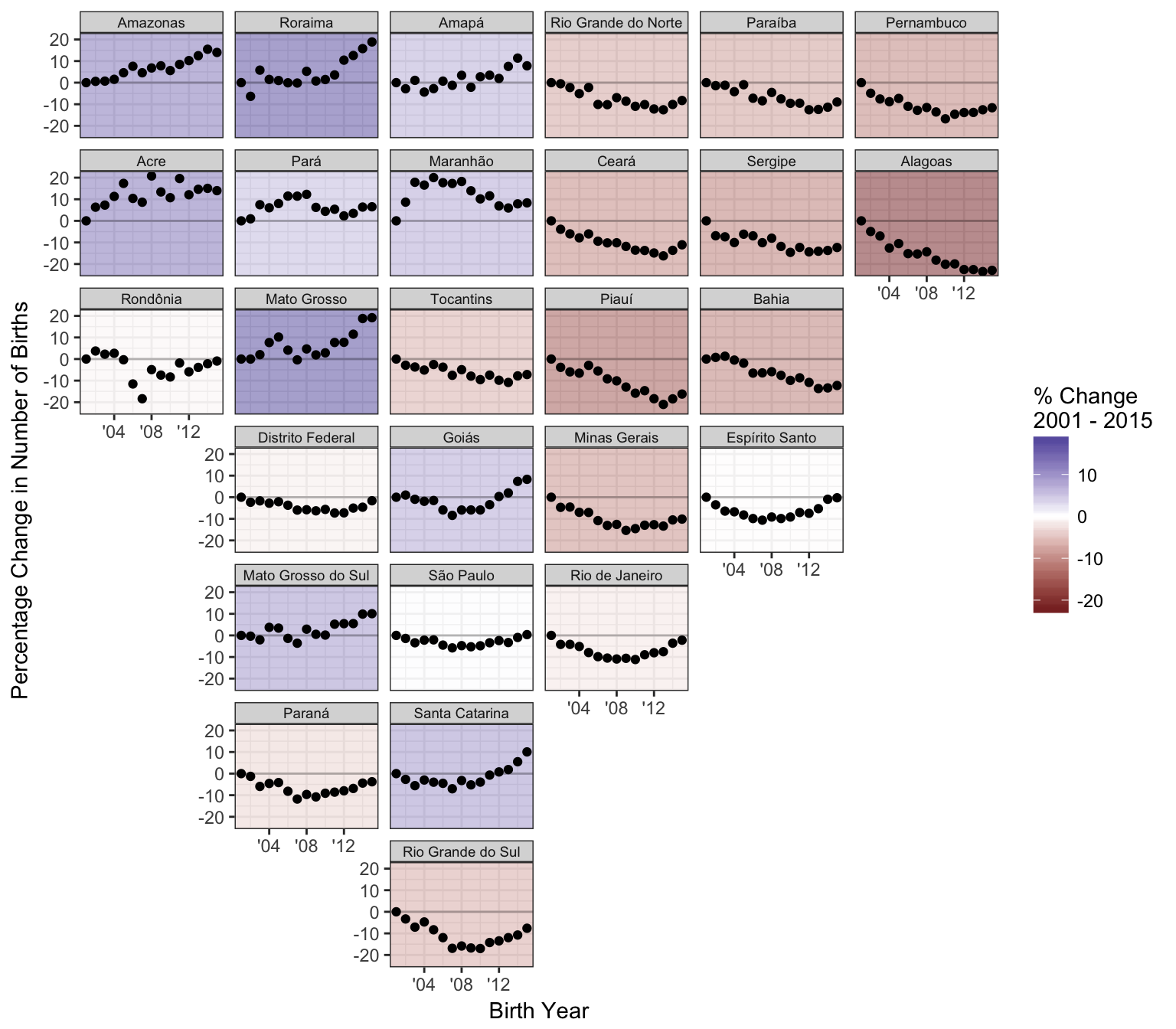
Swap "facet_wrap()" with "facet_geo()"
Advantages of geofacet over a traditional geographical visualization approaches
- We can plot multiple values per geographical entity, for example allowing simultaneous visual representation spatially and temporally
- We can use more effective visual encoding schemes (color, which is used in choropleth-type maps, is one of the least effective ways to visually encode information)
- Each geographical entity gets equal representation
Creating Your Own Grids
- Utility function grid_auto() can take a shape file and provide a first pass at a grid layout that resembles the underlying geography
- grid_design() provides an interactive interface to tweak a grid layout provided by grid_auto(), or allows you to start from scratch
Example: municipality grid for Acre
library(geofacet)
ac <- geogrid::read_polygons("http://bit.ly/br-ac-geojson")

ac_grid <- grid_auto(ac, seed = 123)
grid_preview(ac_grid, label = "name2", label_raw = "name_NOME")
grid_design(ac_grid, label = "name_NOME")
library(geofacet)
ac <- geogrid::read_polygons("http://bit.ly/br-ac-geojson")

ac_grid <- grid_auto(ac, seed = 123)
grid_preview(ac_grid, label = "name2", label_raw = "name_NOME")


grid_design(ac_grid, label = "name_NOME")
Example: municipality grid for Acre

Incorporating Geofaceting into Applications
Trelliscope:
Interactive Small Multiple Display
- Small multiple displays are useful when visualizing data in detail
- But the number of panels in a display can be potentially very large, too large to view all at once
Trelliscope is a general solution that allows small multiple displays to come alive by providing the ability to interactively sort and filter the panels based on summary statistics, cognostics, that capture attributes of interest in the data being plotted
Motivating Example
Gapminder
Suppose we want to understand mortality over time for each country
Observations: 1,704
Variables: 6
$ country   <fctr> Afghanistan, Afghanistan, Afghanistan, Afghanistan, Afgh...
$ continent <fctr> Asia, Asia, Asia, Asia, Asia, Asia, Asia, Asia, Asia, As...
$ year      <int> 1952, 1957, 1962, 1967, 1972, 1977, 1982, 1987, 1992, 199...
$ lifeExp   <dbl> 28.801, 30.332, 31.997, 34.020, 36.088, 38.438, 39.854, 4...
$ pop       <int> 8425333, 9240934, 10267083, 11537966, 13079460, 14880372,...
$ gdpPercap <dbl> 779.4453, 820.8530, 853.1007, 836.1971, 739.9811, 786.113...
glimpse(gapminder)

qplot(year, lifeExp, data = gapminder, color = country, geom = "line")

Yikes! There are a lot of countries...
qplot(year, lifeExp, data = gapminder, color = continent,
  group = country, geom = "line")

Still too much going on...
qplot(year, lifeExp, data = gapminder, color = continent,
  group = country, geom = "line") +
    facet_wrap(~ continent, nrow = 1)

That helped a little...
p <- qplot(year, lifeExp, data = gapminder, color = continent,
  group = country, geom = "line") +
    facet_wrap(~ continent, nrow = 1)
plotly::ggplotly(p)
This helps but there is still too much overplotting...
(and hovering for additional info is too much work and we can only see more info one at a time)
qplot(year, lifeExp, data = gapminder) + theme_bw() +
  facet_wrap(~ country + continent)

qplot(year, lifeExp, data = gapminder) + theme_bw() +
  facet_trelliscope(~ country + continent, nrow = 2, ncol = 7, width = 300)
Note: this and future plots in this presentation are interactive - feel free to explore!
qplot(year, lifeExp, data = gapminder) + theme_bw() +
  facet_trelliscope(~ country + continent,
    nrow = 2, ncol = 7, width = 300, as_plotly = TRUE)
Application:
Assessing Fits of Many Models
country_model <- function(df)
  lm(lifeExp ~ year, data = df)

by_country <- gapminder %>%
  group_by(country, continent) %>%
  nest() %>%
  mutate(
    model = map(data, country_model),
    resid_mad = map_dbl(model, function(x) mad(resid(x))))

by_country
Example adapted from "R for Data Science"
# A tibble: 142 × 5
       country continent              data    model resid_mad
        <fctr>    <fctr>            <list>   <list>     <dbl>
1  Afghanistan      Asia <tibble [12 × 4]> <S3: lm> 1.4058780
2      Albania    Europe <tibble [12 × 4]> <S3: lm> 2.2193278
3      Algeria    Africa <tibble [12 × 4]> <S3: lm> 0.7925897
4       Angola    Africa <tibble [12 × 4]> <S3: lm> 1.4903085
5    Argentina  Americas <tibble [12 × 4]> <S3: lm> 0.2376178
6    Australia   Oceania <tibble [12 × 4]> <S3: lm> 0.7934372
7      Austria    Europe <tibble [12 × 4]> <S3: lm> 0.3928605
8      Bahrain      Asia <tibble [12 × 4]> <S3: lm> 1.8201766
9   Bangladesh      Asia <tibble [12 × 4]> <S3: lm> 1.1947475
10     Belgium    Europe <tibble [12 × 4]> <S3: lm> 0.2353342
# ... with 132 more rows
Gapminder Example from "R for Data Science"
- One row per group
- Per-group data and models as "list-columns"
country_plot <- function(data, model) {
  figure(xlim = c(1948, 2011),
    ylim = c(10, 95), tools = NULL) %>%
    ly_points(year, lifeExp, data = data, hover = data) %>%
    ly_abline(model)
}

country_plot(by_country$data[[1]],
  by_country$model[[1]])
Plotting the Data and Model Fit for Each Group
We'll use the rbokeh package to make a plot function and apply it to the first row of our data
by_country <- by_country %>%
  mutate(plot = map2_plot(data, model, country_plot))

by_country
Example adapted from "R for Data Science"
# A tibble: 142 × 6
       country continent              data    model resid_mad         plot
        <fctr>    <fctr>            <list>   <list>     <dbl>       <list>
1  Afghanistan      Asia <tibble [12 × 4]> <S3: lm> 1.4058780 <S3: rbokeh>
2      Albania    Europe <tibble [12 × 4]> <S3: lm> 2.2193278 <S3: rbokeh>
3      Algeria    Africa <tibble [12 × 4]> <S3: lm> 0.7925897 <S3: rbokeh>
4       Angola    Africa <tibble [12 × 4]> <S3: lm> 1.4903085 <S3: rbokeh>
5    Argentina  Americas <tibble [12 × 4]> <S3: lm> 0.2376178 <S3: rbokeh>
6    Australia   Oceania <tibble [12 × 4]> <S3: lm> 0.7934372 <S3: rbokeh>
7      Austria    Europe <tibble [12 × 4]> <S3: lm> 0.3928605 <S3: rbokeh>
8      Bahrain      Asia <tibble [12 × 4]> <S3: lm> 1.8201766 <S3: rbokeh>
9   Bangladesh      Asia <tibble [12 × 4]> <S3: lm> 1.1947475 <S3: rbokeh>
10     Belgium    Europe <tibble [12 × 4]> <S3: lm> 0.2353342 <S3: rbokeh>
# ... with 132 more rows
Apply This Function to Every Row
A plot for each model
by_country %>%
  trelliscope(name = "by_country_lm", nrow = 2, ncol = 4)
From ggplot2 Faceting to Trelliscope
Turning a ggplot2 faceted display into a Trelliscope display is as easy as changing:
to:
facet_wrap()
or:
facet_grid()
facet_trelliscope()
TrelliscopeJS in the Tidyverse
- Create a data frame with one row per group, typically using Tidyverse group_by() and nest() operations
- Add a column of plots
- TrelliscopeJS provides purrr map functions map_plot(), map2_plot(), pmap_plot() that you can use to create these
- You can use any graphics system to create the plot objects (ggplot2, htmlwidgets, lattice)
- Optionally add more columns to the data frame that will be used as cognostics - metrics with which you can interact with the panels
- All atomic columns will be automatically used as cognostics
- Map functions map_cog(), map2_cog(), pmap_cog() can be used for convenience to create columns of cognostics
- Simply pass the data frame in to trelliscope()
With plots as columns, TrelliscopeJS provides nearly effortless detailed, flexible, interactive visualization in the Tidyverse
Example: Growth Trajectories of >2k Children

(offline demo)
Example:
Images as Panels
read_csv("http://bit.ly/trs-mri") %>%
  mutate(img = img_panel(img)) %>%
  trelliscope("brain_MRI", nrow = 2, ncol = 5)
Exploring SINASC Data in Greater Detail
Low Birth Weight Over Time by State

Low Birth Weight Over Time by Municipality
ggplot(by_muni_lbwt_time, aes(birth_year, pct_low_bwt)) +
  geom_point(size = 3, alpha = 0.6) +
  geom_line(stat = "smooth", method = rlm,
    color = "blue", size = 1, alpha = 0.5) +
  labs(y = "Percent Low Birth Weight", x = "Year") +
  facet_trelliscope(~ state_name + muni_name,
    nrow = 2, ncol = 4, width = 400, height = 400,
    name = "pct_low_bwt_muni",
    desc = "percent low birth weight yearly by municipality")
Method of Delivery

Benefits of Trelliscope
- Interactive displays can be generated with little effort
- Provide the potential to look at any corner of the data in detail (but not necessary to look at all of the data)
- Detailed views of the data can facilitate new insights that drive the next steps of analysis
- Metrics about the data provide a mechanism to drill down into areas of interest
- Interactivity provides a nice medium for communicating with domain experts
An Interesting Result
Examining Birth Weight vs. Income
Live birth and census data were merged to investigate relationship between birth weight and income
- Average income computed from census data for each municipality for 2010
- Average birth weight computed from live birth data for each municipality and gestational age grouping for 2010
- Datasets merged on municipality code
- Resulting dataset allows for comparison of average municipality-level income vs. average municipality-level birth weight across gestational age
Birth Weight vs. Income by Gestational Age
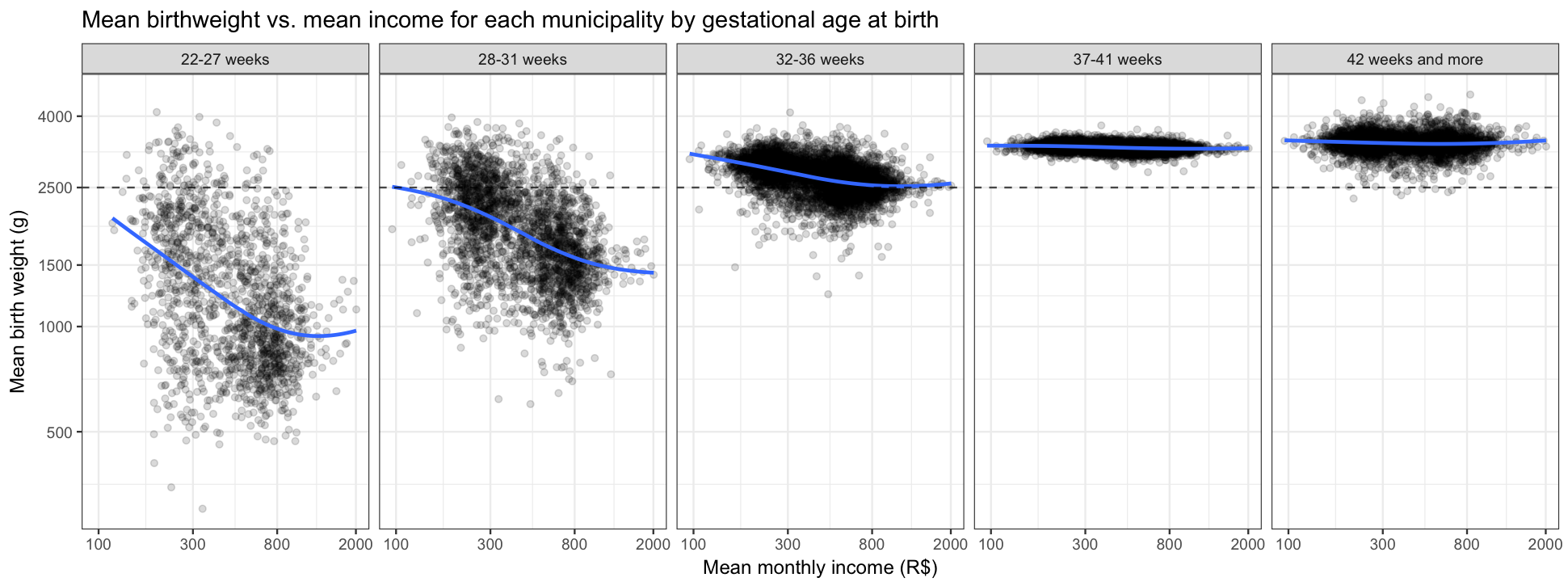
There is an association indicating that for pre-term births, on average, higher-income municipalities tend to have lower birth-weight babies.
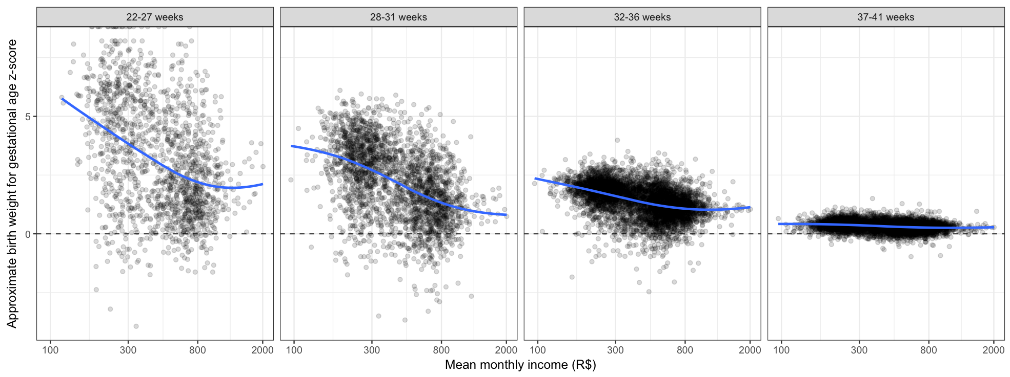
Birth Weight Z-score vs. Income by Gestational Age
Changing the y-axis by converting the mean birth weight to an approximate z-score based on the expected birth at each gestational age, it is apparent that lower-income municipalities have heavier-than-expected pre-term babies
For More Information
- Twitter: @hafenstats
- Blog: http://ryanhafen.com/blog
- Geofacet
- Documentation: https://hafen.github.io/geofacet/
- Github: https://github.com/hafen/geofacet
- Trelliscope
- Documentation: http://hafen.github.io/trelliscopejs
- Github: https://github.com/hafen/trelliscopejs
- These slides: http://bit.ly/cidacs-vis