淺談 CSS
前端工程演化史
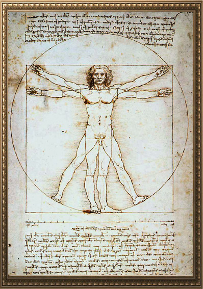
上古時代
HTML / CSS / JS 大亂鬥
<table style="width: 300px; font-size: 18px;">
  <tr>
    <td>
      <b>我是粗體字</b>
      <button onclick="alert('123')">按鈕</button>
      <marquee>我是跑馬燈</marquee>
    </td>
  </tr>
</table>
古典時代
關注點分離
<html>
  <head>
    <title>Title</title>
    <link rel="stylesheet" href="main.css">
  </head>
  <body>
    <p>Text</p>
    <script src="main.js"></script>
  </body>
</html>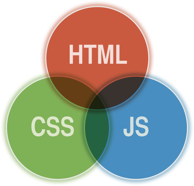
HTML 負責結構
CSS 負責樣式
JS 負責腳本
精美手工藝時期
工業革命時代
前端技術大暴走


大框架時代


關注點分離???
HTML
CSS
JS
Component
表現層面
架構層面
CSS 基礎篇
p { color: red; }基本選擇器
Class 選擇器
ID 選擇器
元素選擇器
p { ... }
通用選擇器
屬性選擇器
偽類(狀態)選擇器
偽元素選擇器
.class { ... }
#id { ... }
* { ... }
[attribute] { ... }
:hover { ... }
::before { ... }群組選擇器
直屬後代選擇器
.class1 > .class2 {
  ...
}
後代選擇器
.class1 + .class2 {
  ...
}
.class1 ~ .class2 {
  ...
}
.class1 .class2 {
  ...
}
.class1, .class2 {
  ...
}
鄰接同層選擇器
通用同層選擇器
複合選擇器
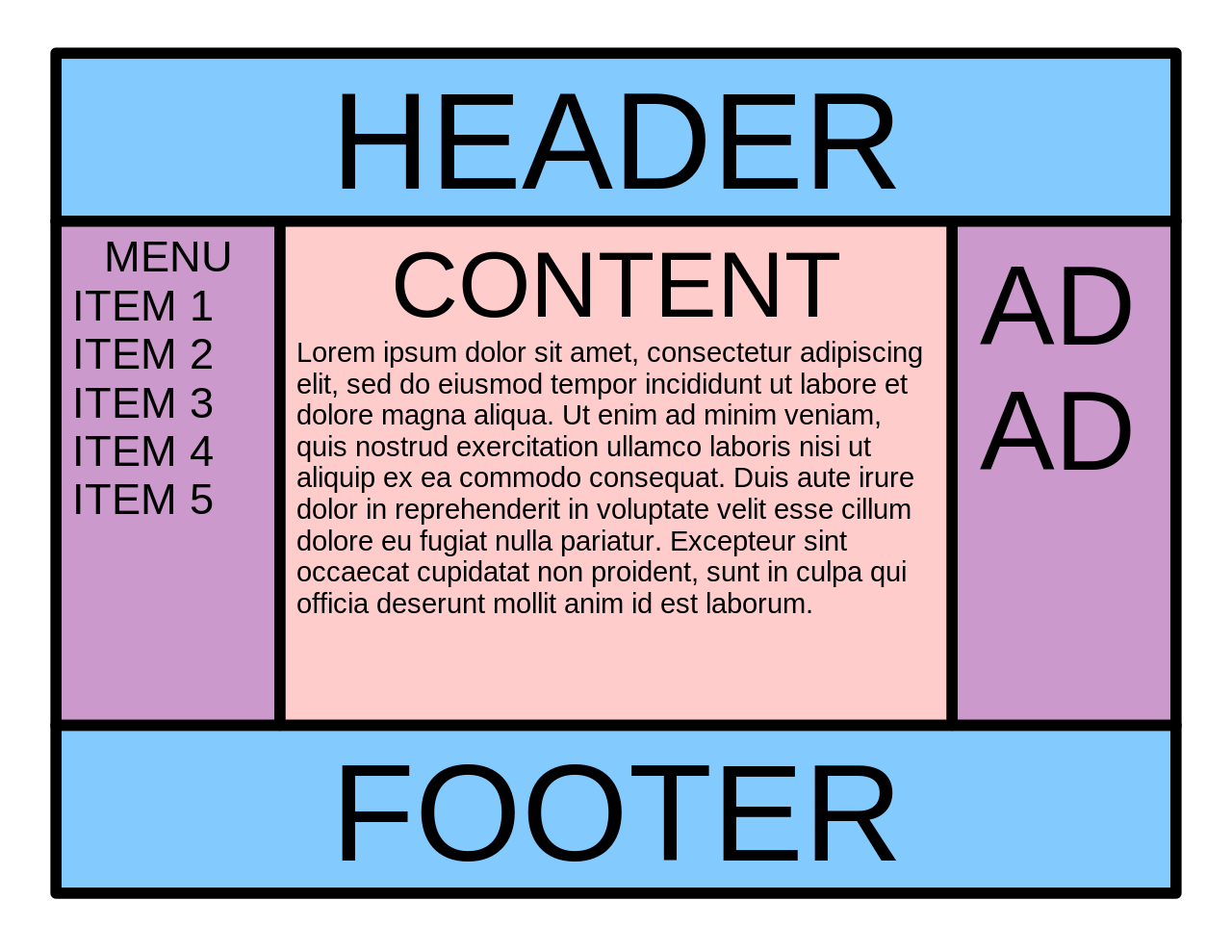
TEXT
BOX MODAL
POSITION
屬性
TEXT
color
font-family
font-size
font-weight
font-style
line-height
text-align
text-decoration
text-indent
text-shadow
...

BOX MODAL
display
background
width
height
border
padding
margin
box-sizing
POSITION
static
relative
absolute
fixed
靜態
相對
絕對
固定
sticky
黏性

CSS FLOW 基本規則
瀏覽器如何安排 HTML 元素的顯示位置
HTML 元素流動時的排列順序
HTML 元素重疊時的顯示順序
規則可以被破壞
float 改變元素的 流動
z-index 改變元素的 堆疊
order(flex) 改變元素的 排序

CSS 命名學
OOCSS
SMACSS
BEM
讓 CSS 在大型專案下能擁有更好的重用性與維護性
OOCSS
分離結構與樣式
分離容器與內容
( Separation of Structure from Skin )
( Separation of Containers and Content )
分離結構與樣式
( Separation of Structure from Skin )
<button type="button" class="btn btn-primary btn-lg">Large button</button>.btn {
display: inline-block;
width: 120px;
height: 60px;
border-radius: 12px;
border: 1px solid #000000;
font-size: 16px;
}
.btn-primary {
background: #8866CC;
}
.btn-lg {
font-size: 24px;
}分離容器與內容
( Separation of Containers and Content )
容器
內容
Card
Modal

Button
Tab
Input
分離容器與內容
( Separation of Containers and Content )
.card {
  ...
}

.card .button {
  ...
}
.card {
...
}
.button {
...
}
BEM
Block
Element
Modifier
區塊
元素
修飾符
獨立的個體
有獨立存在的意義
區塊的一部份
沒有獨立存在的意義
區塊或元素的標記
用以改變它們的樣式
.btn {
  ...
}

.btn-danger {
  ...
}

.btn--icon {
  ...
}

.btn--text {
  ...
}
<button class="btn btn-danger">
<img class="btn--icon" />
<span class="btn--text">刪除</span>
</button>.menu {
...
}
.menu__wrapper {
...
}
.menu__item {
...
}
.menu__item--highlight {
...
}<nav class="menu">
<ul class="menu__wrapper">
<li class="menu__item">Item1</li>
<li class="menu__item">Item2</li>
<li class="menu__item menu__item--highlight">Item3</li>
</ul>
</nav><nav class="menu">
<ul class="menu__wrapper">
<li class="menu__item">
<button class="btn">
<img class="btn__icon" />
<span class="btn__text">新增</span>
</button>
</li>
<li class="menu__item">
<button class="btn">
<img class="btn__icon" />
<span class="btn__text">編輯</span>
</button>
</li>
<li class="menu__item">
<button class="btn btn--danger">
<img class="btn__icon" />
<span class="btn__text">刪除</span>
</button>
</li>
</ul>
</nav>Atomic CSS

CSS FOR COMPONENT-BASED FRAMEWORKS
Style with class
將 CSS style 最小元件化,重用性最大化
<div class="Bgc(#0280ae.5) C(#fff) P(20px)">
    Lorem ipsum
</div>
.Bgc\(\#0280ae\.5\) {
background-color: rgba(2,128,174,.5);
}
.C\(\#fff\) {
color: #fff;
}
.P\(20px\) {
padding: 20px;
}誰在用 Atomic CSS ???
Flex & Grid
Flex
彈性盒子
flex元素在主軸方向上的初始大小。
flex-basis
定義彈性盒子項的拉伸因子
flex-grow
flex元素的收縮規則。flex元素僅在默認寬度之和大於容器的時候才會發生收縮,其收縮的大小是依據flex-shrink的值。
flex-shrink


Grid
格線布局
Holy Grail 聖杯佈局
水平垂直置中
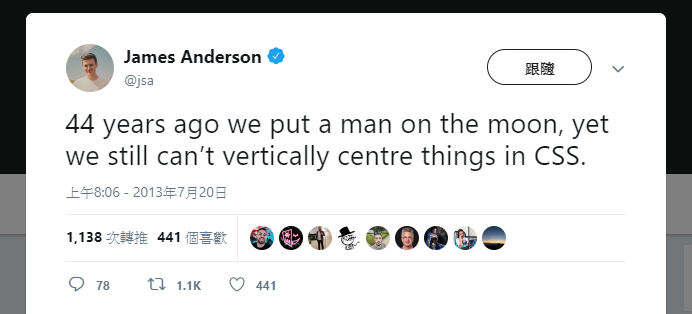
44年前我們就把人類送上月球了
但現在我們仍然無法在 CSS 中實現垂直置中。
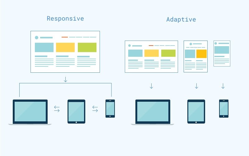
RWD
Adaptive Web Design
Responsive Web Design
響應式網頁設計
自適式網頁設計
RWD
AWD
V.S.
@media (max-width: 1000px) {
  body {
    font-size: 24px;
  }
}
Media Query
<head>
  <meta name="viewport" content="width=device-width, initial-scale=1.0">
</head>
@media only screen and (min-width: 500px) and (max-width: 1000px) {
body {
font-size: 24px;
}
}Media Query
最常見的那種選單
CSS Transform
translate = 位移
scale = 縮放
rotate = 旋轉
skew = 偏斜
CSS Transform 就這些
CSS 3D
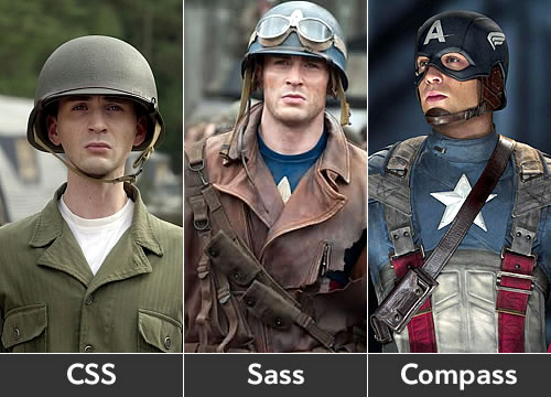
CSS Sass 篇


可讀性:語法與CSS非常相似
學習曲線:它只在CSS上添加了一些額外的功能
兼容性: CSS文件就是有效的SCSS文件
資源:許多在線閱讀文章和開源庫使用
Why Sass (SCSS)
Features
變數:將需要重複使用的值設為變數
嵌套:CSS 規則可以互相嵌套
Mixins:可以接受參數的自定義函數
擴展:繼承另一個選擇器的屬性
運算符:加減乘除 / 大於小於等於 / AND OR
Don't repeat yourself
變數:防止重複的值
嵌套:防止重複的選擇器
Mixins & 擴展:防止重複的屬性
Variables
$hank-color: #8866CC;

header {
  border: 3px solid $hank-color;
}

.btn {
  background: $hank-color;
}

#footer {
  color: $hank-color;
}
header {
border: 3px solid #8866CC;
}
.btn {
background: #8866CC;
}
#footer {
color: #8866CC;
}SCSS
CSS
Variables
$hank-color: #8866CC;

header {
  border: 3px solid $hank-color;
}

.btn {
  background: $hank-color;
}

$hank-color: #66CCFF;

#footer {
  color: $hank-color;
}
header {
border: 3px solid #8866CC;
}
.btn {
background: #8866CC;
}
#footer {
color: #66CCFF;
}SCSS
CSS
Variables
$hank-color: #8866CC;

header {
  $hank-color: #66CCFF;
  border: 3px solid $hank-color;
}

.btn {
  background: $hank-color;
}

#footer {
  color: $hank-color;
}
header {
border: 3px solid #66CCFF;
}
.btn {
background: #8866CC;
}
#footer {
color: #8866CC;
}SCSS
CSS
Scope
Variables
$hank-color1: #8866CC;
$hank-color2: #66CCFF;

$primary-color: $hank-color2;

header {
  border: 3px solid $primary-color;
}

.btn {
  background: $primary-color;
}

#footer {
  color: $primary-color;
}
Variables
$hank-fav-colors: (
  "purple": #8866CC,
  "blue": #66CCFF
);

header {
  border: 3px solid map-get($hank-fav-colors, "purple");
}

.btn {
  background: map-get($hank-fav-colors, "blue");
}

#footer {
  color: map-get($hank-fav-colors, "purple");
}
Map
Variables
// 顏色
$yellow: #fce473;
$pink: #c71585;
$green: #32cd32;
$blue: #1d90ff;

// 字體
$serif: "Lora", "Playfair Display", Georgia, serif;
$sans-serif: "Roboto", "Source Sans Pro", "Open Sans", Arial, sans-serif;
$monospace: "Inconsolata", monospace;

// 間距
$mobile-space: 10px;
$desktop-space: 35px;
Nesting
.parent {
  color: #8866CC;
  .child {
    color: #66CCFF;
  }
}
SCSS
CSS
.parent {
  color: #8866CC;
}
.parent .child {
  color: #66CCFF;
}Nesting
.header {
  .logo {
    width: 100px;
  }
  .menu {
    width: 300px;
    ul, ol {
      background: #000000;
      li {
        font-size: 12px;
      }
    }
  }
}
SCSS
CSS
.header .logo {
  width: 100px;
}
.header .menu {
  width: 300px;
}
.header .menu ul, .header .menu ol {
  background: #000000;
}
.header .menu ul li, .header .menu ol li {
  font-size: 12px;
}
Nesting
.parent {
  &:hover {
    color: #8866CC;
  }
  &.other-class {
    color: #66CCFF;
  }
  &-abc {
    color: #000000;
  }
}
SCSS
CSS
.parent:hover {
  color: #8866CC;
}
.parent.other-class {
  color: #66CCFF;
}
.parent-abc {
  color: #000000;
}
Parent Selector
Nesting
.header {
  font-size: 36px;
  @media (max-width: 768px) {
    font-size: 24px;
  }
}
SCSS
CSS
.header {
  font-size: 36px;
}

@media (max-width: 768px) {
  .header {
    font-size: 24px;
  }
}
Media Query
Mixins
@mixin overlay() {
  position: absolute;
  top: 0;
  left: 0;
  width: 100%;
  height: 100%;
}

.modal-login {
  @include overlay();
  background: #8866CC;
  opacity: 0.9;
}
SCSS
CSS
.modal-login {
  position: absolute;
  top: 0;
  left: 0;
  width: 100%;
  height: 100%;
  background: #8866CC;
  opacity: 0.9;
}Mixins
@mixin overlay($bg-color: #000000) {
  position: absolute;
  top: 0;
  left: 0;
  width: 100%;
  height: 100%;
  background: $bg-color;
}

.modal-login {
  @include overlay(#8866CC);
  opacity: 0.9;
}

.modal-cart {
  @include overlay(#66CCFF);
}
SCSS
CSS
.modal-login {
  position: absolute;
  top: 0;
  left: 0;
  width: 100%;
  height: 100%;
  background: #8866CC;
  opacity: 0.9;
}

.modal-cart {
  position: absolute;
  top: 0;
  left: 0;
  width: 100%;
  height: 100%;
  background: #66CCFF;
}
Mixins
Compass VS Node Sass ?
Mixin libraries
Extend
.overlay {
  position: absolute;
  top: 0;
  left: 0;
  width: 100%;
  height: 100%;
}

.modal-login {
  @extend .overlay;
  background: #8866CC;
  opacity: 0.9;
}

.modal-cart {
  @extend .overlay;
}
SCSS
CSS
.overlay, .modal-login, .modal-cart {
  position: absolute;
  top: 0;
  left: 0;
  width: 100%;
  height: 100%;
}

.modal-login {
  background: #8866CC;
  opacity: 0.9;
}Extend
Mixin ???
@extend 沒有參數, @mixin 有參數
@extend 會合併選擇器, @mixin 不會合併選擇器

Extend ???
Extend
%overlay {
  position: absolute;
  top: 0;
  left: 0;
  width: 100%;
  height: 100%;
}

.modal-login {
  @extend %overlay;
  background: #8866CC;
  opacity: 0.9;
}

.modal-cart {
  @extend %overlay;
}
SCSS
CSS
.modal-login, .modal-cart {
  position: absolute;
  top: 0;
  left: 0;
  width: 100%;
  height: 100%;
}

.modal-login {
  background: #8866CC;
  opacity: 0.9;
}
Placeholder Selectors
Operators
$font-size: 12px;

.font-small {
 font-size: $font-size;
}

.font-middle {
 font-size: $font-size * 1.5;
}

.font-big {
 font-size: $font-size * 2;
}
SCSS
CSS
.font-small {
  font-size: 12px;
}

.font-middle {
  font-size: 18px;
}

.font-big {
  font-size: 24px;
}SCSS With BEM
SCSS With RWD
CSS 魔術把戲
天啊~這已經是藝術了
CSS小畫家
想不到吧 意不意外
利用 checked
JS 掰掰
黏黏軟軟濕濕滑滑的
阿~ 好舒服~
裝B必備~空間感!
視差效果
這有點難喔我要研究一下
結果回座位瞬間做完
背景固定模式
汽車旅館必備!毛玻璃效果
復古風~三色旋轉燈
CSS + SVG !
賦予線條自由的靈魂
CSS in React 篇
作用域
依賴管理
CSS 現代問題
作用域
import React from "react"
import "style.scss"

// 以下省略
這是某一個 Component
.button {
  background: #8866CC;
}
這是 style.scss
不 ~ 全世界的 .button 都變色了!
作用域
import React from "react"
import "style.scss"

export default function Homepage() {
  return (
    <div className="homepage">
      <button className="button">按鈕</button>
    </div>
  )
}
這是某一個 Component
.homepage {
  .button {
    background: #8866CC;
  }
}
這是 style.scss
你確定 .homepage 是唯一的嗎 ??
依賴管理
import React from "react"
import "style.scss"

// 以下省略
這是某一個 Component
.homepage {
  .button {
    background: #8866CC;
  }
  .card {
    // ...
  }
  .test {
    // ...
  }
}
這是 style.scss
到底哪一些 class 有用阿???
CSS Modules
CSS IN JS
這些問題能解決嗎
能!!!
CSS Modules
Create React App Demo
CSS IN JS

- 最佳化 CSS
- 自動生成 Class 名稱
- 輕鬆刪除 CSS
- 簡單的動態樣式
- 好維護
- 自動添加屬性前綴詞
styled-components
Q&A
