Design Patterns
Inspiration
Get the blood pumping !
What's in it for me ?
Definition
# Fields of expertise
UI-type patterns
Anatomy of a pattern
The big 3
Resources / links
INTRO
Inspriration



Vitally Friedman
Nathan Curtis
Michelle Barker
SmashingConf Freiburg 2022

INTRO
get the blood pumping
Let's see where we live
EXAMPLES
METHODOLOGY REFERENCE

EPD
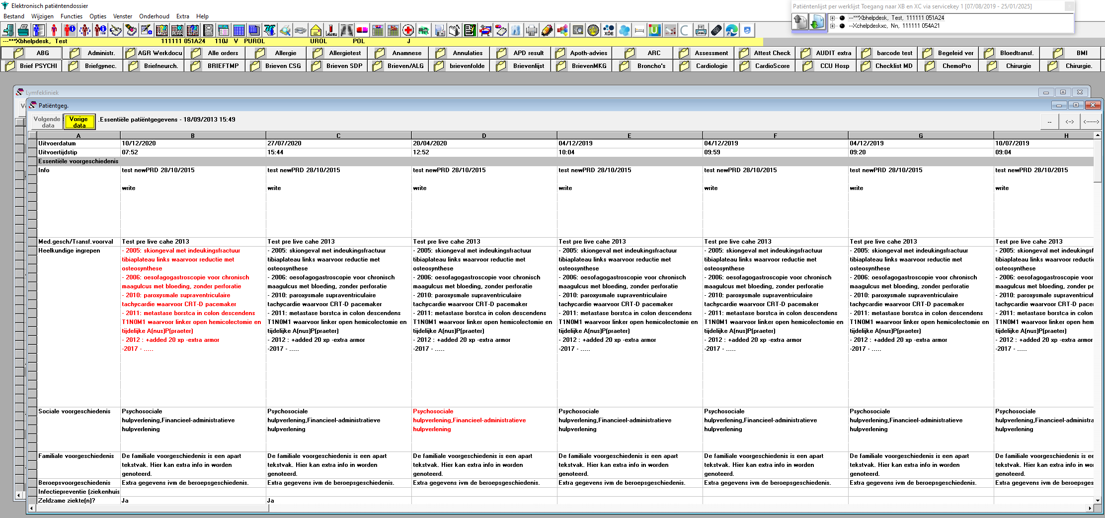
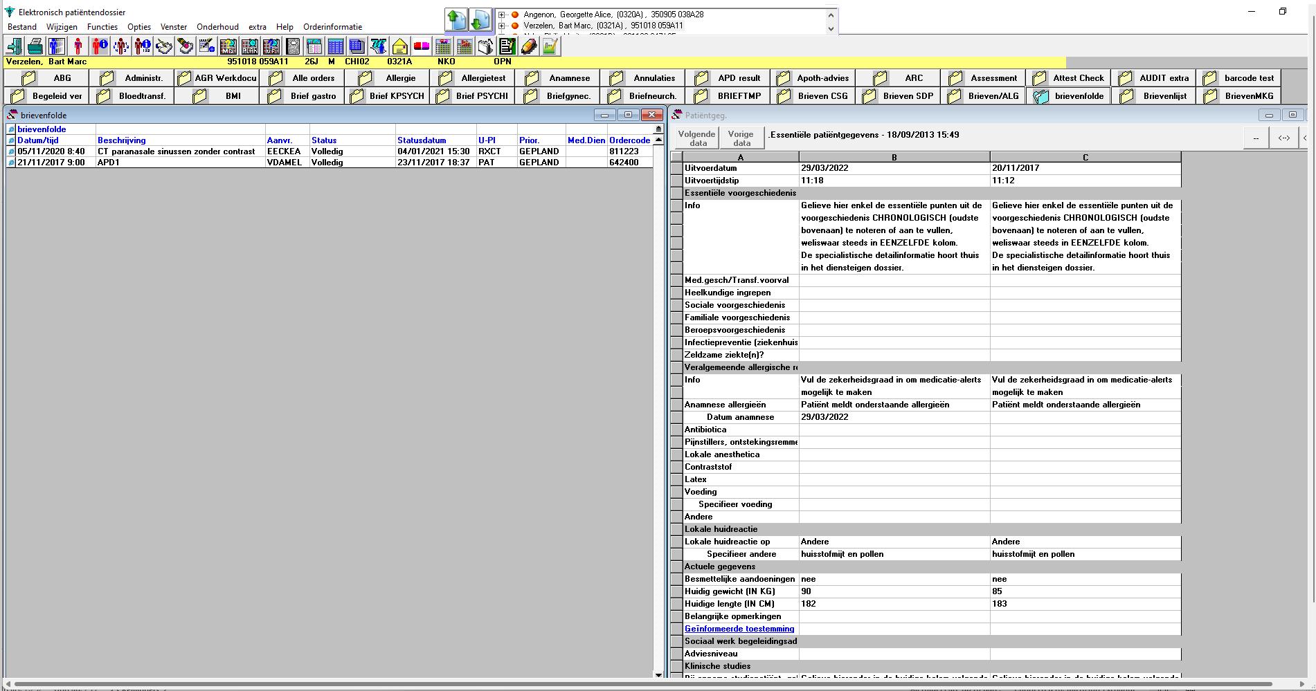
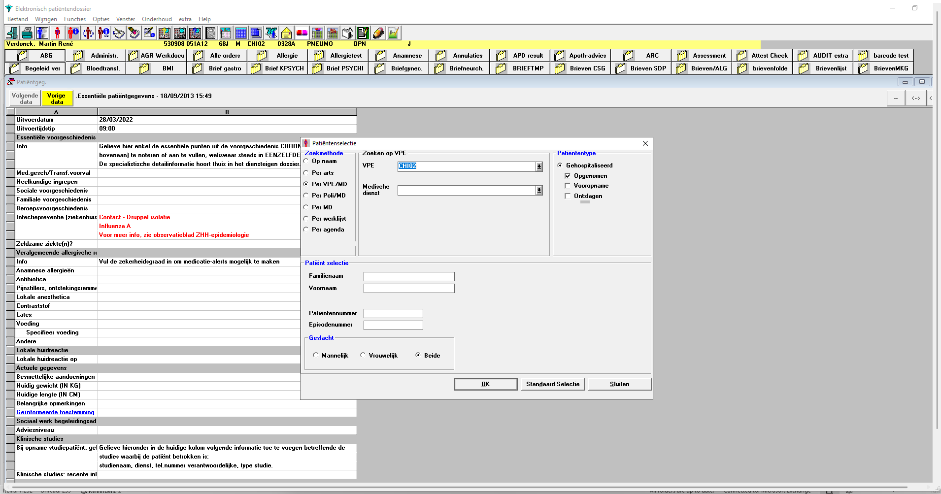
Elektronisch Patiëntendossier
01
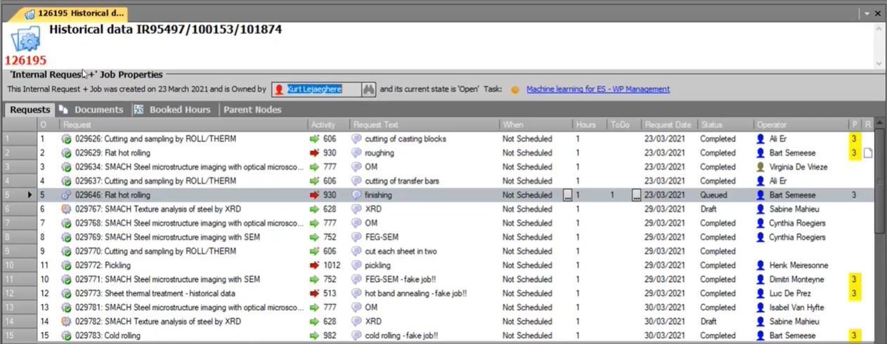
Jobmanager
New project 2023

02
Jobmanager
New project 2023
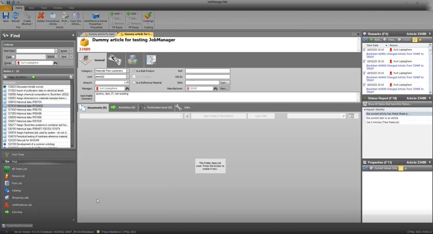
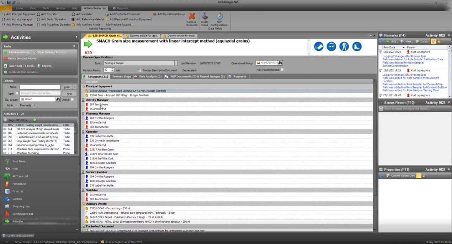
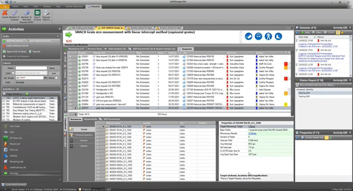
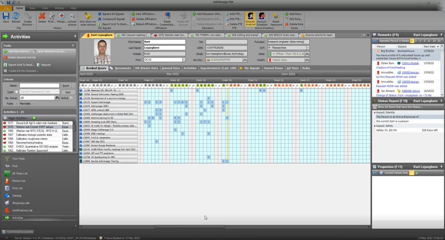
02
what's in it for me ?
The big picture, where does it fit ?

Patronen
Features
Pages
Producten
UI-design only ?
UXD ?
Functional analysis ?
HERKENBAARHEID / INTUÏTIVITEIT / KORTERE LEERCURVE
ATOMIC
definition
What is a design pattern ?
A specific solution for a common problem

Any repeating / reusable part of an interface, that can be repurposed to solve a specific problem

THEORY
#fields of expertise
Categories of design patterns

Deal with creation of an object
Class structure like inheritance and composition
Solutions for interaction and responsibilities between objects
FOCUS
THEORY
#UI-type patterns
Targeted at UX/UI-challenges

FOCUS
Tangible building blocks of any interface
Buttons, menus, forms, ...
Behaviour
Strengthen an emotional connection with the product
Brand & aestethics
Iconography styles, colours, typography, ...
THEORY
Anatomy
The design pattern formula
The user needs to know their location in the website's hierarchical structure in order to possibly browse back to a higher level in the hierarchy.
What does the user want to do
Problem
Breadcrumb
Name of the specific pattern
Title
When should the pattern be used
Context
Support wayfinding by including breadcrumbs that reflect the information hierarchy of your site. On mobile, avoid using breadcrumbs that are too tiny or wrap on multiple lines.
Specific conditions for use
Usage/solution
Use when the structure of the website follows a strict hierarchical structure
of similar formatted content.
Use together with some sort of main navigation.
Do not use alone as the main navigation of the website.
Where and how has the pattern been implemented before
Examples

THEORY
The big 3
Groups of patterns we can't do without ...

FOCUS
Navigation
Mental models visualised in a structure
Navigation menus are lists of content categories or features, typically presented as a set of links or icons grouped together with visual styling distinct from the rest of the design.

THEORY
information architecture
Similarities between 3 key types
of abstract models
UI elements: menus / links / breadcrumbs

Map of key pages / key
screens and relationships /
sitemap
Metadata to describe content / make connections
navigation planning
Questions to ask as preparation for the navigation scheme
Who is the enduser ? (expertise / goals / ...)

What kind of information will be shown,
what functional modules will be combined on screen ?

How do I group the information in the order of importance for users ?

navigation planning
Organizing elements / naming / positioning

UX research context & priorities
Based on mental model enduser
Innovative path wireframing
simple rules
Basic rules that always apply...


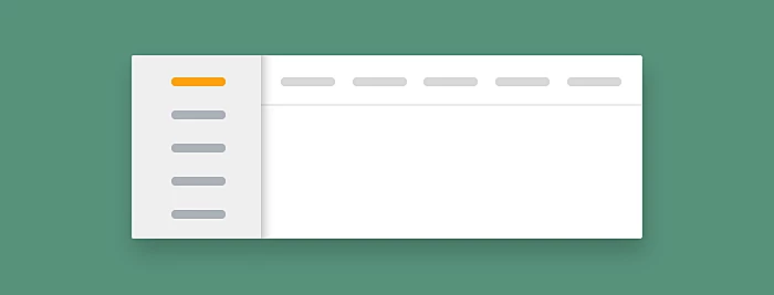
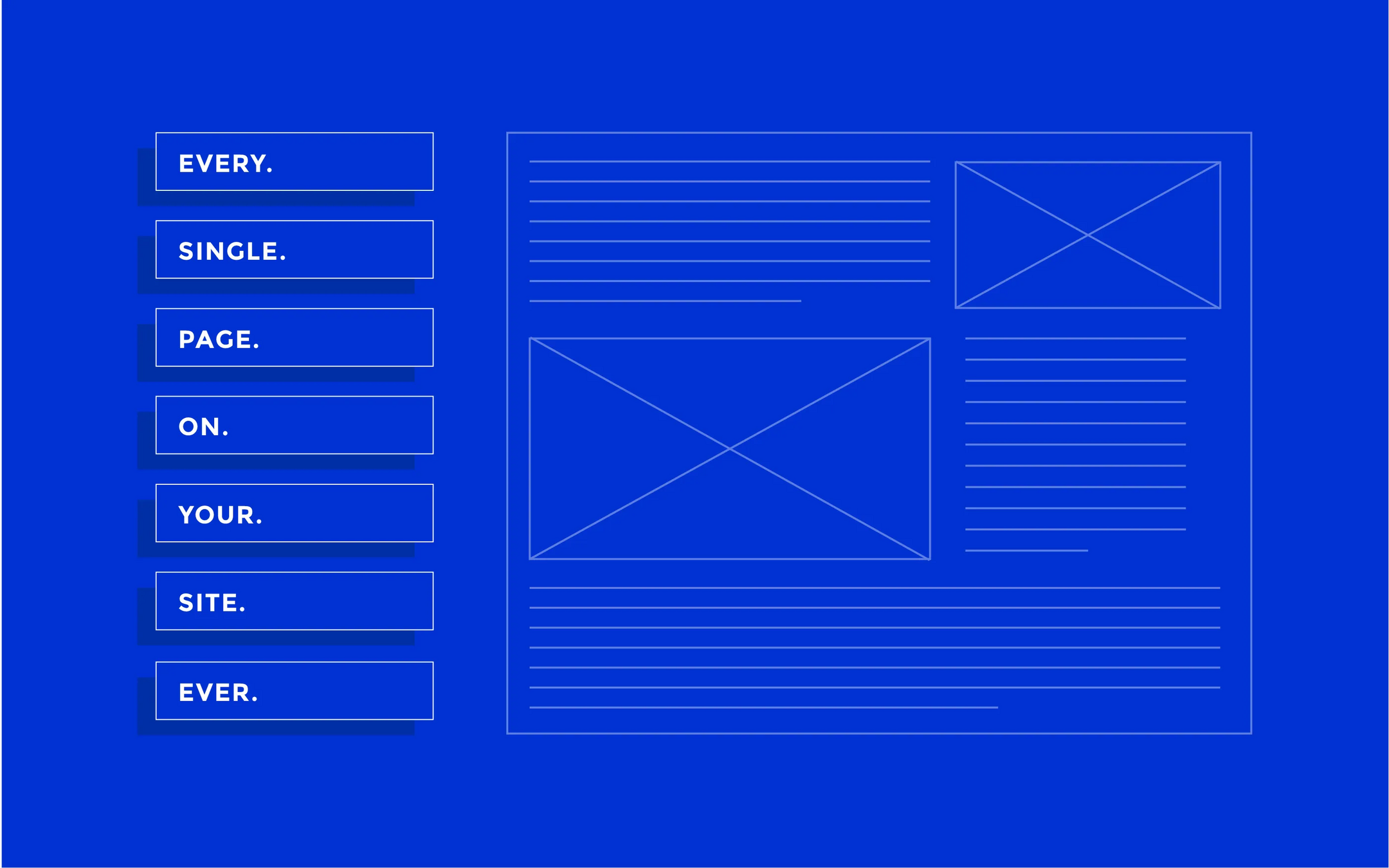
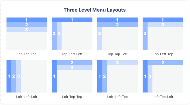
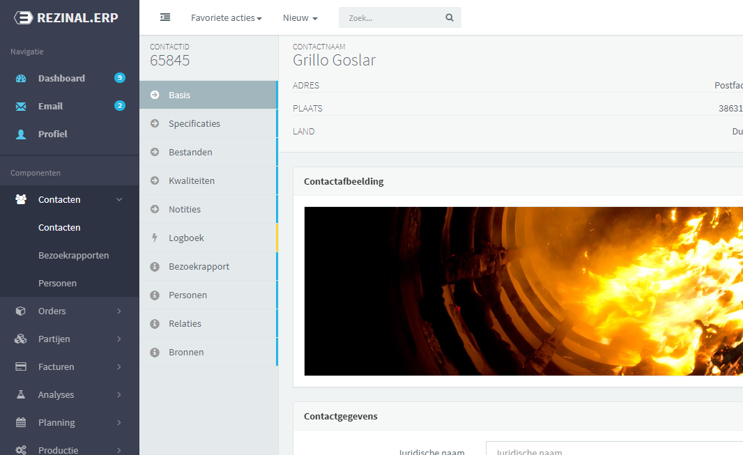
vertical & horizontal nav
All time favourites for all sizes of applications / combined Inverted L
PATTERNS
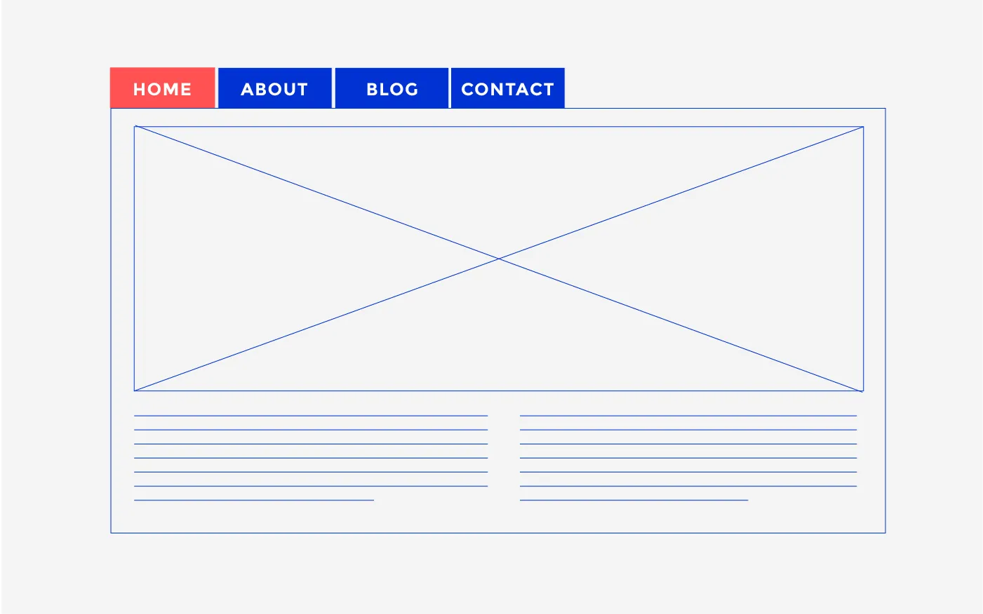
tabs
A variation of the horizontal navigation bar
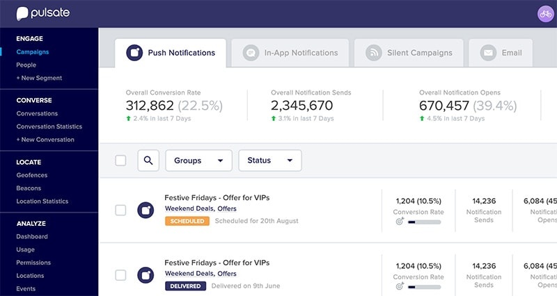
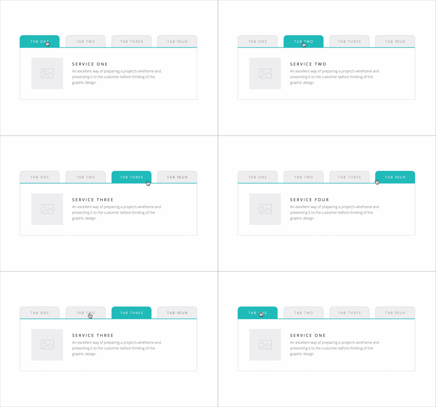
primary / secondary nav
Drop-down / flyout / ...

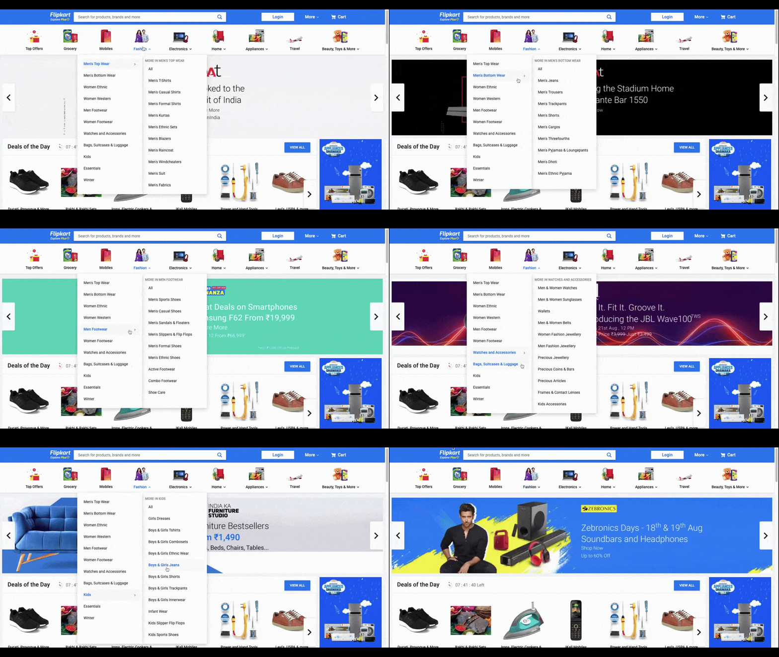
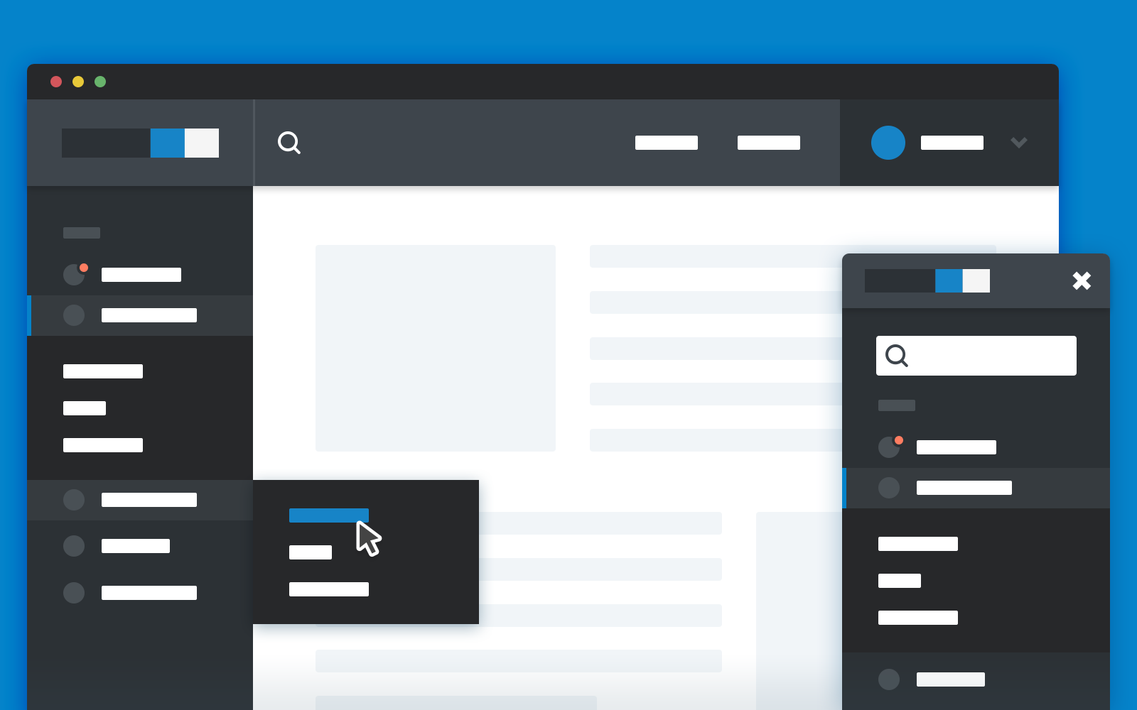

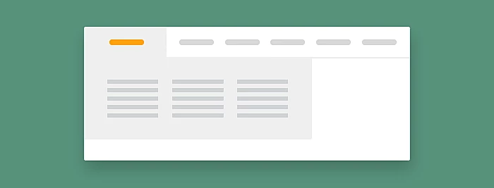
mega menu
Facilitate the display of many options at once


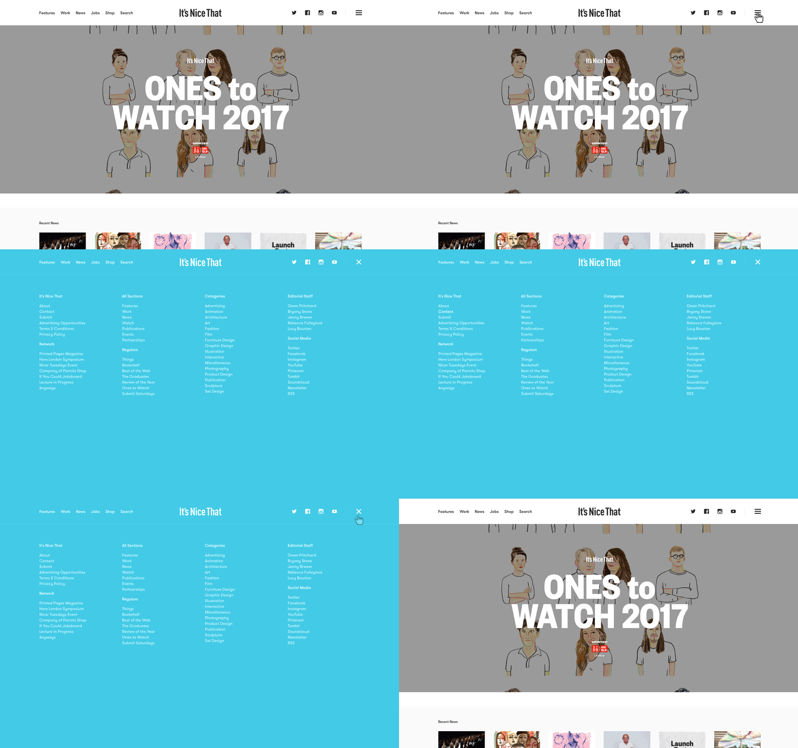
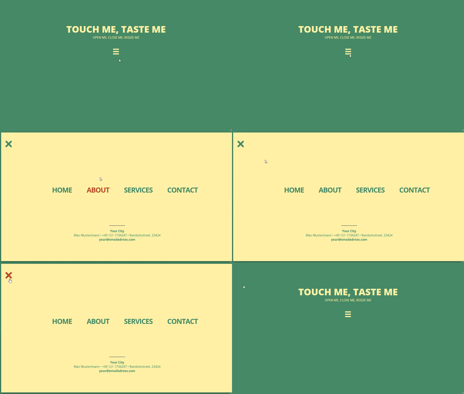
fullscreen navs
Mostly for mobile, but currently popping up everywhere
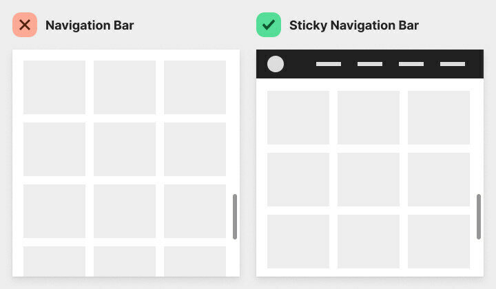
sticky navigation
Never loose your navigation out of sight


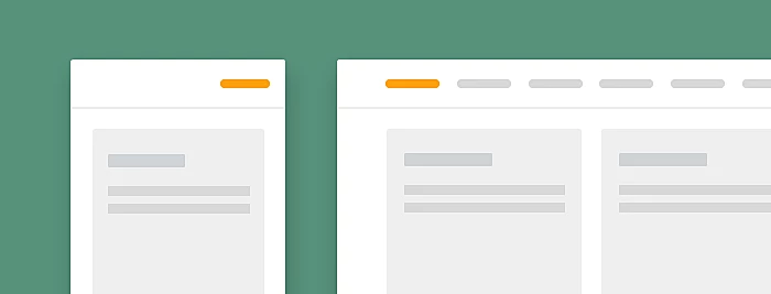
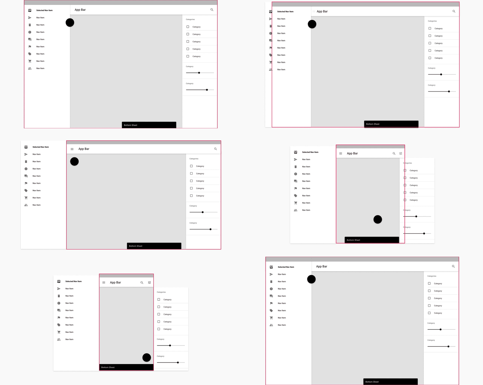
Responsive navigation
Behaviour of navigation for responsive webapplications


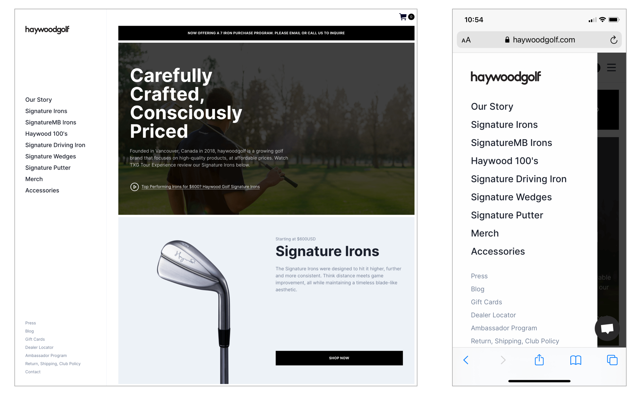
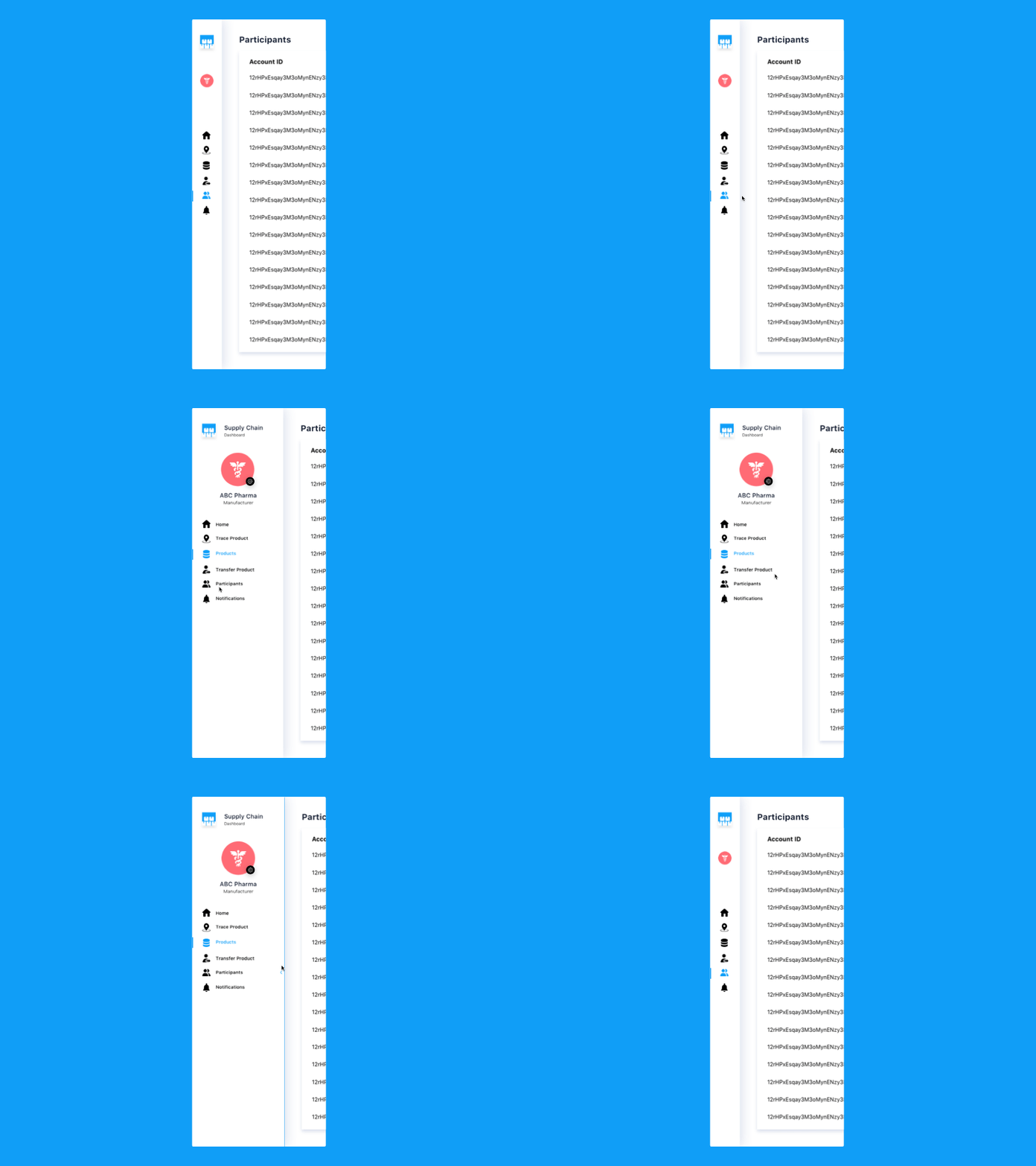
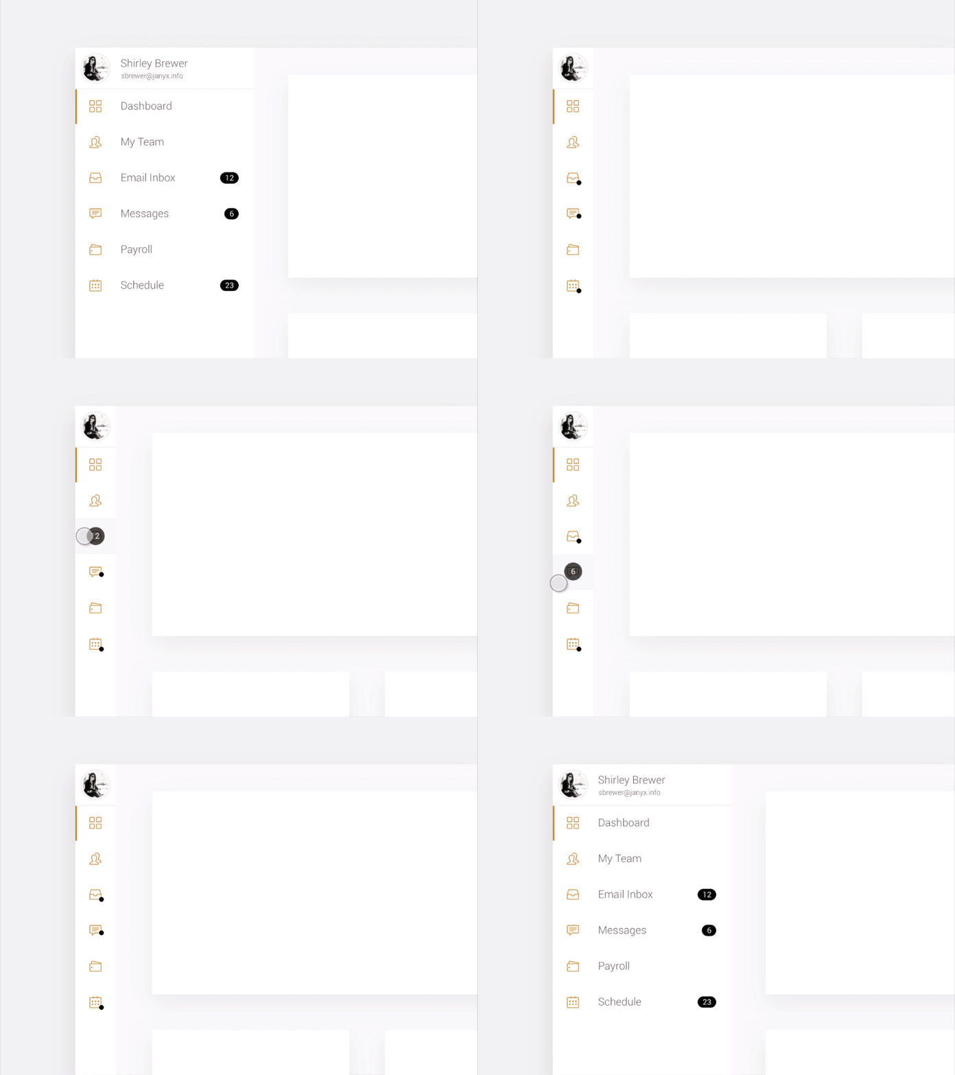
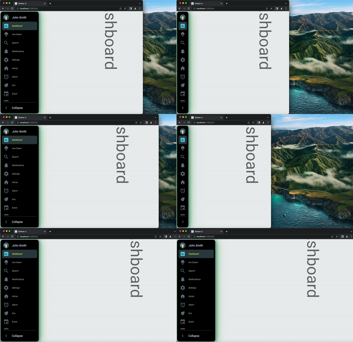
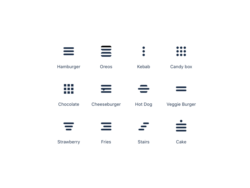
the hamburger menu
Love it, hate it, use it ...

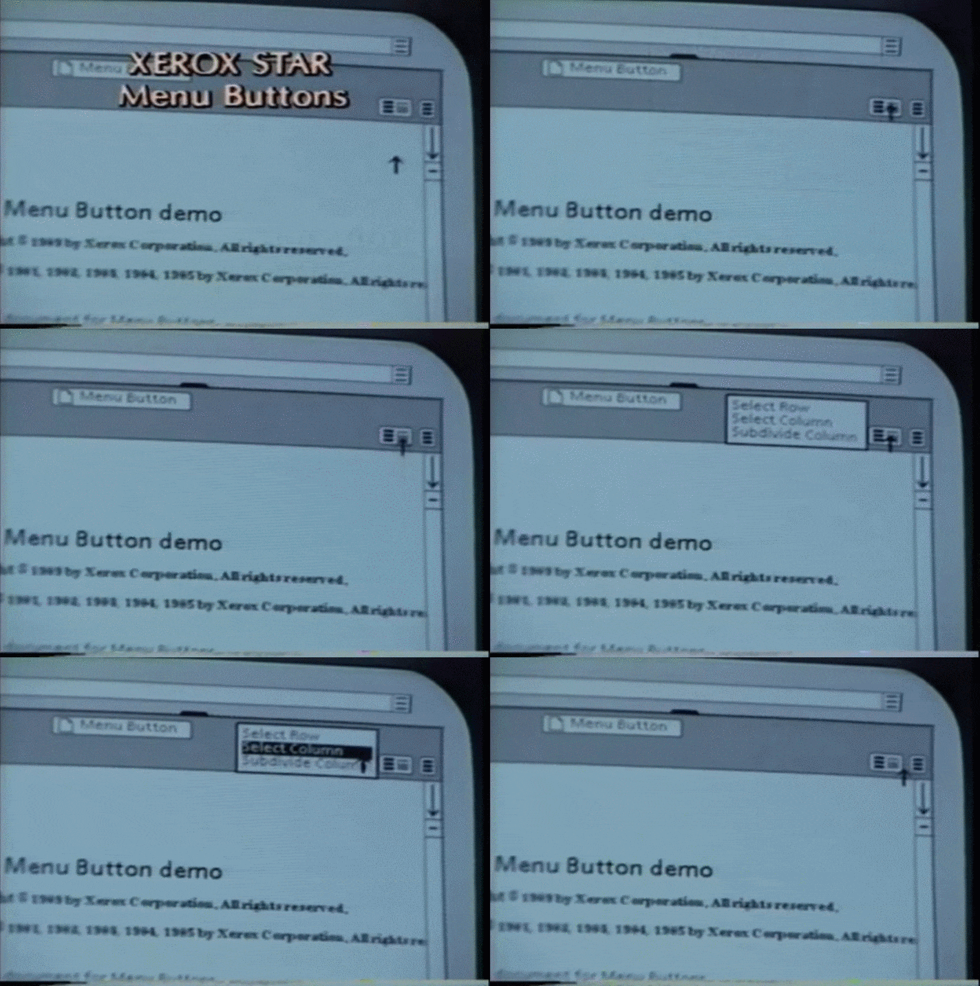
The hamburger icon was designed by Norm Cox for the Xerox Star,
the world’s first graphical user interface.
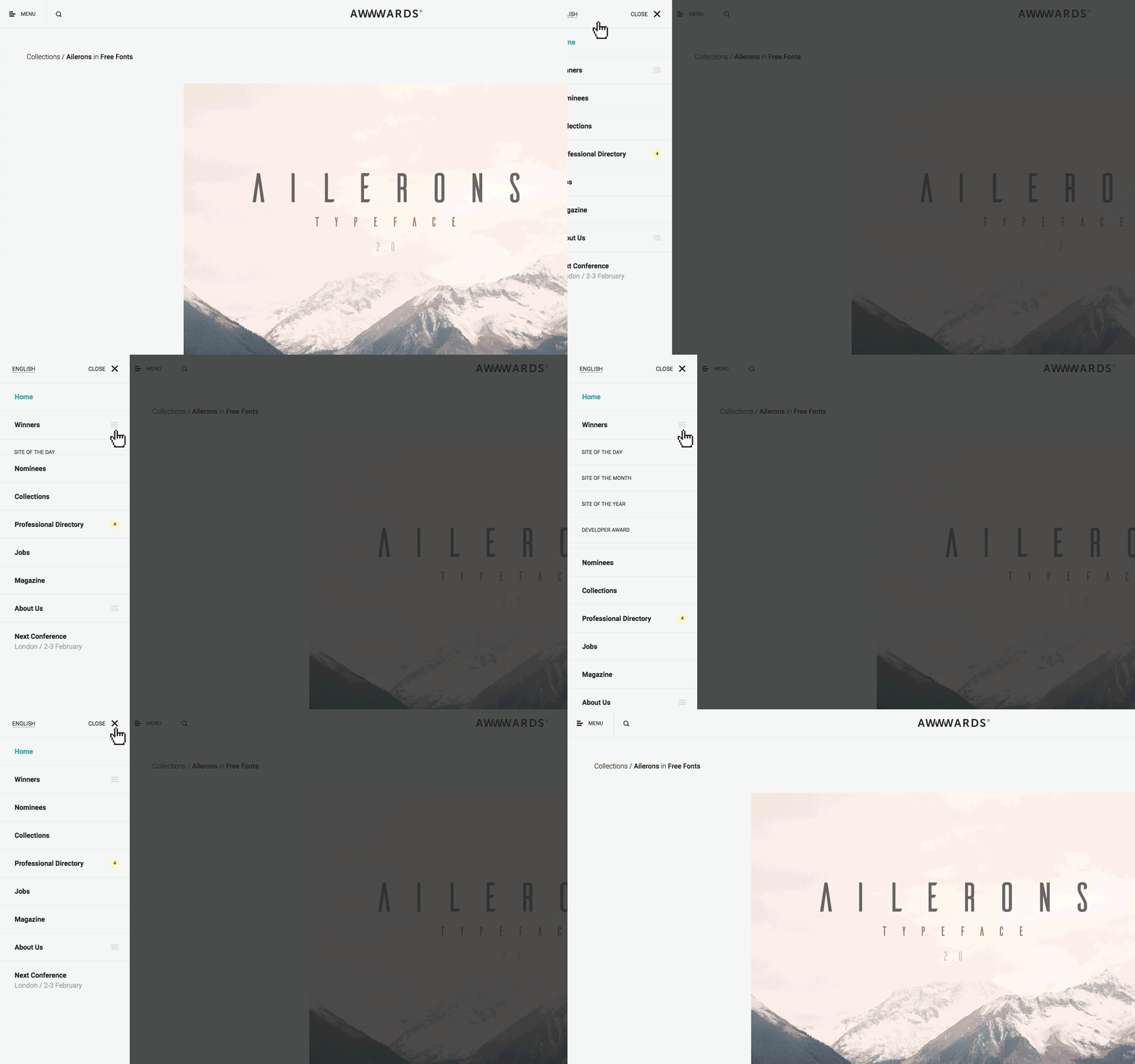
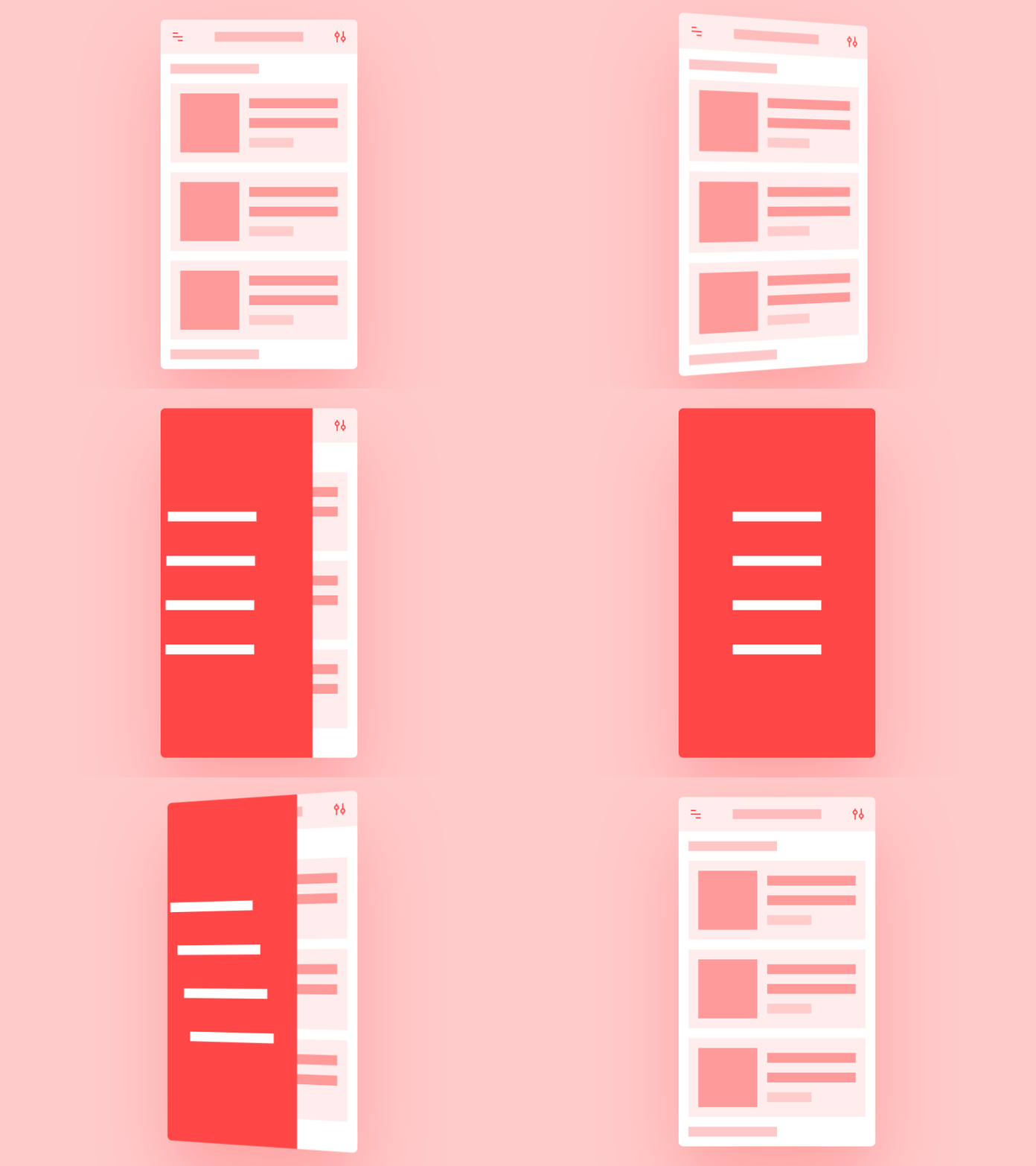
the hamburger menu
A pattern with a variety of uses

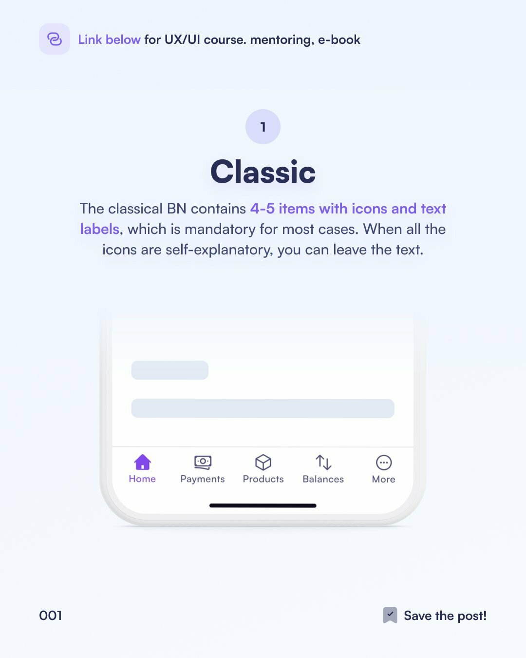
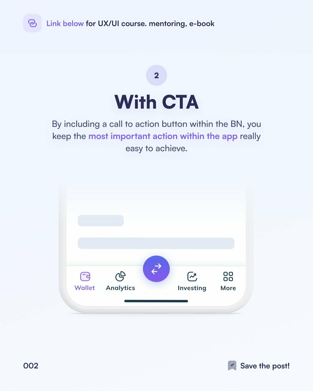
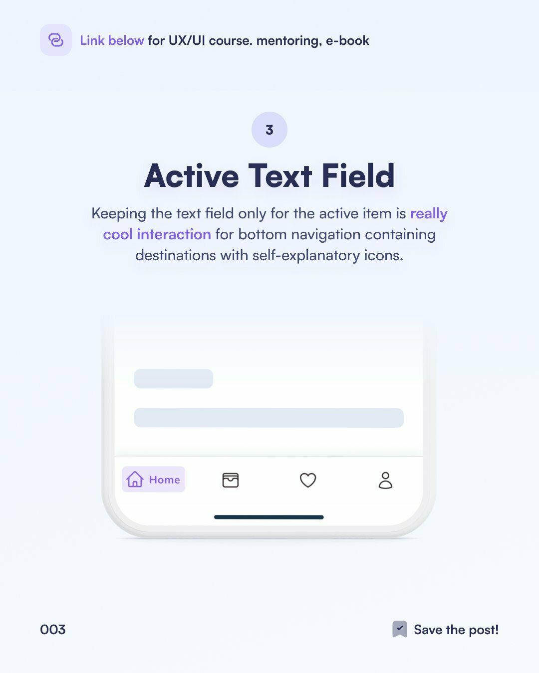
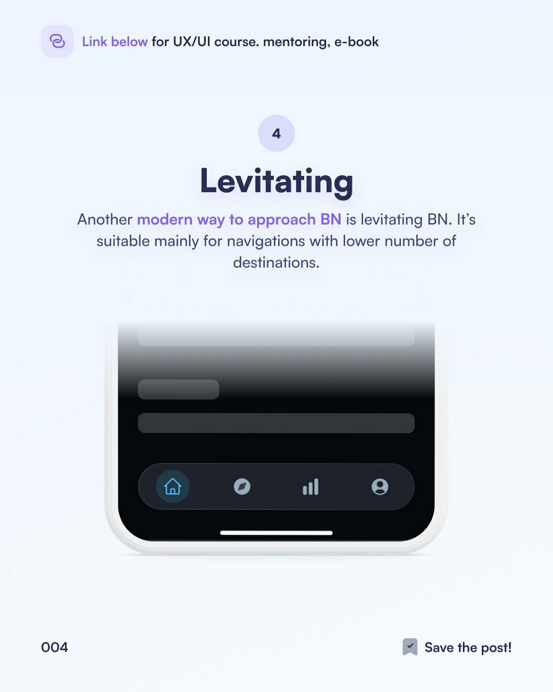
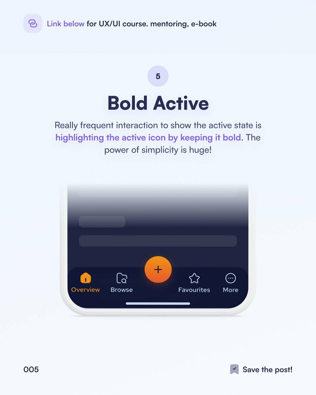
bottom Navigation
Permanently visible mobile navigation pattern
Using icons
Universal meaning (2020) and tips
A user’s understanding of an icon is based
on previous experience.
That’s why it’s always better to use familiar icons.


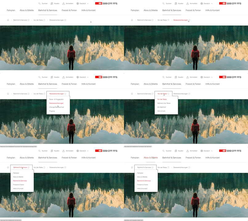
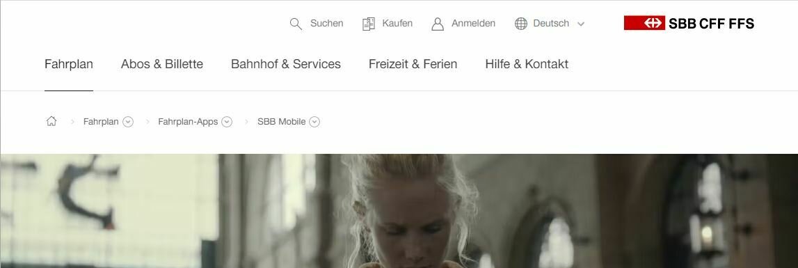
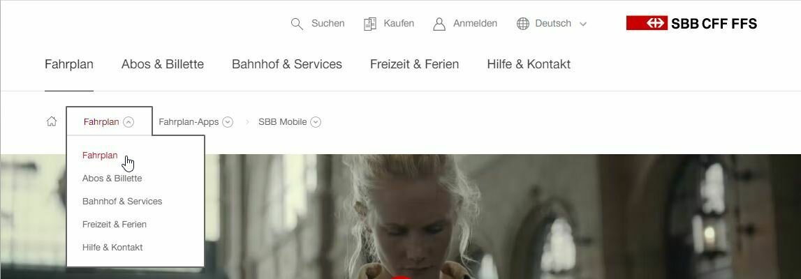
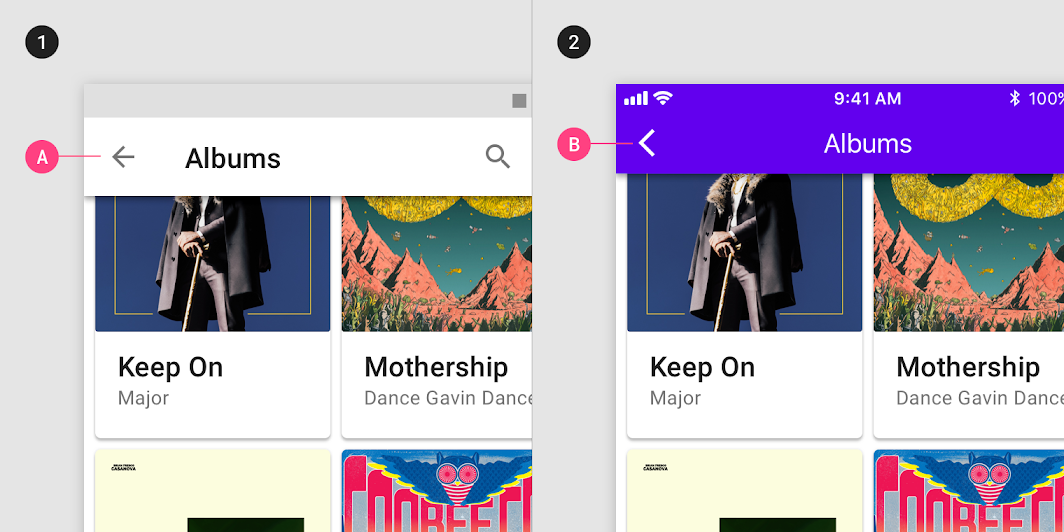
Breadcrumbs
And pattern combination; sideways breadcrumb

EXTRAS
logo goes home
A convention best followed; clicking the logo always goes to the homepage
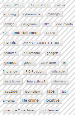
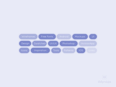
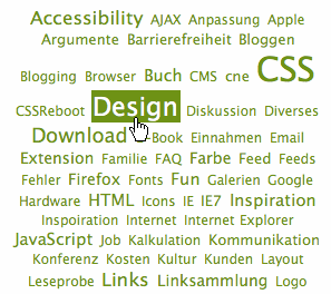
TAGCLOUD
A visual representation of the tags that describe content
Navigation map
A visual representation of the tags that describe content
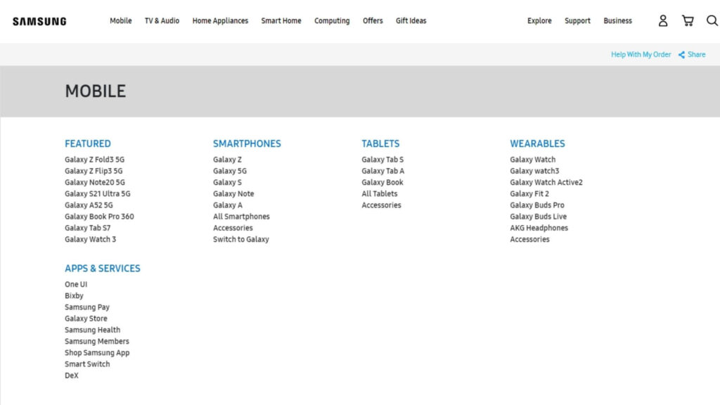
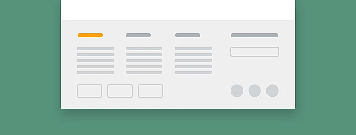
extended footer navs
Combine a secondary navigation to guide your endusers
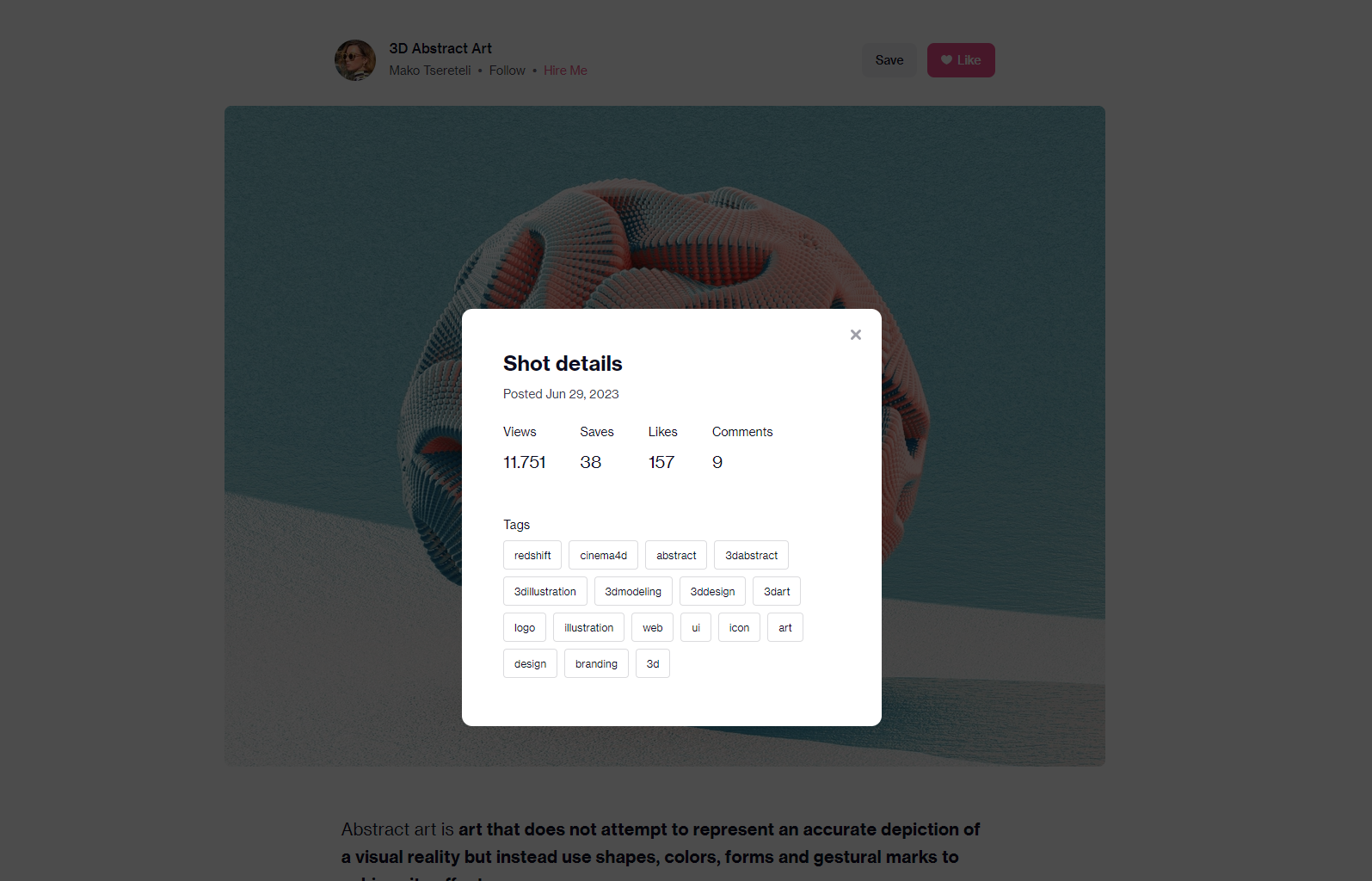
folksonomy / taxonomy
Classification driven by the enduser or reveal contextual data with nav
Tables
Good data tables allow users to scan, analyze, compare, filter, sort, and manipulate information to derive insights and commit actions.

Table design should support four common user tasks: find records that fit specific criteria, compare data, view/edit/add a single row’s data, and take actions on records
analyse Table reqs
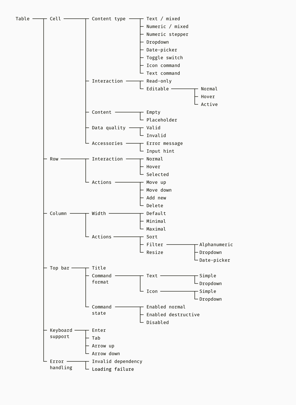
Try to find out what needs to happen at what location in your table
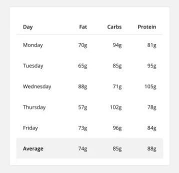
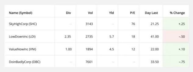
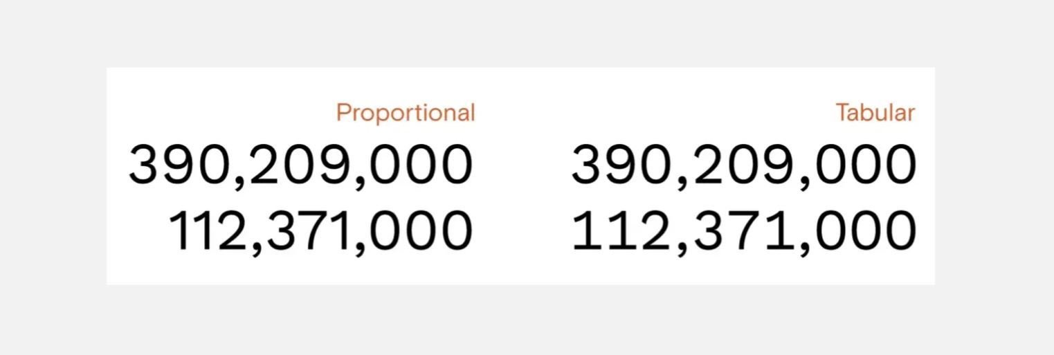
Data alignment
Make the data easily scannable, readable and comparable.
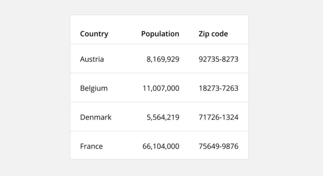
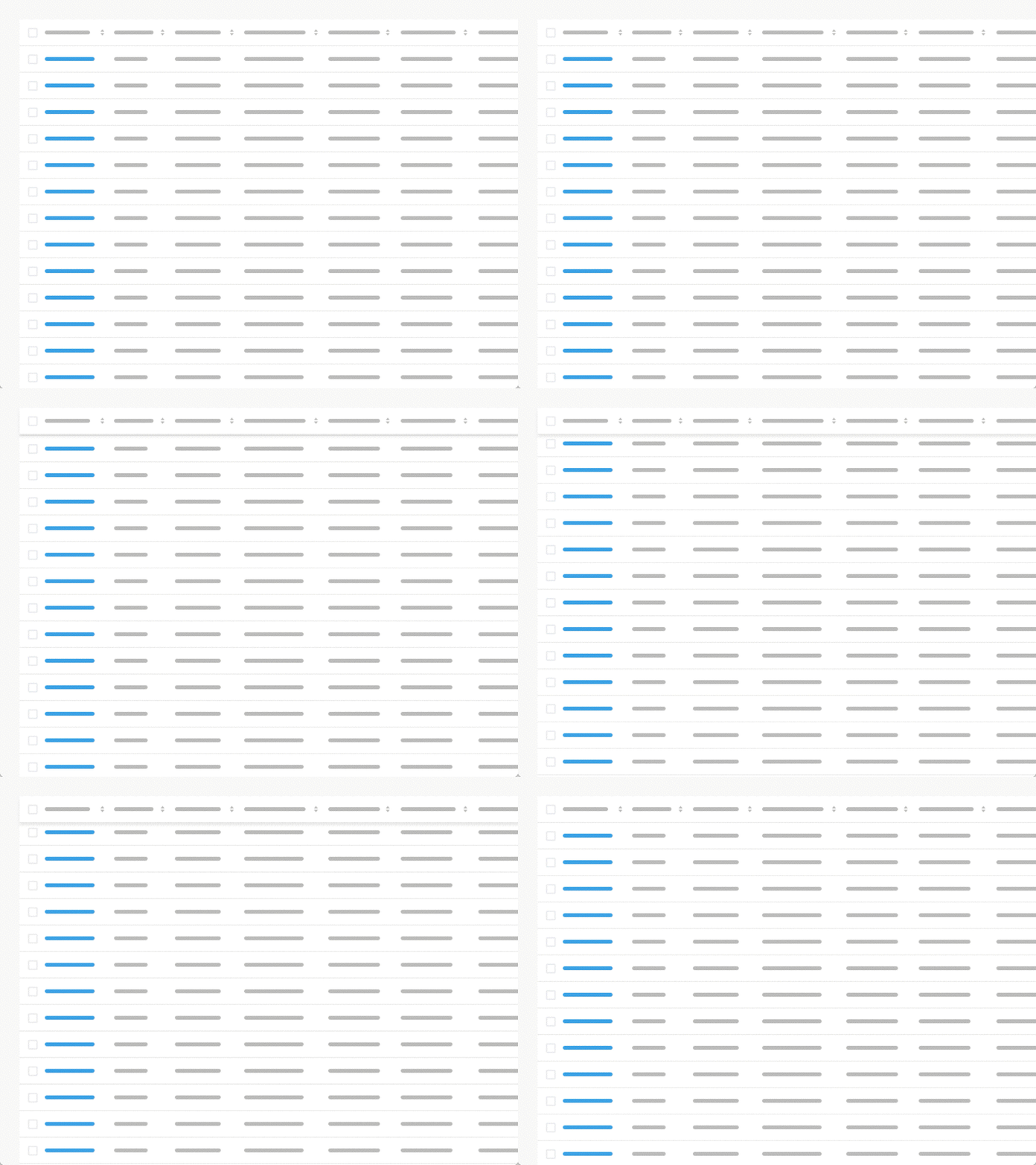
fixed header
Fixing the row header as a user scrolls provides context on what column the user is on
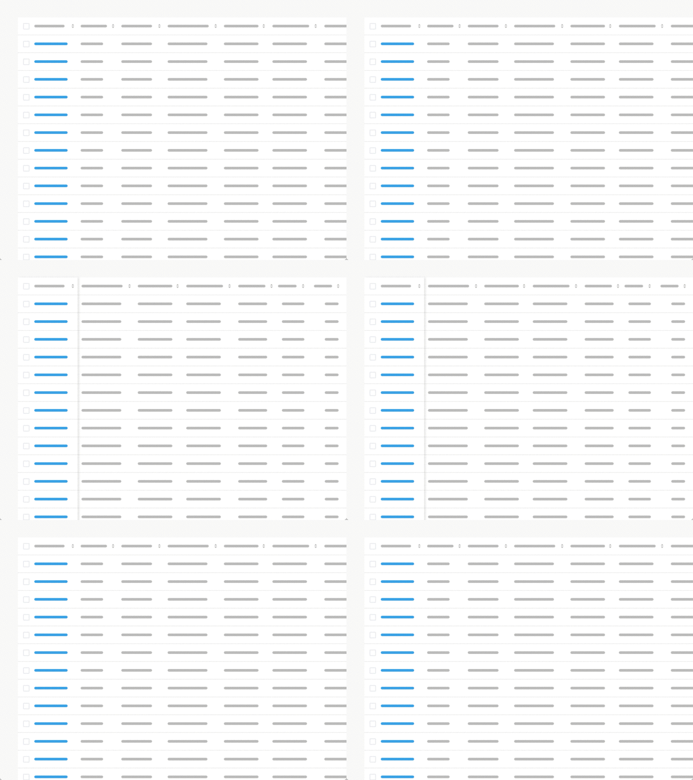
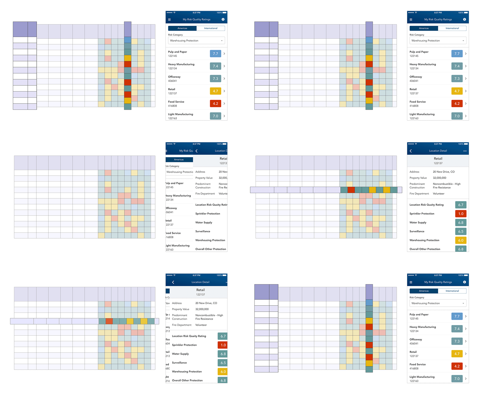
horizontal scroll
When presenting large datasets. Place identifier data in the first column.
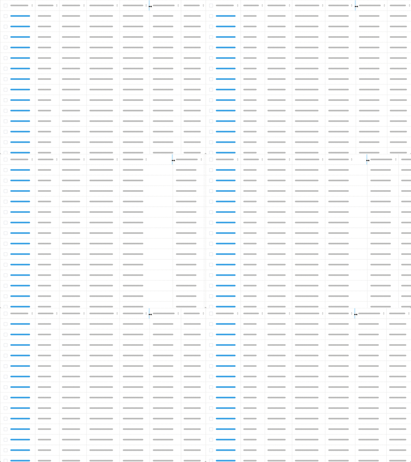
Resizable columns
Resizing columns allows users to see abbreviated data in full.
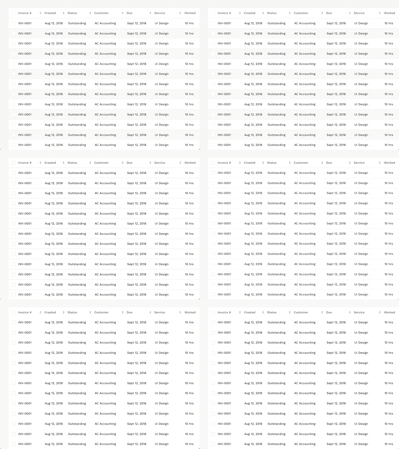
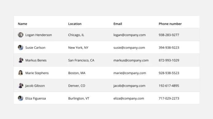
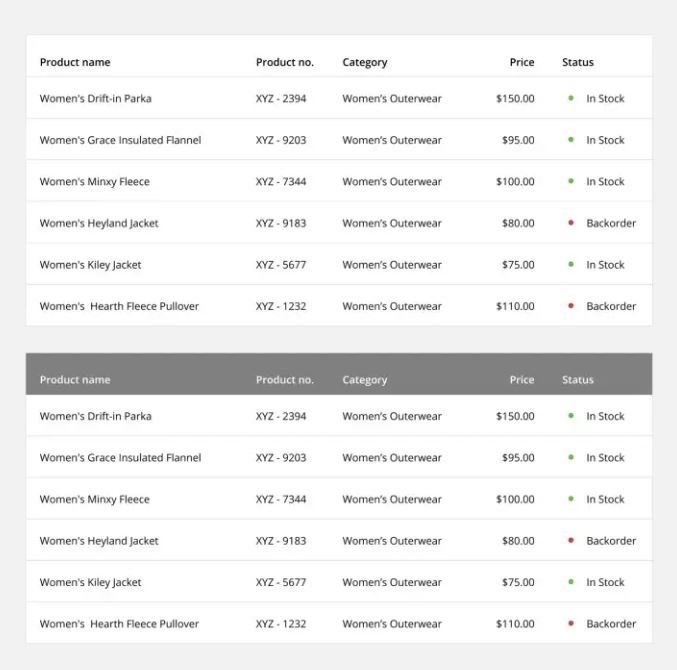
Row Style
Helps users scan data. Zebra Stripes, Line Divisions, Free Form.
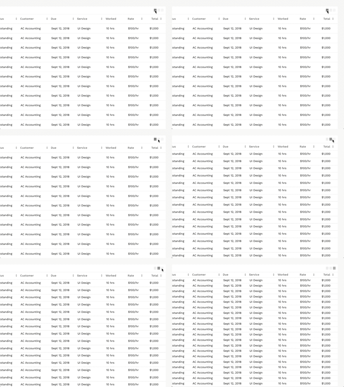
Display Density
Smaller row height enables the user to view more data without the need for scrolling.
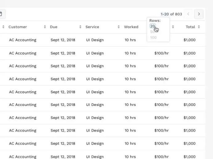
Pagination
Works by presenting a set number of rows in a view, with the ability to navigate to another set.
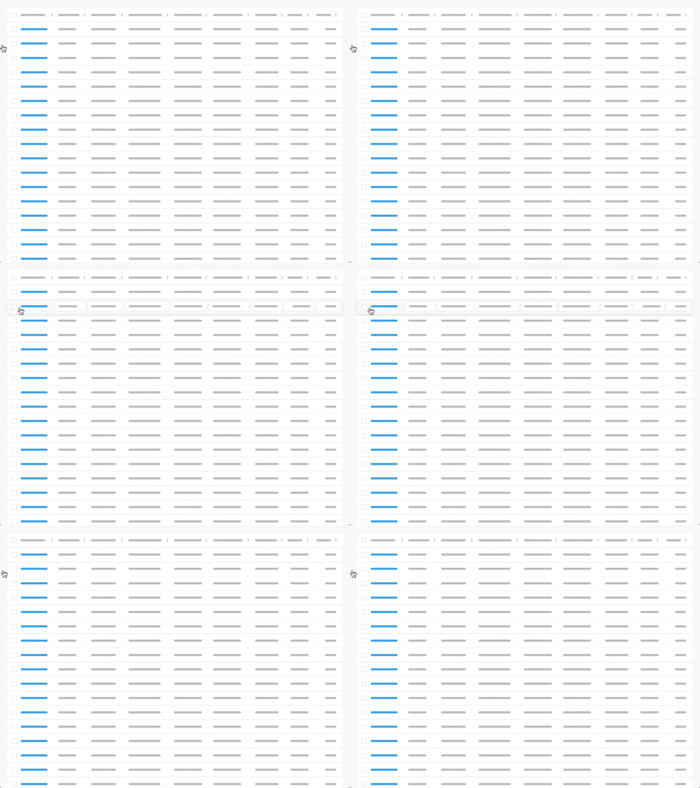
Hover Actions
Presenting additional action when a user hovers reduces visual clutter.

Inline Editing
Allows the user to change data without navigating to a separate details view.
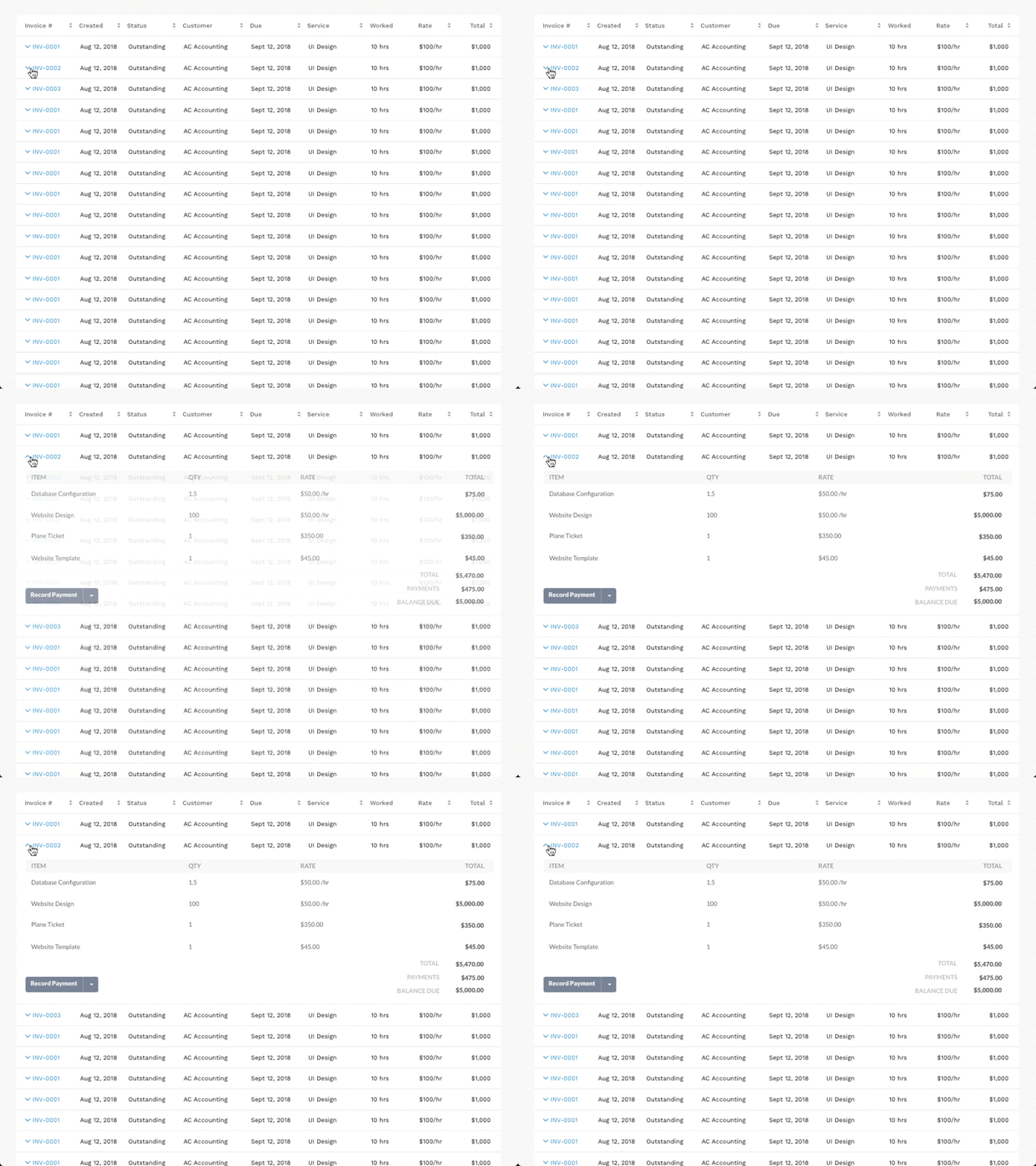
Expandable Rows
Allow the user to evaluate additional information without losing their context.
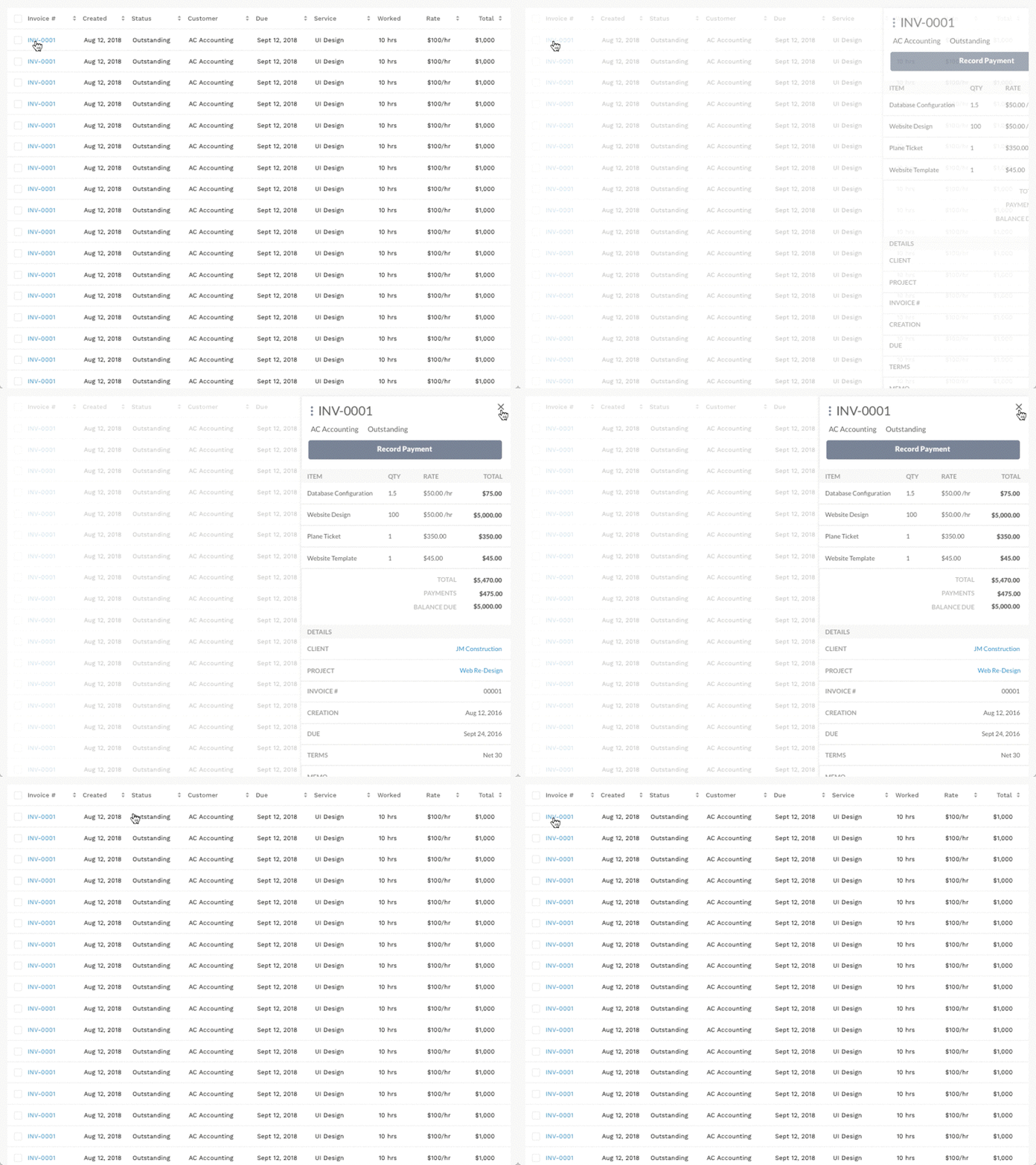
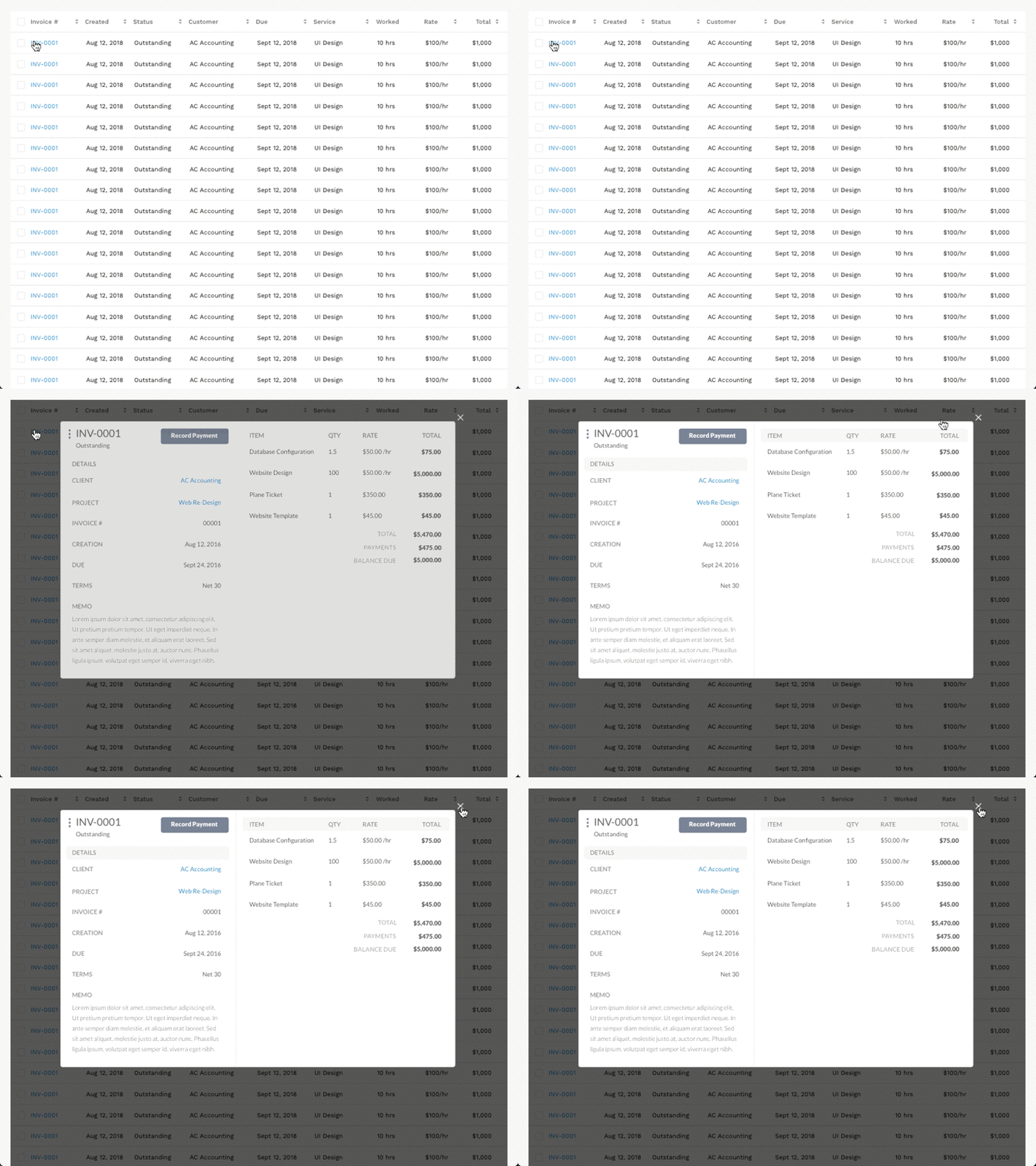
Detailed views
Quick view and modal view
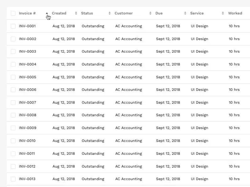
Sortable Columns
Column sorting allows users to organize rows alphabetically and numerically.
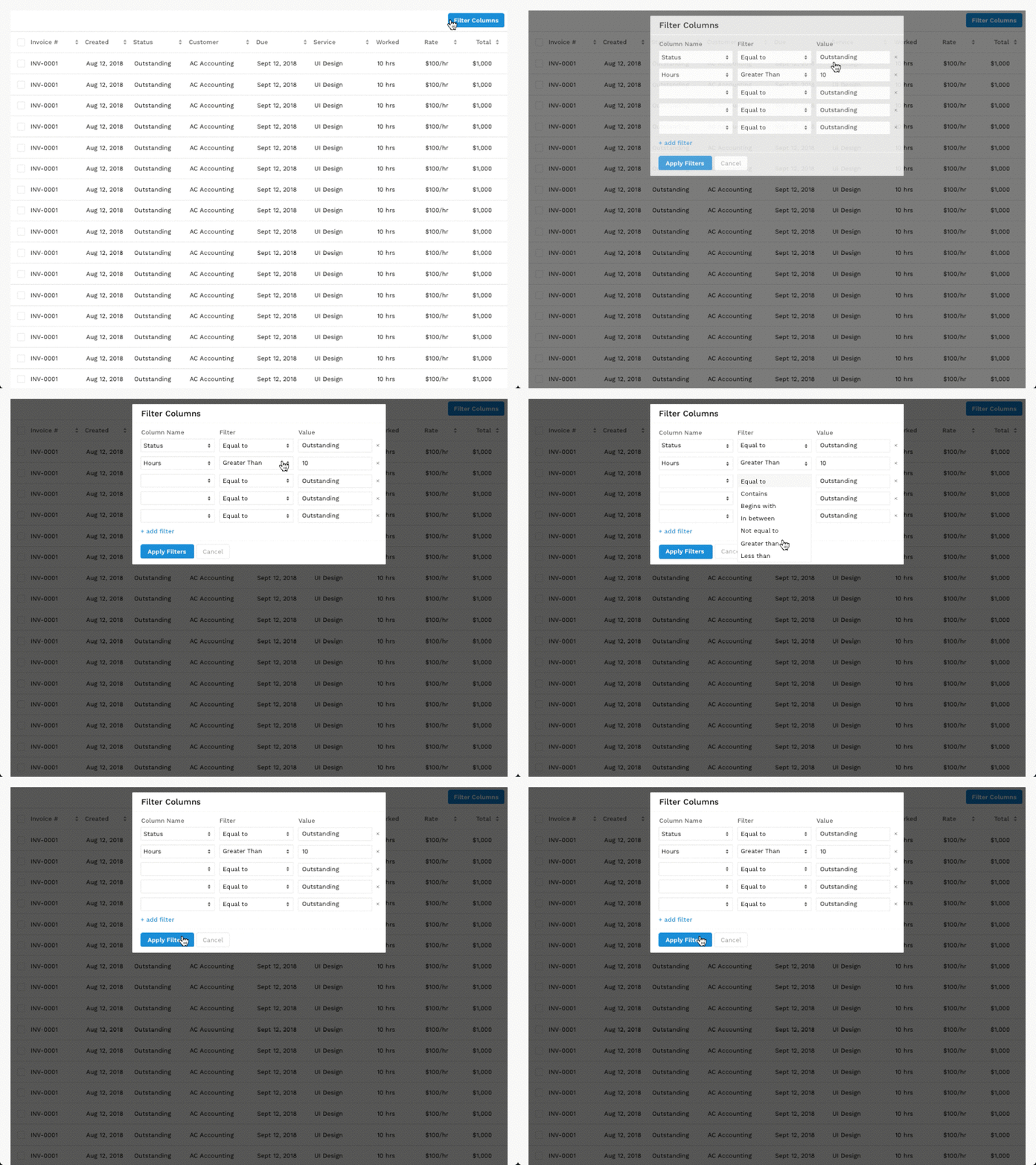
Filter Columns
This design pattern allows users to assign filtering parameters to specific columns.
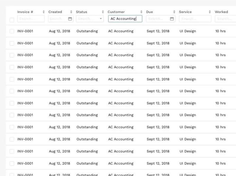
Searchable Columns
Allows a user to search specific values within each column.
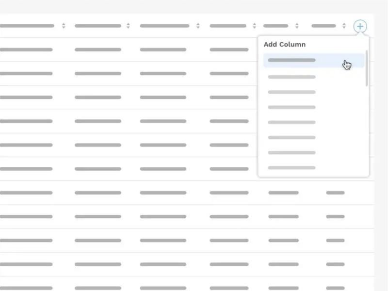
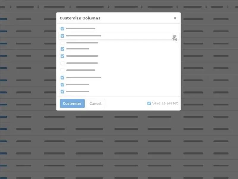
Customizable Columns
Add columns from a dataset or pick the columns they want to see, sort and save.
Scalability
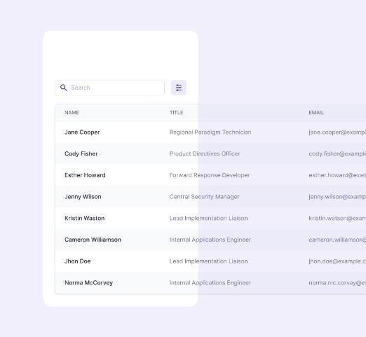
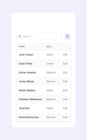
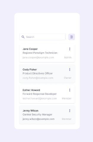
Tables vs. Cards or Modules for Data Presentation
Forms
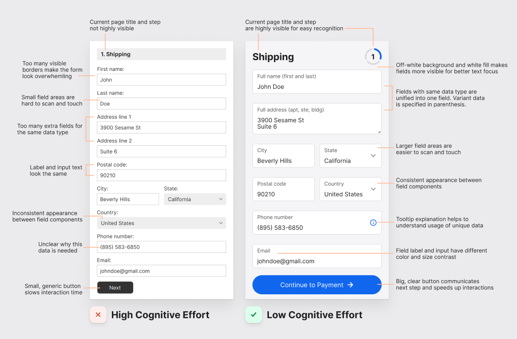
Input data under different circumstances
RESOURCES / LINKS
All information, images borrowed for this presentation
Categories of design patterns
UI/UX Patterns
Atomic design
Anatomy of a pattern
Tables
The Catalog of Design Patterns: https://refactoring.guru/design-patterns
Gangs of Four (GoF) Design Patterns: https://www.digitalocean.com/community/tutorials/gangs-of-four-gof-design-patterns
Functional / perceptual patterns: https://highlandsolutions.com/resources/blog/what-the-heck-is-a-design-system
By Brad Frost: https://atomicdesign.bradfrost.com/
Full research article 2009 The anatomy of HCI design patterns: https://www.researchgate.net/publication/232641271_The_anatomy_of_HCI_design_patterns
https://www.interaction-design.org/literature/topics/ui-design-patterns
https://www.justinmind.com/ui-design/patterns
https://www.uxlibrary.org/explore/ui-design/ui-patterns-and-inspiration
https://careerfoundry.com/en/blog/ui-design/user-interface-patterns/
https://www.smashingmagazine.com/2019/02/complex-web-tables/
https://www.nngroup.com/articles/data-tables/
https://medium.com/nextux/design-better-data-tables-4ecc99d23356
https://uxpin.medium.com/how-to-use-the-best-ui-design-patterns-30323c24a4d6 (old)
RESOURCES / LINKS
All information, images borrowed for this presentation
Navigation
https://www.nngroup.com/articles/menu-design/
A Practical Guide To Information Architecture (by Donna Spencer)
https://www.nngroup.com/videos/information-architecture-models/
https://agentestudio.com/blog/website-navigation-design
https://agentestudio.com/blog/best-practices-mobile-navigation-design
https://www.interaction-design.org/literature/article/six-simple-rules-for-better-navigation-ux
https://www.invisionapp.com/inside-design/an-oral-history-of-the-hamburger-icon-from-the-people-who-were-there/
https://agentestudio.com/blog/hamburger-menu-examples-and-alternatives
https://www.smashingmagazine.com/2016/11/the-golden-rules-of-mobile-navigation-design/
https://twitter.com/i/status/1600569258483793948 (Vitally Friedman on sideway breadcrumbs)
https://cmd-t.webydo.com/from-simple-to-unusual-a-look-at-navigation-in-web-design-1057d0baef7b#.8diwemf5t
https://medium.com/@kollinz/hamburger-menu-alternatives-for-mobile-navigation-a3a3beb555b8#.sobwzhik6
https://usabilitygeek.com/ui-patterns-for-navigation-good-ux/
https://m2.material.io/design/navigation/understanding-navigation.html#reverse-navigation
https://www.nngroup.com/articles/vertical-nav/
https://uxplanet.org/25-icons-with-universal-meaning-3ac48d22c686
Thank you for your attention
HENDRIK MONDELAERS
hendrik.mondelaers@realdolmen.com