HTML、CSS製作翻牌效果
5/3 講者:Cuboid
Outline
- HTML結構
- 利用 CSS 達到翻牌
- 完整程式碼
- 參考資源
HTML結構
<div class="container">
   <div class="front">front</div>
   <div class="back">back</div>
</div>
利用CSS 達到翻牌
step 1.
body {
height: 100vh;
/*高度等於螢幕寬度*/
/*垂直置中*/
display: flex;
justify-content: center;
align-items: center;
}
.container {
width: 300px;
height: 400px;
}
.front,
.back {
width: 100%;
height: 100%;
}
.front {
background-color: red;
}
.back {
background-color: blue;
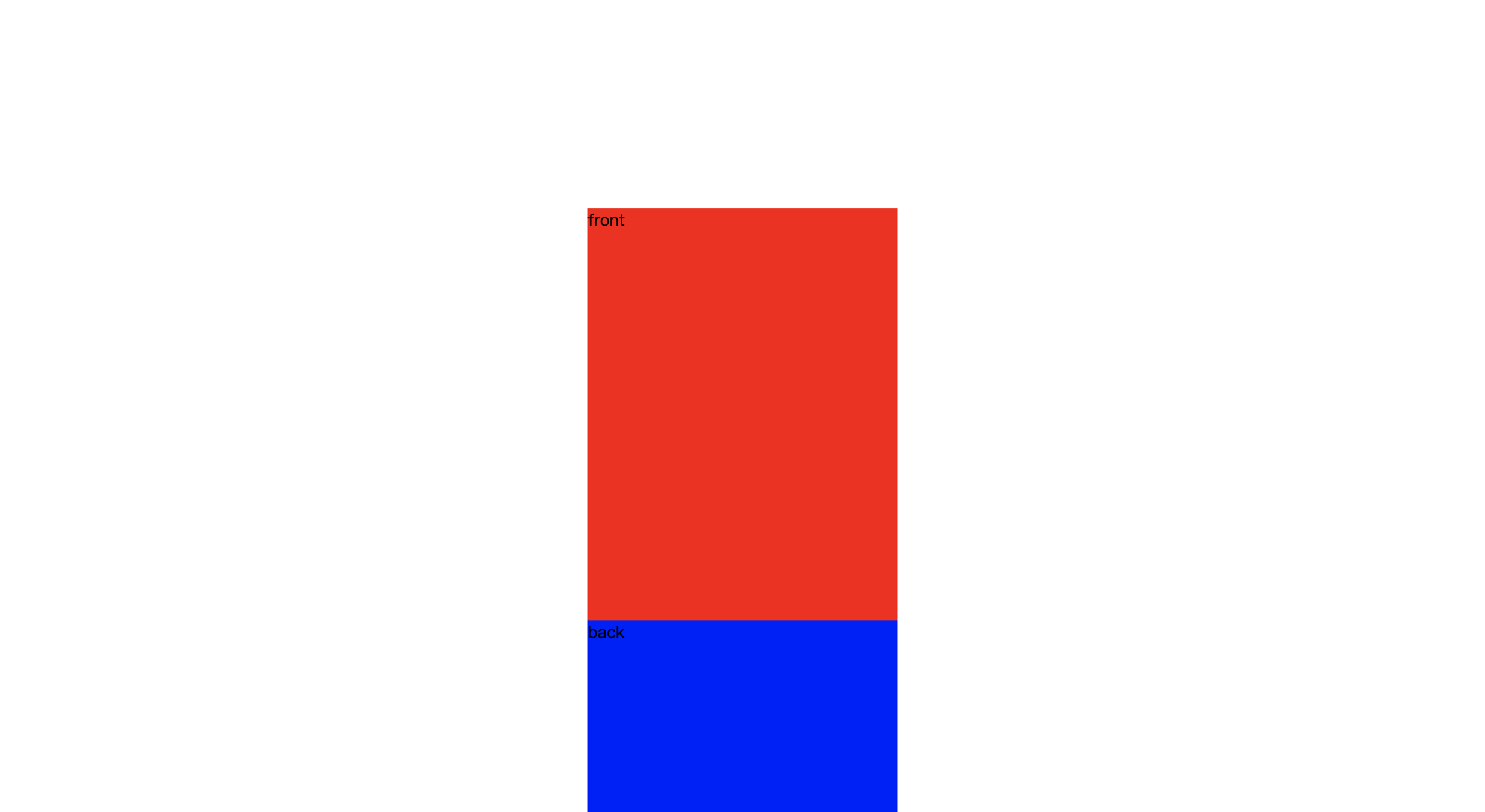
}設定container,front,back的長寬(長寬都一樣),並給上顏色
接著將物件垂直置中
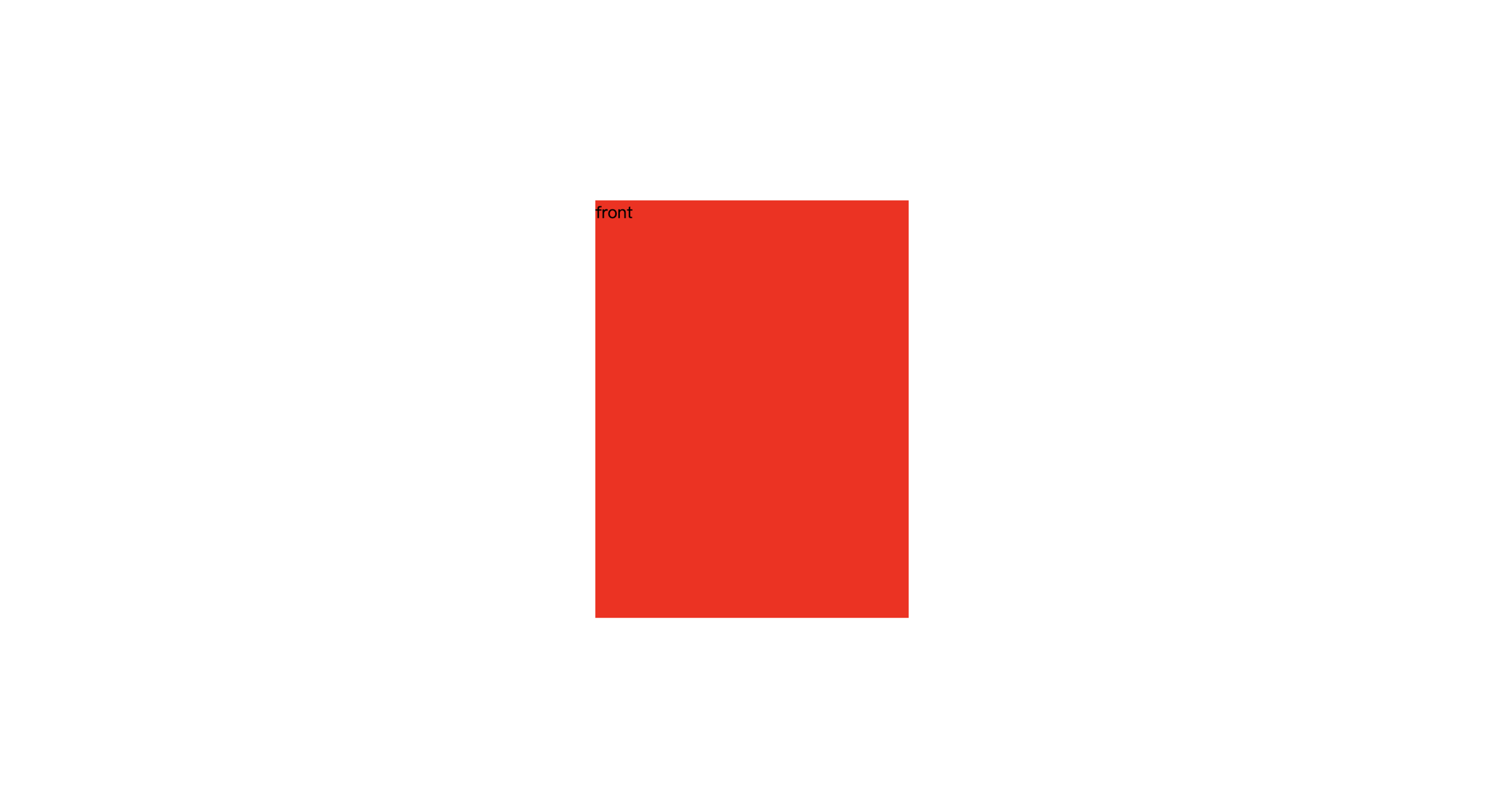
step 1 做完長這樣
step 2.
將 front,back
用絕對定位重疊再一起
 	body {
            height: 100vh;
            /*高度等於螢幕寬度*/
            /*垂直置中*/
            display: flex;
            justify-content: center;
            align-items: center;
        }

        .container {
            width: 300px;
            height: 400px;
            /*新增*/
            position: relative;
            /*-----*/
        }

        .front,
        .back {
            width: 100%;
            height: 100%;
            /*新增*/
            position: absolute;
            /*-----*/
        }

        .front {
            background-color: red;
        }

        .back {
            background-color: blue;
        }
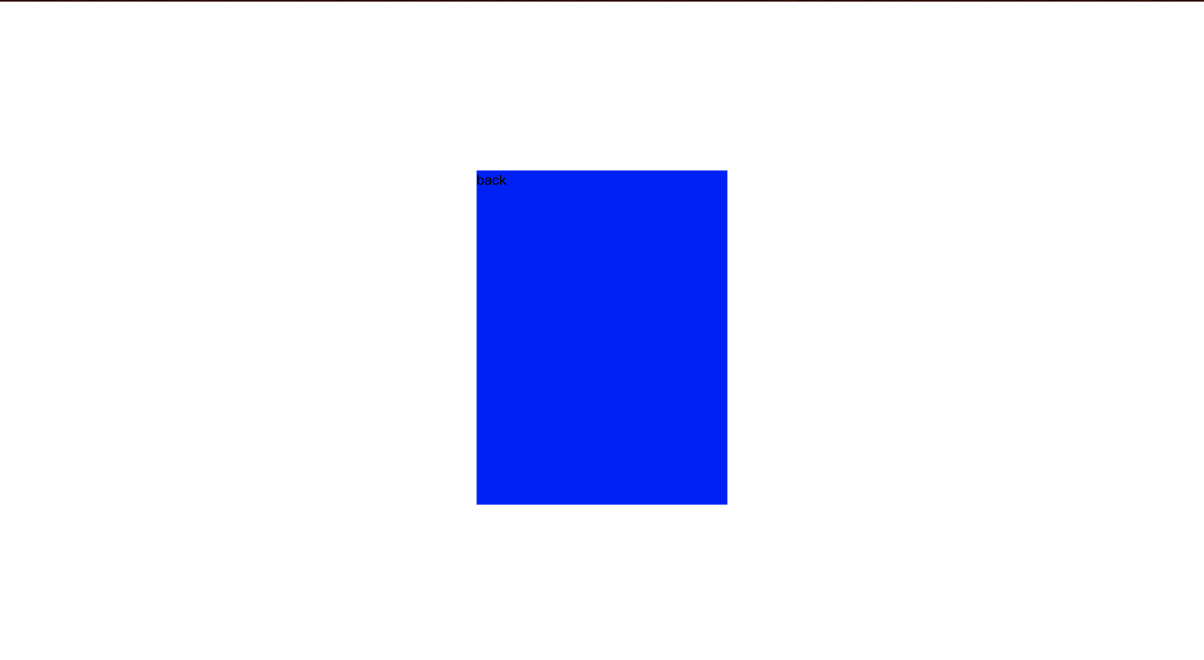
step 2 做完長這樣
先做到這樣 限時2分鐘
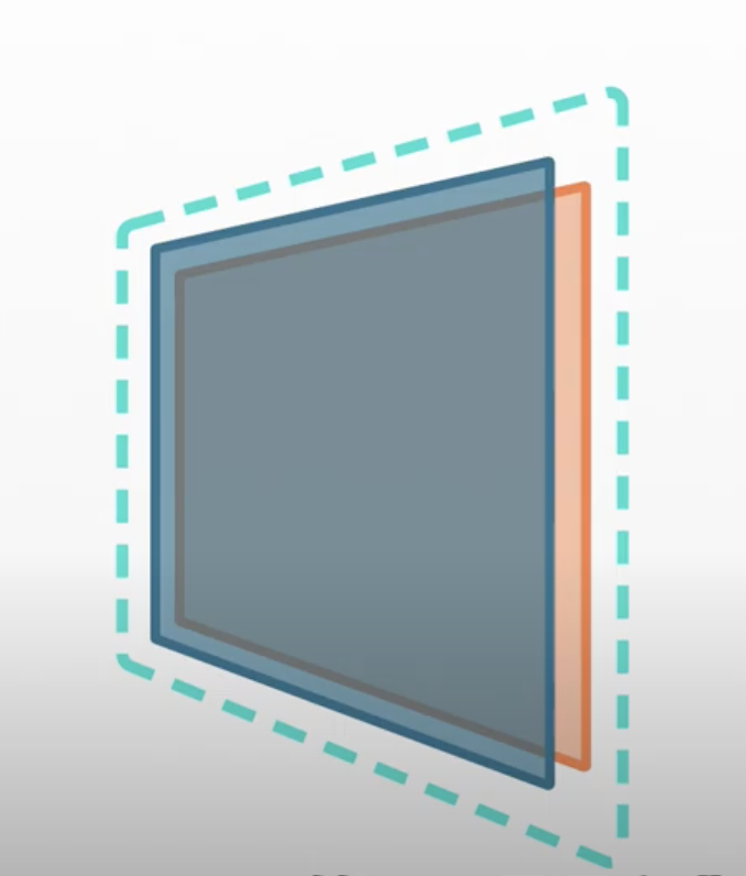
step 3-1
.container {
width: 300px;
height: 400px;
position: relative;
/*新增*/
perspective: 1000px;
/*立體透視深度,即是讓物件看起來有3D的感覺*/
/*而perspective的值我們可以想像成物件距離螢幕的距離,如果值越大代表越遠。*/
/*數值越小代表離螢幕越近,而越貼近則會有透視越強烈的感覺*/
/*-----*/
}
.front,
.back {
width: 100%;
height: 100%;
position: absolute;
/*新增*/
backface-visibility: hidden; /*html 元素背後不可看見*/
/*------*/
}
.front {
background-color: red;
/*新增*/
transform: rotateY(0deg);
/*-----*/
}
.back {
background-color: blue;
/*新增*/
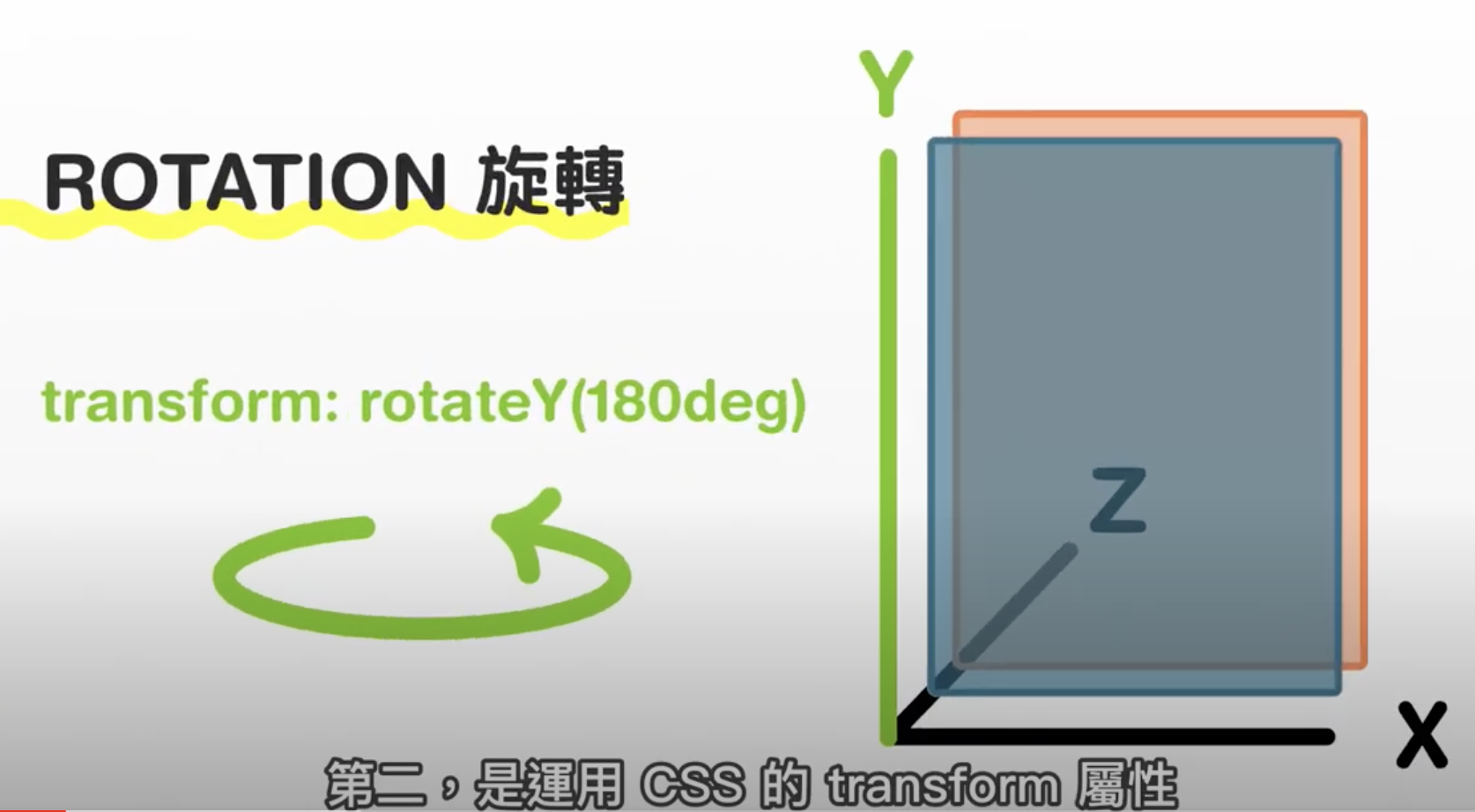
transform: rotateY(-180deg);/*設定-180deg即是將back翻到背面(背面看不到,因為設定了 backface-visibility: hidden;)*/
/*------*/
}step 3-2 rotate
step 3 做完長這樣
step 4 翻牌動畫
.front,
.back {
	width: 100%;
	height: 100%;
	position: absolute;
	backface-visibility: hidden; /*html 元素背後不可看見*/
	/*新增*/
	transition: .8s; /*動畫時間 0.8秒*/
	/*------*/
        }

.front {
	background-color: red;
	transform: rotateY(0deg);
        }

.back {
	background-color: blue;
	transform: rotateY(-180deg);/*設定-180deg即是將back翻到背面(背面看不到,因為設定了 backface-visibility: hidden;)*/
		}


.back {
	background-color: blue;
	transform: rotateY(-180deg);/*設定-180deg即是將back翻到背面(背面看不到,因為設定了 backface-visibility: hidden;)*/
        }


/*新增*/
.container:hover .front{
	transform: rotateY(180deg);/*當hover時,front從正面轉到背面*/
        }
.container:hover .back{
 	transform: rotateY(0deg);/*當hover時,back從背面轉到正面*/
        }
/*--------*/
完整css 程式碼
        body{
            height: 100vh;
            display: flex;
            justify-content: center;
            align-items: center;
           }
        .container{
            width: 300px;
            height: 400px;
            margin: auto;
            position: relative;
            perspective: 1000px; /*立體透視深度*/
        }
        .front,.back{
             width: 100%;
             height: 100%;
             position: absolute;
             backface-visibility: hidden; /*html 元素背後不可看見*/
             transition: .8s;
        }
        .front{
            transform: rotateY(0deg);
            background-color: red;

        }
        .back{
            background-color: blue;
            transform: rotateY(-180deg);

        }
        .container:hover .front{
            transform: rotateY(180deg);
        }
        .container:hover .back{
            transform: rotateY(0deg);
        }
完整
程式碼
<!DOCTYPE html>
<html class="no-js">
    <head>
        <meta charset="utf-8">
        <meta http-equiv="X-UA-Compatible" content="IE=edge">
        <title>flip card</title>
        <meta name="description" content="">
        <meta name="viewport" content="width=device-width, initial-scale=1">
    <style>
        body{
            height: 100vh; /*高度等於螢幕寬度*/
            /*垂直置中*/
            display: flex;
            justify-content: center;
            align-items: center;
        }
        .container{
            width: 300px;
            height: 400px;
            position: relative;
            perspective: 1000px; /*立體透視深度*/
        }
        .front,.back{
            width: 100%;
            height: 100%;
            position: absolute; /*絕對定位 使兩個div重疊*/
            backface-visibility: hidden; /*html 元素背後不可看見*/
            transition: .8s; /*動畫時間 0.8秒*/
        }
        .front{
            transform: rotateY(0deg);
            background-color: red;

        }
        .back{
            background-color: blue;
            transform: rotateY(-180deg);/*設定-180deg即是將back翻到背面(背面看不到,因為設定了 backface-visibility: hidden;)*/

        }
        .container:hover .front{
            transform: rotateY(180deg);/*當hover時,front從正面轉到背面*/
        }
        .container:hover .back{
            transform: rotateY(0deg);/*當hover時,back從背面轉到正面*/
        }
    </style>
    </head>

    <body>
        <div class="container">
            <div class="front">front</div>
            <div class="back">back</div>
        </div>
    </body>
</html>