Images for the Modern Web
Puzzle ITC Tech Kafi 15.03.2023
Mathis Hofer
Agenda
General
<img> srcset & sizes
<picture>
Control Loading Behavior
Next Generation (Web) Image Formats
Framework Support
General
A word about compat
Features shown are available in all evergreen browsers*
⚠️ *with a few exceptions ⚠️
Responsive Web Design
Ethan Marcotte, 2010
Fluid Layout
Flexible Images
Adaptive Design
Source: http://alistapart.com/article/responsive-web-design/
Constrain images
Default behavior:
Images will overflow (scrollbar)
Avoid overflowing with CSS:
<style>
  img {
    max-width: 100%;
    height: auto
  }
</style>
<img
  src="images/bikes-3000w.jpg"
  alt="Bikes in the rain"
/>
Other ways
aspect-ratio: 1/1;
aspect-ratio: 3/2;

object-fit: contain;
object-fit: cover;

object-position: top center;
Responsive Images
A method for providing the browser with multiple image sources depending on display density, size of the image element in the page, or any number of other factors.
In other words:
How to save thousands of Megabytes
of avoidable data on the wire!*
*especially favorable for mobile devices
But:
Use SVG if you can!
Scalable
Small*
Ideal for logos, icons, line graphics etc.
*use SVGO to optimize even more
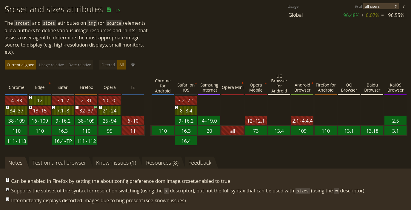
<img> srcset & sizes
srcset
Suggestion/hint to the browser what image to load
Density Descriptors
<img
  srcset="
    images/bikes-500w.jpg  1x,
    images/bikes-1000w.jpg 2x,
    images/bikes-1500w.jpg 3x
  "
  src="images/bikes-1000w.jpg"
  alt="Bikes in the rain"
/>
Device Pixel Ratio (DPR):
the ratio of the resolution in physical pixels to the resolution in CSS pixels for the current display device
Useful for fixed-sized images
Width Descriptors
<img
  srcset="
    images/bikes-500w.jpg   500w,
    images/bikes-1000w.jpg 1000w,
    images/bikes-2000w.jpg 2000w,
    images/bikes-3000w.jpg 3000w
  "
  src="images/bikes-2000w.jpg"
  alt="Bikes in the rain"
/>
Width = viewport width
No calc()
Browser considers DPR as well
Breakpoints
Choosing the right breakpoints is science:
https://cloudfour.com/thinks/responsive-images-101-part-9-image-breakpoints/
Sizes
<img
  srcset="
    images/bikes-500w.jpg   500w,
    images/bikes-1000w.jpg 1000w,
    images/bikes-2000w.jpg 2000w
  "
  sizes="
    (max-width: 500px) 100px,
    (max-width: 1000px) 500px
  "
  src="images/bikes-2000w.jpg"
  alt="Bikes in the rain"
/>
Media condition (< media query)
Width relative to viewport (no %)
calc() can be used
Only with width descriptors & without CSS
...but I am confused 🤔
⚠️ CSS? ⚠️
background-image: image-set(
  url("images/bikes-500w.jpg") 1x,
  url("images/bikes-1000w.jpg") 2x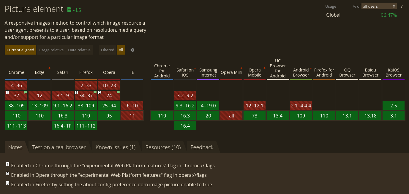
);<picture>
Multiple sources
Similar to <audio> & <video>
How to use?
<picture>
  <source
    media="(max-width: 500px)"
    srcset="images/bikes-500w.jpg"
  />
  <source
    media="(max-width: 1000px)"
    srcset="images/bikes-1000w.jpg"
  />
  <source
    media="(min-width: 2001px)"
    srcset="images/bikes-3000w.jpg"
  />
  <img
    src="images/bikes-2000w.jpg"
    alt="Bikes in the rain"
  />
</picture>
Source
<source
  media="(max-width: 500px)"
  srcset="images/bikes-500w.jpg"
>
media = Media query
First matching <source> is considered
(not a hint)
<img> as fallback
"Art Direction"
Use different variants of an image (maybe with different aspect ratios?) for different resolutions
For example:
Use wide-angle image on desktops,
use close-up portrait on mobiles
Provide multiple formats
<picture>
<source
type="image/avif"
srcset="images/bikes-2000w.avif"
/>
<source
type="image/webp"
srcset="images/bikes-2000w.webp"
/>
<img
src="images/bikes-2000w.jpg"
alt="Bikes in the rain"
/>
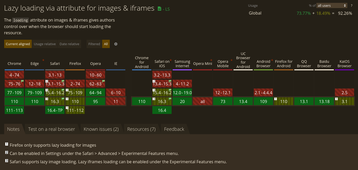
</picture>Control Loading Behavior
<img> Lazy Loading
  <img
    src="images/bikes-2000w.jpg"
    loading="lazy"
    alt="Bikes in the rain"
  >
Default value loading="eager"
loading="lazy" tells the user agent to hold off on loading the image until the browser estimates that it will be needed imminently.
⚠️ <img> Fetch Priority ⚠️
fetchpriority="high"
fetchpriority="low"
fetchpriority="auto" (default)
Loading priority relative to the other images
Chrome/Edge only
<img> Async Decoding
decoding="async"
decoding="sync"
decoding="auto" (default)
Allows you to control whether or not the browser is allowed to try to parallelize loading your image
⚠️ Save-Data ⚠️
Network client hint header
Manually activatable (Data Saver mode)
navigator.connection.saveData === true;
Blink-based browsers (Chrome, Edge, Opera)
⚠️ prefers-reduced-data ⚠️
<source media="(prefers-reduced-data: reduce)" ... />
Blink-based, behind flag
https://developer.mozilla.org/en-US/docs/Web/CSS/@media/prefers-reduced-data
Next Generation (Web) Image Formats
Most widely used today
Lossy:
JPEG
(30 years old)
Lossless:
PNG
(26 years old)
Next Generation Features
Lossy & Lossless
Image & Animation
Improved color depth
Improved compression (= smaller file size)
etc.
MDN Image Format Guide
APNG
Animated PNG
Lossless
Variety of color depths
Transparency
More performant than GIF
Works in all evergreen browsers
WEBP
Web Picture Format
Created by Google (10 years ago)
Lossy (based on VP8 video codec) & lossless
Images and animated images
Transparency
ICC profile support
25–35% smaller than JPEG
26% smaller than PNG
Works in all evergreen browsers
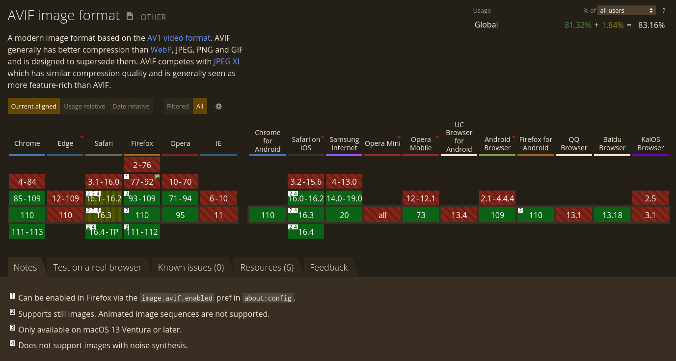
AVIF
AV1 Image File Format
Royalty-free standard
Alliance for Open Media
AV1 codec inside MP4/HEIF/MIAF container
AVIF Features
The next big thing
State-of-the-art features & performance:
Lossy & lossless
Images and animated images
Transparency
HDR
Wide Color Gamut, ICC profile support
50% smaller than JPEG
AVIF Browser Support
Browsers & tools support varies
Still images support in Chrome (2020), Firefox (2021), Opera (2020) & Safari (2022)
No Edge support
https://avif.io/blog/articles/avif-browser-support/
Supported on Cloudflare, Vimeo
AVIF Tooling
Gimp >= 2.10.22
Adobe Illustrator >= 26.3.1
Adobe Photoshop only via plugin yet?
Image Magick >= 7.0.25
https://squoosh.app/ (PWA)
AVIF Insights
Checkout the following talk by Jon Bauman for insights:
More exotic formats...
JPEG 2000
JPEG XR
HEIC
...that will never make it into the browsers?
Framework Support
Automate
Image resizing
Encoding to various formats
Rails Active Storage Variants
<%= image_tag user.avatar.variant(
  resize_to_limit: [100, 100],
  format: :jpeg,
  saver: {
    subsample_mode: "on",
    strip: true,
    interlace: true,
    quality: 80
  }) %>
next/image
@astro/image
What did I forget?
How is your experience?
Resources
Code examples:
https://github.com/hupf/techkafi-images
MDN Responsive Images Guide:
https://developer.mozilla.org/en-US/docs/Learn/HTML/Multimedia_and_embedding/Responsive_images
Responsive Images 101:
https://cloudfour.com/thinks/responsive-images-101-definitions/
Learn Responsive Design, Chapter 007 Responsive Images:
https://web.dev/learn/design/responsive-images/
AVIF: Creating a new image format in the open (Jon Bauman):
https://www.youtube.com/watch?v=BUkRlfkv2D8
This work is licensed under a
Creative Commons Attribution 4.0 International License.
