Persuasive map design
(Or: designing maps that sell)
Follow Along in Your Browser Here
https://goo.gl/YCeGVe
what?why?when?
what are persuasive maps & what makes
them different?
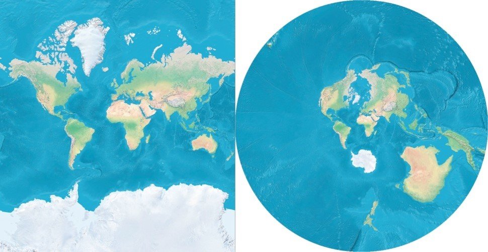
Biased maps
All maps are biased. Certain things are represented on the map, or omitted, due to cartographic decisions.
How things are represented
also changes.

persuasive maps
Maps created with the purpose of eliciting a particular interpretation or point of view from map readers.
why "persuasive" maps?

The Goal is to inform
Most often, this means you're trying to sell the information you're communicating to convince your audience
of something.
If you don't have a point, then
you're just mapping data.
When should you design persuasive maps?
nUMEROUS TIMES WHEN
IT'S APPROPRIATE
- When it's important people pay attention
- When you're trying to sell information
- Trying to make people care
- Trying to change people's opinions
group discussion
are there times or circumstances
in your work where designing
persuasive maps might be useful?
When and in what situations?
When shouldn't you design persuasive maps?
3 types of MAP USER
understanding
1) referential
2) explicit
3) implicit
REFERENTIAL
EXPLICIT
Disgustingly Explicit
IMPLICIT


NEVER UNDERESTIMATE
A MAP TITLE

Come up with a good title!
GROUP DISCUSSION
- Think of a map project you worked on that was hampered by only focusing on referential meaning in your design?
- How might your map have been designed more effectively to arouse implicit or explicit understanding?
- Come up with three things you might have changed about the map to enhance an implicit or explicit understanding?
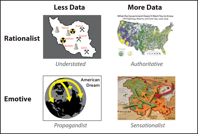
persuasive maps
a taxonomy

Handouts Available Here
https://goo.gl/Q9xB44
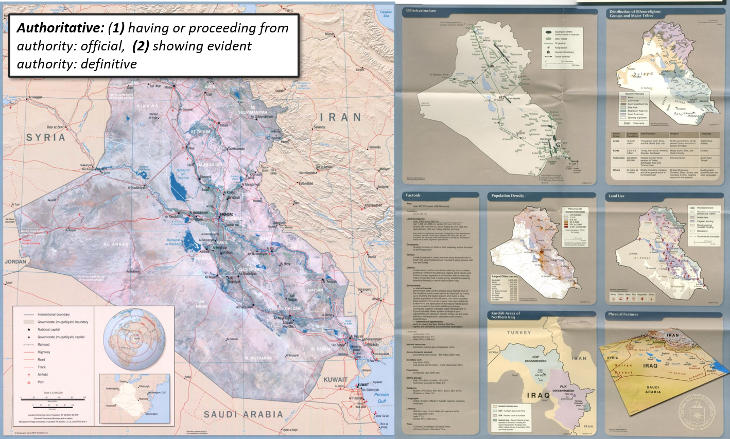
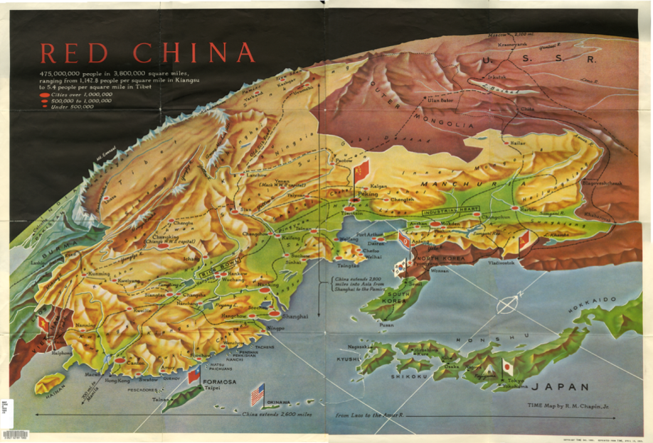
authoritative map characteristics
-
The maps you're taught to make in college
-
Data heavy, scientific in appearance
-
Largely referential in appearance
-
Lack of major contrast
-
USEFUL FOR DISGUISING AN IMPLICIT MEANING UNDER THE GUISE OF A REFERENTIAL ONE
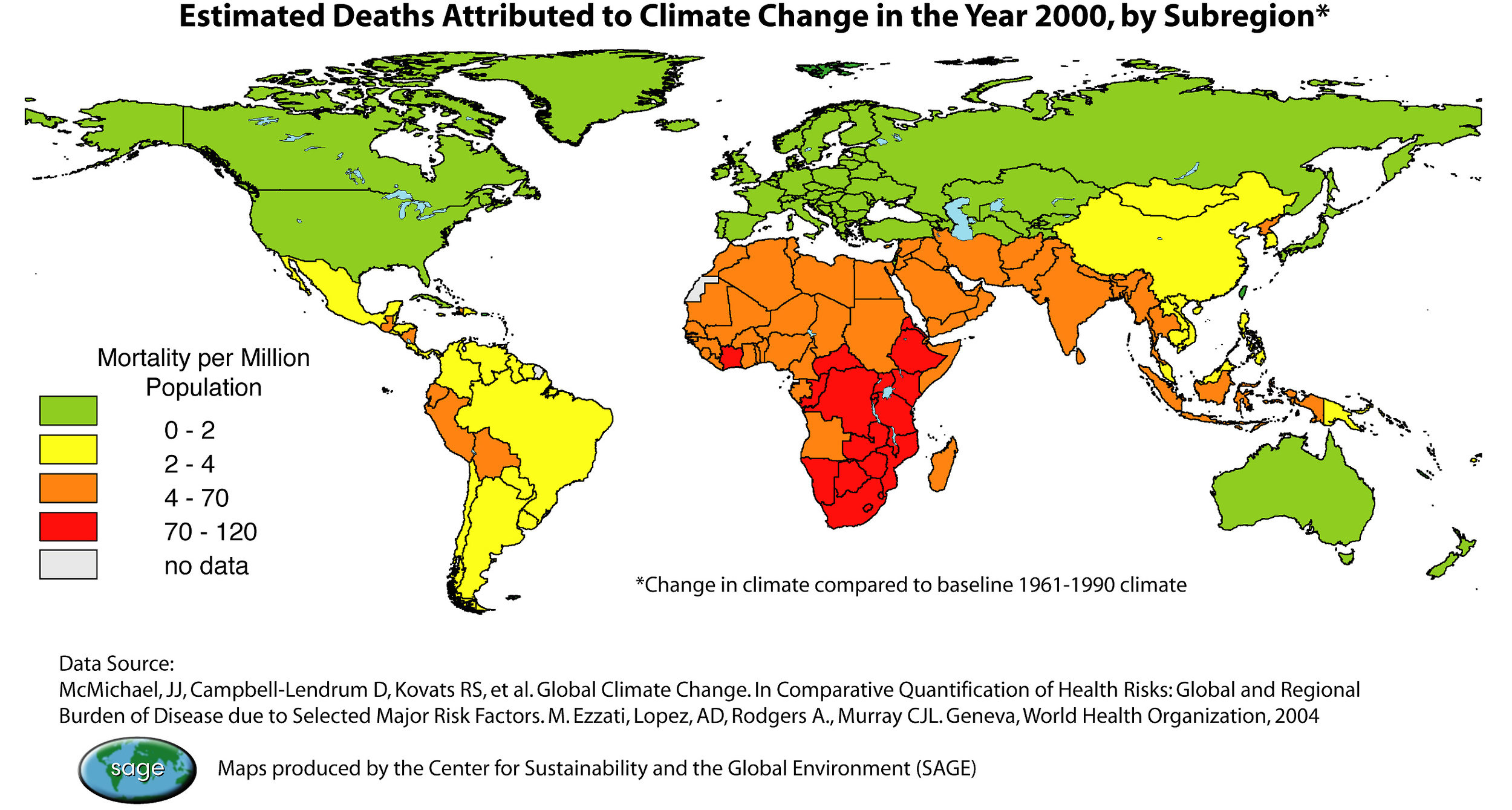
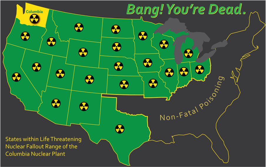
understated map characteristics
-
Frugal use of visual variables, map elements, and contrast
-
Rarely have illustrations
-
No multivariate symbolization
-
One theme per map
-
Often use choropleth representations
-
Simple base maps (little or no relief)
-
Geometric symbols
-
Static representation
-
Simplistic graphic/visual hierarchy
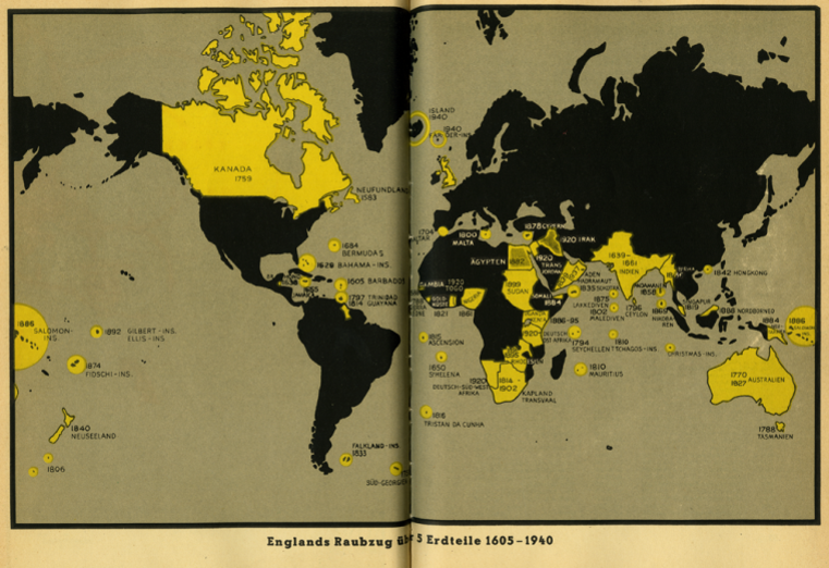
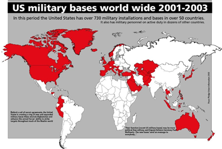
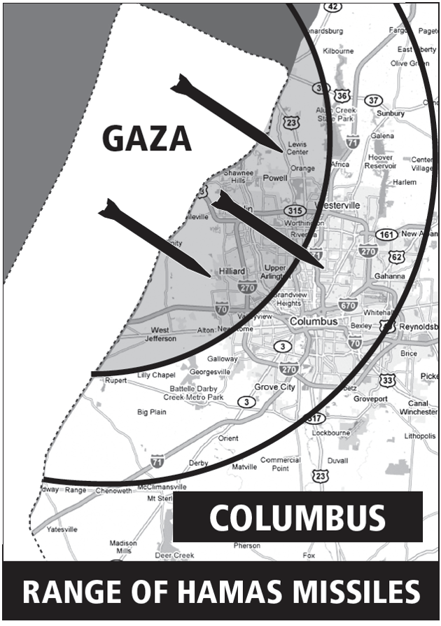
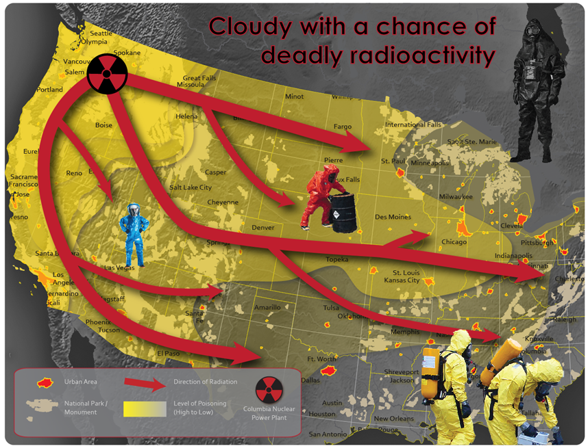
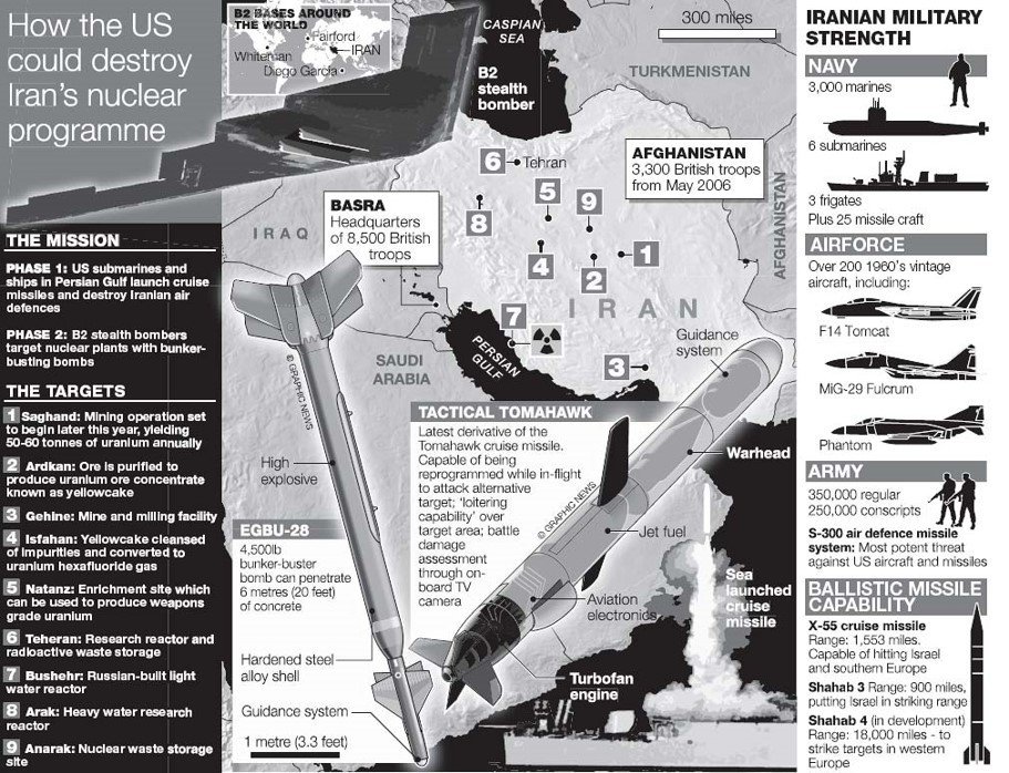
propagandist / in-your-face maps
-
Use appropriate embellishments
-
Often have high visual contrast
-
Often have dynamic symbolization
-
Rarely use illustrations
-
Only highlight one-to-two themes, rarely more
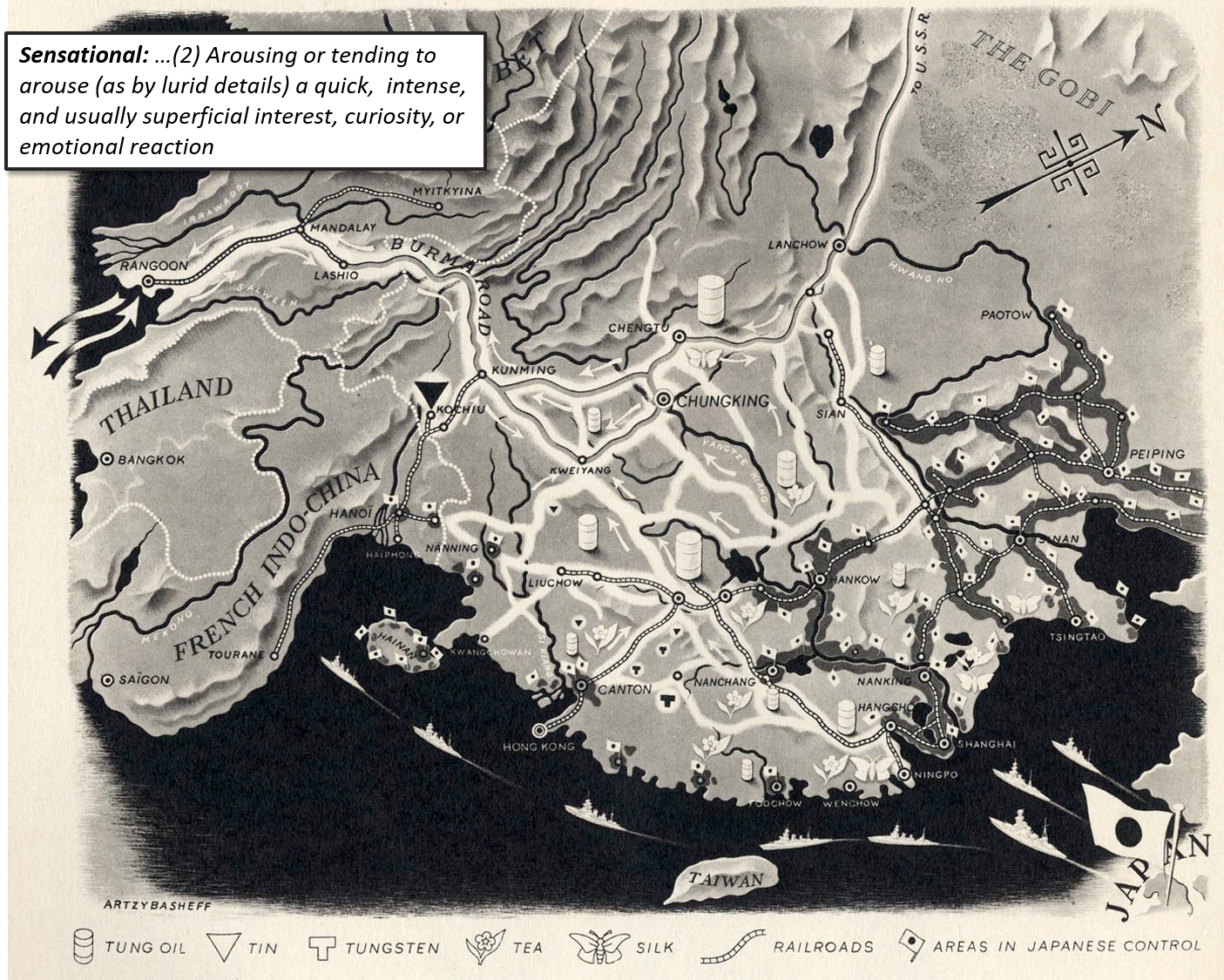
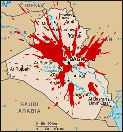
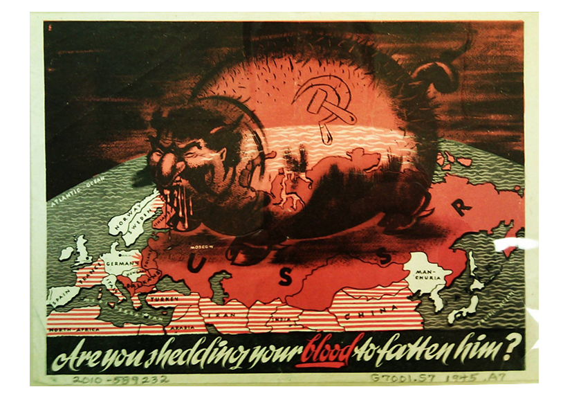
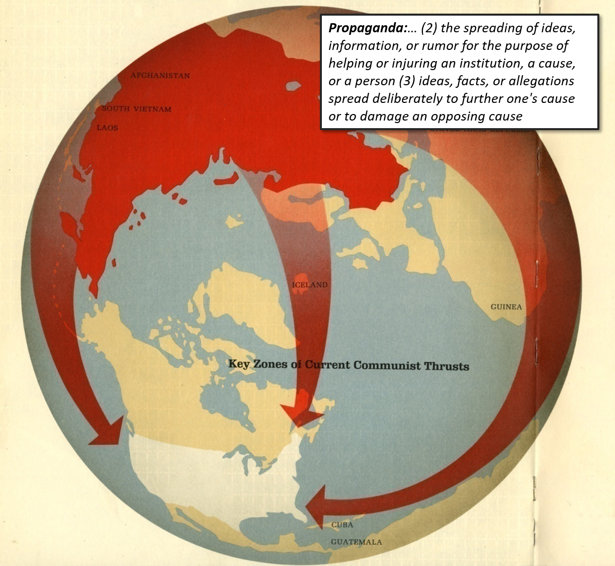
sensationalist map characteristics
-
Oblique perspectives and depth
-
Emotive iconography and symbolization
-
Dynamic representations (though not always a necessity)
-
Illustrations surrounding the mapped area or over the mapped area
-
Massive amounts of unnecessary but mood-setting data
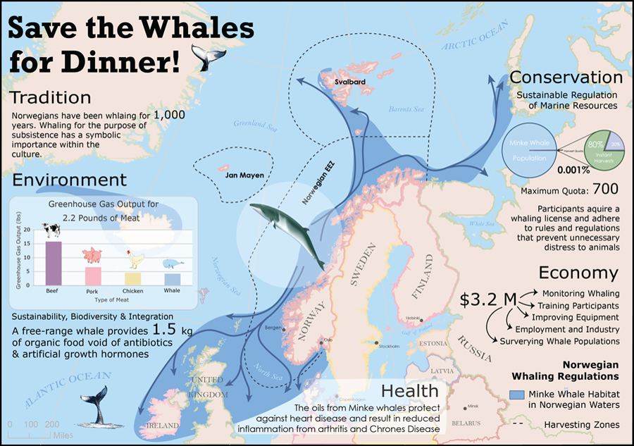
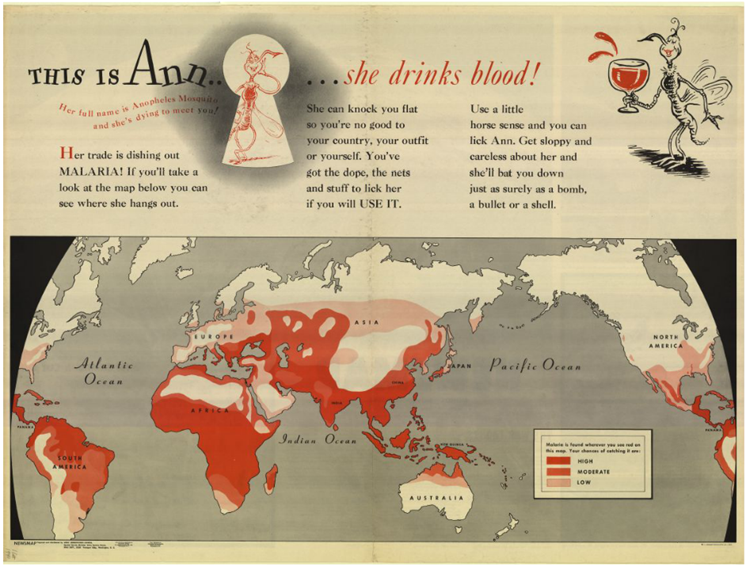
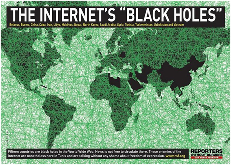
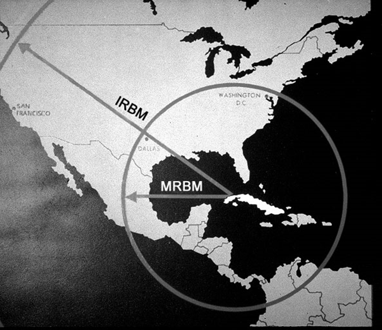
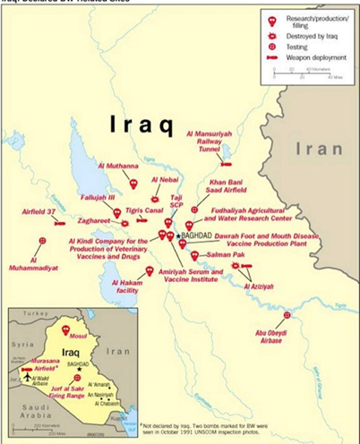
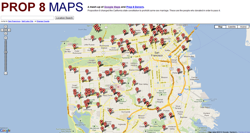
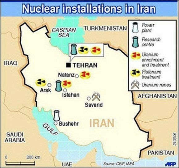
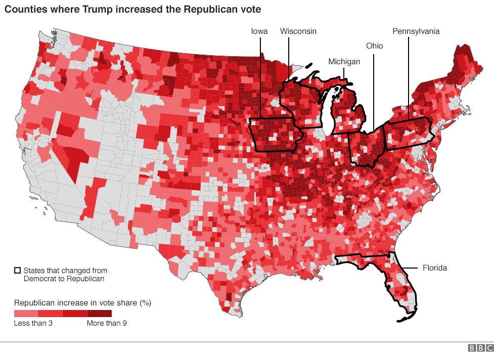
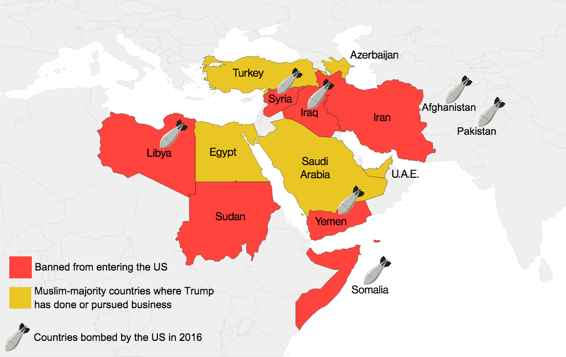
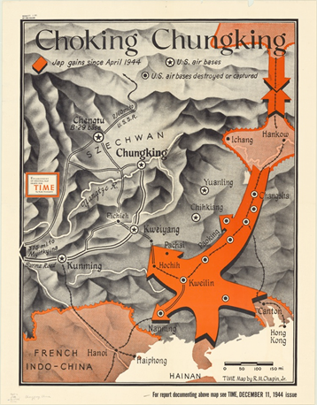
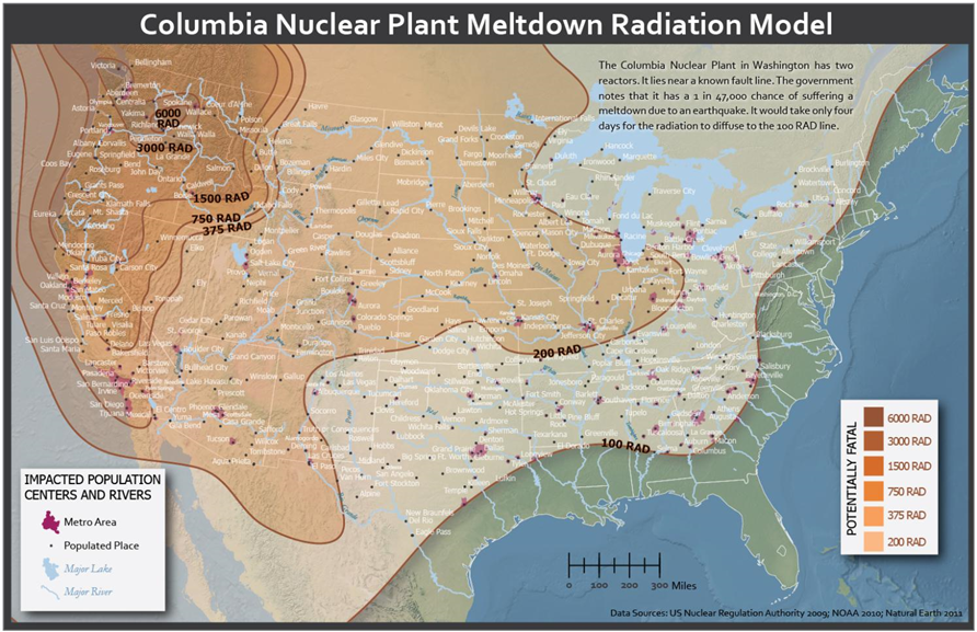
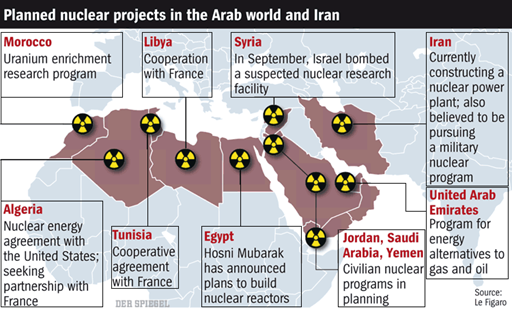
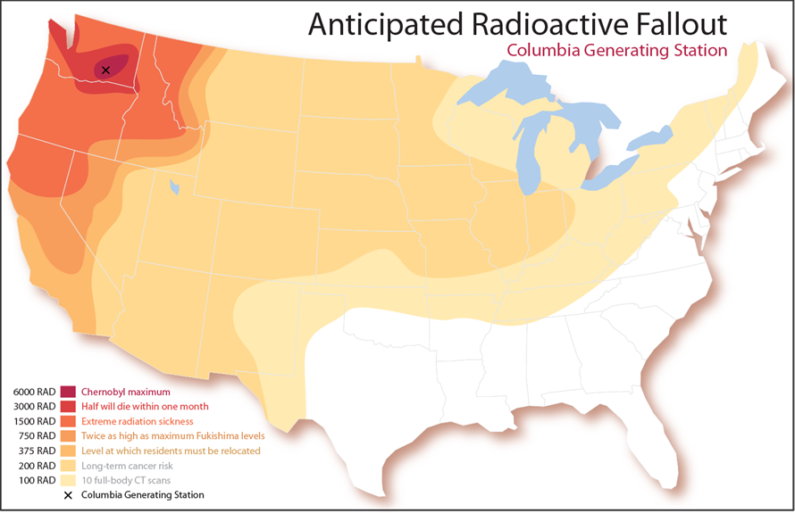
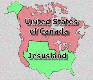
IMPLICIT
IMPLICIT
EXPLICIT
EXPLICIT
now the fun BEGINS!
Use the handouts here:
https://goo.gl/Q9xB44