Flexbox
Things you can do in flexbox
- align items (in a container)
- distribute space between/around items
- make contents flexible ("grow"/"shrink" them)
- lay elements out in either direction (horizontally or vertically)
- visual order of elements
Flexbox Properties
- flex-direction
- flex-wrap
- flex-flow
- justify-content
- align-items
- align-content
- order
- align-self
- flex-grow
- flex-shrink
- flex-basis
- flex
How To Flex
- container:
display: flex; - think of children of container as flex items
Main Axis vs. Cross Axis
Flex Lines
- single-line (no wrap)
- multi-line (wrap)
flex-direction: row | row-reverse | column | column-reverse
- sets the container's main axis
- demo
flex-wrap: nowrap | wrap | wrap-reverse
flex-flow
- shorthand for flex-direction and flex-wrap
- flex-flow: <flex-direction> <flex-wrap>
justify-content: flex-start | flex-end | center | space-between | space-around
- aligns flex items along main axis of container
- space-between: evenly distributes items in the line
- space-around: half-size spaces on either end of items, and equal spaces between each item
- demo
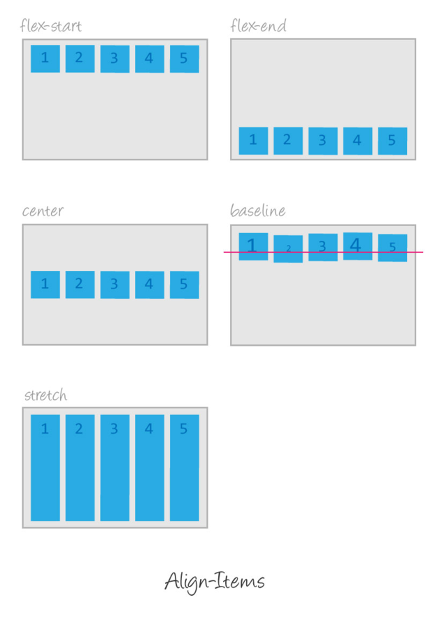
align-items: flex-start | flex-end | center | baseline | stretch
- instead of aligning items on main axis, aligns items on cross-axis
- baseline: aligns flex items across row by their baseline
- stretch: default
- demo
align-content: flex-start | flex-end | center | space-between | space-around | stretch
- only affects flex-items when has multiple lines
- aligns flex container's lines across cross-axis
- demo
order: <integer>
align-self: auto | flex-start | flex-end | center | baseline | stretch
- for overriding align-items property (individual items)
- demo
flex-grow: <positive number>
- setting proportions of items in flex container (how large the item is allowed to grow)
- demo
flex-shrink: <pos int>
- control the ratio by which elements are shrunk (when the item widths/heights of all items are larger than the container width/height)
flex-basis: auto | <width>
flex
- shorthand for flex-grow, flex-shrink, flex-basis
Problems solved (easily) with flex
- vertical centering
- "holy grail"
- sticky footers
LINKS
- http://jonibologna.com/flexbox-cheatsheet/
- http://www.sketchingwithcss.com/samplechapter/cheatsheet.html