Week 3 BootStrap
Installing
Boostrap
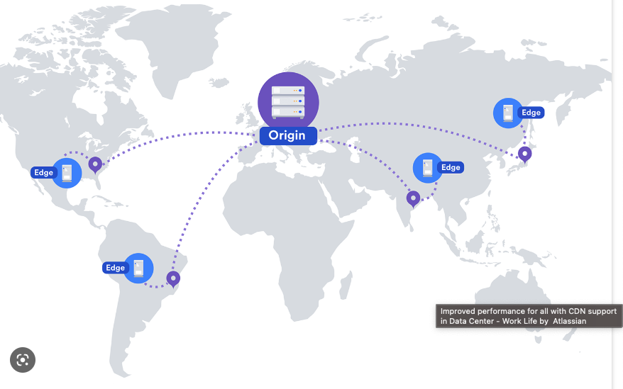
Using a Content Delivery Network (CDN)
A CDN (Content Delivery Network) is a network of servers located in multiple geographic locations that are used to serve and distribute content to users. The main purpose of a CDN is to provide fast and reliable access to the content, by copying the content to multiple servers and delivering the content from the server closest to the user, reducing latency and improving the user experience.
-
Faster load times: By serving content from a server closest to the user, CDNs significantly reduce the time it takes for the content to load, resulting in a better user experience and potentially higher user engagement.
-
Improved reliability and availability: If one server in the network encounters issues or fails, a CDN can seamlessly switch to another server, ensuring that the content remains available to users.
-
Reduced server load and bandwidth costs: CDNs help to distribute the load of serving content among multiple servers, reducing the load on the origin server. This can result in lower bandwidth costs and improved server performance.
-
Enhanced security: CDNs often include security features such as DDoS protection and secure content delivery using HTTPS
Linking Bootstrap using CDN
<!-- Latest compiled and minified CSS -->
<link rel="stylesheet" href="https://cdn.jsdelivr.net/npm/bootstrap@5.2.3/dist/css/bootstrap.min.css" integrity="sha384-IiVmCnJi3uqeJ9aWVdZrj/zN/JtLW9/Ck8VuNQxCn7VN/bzMw7VQ+H/6zfrm6mRU" crossorigin="anonymous">

<!-- Latest compiled JavaScript -->
<script src="https://cdn.jsdelivr.net/npm/bootstrap@5.2.3/dist/js/bootstrap.bundle.min.js" integrity="sha384-8tPv9zdKV0cxLjOwf1v0lKM/z1ef0hT55g8y3G9T2QDV/oP0aWgRv/s1TzLjTcN/G" crossorigin="anonymous"></script>
Cons: if the CDN is down, your website will not be able to access the necessary files to properly display the Bootstrap elements.
Linking Bootstrap using Node_Modules
npm install bootstrapBenefits: the main advantage is that you have the entire library locally, giving you more control over the version you are using and also enabling you to make custom modifications to the library.
Cons:the main disadvantage of using node_modules to include Bootstrap in your project is that it can increase the load time of your website. This is because the entire library must be downloaded and stored on the user's device before they can use your site.
<link rel="stylesheet" href="node_modules/bootstrap/dist/css/bootstrap.min.css">
Understanding
the Grid System
Layout with Bootstrap Grid
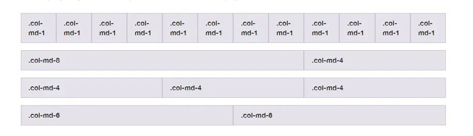
The Bootstrap grid system is a flexible and responsive layout system that is used to arrange content on a page. It is based on a 12-column grid that can be divided into equal or unequal widths to create complex and flexible layouts. The grid system is designed to be mobile-first, meaning that it prioritizes smaller screens and adjusts the layout for larger screens.
Why use the Bootstrap Grid System
The Bootstrap Grid System is designed to create responsive layouts by dividing the screen into rows and columns. This system provides a flexible and organized way to arrange content, ensuring it adapts to various screen sizes and devices. The grid system utilizes classes such as 'container', 'row', and 'col' to define the structure of the layout, making it easy to use and customize.
-
Responsive Columns: Example: col-4 col-sm-3 col-lg-2 These classes define column widths for different screen sizes, ensuring a flexible and adaptable layout.
Responsive Display: Example: d-none d-md-block These classes control the visibility of elements based on screen size, allowing for a tailored user experience.
Responsive Spacing: Example: me-xl-3 These classes adjust the margins and padding of elements depending on screen size, ensuring consistent spacing across devices.
Responsive Container: Example: container-md This class sets a max-width for the container based on the screen size, allowing content to adapt responsively within the container.
| Breakpoint | Class infix | Dimensions |
|---|---|---|
| X-Small | None | <576px |
| Small | sm | >576px |
| Large | lg | >992px |
| Extra large | xl | > 1200px |
| Extra extra large | xxl | >1400px |
- Responsive
containercreated. - A
rowdefined inside the container. - Two columns with classes
col-sm-6&col-lg-12:- Side by side on small screens.
- Stacked on large screens.
- Styled
boxinside each column.
Row class and its purpose
The .row class in Bootstrap is used to create a row within a container. It acts as a container for columns, allowing you to arrange your content into a grid-like layout. The .row class sets a negative left and right margin to create a gutter (space) between columns.
div class="container">
  <div class="row">
    <div class="col-sm">Column 1</div>
    <div class="col-sm">Column 2</div>
    <div class="col-sm">Column 3</div>
  </div>
</div>
<div class="flex-container">
  <div class="flex-item">Column 1</div>
  <div class="flex-item">Column 2</div>
  <div class="flex-item">Column 3</div>
</div>

.flex-container {
  display: flex;
  flex-wrap: wrap;
}

.flex-item {
  width: 33.33%;
}
Responsive Columns:
- Columns: col-4, col-sm-3, col-lg-2
- Numbers: represent column span (e.g., col-4 spans 4 columns)
- Breakpoints: "sm" and "lg" for small and large screens
- The layout adapts based on screen size

<div class="container">
  <div class="row">
    <div class="col">
      One of three columns
    </div>
    <div class="col">
      One of three columns
    </div>
    <div class="col">
      One of three columns
    </div>
  </div>
</div>
<div style="display: flex;">
<div style="flex: 1;">One of three columns</div>
<div style="flex: 1;">One of three columns</div>
<div style="flex: 1;">One of three columns</div>
</div>
Container class and its purpose
<div class="container">
  <div class="row">
    <div class="col-sm-4">Column 1</div>
    <div class="col-sm-4">Column 2</div>
    <div class="col-sm-4">Column 3</div>
  </div>
</div>
The container class in Bootstrap is used as a wrapper for the grid system. It helps to center the content horizontally on the page and also defines the maximum width of the grid.
This example uses the container class to wrap the row class which contains three col-sm-4 classes. This creates three columns, each taking up 4 of the 12 available grid columns.
Fluid Container Class
<div class="container-fluid">
  <header class="header">Header</header>
  <main class="main-content">Main Content</main>
  <footer class="footer">Footer</footer>
</div>
The .container-fluid class in Bootstrap is used to create a full-width container that spans the entire width of the viewport. This container has a width of 100%, which means that it adjusts its width based on the size of the screen or device it is being viewed on.
And here's an example of the equivalent using flexbox:
<div style="display: flex; flex-wrap: wrap; height: 100vh;">
  <header class="header" style="background-color: #ddd; width: 100%; padding: 10px; text-align: center;">Header</header>
  <main class="main-content" style="background-color: #fff; padding: 10px; flex: 1;">Main Content</main>
  <footer class="footer" style="background-color: #ddd; width: 100%; padding: 10px; text-align: center;">Footer</footer>
</div>
To create a column using the Bootstrap grid system, add a class col or col-* to a div element. The * represents the width of the column. For example, use the class col-6 to create a column spanning half the screen width, and col-12 for a column spanning the full width of the screen.