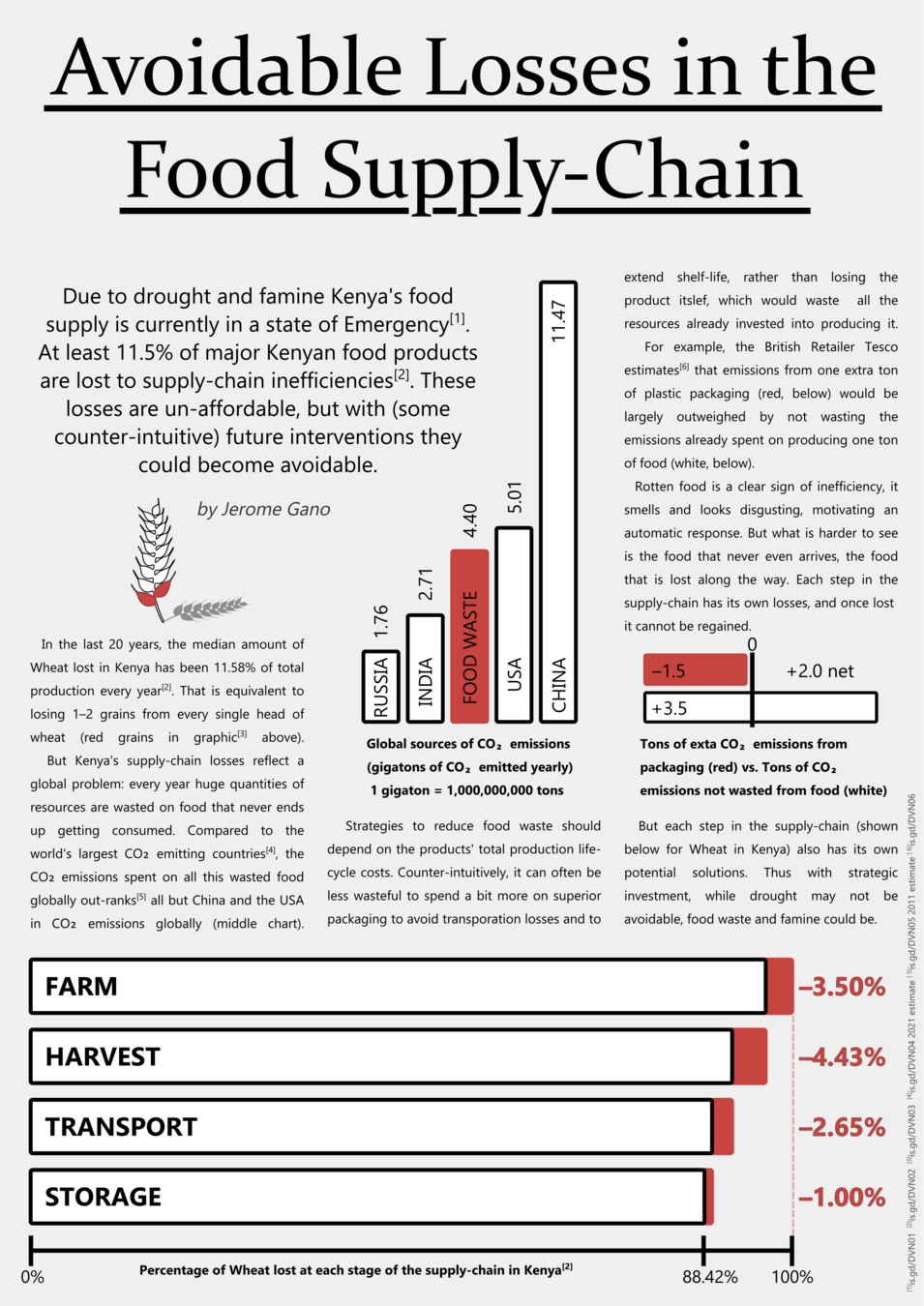
Avoidable Losses in the Food Supply-Chain
HSLU MscIDS DVN 2022.12.23
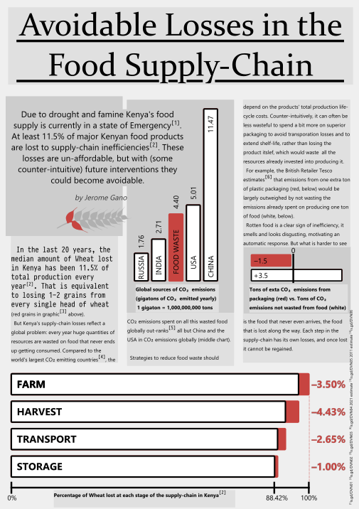
by Jerome Gano
Lots of Variables
-
Region (Africa vs. Europe)
-
Product (Wheat vs. Fruit)
-
Stage (Farm vs. Transport)
-
Context (Stable vs. Drought)
-
Quality (Survey vs. Modelling)
Food Waste Is Complicated

-
Wants: Clarity
-
Likes: Counter-Intuitive Concepts
-
Reads: The Economist, The Financial Times
-
Needs: Global Context, Specific Examples
Target Audience: Logistics Experts

Design:
Data Choices
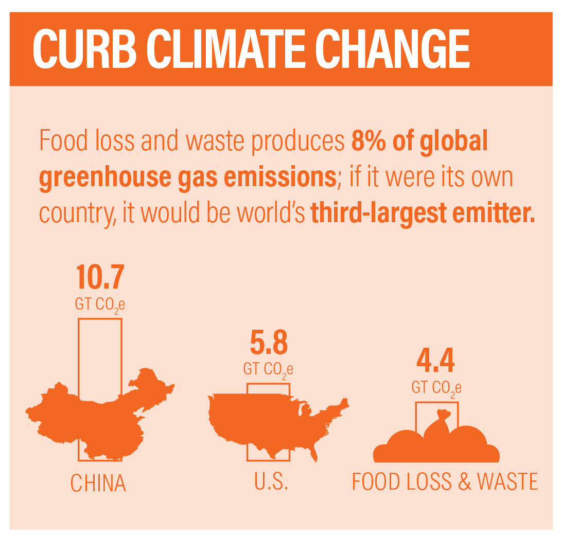
https://champions123.org/publication/why-reduce-food-loss-and-waste
Design:
Style Choices

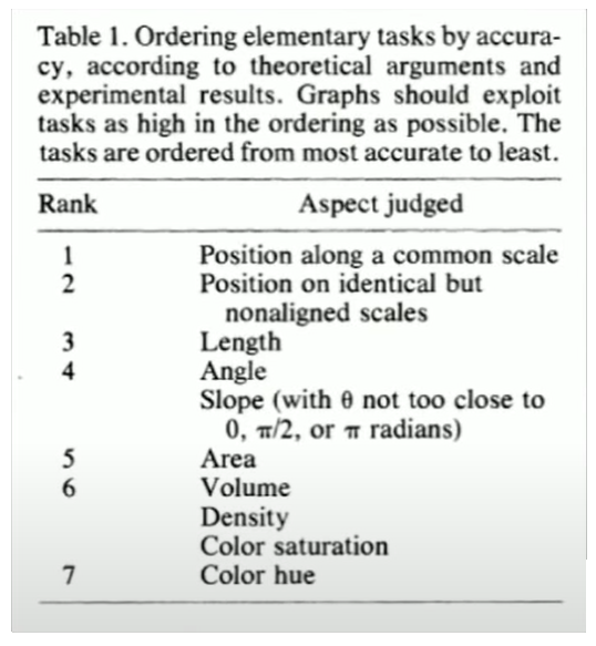
"Graphical perception and graphical methods for analyzing scientific data." Clevland (1985)
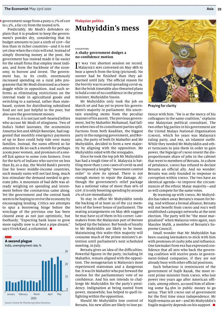
The Economist
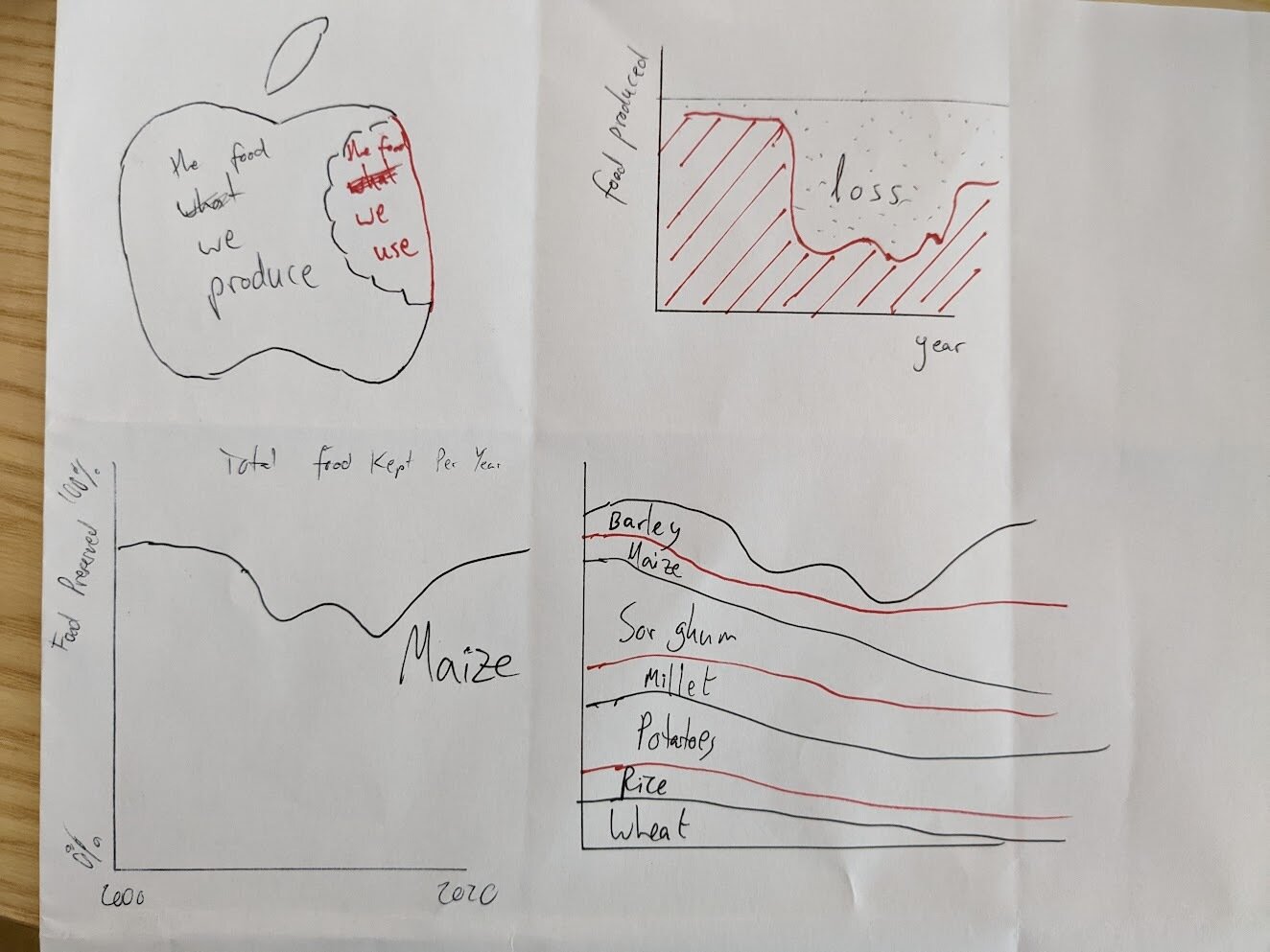
Iterations:
Selecting Time & Products
Iterations:
Negative Space Bar Chart

Iterations: Layout & Sequence
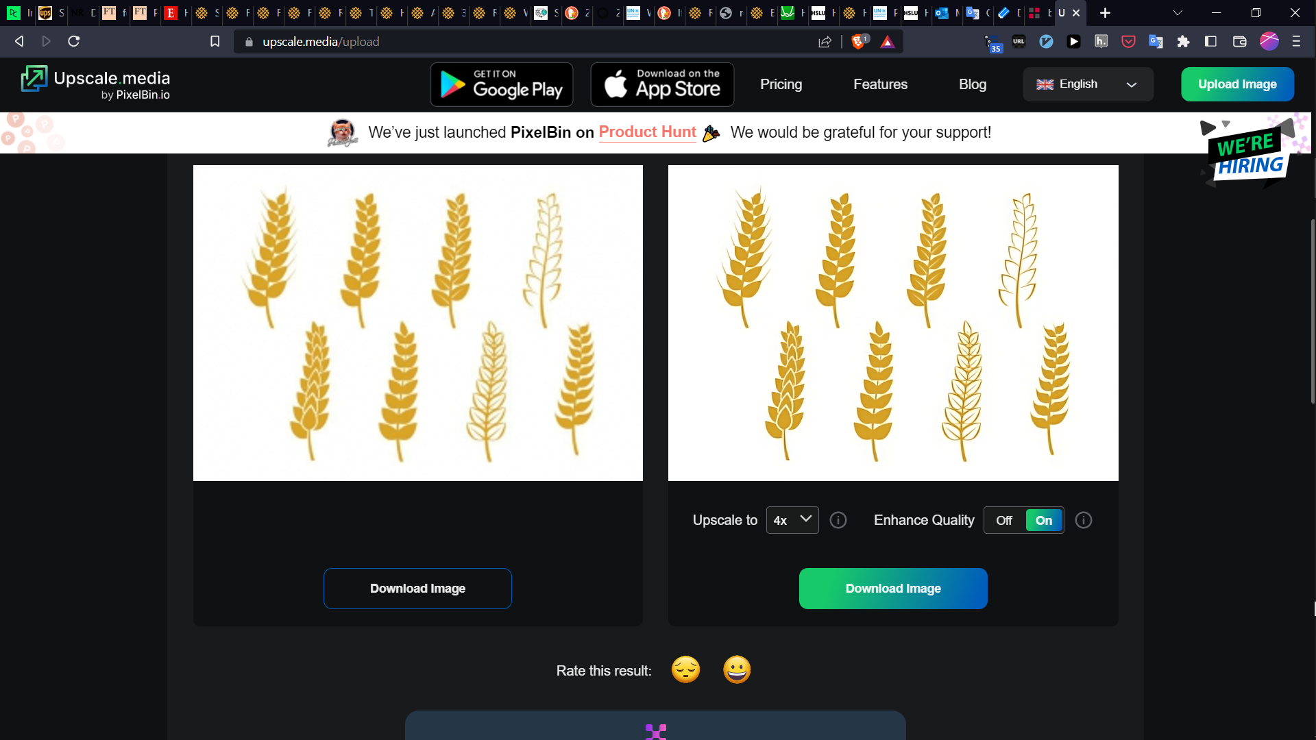

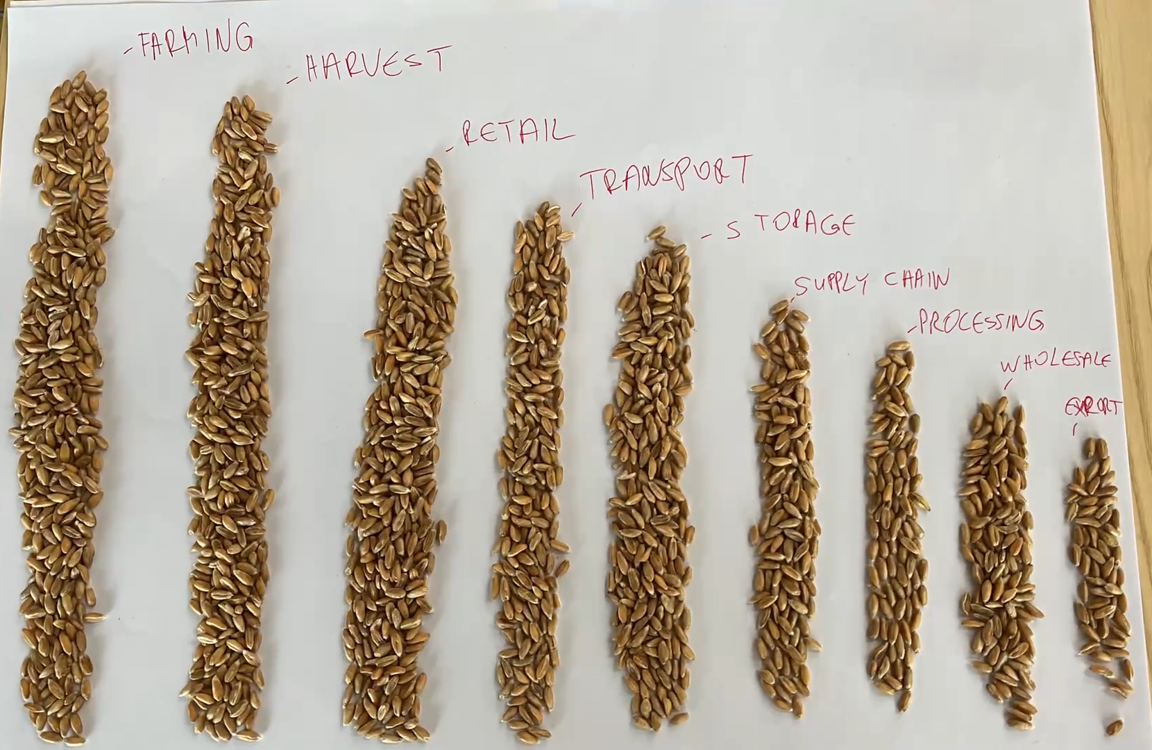
Iterations: Wheat Graphic
Final Product
Satisfying the
Design Goals
-
"Presentation & graphics looks good."
-
"I like that you approach the loss concept from a few angles."
-
"Nice visuals."
-
"If you're going to solve waste, you've got to see where it happens."
Target Audience:
Feedback
-
Data Quality is Essential
-
Work Backwards from the Format Constraints (e.g. magazine print)
-
Balance Visual and Written Narrative Flow
-
Get User Feedback Often
Conclusion & Lessons Learned
Article
-
is.gd/DVN01
-
is.gd/DVN02
-
is.gd/DVN03
-
is.gd/DVN04
-
is.gd/DVN05
-
is.gd/DVN06
References
Design: Style Choices
-
"The Economist: Middle East North Africa Edition" May 23 2019
-
Cleveland WS, McGill R. Graphical perception and graphical methods for analyzing scientific data. Science. 1985;229(4716):828-833. doi:10.1126/science.229.4716.828
-
John Rauser, How Humans See Data, https://www.youtube.com/watch?v=fSgEeI2Xpdc