
Before we start
http://bit.ly/DataViz_WWCS2020
structure
- Why data visualization?
- Basic rules
- Theory
- Appropriate visualizations
- How to make better graphs
disclaimer
My opinions
1. Why do we visualize data
EFFICIENCY
Clarify and focus your message


Pirate Peel, Delvenne & Lambiotte (2018). Multiscale mixing patterns in networks. PNAS.
n = 40 m = 160 (40 B-B, 40 O-O, 80 B-O)
E(x) = 54 E(y) = 48 std(x) = 8 std(y) = 27 corr(X,Y) = -6%
EFFICIENCY
Explore your data

self-promotion

2. three basic rules
Rule #1: WHAT IS THE POINT?

Message: Female survive more
Message: Males in first class do fairly well

Example: Titanic dataset


Rule #2: WHAT IS your audience?
Academic
General public

https://medium.economist.com/mistakes-weve-drawn-a-few-8cdd8a42d368
Rule #3: digital vs printed?
Use beautiful colors
printed
Use colors that convert to grayscale
digital

Presentation? Careful with the contrast
datawrapper.de
Python (matplotlib + seaborn)
In any case:
Use vector graphics!!!
Make plots interactive


Vector
PDF/EPS/SVG
Bitmap
Screenshots/PNG/JPEG
3. theory

channels

not all channels are equal


because humans are biased
Step 1: Determine your point and your audience
Step 2: Map the most important variable(s) to length
Step 3: Use color only if necessary
MID-summary
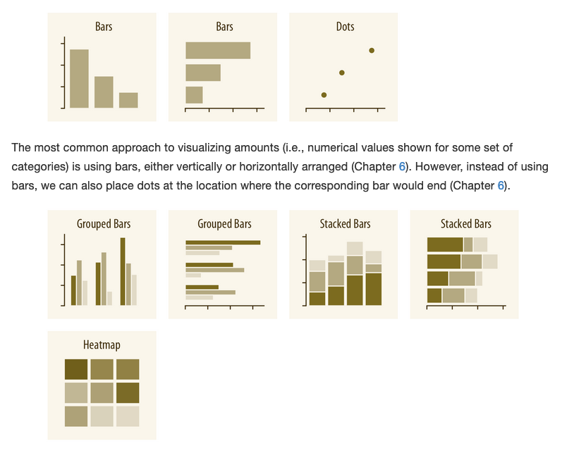
4. summary of visualizations


Correlation plots
Differences within row
Required with log-scales
Proportions over x
amounts and proportions
...what about pie charts?


- Allow to compare the number to the total easily
- People understand them
--> Useful for reports, not so much in papers

https://www.knowablemagazine.org/article/mind/2019/science-data-visualization
distributions
Too many points?
Time series?
relationships

Do you actually need a map?
Color is key here (more on this later). No rainbows! No diverging scales for amounts starting at 0!
Combine with a barplot or bubbles if the sizes are highly unequal
geographical data
Different ways to visualize networks
networks

Faskowitz et al(2018). Weighted stochastic block models of the human connectome across the life span. Scientific reports


Do you actually need a network?
networks
Face it, you don't need to show your hairball.
Sometimes you can visualize it:
- Small networks when humans can understand (karate club, medici)
- Convince the reader about a point that you want to make
- Art


5. eight ways to make better graphs
- Enlarge the labels, almost always too small
- Use vector graphics (pdf/eps) to avoid blurry and large figures
- Eliminate unnecesary lines (all frames, use gray grid lines, etc)
- Create the Figure with the right size
- Make sure you align subplots
- Don't use a gray background
1) keep it clean


https://serialmentor.com/dataviz/avoid-line-drawings.html
Grid lines that run perpendicular to the key variable of interest tend to be the most useful.


2) don't use 3D


3) use color when needed
- Don't use defaults, they are ugly.
-
Three uses of colors: Represent values, categories or highlight
- Represent values: Only if strictly needed
- Represent categories: Make gray as many as you can and highlight the most relevant one
-
Three type of color palettes:
- Sequential: Use when the min is important
- Diverging: When the mean is important and will be read in color
- Qualitative
- Try to be color-blind friendly. Don't use a green to red palette!
- Don't use rainbows.
- Choosing a palette: https://matplotlib.org/tutorials/colors/colormaps.html?highlight=palette


...represent amounts
The real value is not important
Don't use more than 4 lines
Unless you gray most and highlight 1-2


...defaults

Real examples


3B) be consistent
Colors consistent across figures
Same type of figures in the paper
4) use an appropriate type
- Use length to reflect the most important variable(s)
- One numerical variable --> barplot or histogram
- Two numerical variables --> scatter plot
- Three numerical variables --> scatter plot + bubbles
- Use color for categorical variables (ideally most of them gray + one highlighted)


Me 2013
Me 2016
Me 2020
- Take the frame out of the legend
- Make the axis less thick
- Add horizontal grid lines
- Use gray and a more muted blue
- ...

5) eliminate redundant information
- Bubbles and y axis measuring the same
- Blurry and small labels
- WTF colors and gray background
- It's a a paper about IT, the "J" sector should be highlighted
6) show the context


- The axis should reflect the range of the data (doesn't have to cross zero!)
- Don't do double scale, unless you actually want to show there is an association
- Don't break bars. Use dots and log-scale as an alternative.
7) use tidy data from day 1


sns.catplot(x="GDP_PC",data=df,kind="...")


box
violin
boxen
swarm
strip
sns.catplot(x="City",y="GDP_PC",
data=df,kind="strip",color="gray")
8) combine several types

- Get ideas from the papers you read

Try to guide the audience
some random thoughts


Horizontal bar plots usually look better

Prototype and ask for feedback
Always: Use tidy data.
Step 1: Determine your point and your audience.
Step 2: Choose an appropriate visualization:
- Map the most important variable(s) to length
- Use color to highlight, refrain from using it to show amounts
- Show the context and guide the audience
Step 3: Prototype different visualizations and ask for feedback.
Step 4: Remove all unnecessary components, make sure fonts are large enough and subplots are aligned.
Step 5: Save the figure as PDF (or EPS).
Step 6: Do minor edits in Inkscape or Illustrator.
summary
Spend time, it is worth it
Resources
https://serialmentor.com/dataviz/
https://medium.economist.com/mistakes-weve-drawn-a-few-8cdd8a42d368
https://www.pnas.org/content/116/6/1857
https://larremorelab.github.io/assets/pdf/workshop_DataVisualization.pdf
https://slides.com/maartenzam/databeers#/
https://www.knowablemagazine.org/article/mind/2019/science-data-visualization
https://davidmathlogic.com/colorblind/#%23D81B60-%231E88E5-%23FFC107-%23004D40

Leão, J. C., Brandão, M. A., de Melo, P. O. V., & Laender, A. H. (2018). Who is really in my social circle?. Journal of Internet Services and Applications, 9(1), 20.