CSS :yes !important;

Cascading Style Sheets
The key to understanding CSS is the term cascading.

<div class="waterfall first-level">
    <div class="second-level">This is rad!</div>
    <ul>
        <li>
            <span>Home</span>
        </li>
        <li>
            <span>About</span>
        </li>
        <li>
            <span>FAQ</span>
        </li>
    </ul>
</div>
It's like a waterfall in that it cascades from the top down.
Cascading Style Sheets
<html>
    <body>
        <div class="waterfall first-level">
            <div id="main-title">
                <span>This is rad!</span>
            </div>
            <ul>
                <li>
                    <span>Home</span>
                </li>
                <li>
                    <span>About</span>
                </li>
                <li>
                    <span>FAQ</span>
                </li>
            </ul>
        </div>
    </body>
</html>
body{
    font-size: 12px;
}

div{
   border: solid 1px #fff;
}

#main-title{
    border: solid 2px #bebebe;
}

span{
    font-size: 14px;
}

.waterfall ul > li span{
    font-size: 10px;
}
Can you spot the cascade?
Cascading Style Sheets
Specificity...yes it's a word.
It basically means which rule takes precedence when more than 1 rule matches a given element.
The following rules apply from most specific (higher precedence) to least specific (lowest precedence)
- Style on HTML element Ex. <div style="...">
- ID Ex. #someid
- Class Ex. .some-class
- Tag Ex. div
The MOST specific matching rule will be applied.
Cascading Style Sheets
Specificity holds true always....except when it's:
!important
div{
    color: pink !important;
}

div#blue{
    color: blue; <-- doesn't matter, not important
}
Cascading Style Sheets
:pseudo selectors
a{
    color: black;
}

a:hover{
    color: pink;
}

ul:first-child{
    color: blue;
}
Pseudo selectors are styles that are applied to elements with a certain state or relation
They allow us to bring life to our dynamic applications as we interact with them and UI changes.
Past, Present, Future
CSS2 has support across most browsers that you should care about.
CSS3 is largely supported by most modern browsers but certain styles may differ with support.
CSS4 is very recently starting to creep into the latest releases of modern browsers and include mostly new pseudo selectors.
NOTE: Standard support among all browsers and versions has been a problem for years.
Browser Support
Browser Support: Always check and use appropriately.
Vendor prefixes came about as certain browsers started implementing support before others so that developers could target their browsers while offering fallbacks for other browsers.
-webkit-transition: all 4s ease; //Android and chrome
-moz-transition: all 4s ease; //Firefox
-ms-transition: all 4s ease; //Internet Explorer
-o-transition: all 4s ease; //Opera
transition: all 4s ease; //Standard Architecture
CSS is relatively easy to understand but can grow unwieldy and unmanageable over time.
CSS can be learned in a day, but mastered over years.
The CSS Bible:
For years, we had hacks, semi best practices and new frameworks but no true consistency.
querySelector()
The querySelector() method returns the first element that matches a specified CSS selector(s) in the document.
querySelectorAll()
Returns a non-live NodeList of all elements descended from the element on which it is invoked that match the specified group of CSS selectors.
//This example returns a list of all the p elements in the HTML document body:
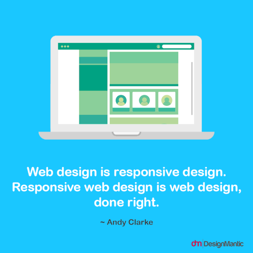
var matches = document.body.querySelectorAll('p');Responsive Design
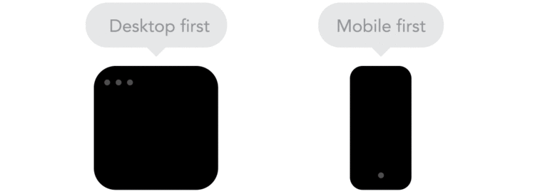
Mobile First
- Designing a web app for small screen's first, then designing for larger screen sizes.
- Adds extra limitations and helps you make decisions if you start with mobile first.
Okay, so responsive design in important
How do I start?
Media Queries
A media query consists of a media type and at least one expression that limits the style sheets' scope by using media features, such as width, height, and color.
Media queries let the presentation of content be tailored to a specific range of output devices without having to change the content itself.
Media Queries
The @media rule is used to define different style rules for different media types/devices.
// A media query consists of a media type and one
// or more expressions, involving media features,
// which resolve to either true or false.

@media screen and (min-width: 480px) {
    body {
        background-color: lightgreen;
    }
}
Media Queries
If you want to link to a separate stylesheet, put the following line of code in between the <head> tag.
<link rel="stylesheet" media="screen and (max-width: 600px)" href="small.css" />