Intro to CSS Animation Class with Joni Bologna
Hi again.
Bouncing Dot
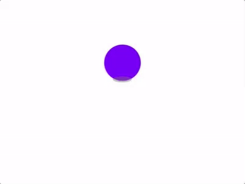
Demo HTML/CSS Review
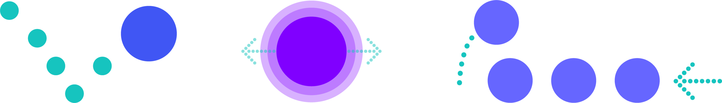
One div per shape
Different styling applied to each
Two separate animations
Two separate animation assignments
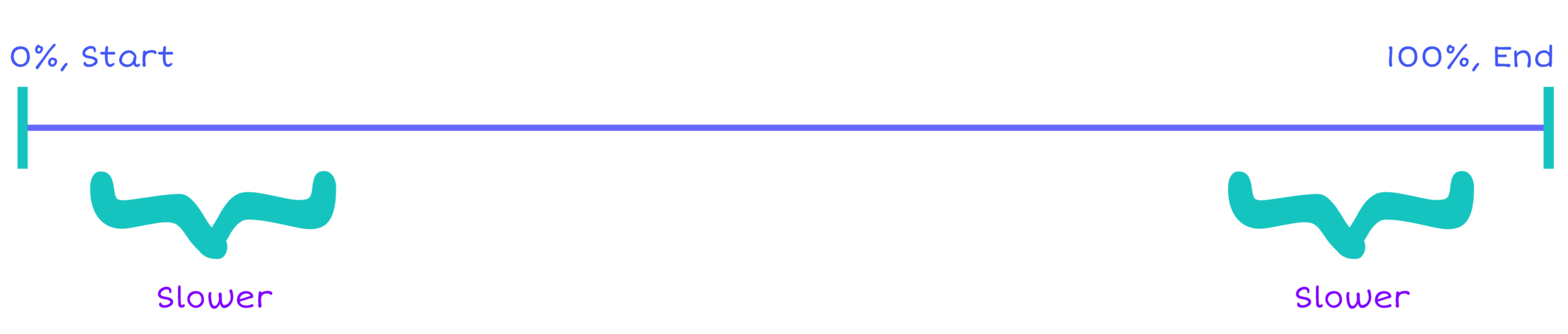
Planning Movements
Animation Timeline
1
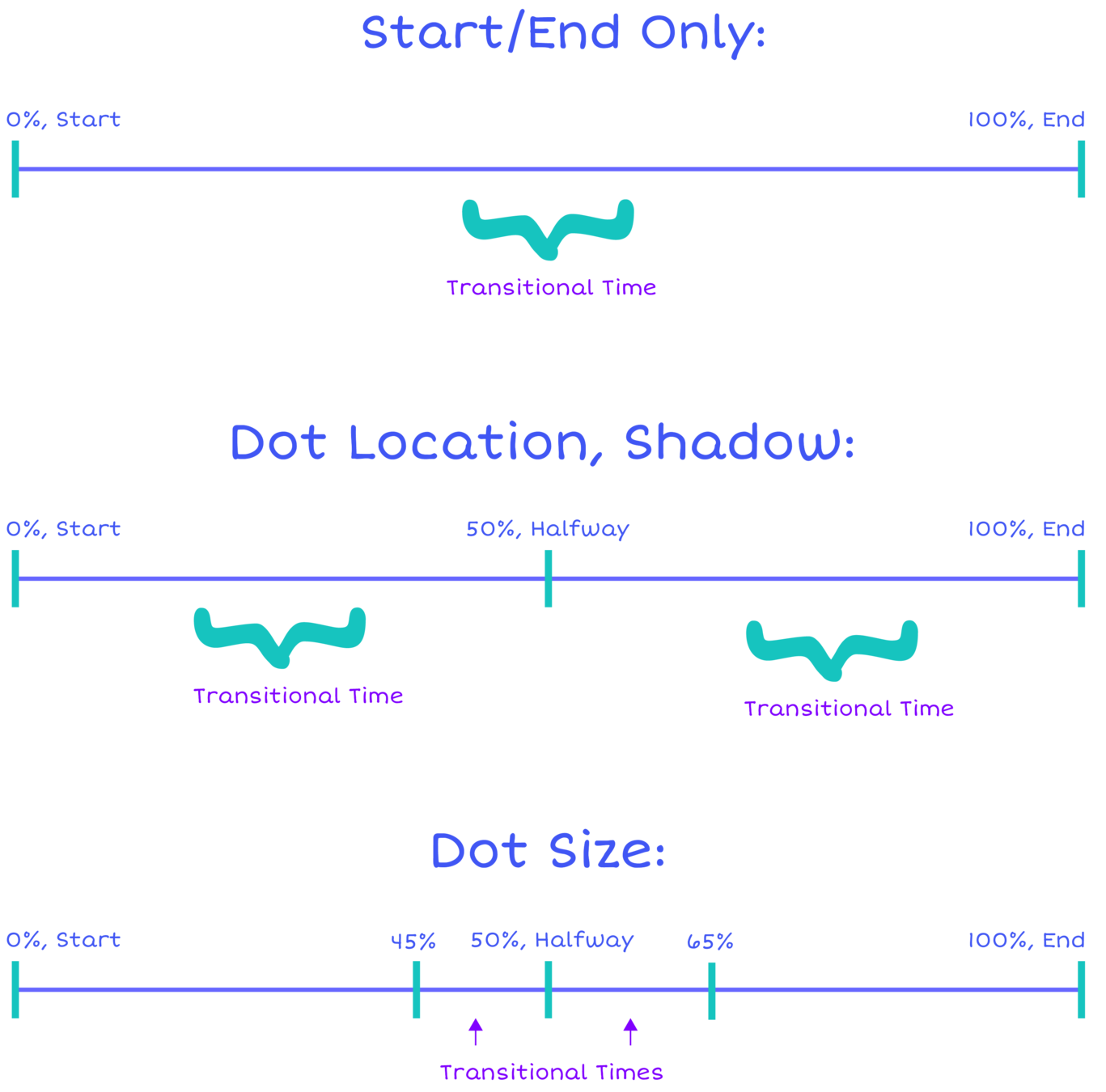
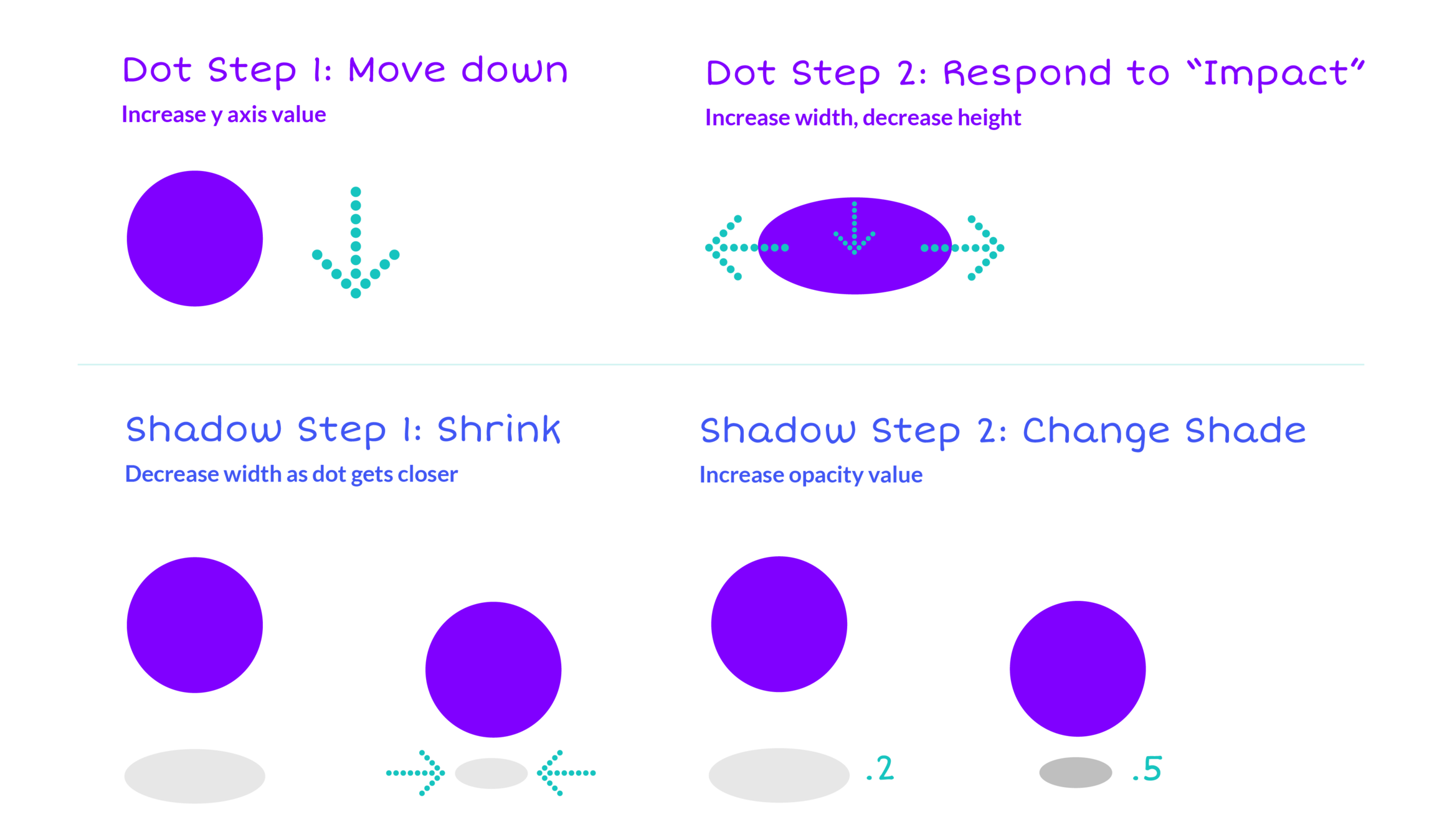
Setting Moments in CSS
@keyframes bounce {
  45% {
    /* Same original width, height */
  }
  50% {
    /* New styles */
  }
  65% {
    /* Same original width, height */
  }
}

@keyframes shadow-thing {
  50% {
    /* New styles */
  }
}
2
Animation Styling: Dot
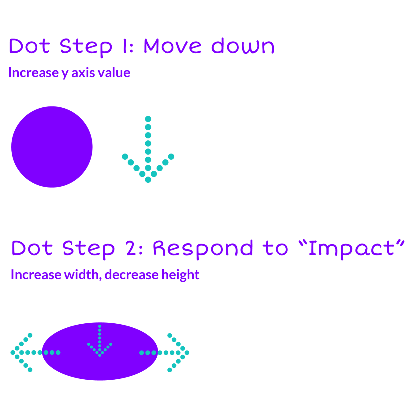
Step 1: Move Down

@keyframes bounce {
45% {
}
50% {
transform: translateY(45px);
}
65% {
}
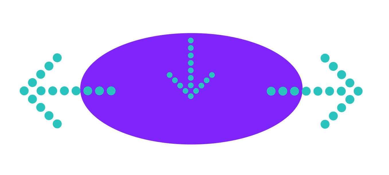
}Step 2: Make Oval
@keyframes bounce {
  45% {
    width: 60px;
    height: 60px;
  }
  50% {
    transform: translateY(45px);
    width: 80px;
    height: 40px;
  }
  65% {
    width: 60px;
    height: 60px;
  }
}
Animation Styling: Shadow
3
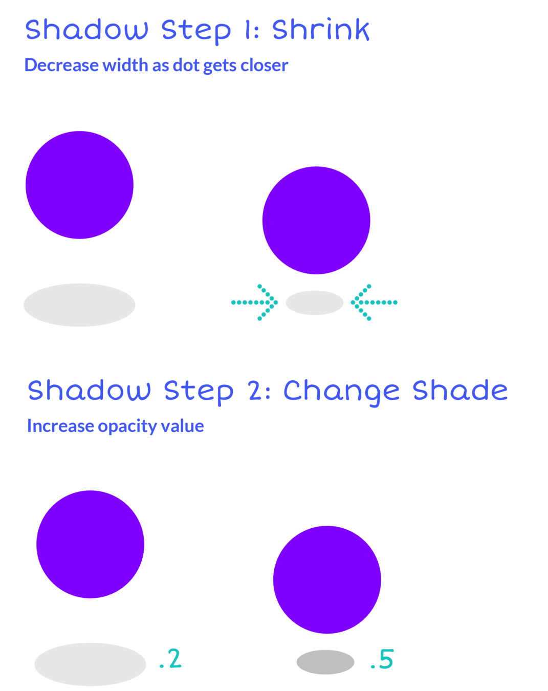
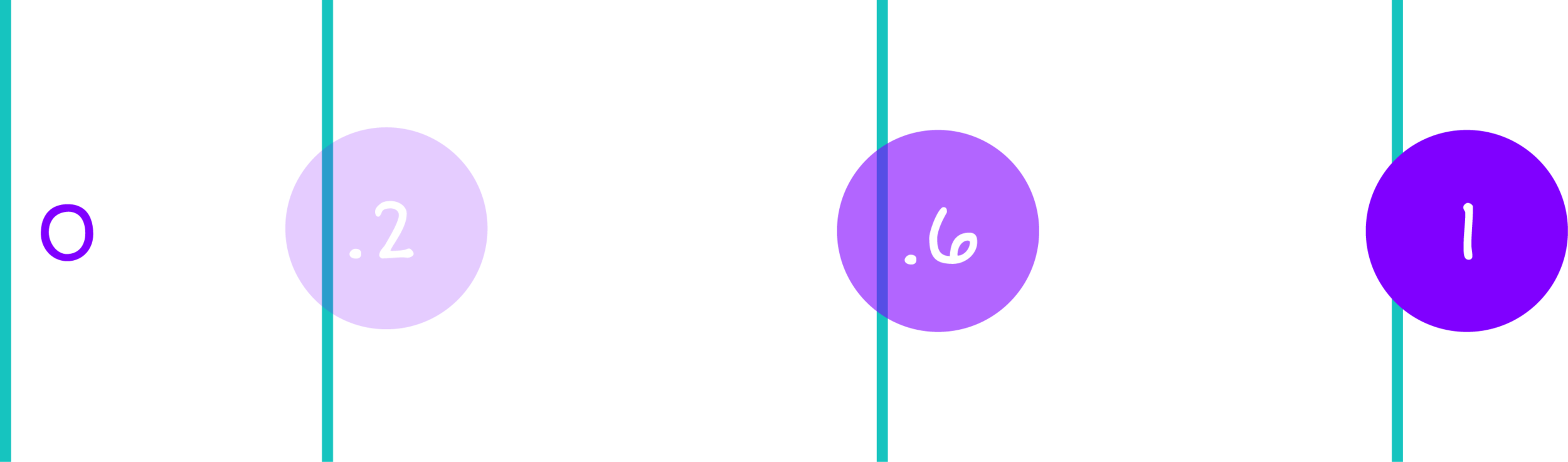
opacity
Animation Styling: Shadow
@keyframes shadow-thing {
  50% {
    width: 30px;
    opacity: .5;
  }
}
Assigning Animation: Dot
4
.dot {
    animation: bounce 700ms infinite ease-in-out;
}
animation property
element class
animation name
duration
repeat
transition timing
Transition Timing: ease-in-out
Assigning Animation: Shadow
5
.shadow {
    animation: shadow-thing 700ms infinite;
}
animation property
element class
animation name
duration
repeat
Let’s change the animation values and see what happens!
What Next?
Keep practicing and experimenting
Find all materials at dotdoodl.com
Next class: Morph Dot
Thanks again!