CSS Positioning
CSS DEFAULT VALUES FOR html ELEMENTS
This table shows the default CSS browser values for all HTML elements. Problem: default CSS properties are displayed differently in different browsers. Solutions: Normalize or Sanitize
HTML Block and Inline Elements
Every HTML element has a default display value depending on what type of element it is. The two display values are: block and inline.
Block-level Elements
A block-level element always starts on a new line and takes up the full width available (stretches out to the left and right as far as it can)
<article><aside><blockquote><canvas><div><figure><footer><form><h1>-<h6><header><hr><li><main><nav><ol><p><section><table><ul><video>
INLINE Elements
An inline element does not start on a new line and only takes up as much width as necessary.
<a><br><button><code><i><img><input><label><select><small><span><strong><textarea>
css box model
All HTML elements can be considered as boxes. The CSS box model is essentially a box that wraps around every HTML element. It consists of: margins, borders, padding, and the actual content.
- Content - The content of the box, where text and images appear
- Padding - Clears an area around the content. The padding is transparent
- Border - A border that goes around the padding and content
- Margin - Clears an area outside the border. The margin is transparent
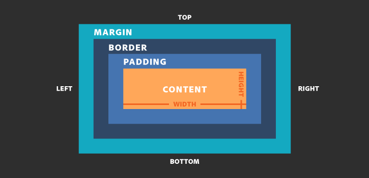
The box-sizing property allows us to include the padding and border in an element's total width and height. If you set box-sizing: border-box; on an element padding and border are included in the width and height
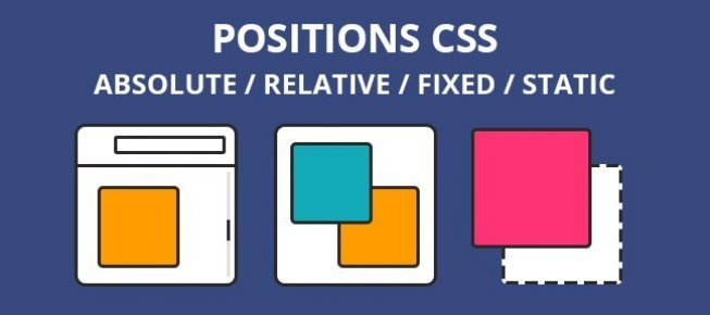
eLEMENT POSITIONS
The CSS position property defines, as the name says, how the element is positioned on the web page. There are five different position values: static, relative, fixed, absolute, sticky.
- Static - This is the default value, all elements are in order as they appear in the document.
- Relative - The element is positioned relative to its normal position.
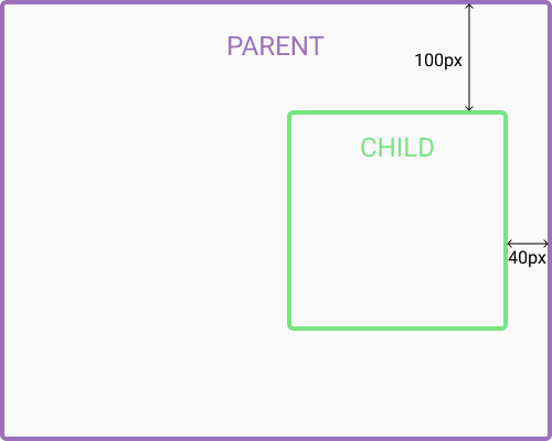
- Absolute - The element is positioned absolutely to its first positioned parent.
- Fixed - The element is positioned related to the browser window.
- Sticky - The element is positioned based on the user's scroll position.
What Is Relative Positioning?
When you set the position relative to an element, without adding any other positioning attributes (top, bottom, right, left) nothing will happen. When you add an additional position, such as left: 20px the element will move 20px to the right from its normal position. Here, you can see that this element is relative to itself. When the element moves, no other element on the layout will be affected.
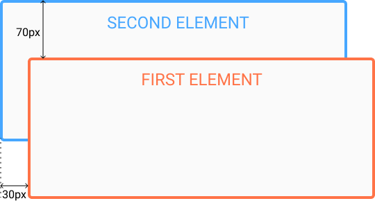
There is a thing you should keep in mind while setting position - relative to an element limits the scope of absolutely positioned child elements. This means that any element that is the child of this element can be absolutely positioned within this block.
What Is absolute Positioning?
This type of positioning allows you to place your element precisely where you want it. The positioning is done relative to the first relatively (or absolutely) positioned parent element. In the case when there is no positioned parent element, it will be positioned related directly to the HTML element (the page itself).
An important thing to keep in mind while using absolute positioning is to make sure it is not overused, otherwise, it can lead to a maintenance nightmare.
center Left/Right Layout
The float CSS property places an element on the left or right side of its container, allowing text and inline elements to wrap around it. The element is removed from the normal flow of the page, though still remaining a part of the flow (in contrast to absolute positioning).
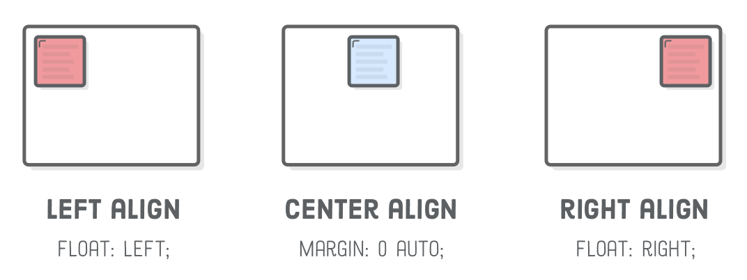
The margin CSS property can also be used to move elements (right, left) or to center things with the "auto" option
One good use of absolute prop is to center things like so:
position: absolute;
left: 50%;
top: 50%;
transform: translate(-50%, -50%);
FLEXBOX
The main idea behind the flex layout is to give the container the ability to alter its items’ width/height (and order) to best fill the available space


Properties for container (Parent)
display, flex-direction, flex-wrap, flex-flow, justify-content, align-items and align-content
Properties for items (Children)
order, flex-grow, flex-shrink, flex-basis, flex and align-self,
Display
This defines a flex container; inline or block depending on the given value. It enables a flex context for all its direct children.
Note that CSS columns have no effect on a flex container
.container {
  display: flex; /* or inline-flex */
}
FLEX-DIRECTION
This establishes the main-axis, defining the direction flex items are placed in the flex container. Think of flex items as primarily laying out either in horizontal rows or vertical columns.
- row (default): left to right
- row-reverse: right to left
- column: same as row but top to bottom
- column-reverse: same as row-reverse but bottom to top

//default row
.container {
  flex-direction: row | row-reverse | column | column-reverse;
}
FLEX-WRAP
By default, flex items will all try to fit onto one line. You can change that and allow the items to wrap as needed with this property
- nowrap (default): all flex items will be on one line
- wrap: flex items will wrap onto multiple lines, from top to bottom
- wrap-reverse: flex items will wrap onto multiple lines from bottom to top.

//default nowrap
.container {
  flex-wrap: nowrap | wrap | wrap-reverse;
}
FLEX-flow
This is a shorthand for the flex-direction and flex-wrap properties, which together define the flex container’s main and cross axes. The default value is row nowrap.
//<‘flex-direction’> || <‘flex-wrap’>
.container {
  flex-flow: row-reverse wrap;
}
flex-flow: row;
flex-flow: row-reverse;
flex-flow: column;
flex-flow: column-reverse;
/* flex-flow: <'flex-wrap'> */
flex-flow: nowrap;
flex-flow: wrap;
flex-flow: wrap-reverse;
/* flex-flow: <'flex-direction'> and <'flex-wrap'> */
flex-flow: row nowrap;
flex-flow: column wrap;
flex-flow: column-reverse wrap-reverse;justify-content
This defines the alignment along the main axis. It helps distribute extra free space leftover when either all the flex items on a line are inflexible

//default flex-start
.container {
  justify-content: flex-start | flex-end | center | space-between | space-around | space-evenly
}
align-items
This defines the default behavior for how flex items are laid out along the cross axis on the current line. (perpendicular to the main-axis).

//default stretch
.container {
  align-items: stretch | flex-start | flex-end | center | baseline
}
align-content
This aligns a flex container’s lines within when there is extra space in the cross-axis, this has no effect when there is only one line of flex items

//default stretch
.container {
  align-content: flex-start | flex-end | center | space-between | space-around | space-evenly | stretch
}
ORDER
By default, flex items are laid out in the source order. However, the order property controls the order in which they appear in the flex container

//default 0
.item {
  order: <integer>;
}
FLEX-GROW
This defines the ability for a flex item to grow if necessary. It dictates what amount of the available space inside the flex container the item should take up. If all items have flex-grow set to 1, the remaining space in the container will be distributed equally to all children.

//default 0
.item {
  flex-grow: <number>;
}
FLEX-GROW
This defines the ability for a flex item to grow if necessary. It dictates what amount of the available space inside the flex container the item should take up. If all items have flex-grow set to 1, the remaining space in the container will be distributed equally to all children.
Negative numbers are invalid.
//default 0
.item {
  flex-grow: <number>;
}
flex-shrink
Defines how much a flexbox item should shrink if there's not enough space available.
Negative numbers are invalid.
// default 1
.item {
  flex-shrink: <number>;
}
flex-shrink: 0; The element will not shrink: it will retain the width it needs, and not wrap its content. Its siblings will shrink to give space to the target element.
flex-shrink: 1; If there's not enough space available in the container's main axis, the element will shrink by a factor of 1, and will wrap its content.
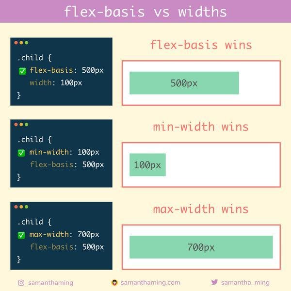
flex-BASIS
Defines the default size of an element before the remaining space is distributed. It can be a length (e.g. 20%, 5rem, etc.) or a keyword. The auto keyword means “look at my width or height property”.
// default auto
.item {
  flex-basis: <length> | auto;
}
FLEX
This is the shorthand for flex-grow, flex-shrink and flex-basis combined. The second and third parameters (flex-shrink and flex-basis) are optional. The default is 0 1 auto, but if you set it with a single number value, it’s like <number> 1 0.
It is recommended that you use this shorthand property rather than set the individual properties. The shorthand sets the other values intelligently
// default 0 1 auto
.item {
  flex: 1;
}
center elements
Simple way to center things with flexbox.
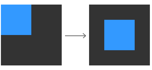
.container {
     display: flex;
	 justify-content: center;
     align-items: center;
}