Making the
Envato Marketplaces
Responsive
@jordanlewiz
What are the Envato Marketplaces?
A Collection of Online Digital Marketplaces

Fun Facts
- 7 Years old
- 3.4 million members
- 4.6 million items
- Item sold every 10 sec
- 10 Authors sold > $1million
- Themeforest: 111th Alexa ranking
- 25+ active developers
- 10+ deploys a day
- MASSIVE code-base
- Lots of user generated content
Where to begin?
Take one page and make it responsive
... and
Mobile-first
“Designing an online experience for mobile before designing it for the desktop Web — or any other device”uxmatters.com
Tasks
- Select a Mobile-First grid framework
- Build a switch to limit which pages are responsive
- Serve separate CSS for responsive pages
- Conditional media-queries
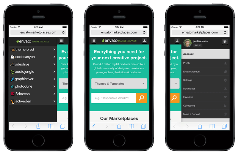
- Complete re-build header with off-canvas nav
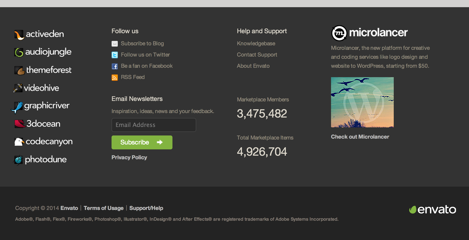
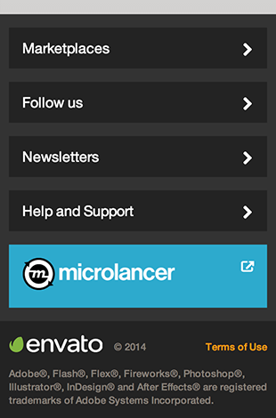
- Complete re-build of footer
- Build responsive modules
- Put it all together
Choosing a Grid Framework

- Pure grid framework
- Grids applied with mixins (no grid classes required in HTML)
- Highly configurable
- Works with Rails + Compass
- Written with Sass
- IE7+ compatibility (legacy fallback is desktop version)
- Can change grid columns at different breakpoints
- Actively developed and maintained
Responsive Switch
Control which pages should be responsive at the flip of a switch
def show
  @responsive = true
end
Enable the switch based on conditions
- Specific pages
- Features
- User roles
- Traffic percentage
- A-B testing
- etc
Conditional CSS
Serve up different CSS files depending if the page
has the responsive switch enabled or not
<head>
<%= if @responsive %>
    <link href="application-responsive.css" rel="stylesheet" />
<% else %>
    <link href="application.css" rel="stylesheet" />
<% end %>
application-responsive.sass
$responsive: true
@import 'application.sass'
Conditional media-queries
Compile both the desktop stylesheets (no media-queries)
and the responsive stylesheets (with media-queries)
from the same Sass files
How you ask?
Susy
“Susy provides the power-tools,
what you build is up to you.”
http://susy.oddbird.net
`at-breakpoint` mixin
Sass mixin to handle all our media-queries
$ie-fallback
Allows us to remove any media-query applied with the`at-breakpoint` mixin if the <html> has a certain class
Step 1: Add class to <html>
<!--[if lte IE 8]>
  <html class="lt-ie9 fixed-layout">
<![endif]-->

<!--[if gt IE 8]><!-->
  <html class="<%= 'fixed-layout' unless @responsive %>">
<!--<![endif]-->
Step 2: Setup Sass Config
// Susy
// ------------------------
// Grid settings
$container-style: fluid
$total-columns: 4
$column-width: 65px
$gutter-width: 20px
$grid-padding: 10px

// Breakpoints
$phone-only: 4 568px
$tablet-and-above: 569px 8
$tablet-only: 569px 8 1024px
$tablet-and-below: 8 1024px
$desktop-and-above: 1025px 12 fixed-layout

// Breakpoint output
$breakpoint-media-output: $responsive and not $lt-ie9
$breakpoint-ie-output: $lt-ie9 or not $responsive
Step 3: Use at-breakpoint mixin
.module
  // Mobile default
  background-color: red

  // Tablet
  +at-breakpoint($tablet-only)
    background-color: green

  // Desktop
  +at-breakpoint($desktop-and-above)
    background-color: blue
Output
Susy will remove any media-query applied with the `at-breakpoint` mixinapplication-responsive.css
.module { background-color: red; }

@media (min-width: 569px) and (max-width: 1024px) {
  .module { background-color: green; }
}

@media (min-width: 1025px) {
  .module { background-color: blue; }
}
application.css
.module { background-color: red; }
.fixed-layout .module { background-color: green; }
.fixed-layout .module { background-color: blue; }
// With breakpoints removed the desktop style (background-color: blue) will take precedence
Rebuild header
with off-canvas nav
- Most complex module
- Took the most time
- Required Prototyping
- Device/Browser Edge-cases
- Duplicate nav HTML
- Lots of testing

Rebuild the footer

Responsive Modules
Coded to work anywhere and don’t care about or inherit
styles from their parent container.
At most, the parent container controls the position and
dimensions of where the module will be used.
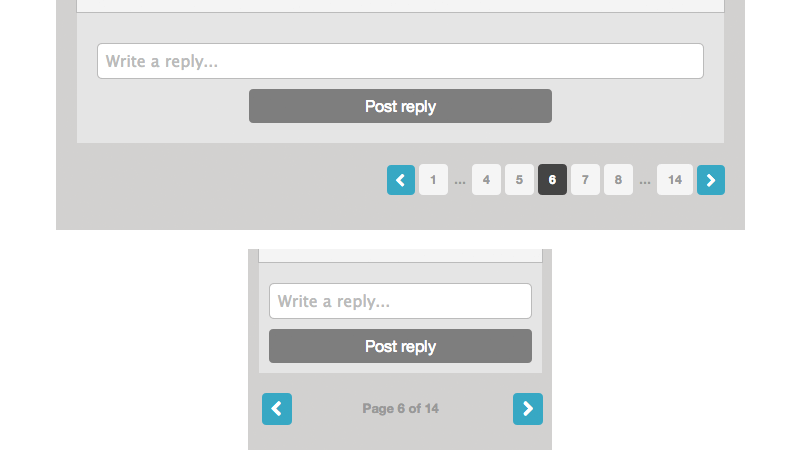
Pagination module

Putting it all together
Other Considerations
- Icon fonts
- Hi-res logos for retina
- SVGs
- Living style-guide
- Killing background sprites usage
- Conditional Modals
Conclusion
- It's a long journey
- Our code is benefiting straight away
- Freeing ourselves from legacy front-end constraints
- We still have user generated content hurdles to overcome
