An Artist's Website
An artists website should inform the audience about the artist and to offer many opportunities for purchasing and interactivity.
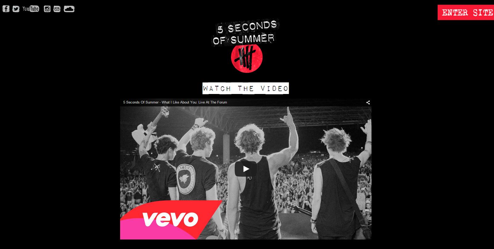
Landing Page
5 Seconds of Summer have a landing page which consists of their logo and their music video so their audience can watch it instantly. They also have a social network links at the top and a clear 'Enter Site' button.
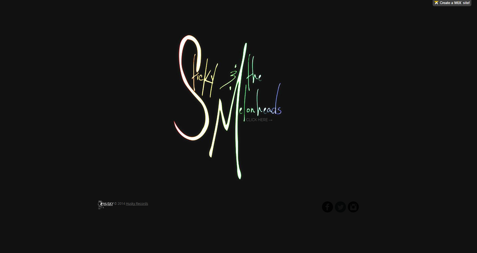
With our landing page, we have our band logo, which is also our album cover fade in. By having the album art on the landing page, it's subtly promoting the album, making it memorable for the audience.
Also including are our record label on the bottom left and social media links which are blended in stylistically to create the full impact of the band logo.
Layout
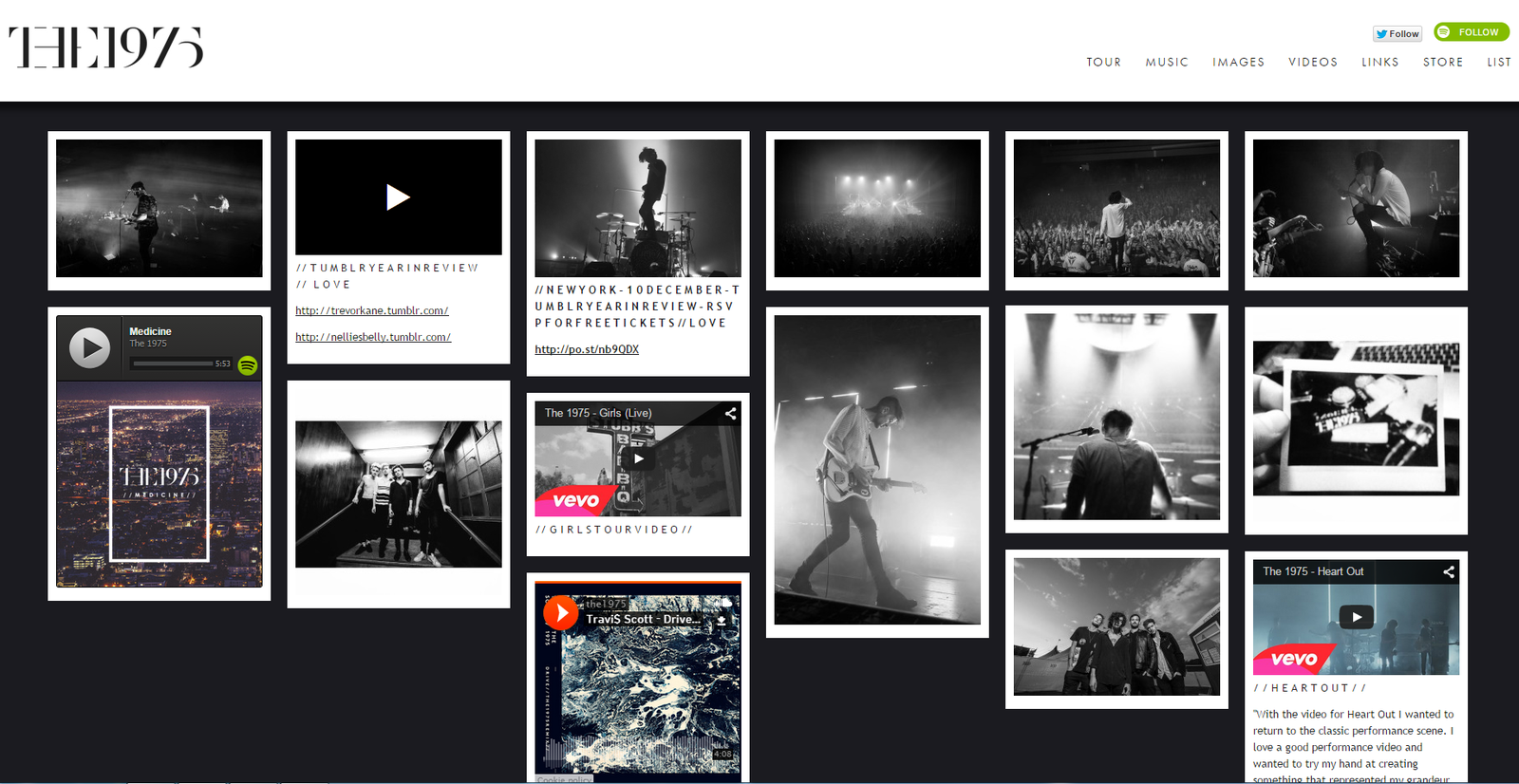
From 5 Seconds of Summer, we liked the way all the links are displayed through images. Same as The 1975's website, they have a minimalist style website that consists of mainly images.
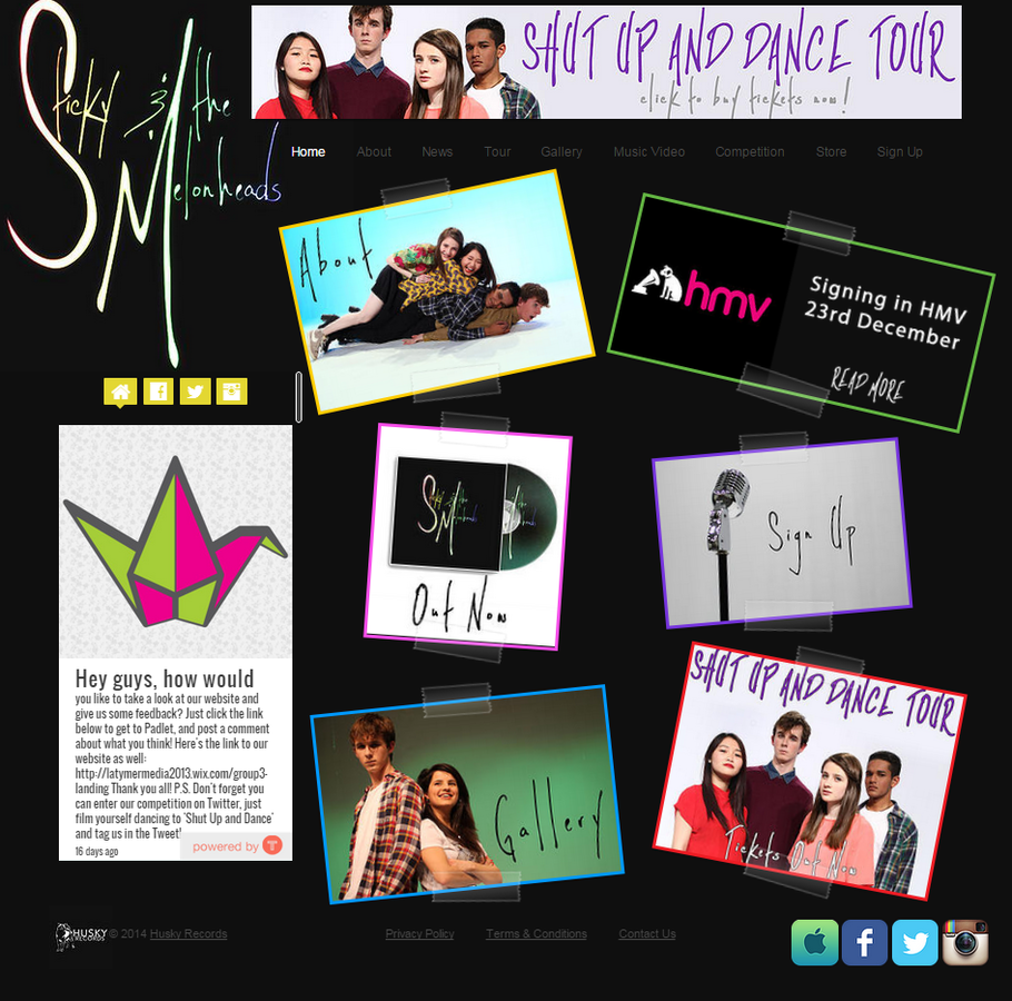
So for our website, we decided to have colour images which would contrast with the black background, similar to the effect we were trying to make on our album cover, creating synergy between the two.
Interactivity
Having 'call-to-action' features on the website directs the audience's attention to do certain things on the site.
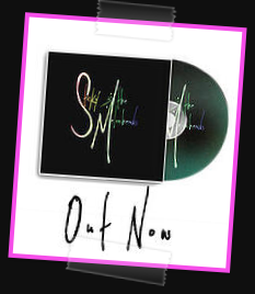

Attracting the audience to buy the album - increasing the purchasing opportunities

The audience would feel more involved with the band if they were to sign up and weekly newsletter.


Competition involving the audience hence increasing the interactivity

Since it is an artist website, we have to include videos of the their work. So we embedded the official music video, where the audience can share instantly onto social networking sites like twitter and facebook.
Interactivity
Having 'call-to-action' features on the website directs the audience's attention to do certain things on the site.

A gallery for the audience to become more familiar with the band and feel more involved.


Having tour dates on the websites informs the audience when they are able to see the band live. We have links straight to ticketmaster for easy access and a purchasing opportunity.
Having merchandise allows the audience to support the band and feel part of a community. This would also help advertise the band but also conform to the Uses and Gratifications theory since it would satisfy the audience's social interactions aswell when they discuss the item with others.

Having a news page is important to update the fans on what the band is up to since it would increase the bands exploitation as well as increase the interactivity between the audience and the band. For example the band signings are available to fans to become more familiar with the band
Our target audience are those that use social media. Therefore having social media pages are useful to share since they are free and has such a high shareability. On the website, we have a live news feed of what the band posts on their social media pages (as shown on the left). From the website, fans can instantly share the posts.
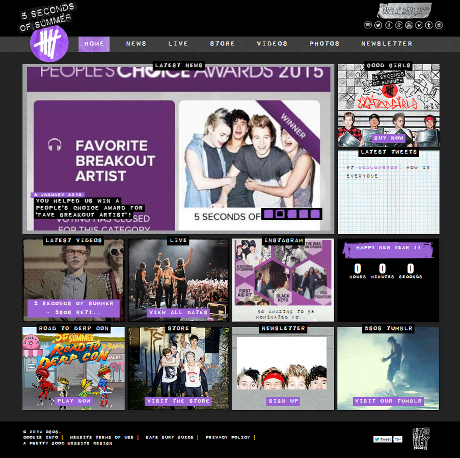
Here are 5 Seconds of Summer's website:


Social media links
News

Live Twitter feed


Links to their video gallery

Live tour dates
Institutions
At the bottom of our website, we have 'Privacy Policy', 'Terms & Conditions' and 'Contact us' pages. The 'Contact Us' page is linked to a page with all the institution details. The record labels logo is presented on every page of the website as well.


Like many artist websites, having the institution details is important. The 'Husky Records' hyperlink next to the logo links to the record labels website itself.

'Infectious Music' links straight to their own website from Alt-J's website.