Evaluation 7
Looking back at your preliminary task, what do you feel that you have learnt in the progression from it to the full product?
Front cover comparison
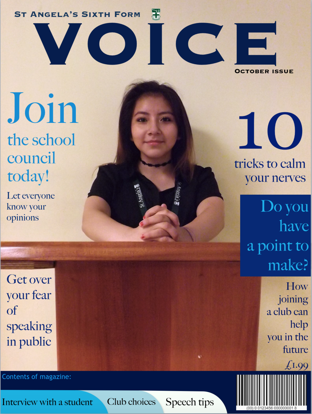
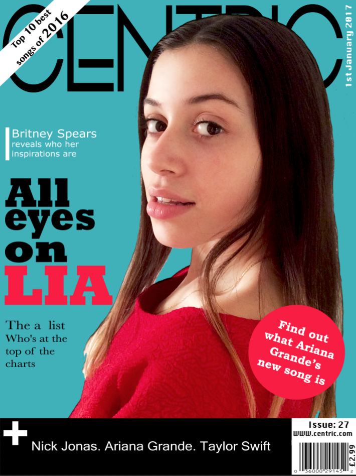
My school magazine front cover is completely different from my music magazine front cover. The process of making the front cover of my music magazine was different because it was not done on photoshop, but on powerpoint. This meant that i was limited to how much i could change the original image, therefore, the quality of the image is not as good as the quality of my music magazine image. Brightness was a big issue when making my school magazine, i learned from that mistake and the lighting and brightness for the image on mu front cover is good. The school magazine does not have a clear headline, i changed this when making my music magazine, as the headline is clear and visible. I used a better camera when taking the music magazine picture, which is why it is not as pixelated as the school magazine.
Masthead
Sell lines
Model
Banner
Headline
Button
Date
Price
Bar code
Contents page comparison
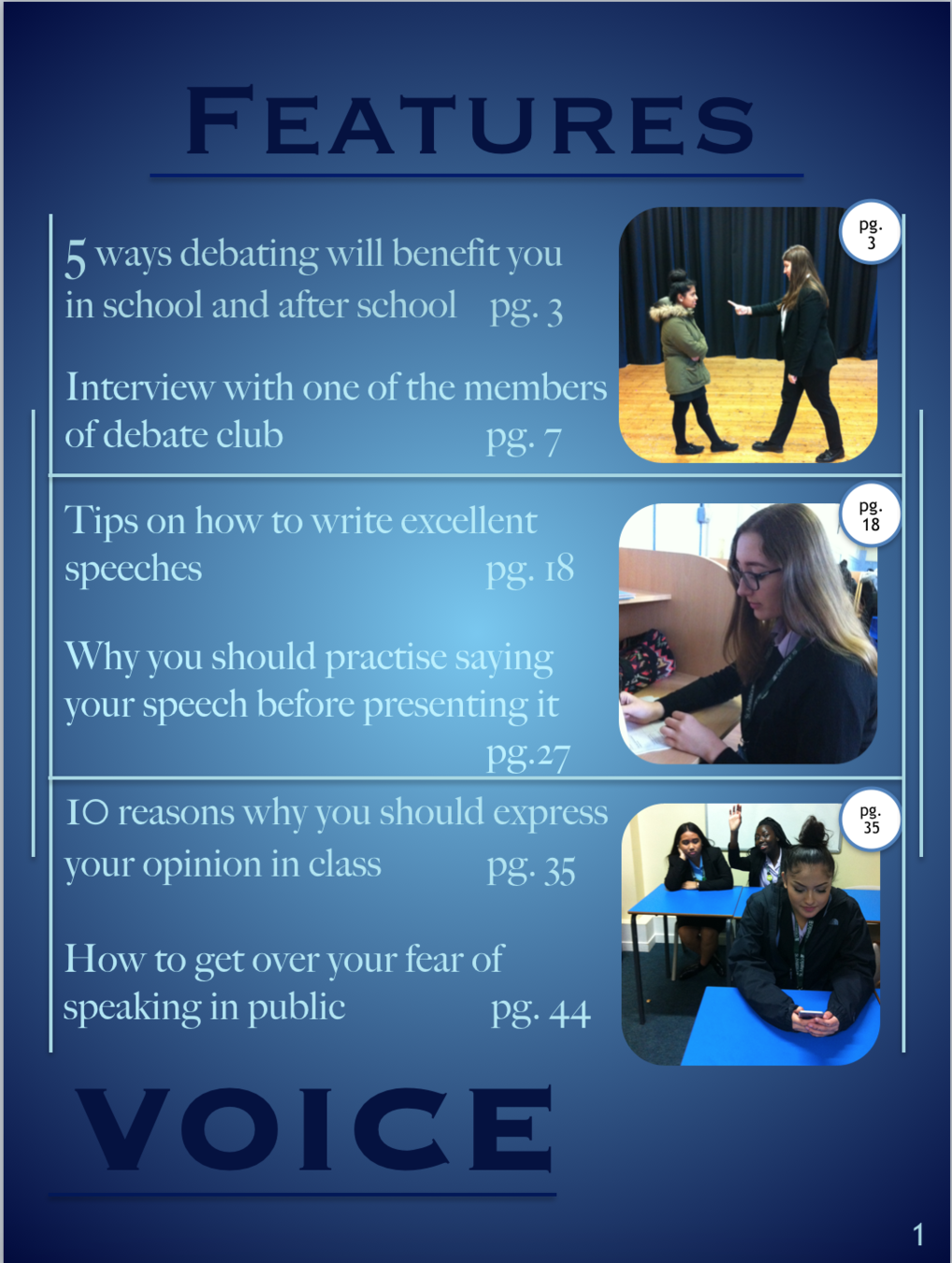
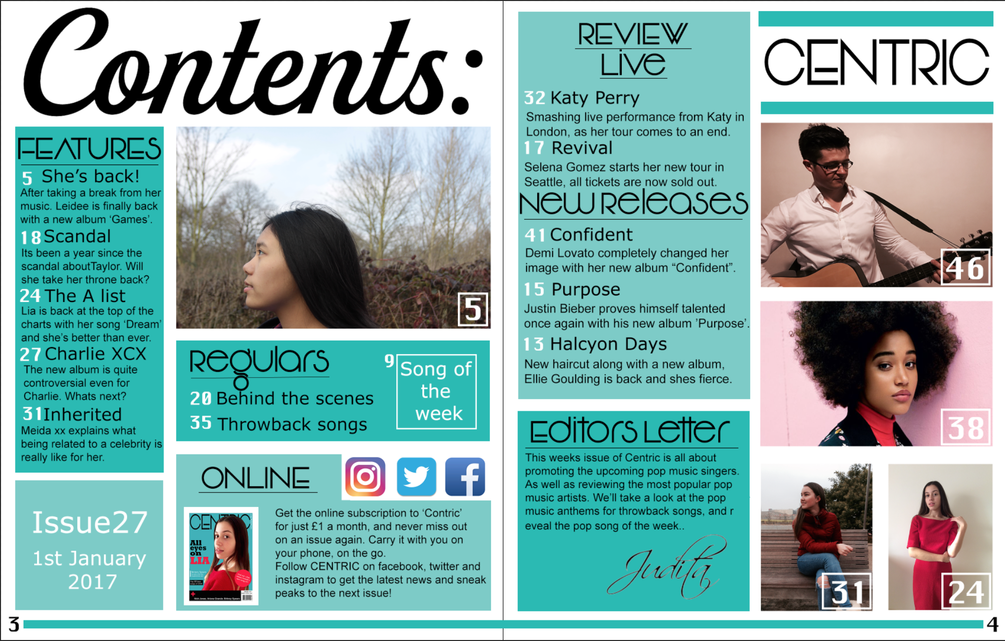
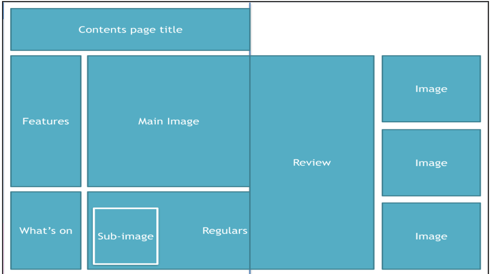
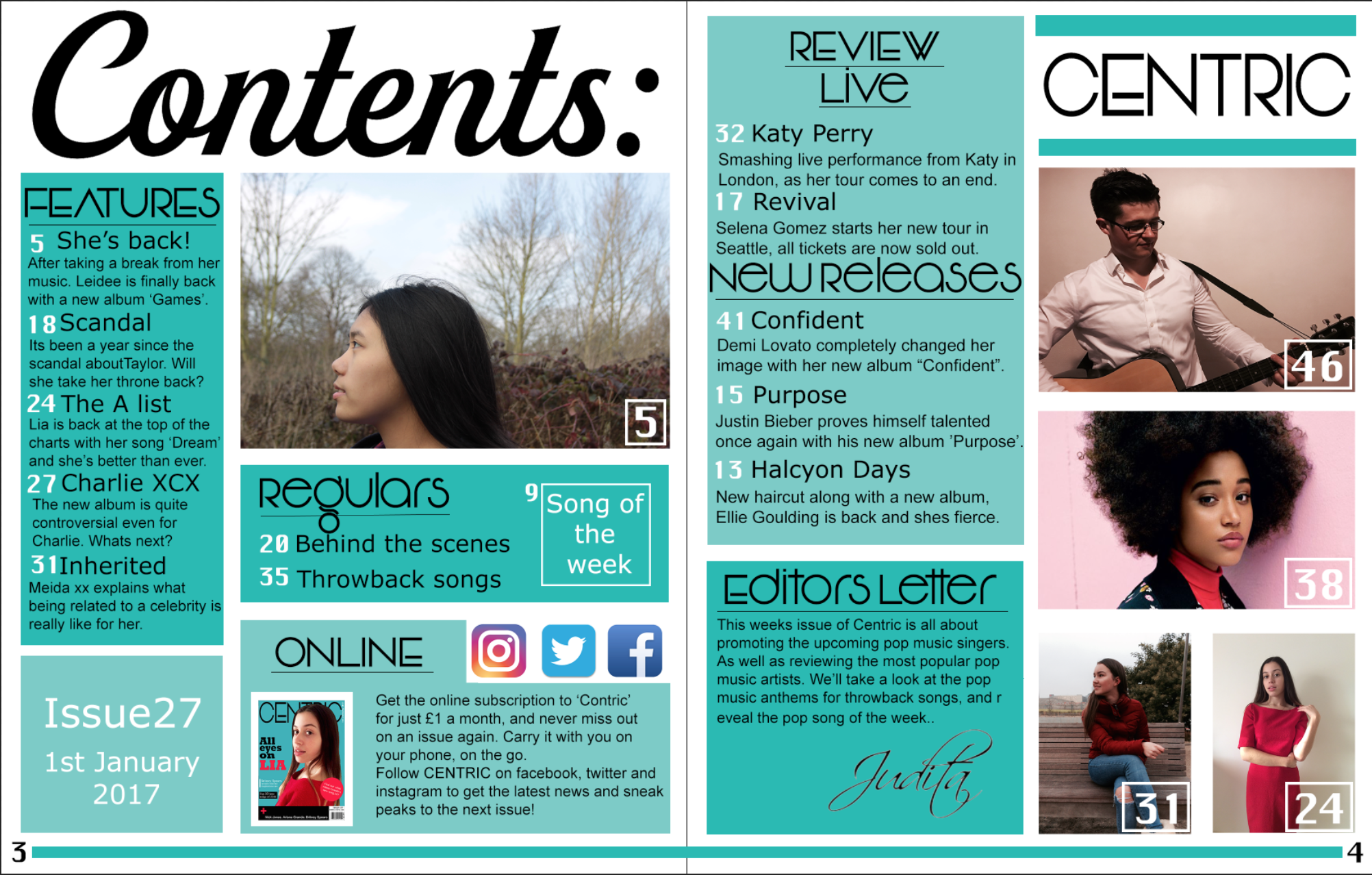
The contents pages are also completely different. The school magazine contents page is a single page contents page, thus it has a lot less text and information. But this is because the school magazine was a much smaller project, it was a smaller scale magazine. Whereas my music magazine has a decent amount of text and it is a double page contents page. The school magazine contents page does not have a main image, just three identically sized images, as this was before i knew the conventions of a contents page. But my music magazine contents page does have a main image and four sub-images, as at this point i was aware of the conventions of a contents page.
Page title
Main image
Sub images
Featuring
Masthead
editors letter
Page number
Process of making school magazine
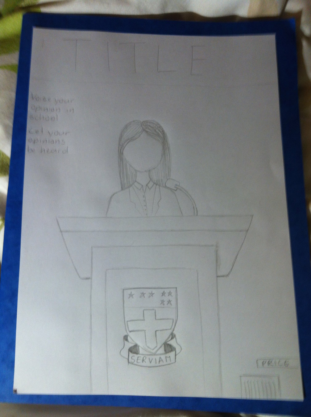
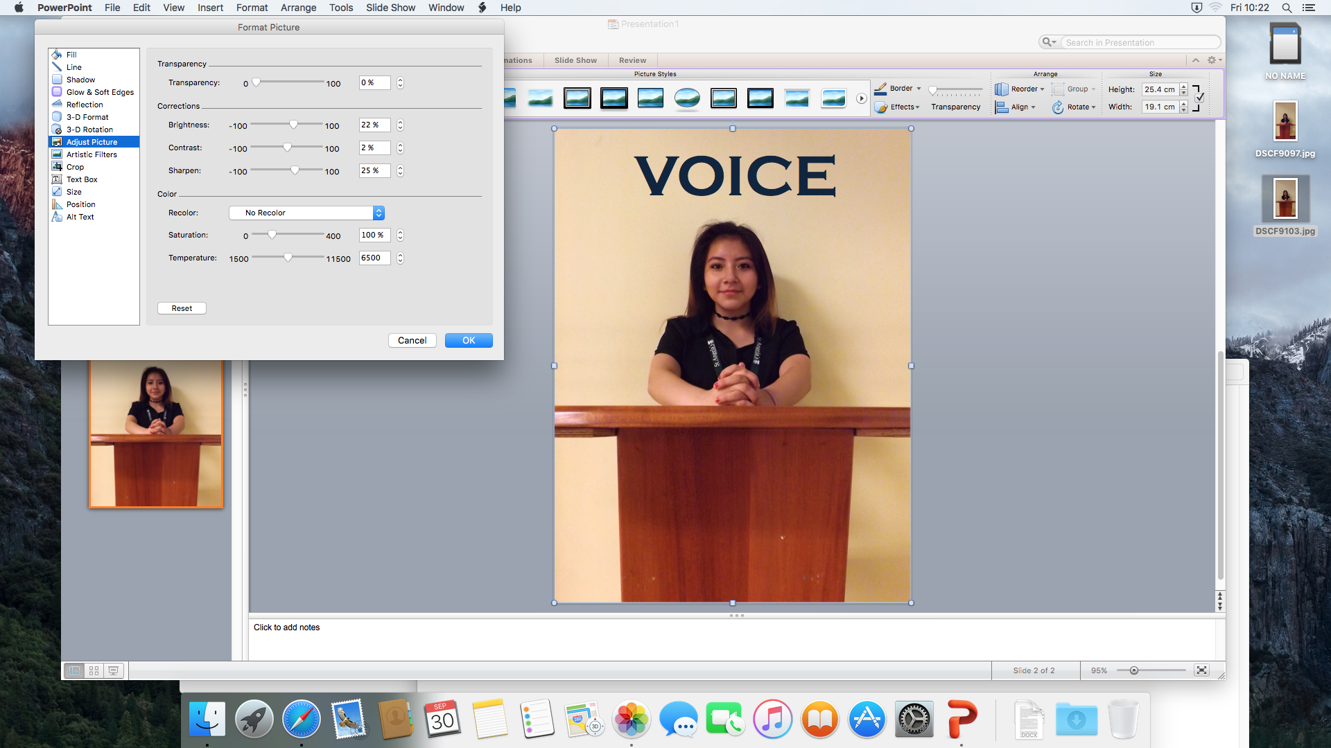
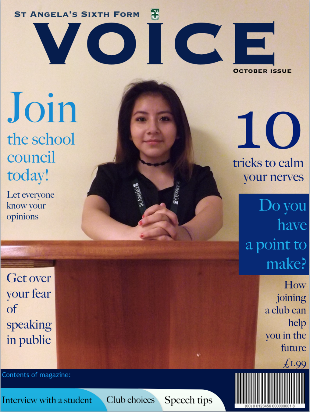
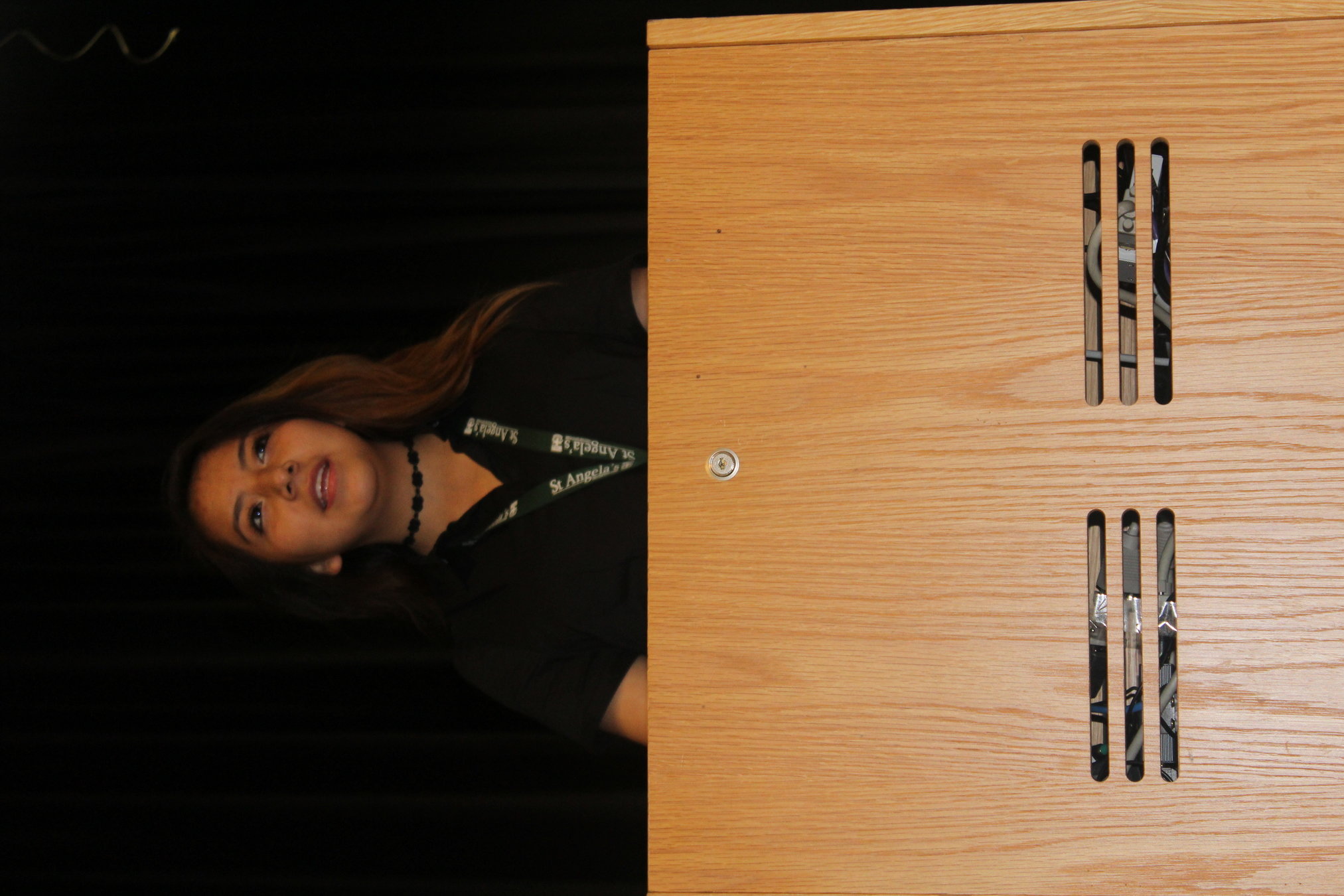
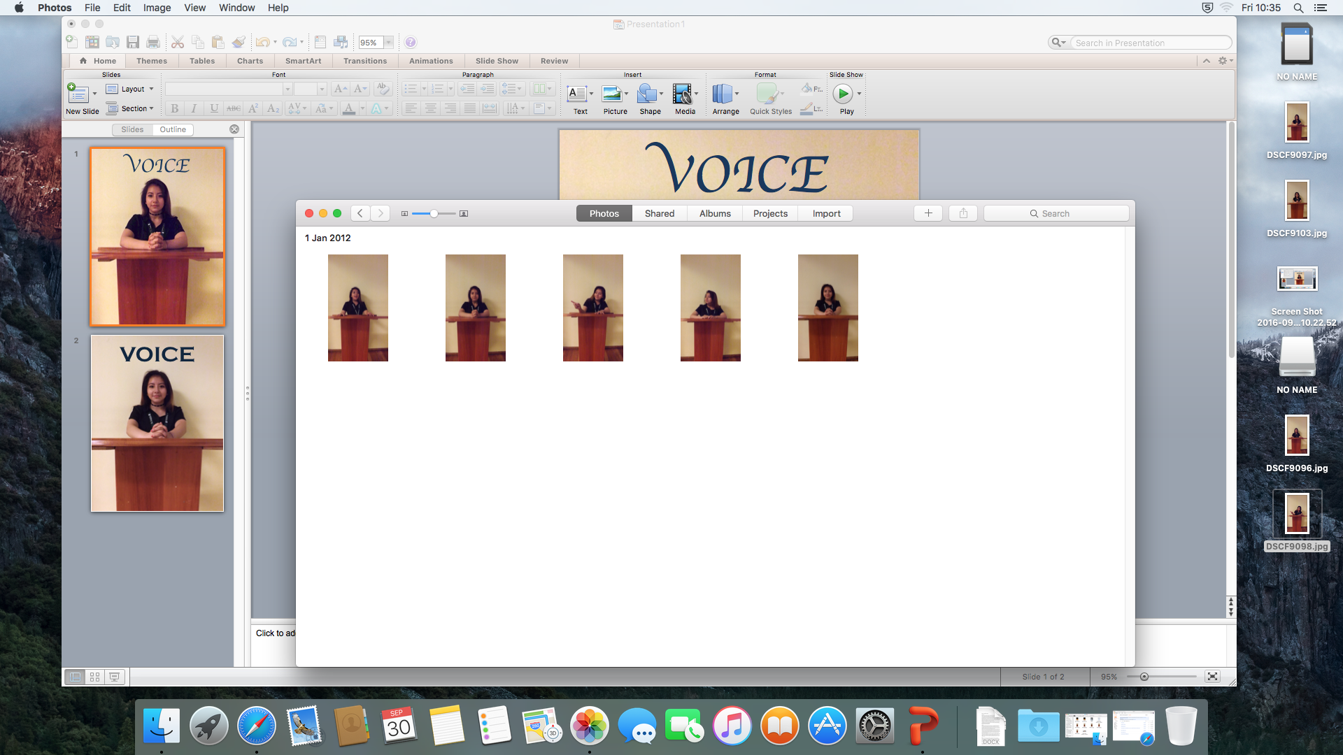
The process of making the school magazine was quite difficult as i had almost no idea of the conventions of a magazine front cover. But i had a clear idea of what i wanted the image to look like, which is displayed in the sketch. I then took the photos with a camera and started constructing the magazine on powerpoint. This wasn't ideal as powerpoint was not made for making front covers, therefore it didn't have the tools i needed to make a decent front cover.
At first, i took the picture in a hall, but the lighting was very bad, and the background was too dark, which meant that you couldn't see the model clearly. Also, the stand was not the type of stand that i had envisioned for my magazine. So i found a different stand in a different hall, with a lighter background, and yet, the images are still pixelated and the lighting is not good enough.
Text
Process of making my music magazine
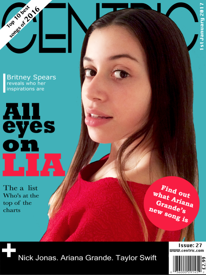
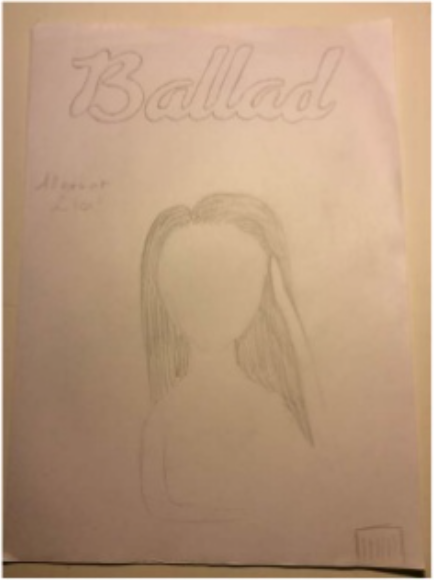
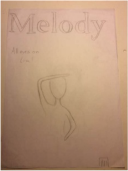
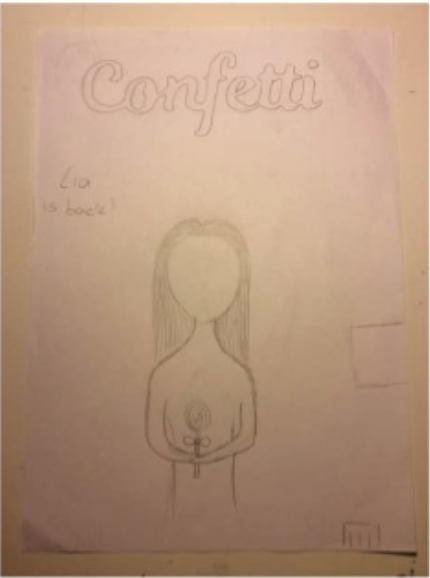
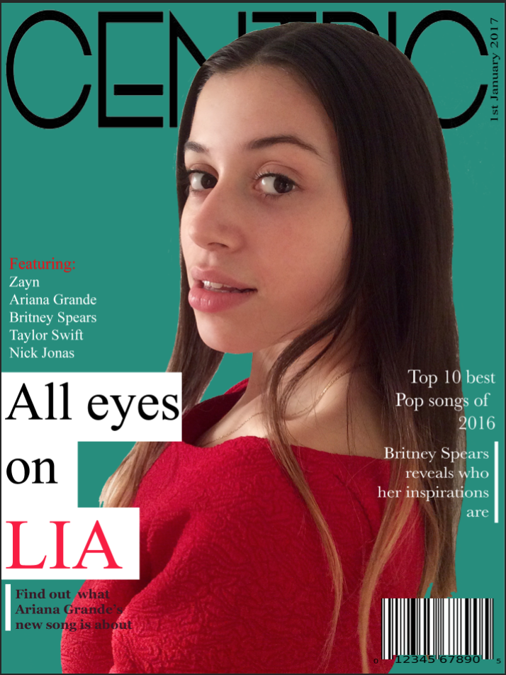
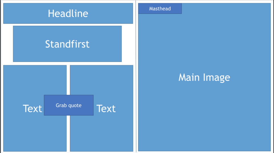
The front cover took the longest to make out of the three, this was because i had to learn the basics of photoshop whilst making the front cover on photoshop. Although, it looks nothing like the sketches, which means that i didn't follow my initial plan.
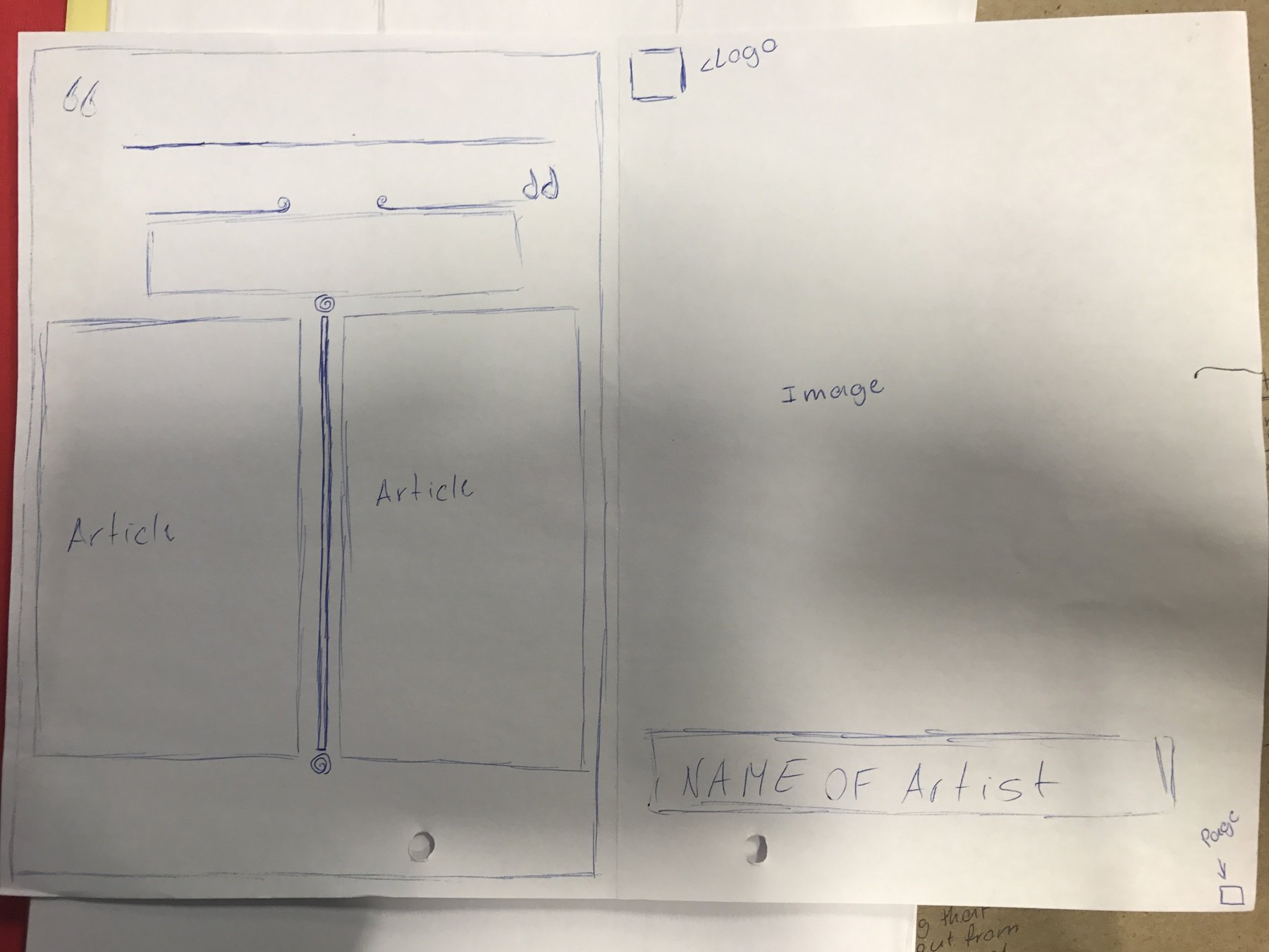
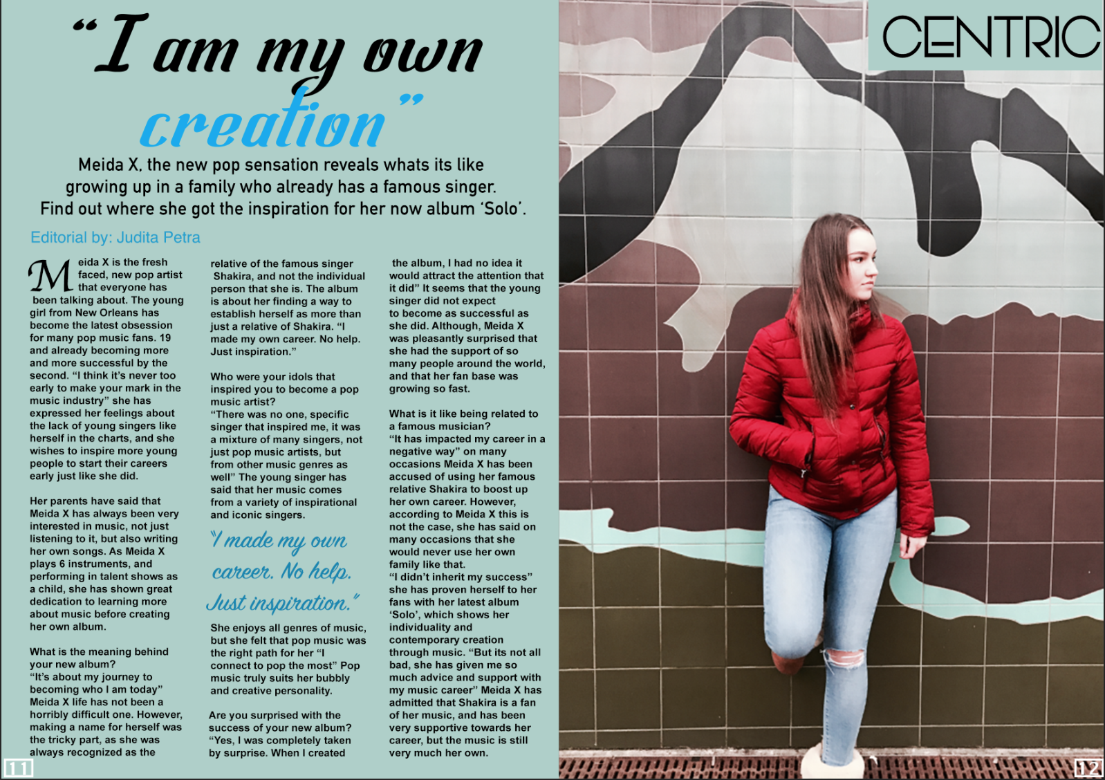
The double page spread was the quickest and easiest process, as the image for it came out really good, which made the rest of the process really smooth. Although, i think the font of the masthead doesn't really match the rest of the text.
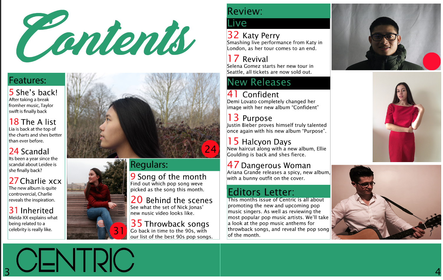
The contents page was the most difficult to make, as it contains so many conventions and rules that must be followed is order for the contents page to work. But i did follow my initial template to the end, with a few small changes along the way.
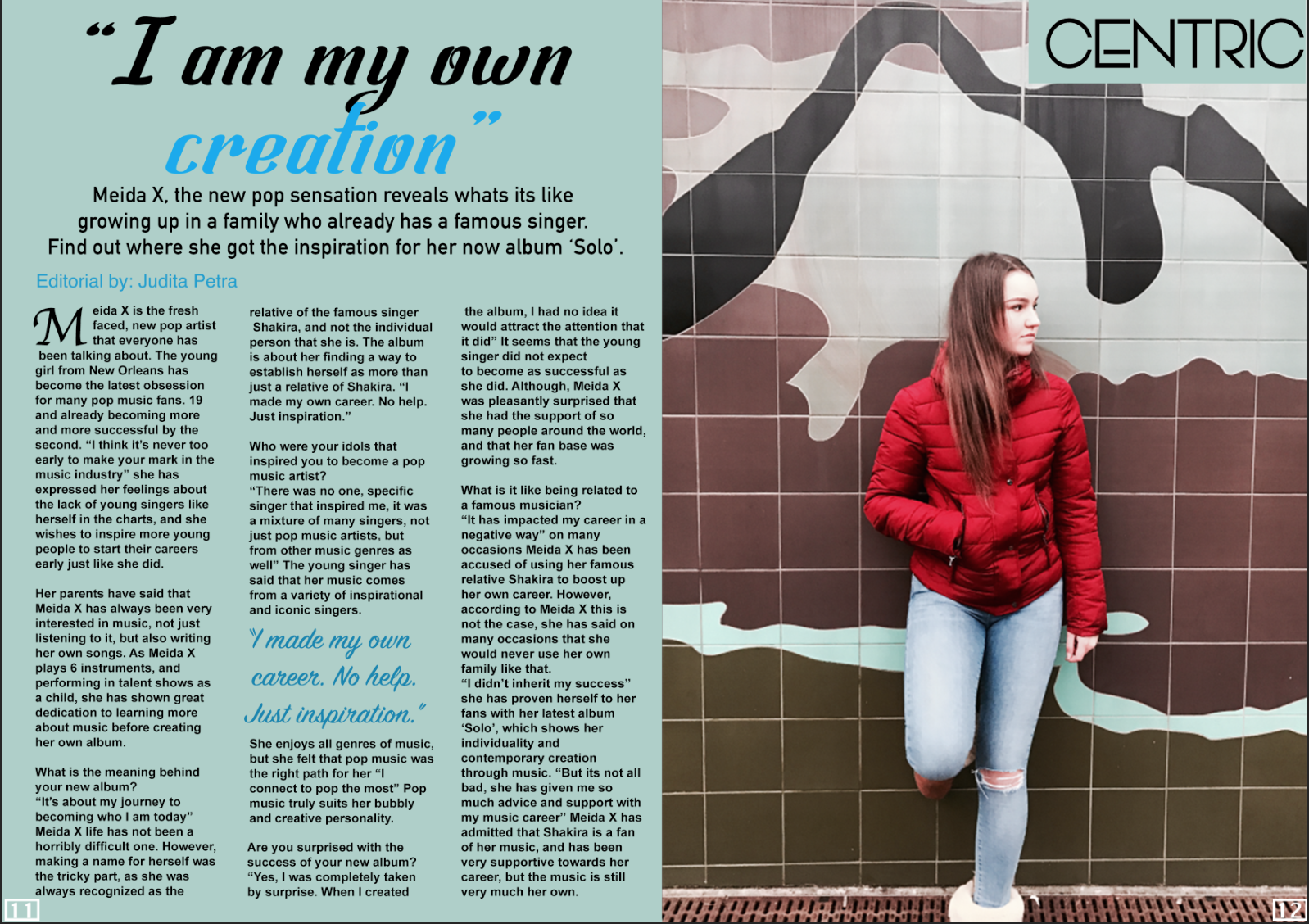
Audience research: DPS
"The headline doesn't stand out enough, the colours are a bit dull"
"The page numbers have the same font and layout as the contents page, which shows that its the same magazine"
"The image has an interesting background that provides a nice colour scheme"
"The double page spread contains all the conventions of a double page spread"
"The colour scheme contrasts well together, and the two pages clearly link together because of this"
"The article columns line up to each other, and there are no run-off lines"
Audience research: Front page
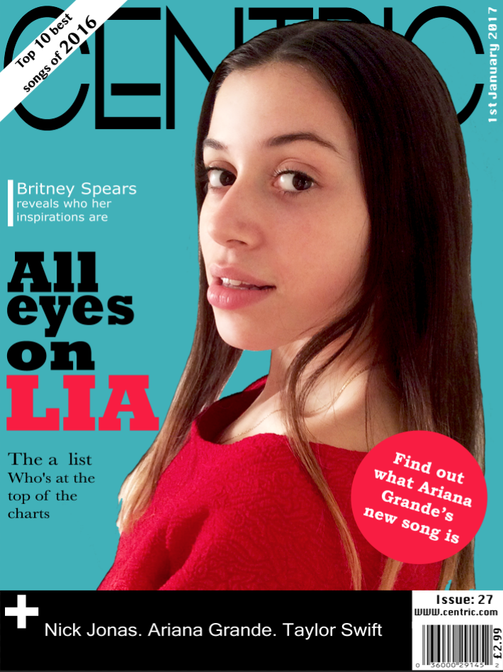
"The headline is bold and it really stands out from the sell-lines"
"The colour scheme of the front cover is quite unconventional for a pop music magazine, but this could be a good thing"
"The model and the whole image matches your pop music genre"
"The button is well placed, it really stands out and matches the front cover"
"The sell-lines are too different from each other, there aren't enough of them and some are hard to see"
"The layout of the front cover is really good, and organised"
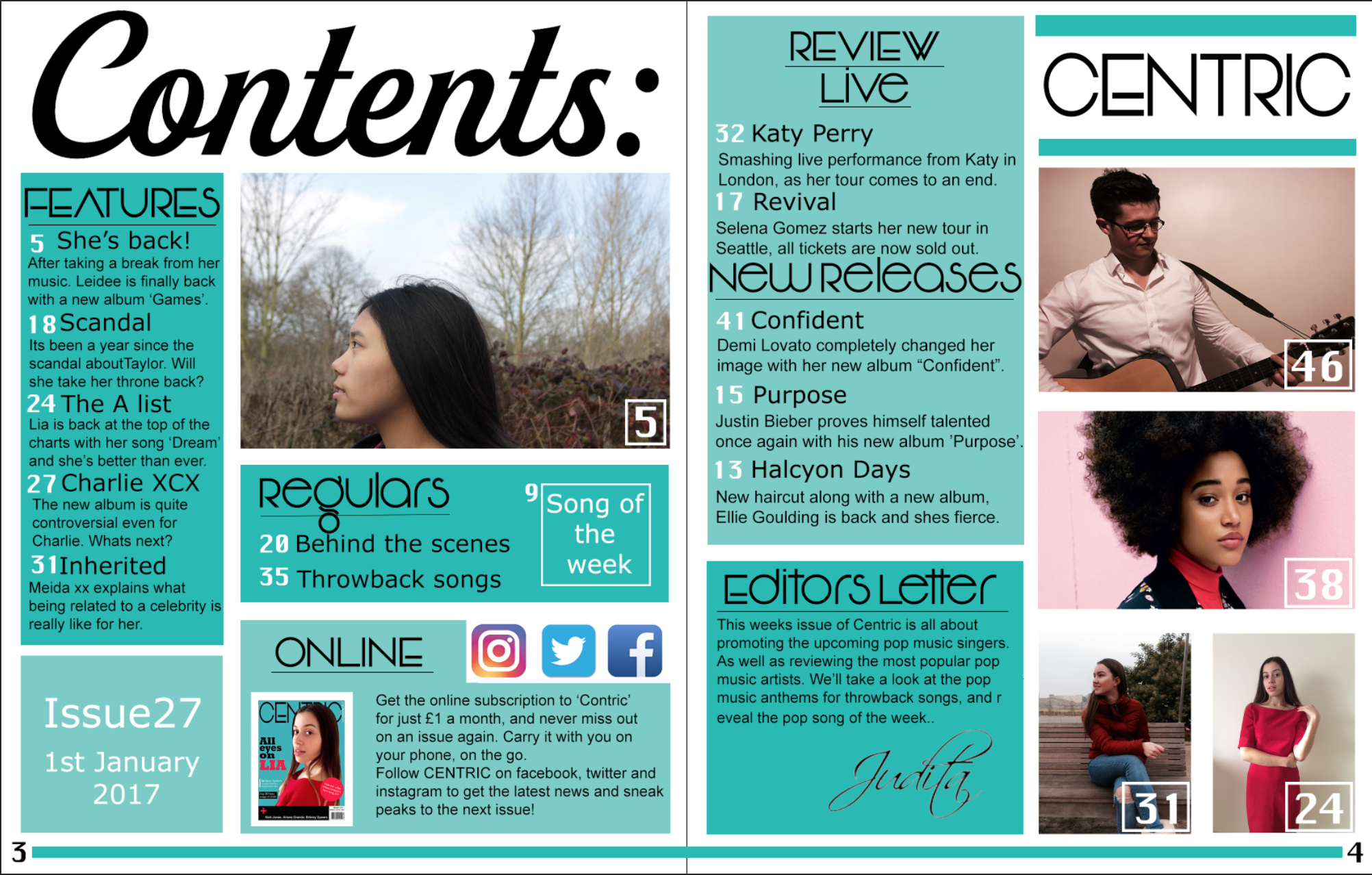
Audience research:
contents page
"The title is bold and clear, easy to read"
"The layout is very neat and well structured"
"The signature on the editors letter is not bold enough, its a bit hard to see"
"The font of the sub-titles doesn't really go well with the title of the page"
"There are no run-off lines"
"All the conventions of a contents page are included"
Overall
Overall, i found the process of making a music magazine quite long and tricky. There are so many conventions to each page of a magazine. Especially the contents page, as every text box has to line up with the other text boxes, the necessary main image, and sub-images. Before making this magazine i had no idea about most of these conventions, for example, i didn't know that there was a thing such as an editor's letter.
I made quite a few mistakes whilst creating my music magazine. The fonts were always an issue, with every page i had to keep changing the fonts, because they just didn't match. Also, it took me a while to decide what colour scheme to use, as i wasn't clear on what look i wanted my magazine to have, thus, i had many drafts of the front cover, each with a different background colour.
Through the process of making my music magazine i have learnt the basics of photoshop. Before this, i had almost no experience with photoshop, but now it is a skill that i will be able to use throughout life. I have also gained experience with online applications such as; press, maze, google slides and visme. Which will be useful when presenting anything.
I think i have progressed a lot since my student magazine. Because the quality of my music magazine is mush higher, this is due to many aspects such as; image quality, layout design, text etc.