Flex Panel Gallery
講者:王婕瑜
日期:2020/5/20
OUTLINE
- Flex Panel Gallery
- 建立基本頁面
- 調整 CSS
- 加上 JavaScript
- Reference
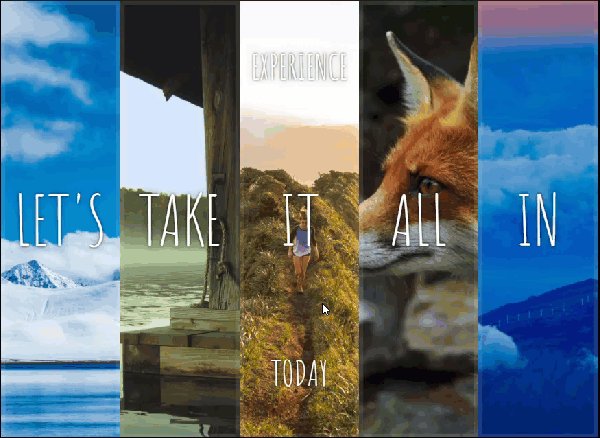
Flex Panel Gallery
Flex Panel Gallery
柔性面板畫廊
建立基本頁面
html
- 五個 panel,內有三行字
- 用 div 標籤 panels 包覆所有的 panel
- 給予每一個 panel 兩個 class: panel、panel + 編號
- 設定字型 Amatic SC
html 完整程式碼
<!DOCTYPE html>
<html lang="en">
<head>
  <meta charset="UTF-8">
  <title>Flex Panels 💪</title>
  <link href='https://fonts.googleapis.com/css?family=Amatic+SC' rel='stylesheet' type='text/css'>
</head>

<body>
  <div class="panels">
    <div class="panel panel1">
      <p>Hey</p>
      <p>Let's</p>
      <p>Dance</p>
    </div>
    <div class="panel panel2">
      <p>Give</p>
      <p>Take</p>
      <p>Receive</p>
    </div>
    <div class="panel panel3">
      <p>Experience</p>
      <p>It</p>
      <p>Today</p>
    </div>
    <div class="panel panel4">
      <p>Give</p>
      <p>All</p>
      <p>You can</p>
    </div>
    <div class="panel panel5">
      <p>Life</p>
      <p>In</p>
      <p>Motion</p>
    </div>
  </div>

</body>
</html>
設定字型、背景顏色、外距
html {
  box-sizing: border-box;
  background:#ffc600;
  font-family:'helvetica neue';
  font-size: 20px;
  font-weight: 200;
}
body {
  margin: 0;
}
CSS
設定 panel
*, *:before, *:after {
  box-sizing: inherit;
}

.panels {
  min-height:100vh;
  overflow: hidden;
}

.panel {
  background:#6B0F9C;
  box-shadow:inset 0 0 0 5px rgba(255,255,255,0.1);
  color:white;
  text-align:center;
  align-items:center;
  transition:
    font-size 0.7s cubic-bezier(0.61,-0.19, 0.7,-0.11),
    flex 0.7s cubic-bezier(0.61,-0.19, 0.7,-0.11),
    background 0.2s;
  font-size: 20px;
  background-size:cover;
  background-position:center;
}
背景圖片
.panel1 { background-image:url(https://source.unsplash.com/gYl-UtwNg_I/1500x1500); }
.panel2 { background-image:url(https://source.unsplash.com/rFKUFzjPYiQ/1500x1500); }
.panel3 { background-image:url(https://images.unsplash.com/photo-1465188162913-8fb5709d6d57?ixlib=rb-0.3.5&q=80&fm=jpg&crop=faces&cs=tinysrgb&w=1500&h=1500&fit=crop&s=967e8a713a4e395260793fc8c802901d); }
.panel4 { background-image:url(https://source.unsplash.com/ITjiVXcwVng/1500x1500); }
.panel5 { background-image:url(https://source.unsplash.com/3MNzGlQM7qs/1500x1500); }
.panel > * {
margin:0;
width: 100%;
transition:transform 0.5s;
}
.panel p {
text-transform: uppercase;
font-family: 'Amatic SC', cursive;
text-shadow:0 0 4px rgba(0, 0, 0, 0.72), 0 0 14px rgba(0, 0, 0, 0.45);
font-size: 2em;
}
.panel p:nth-child(2) {
font-size: 4em;
}
/* 新增 class : open */
.panel.open {
font-size:40px;
}CSS 完整程式碼
<style>
  html {
    box-sizing: border-box;
    background:#ffc600;
    font-family:'helvetica neue';
    font-size: 20px;
    font-weight: 200;
  }
  body {
    margin: 0;
  }
  *, *:before, *:after {
    box-sizing: inherit;
  }

  .panels {
    min-height:100vh;
    overflow: hidden;
  }

  .panel {
    background:#6B0F9C;
    box-shadow:inset 0 0 0 5px rgba(255,255,255,0.1);
    color:white;
    text-align: center;
    align-items:center;
    /* Safari transitionend event.propertyName === flex */
    /* Chrome + FF transitionend event.propertyName === flex-grow */
    transition:
      font-size 0.7s cubic-bezier(0.61,-0.19, 0.7,-0.11),
      flex 0.7s cubic-bezier(0.61,-0.19, 0.7,-0.11),
      background 0.2s;
    font-size: 20px;
    background-size:cover;
    background-position:center;
  }


  .panel1 { background-image:url(https://source.unsplash.com/gYl-UtwNg_I/1500x1500); }
  .panel2 { background-image:url(https://source.unsplash.com/rFKUFzjPYiQ/1500x1500); }
  .panel3 { background-image:url(https://images.unsplash.com/photo-1465188162913-8fb5709d6d57?ixlib=rb-0.3.5&q=80&fm=jpg&crop=faces&cs=tinysrgb&w=1500&h=1500&fit=crop&s=967e8a713a4e395260793fc8c802901d); }
  .panel4 { background-image:url(https://source.unsplash.com/ITjiVXcwVng/1500x1500); }
  .panel5 { background-image:url(https://source.unsplash.com/3MNzGlQM7qs/1500x1500); }

  .panel > * {
    margin:0;
    width: 100%;
    transition:transform 0.5s;
  }

  .panel p {
    text-transform: uppercase;
    font-family: 'Amatic SC', cursive;
    text-shadow:0 0 4px rgba(0, 0, 0, 0.72), 0 0 14px rgba(0, 0, 0, 0.45);
    font-size: 2em;
  }
  .panel p:nth-child(2) {
    font-size: 4em;
  }

  .panel.open {
    font-size:40px;
  }

</style>
基本頁面完整程式碼
<!DOCTYPE html>
<html lang="en">
<head>
  <meta charset="UTF-8">
  <title>Flex Panels 💪</title>
  <link href='https://fonts.googleapis.com/css?family=Amatic+SC' rel='stylesheet' type='text/css'>
</head>
<body>
  <style>
    html {
      box-sizing: border-box;
      background:#ffc600;
      font-family:'helvetica neue';
      font-size: 20px;
      font-weight: 200;
    }
    body {
      margin: 0;
    }
    *, *:before, *:after {
      box-sizing: inherit;
    }

    .panels {
      min-height:100vh;
      overflow: hidden;
    }

    .panel {
      background:#6B0F9C;
      box-shadow:inset 0 0 0 5px rgba(255,255,255,0.1);
      color:white;
      text-align: center;
      align-items:center;
      /* Safari transitionend event.propertyName === flex */
      /* Chrome + FF transitionend event.propertyName === flex-grow */
      transition:
        font-size 0.7s cubic-bezier(0.61,-0.19, 0.7,-0.11),
        flex 0.7s cubic-bezier(0.61,-0.19, 0.7,-0.11),
        background 0.2s;
      font-size: 20px;
      background-size:cover;
      background-position:center;
    }


    .panel1 { background-image:url(https://img.webmd.com/dtmcms/live/webmd/consumer_assets/site_images/article_thumbnails/other/cat_relaxing_on_patio_other/1800x1200_cat_relaxing_on_patio_other.jpg?resize=750px:*); }
    .panel2 { background-image:url(https://source.unsplash.com/rFKUFzjPYiQ/1500x1500); }
    .panel3 { background-image:url(https://images.unsplash.com/photo-1465188162913-8fb5709d6d57?ixlib=rb-0.3.5&q=80&fm=jpg&crop=faces&cs=tinysrgb&w=1500&h=1500&fit=crop&s=967e8a713a4e395260793fc8c802901d); }
    .panel4 { background-image:url(https://source.unsplash.com/ITjiVXcwVng/1500x1500); }
    .panel5 { background-image:url(https://source.unsplash.com/3MNzGlQM7qs/1500x1500); }

    .panel > * {
      margin:0;
      width: 100%;
      transition:transform 0.5s;
    }

    .panel p {
      text-transform: uppercase;
      font-family: 'Amatic SC', cursive;
      text-shadow:0 0 4px rgba(0, 0, 0, 0.72), 0 0 14px rgba(0, 0, 0, 0.45);
      font-size: 2em;
    }
    .panel p:nth-child(2) {
      font-size: 4em;
    }

    .panel.open {
      font-size:40px;
    }

  </style>


  <div class="panels">
    <div class="panel panel1">
      <p>Hey</p>
      <p>Let's</p>
      <p>Dance</p>
    </div>
    <div class="panel panel2">
      <p>Give</p>
      <p>Take</p>
      <p>Receive</p>
    </div>
    <div class="panel panel3">
      <p>Experience</p>
      <p>It</p>
      <p>Today</p>
    </div>
    <div class="panel panel4">
      <p>Give</p>
      <p>All</p>
      <p>You can</p>
    </div>
    <div class="panel panel5">
      <p>Life</p>
      <p>In</p>
      <p>Motion</p>
    </div>
  </div>

</body>
</html>
調整 CSS
將各個 panel 當作 Flex item
.panels {
  /*增加*/
  display: flex;
}
.panel {
/*增加*/
flex: 1;
}設定巢狀 Flexible box ,並讓元素顯示置中
.panel {
  /*增加*/
  display: flex;
}
.panel > * {
/*增加*/
flex: 1 0 auto;
}.panel {
/*增加*/
justify-content: center;
display: flex;
flex-direction: column;
}.panel > * {
/*增加*/
display:flex;
justify-content: center;
align-items: center;
}.panel.open {
/*增加*/
flex: 5;
}設定點擊後展開的特效
.panel > *:first-child { transform: translateY(-100%); }
.panel.open-active > *:first-child { transform: translateY(0); }
.panel > *:last-child { transform: translateY(100%); }
.panel.open-active > *:last-child { transform: translateY(0); }加入選取特效
加上 JavaScript
效果
- 圖片展開
- 上下文字動畫
// 取得所有 panel
const panels = document.querySelectorAll('.panel');
// toggle 切換,有 .open 則刪除,無 .open 則新增
function toggleOpen(){
this.classList.toggle('open')
}
// 加上點擊事件
panels.forEach(panel => panel.addEventListener('click', toggleOpen))
function toggleActive(e) {
if (e.propertyName.includes('flex')) {
this.classList.toggle('open-active');
}
}
panels.forEach(panel => panel.addEventListener('transitionend', toggleActive));<!DOCTYPE html>
<html lang="en">
<head>
<meta charset="UTF-8">
<title>Flex Panels 💪</title>
<link href='https://fonts.googleapis.com/css?family=Amatic+SC' rel='stylesheet' type='text/css'>
</head>
<body>
<style>
html {
box-sizing: border-box;
background:#ffc600;
font-family:'helvetica neue';
font-size: 20px;
font-weight: 200;
}
body {
margin: 0;
}
*, *:before, *:after {
box-sizing: inherit;
}
.panels {
min-height:100vh;
overflow: hidden;
display: flex;
}
.panel {
background:#6B0F9C;
box-shadow:inset 0 0 0 5px rgba(255,255,255,0.1);
color:white;
text-align: center;
align-items:center;
/* Safari transitionend event.propertyName === flex */
/* Chrome + FF transitionend event.propertyName === flex-grow */
transition:
font-size 0.7s cubic-bezier(0.61,-0.19, 0.7,-0.11),
flex 0.7s cubic-bezier(0.61,-0.19, 0.7,-0.11),
background 0.2s;
font-size: 20px;
background-size:cover;
background-position:center;
flex: 1;
justify-content: center;
display: flex;
flex-direction: column;
}
.panel1 { background-image:url(https://source.unsplash.com/gYl-UtwNg_I/1500x1500); }
.panel2 { background-image:url(https://source.unsplash.com/rFKUFzjPYiQ/1500x1500); }
.panel3 { background-image:url(https://images.unsplash.com/photo-1465188162913-8fb5709d6d57?ixlib=rb-0.3.5&q=80&fm=jpg&crop=faces&cs=tinysrgb&w=1500&h=1500&fit=crop&s=967e8a713a4e395260793fc8c802901d); }
.panel4 { background-image:url(https://source.unsplash.com/ITjiVXcwVng/1500x1500); }
.panel5 { background-image:url(https://source.unsplash.com/3MNzGlQM7qs/1500x1500); }
/* Flex Items */
.panel > * {
margin:0;
width: 100%;
transition:transform 0.5s;
flex: 1;
display:flex;
justify-content: center;
align-items: center;
}
.panel > *:first-child { transform: translateY(-100%); }
.panel.open-active > *:first-child { transform: translateY(0); }
.panel > *:last-child { transform: translateY(100%); }
.panel.open-active > *:last-child { transform: translateY(0); }
.panel p {
text-transform: uppercase;
font-family: 'Amatic SC', cursive;
text-shadow:0 0 4px rgba(0, 0, 0, 0.72), 0 0 14px rgba(0, 0, 0, 0.45);
font-size: 2em;
}
.panel p:nth-child(2) {
font-size: 4em;
}
.panel.open {
flex: 5;
font-size:40px;
}
</style>
<div class="panels">
<div class="panel panel1">
<p>Hey</p>
<p>Let's</p>
<p>Dance</p>
</div>
<div class="panel panel2">
<p>Give</p>
<p>Take</p>
<p>Receive</p>
</div>
<div class="panel panel3">
<p>Experience</p>
<p>It</p>
<p>Today</p>
</div>
<div class="panel panel4">
<p>Give</p>
<p>All</p>
<p>You can</p>
</div>
<div class="panel panel5">
<p>Life</p>
<p>In</p>
<p>Motion</p>
</div>
</div>
<script>
const panels = document.querySelectorAll('.panel');
function toggleOpen() {
this.classList.toggle('open');
}
function toggleActive(e) {
if (e.propertyName.includes('font-size')) {
this.classList.toggle('open-active');
}
}
panels.forEach(panel => panel.addEventListener('click', toggleOpen));
panels.forEach(panel => panel.addEventListener('transitionend', toggleActive));
</script>
</body>
</html>
完整程式碼
REFERENCE
- ShunNien Yu (2017) . JS30紀錄 05-Flex Panel Gallery | ShunNien's Blog . Retrieved from: https://shunnien.github.io/2017/12/18/Javascript30days-5/
- Jasmin (2020) . 【JS】 JavaScript30-Day05 Flex Panel Gallery . Retrieved from https://medium.com/jass-note/js-javascript30-day05-flex-panel-gallery-4ccb09e5f2f