by
Travis Waith-Mair
@travisWaithMair
non-traditional.dev

How to achieve layout composition in React


MySudo

The Age of Components
Components let you split the UI into independent, reusable pieces, and think about each piece in isolation
-React Docs
CSS was not designed for components
CSS was invented to solve problems from the top down.
Exception Based Styles
A typical CSS styled-sheet
/* General Styles */
body {
}

/* Sitewide */

.main-nav {
}

.footer {
}

/* More Specific */

.blog-feed {
}

.sign-up-form {
}

#first-name-input {
}
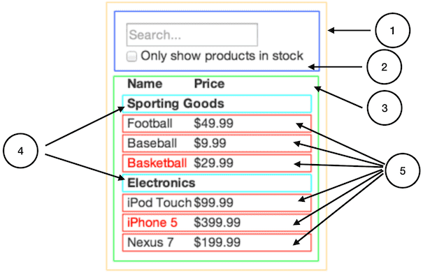
Components Start From The Bottom Up
- Breakdown pages into more specific parts
- Often in isolation
- Composed together to build up the whole
Tooling is Not Enough
Tools like SASS, Less, CSS-Modules, and CSS-in-JS all solve the problem of maintaining CSS style sheets.
They don't show you how to make your CSS composable
How Do We Achieve Layout Composition?
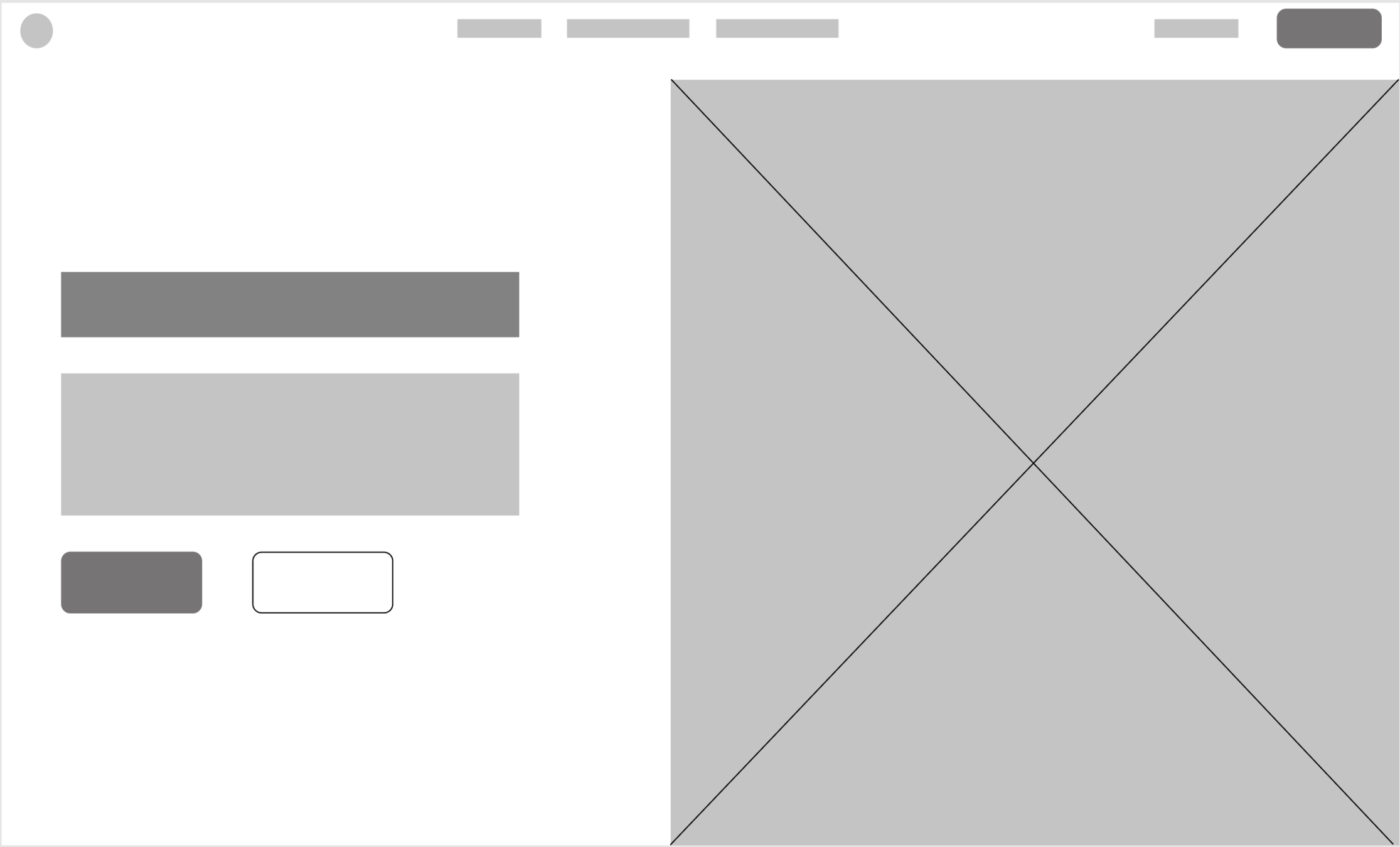
Hero Layout
A Naive Solution
.hero-container {
  /* container styles */
}

.hero-top {
  /* top styles */
}

.hero-left {
  /* left styles */
}

.hero-right {
  /* right styles */
}

/* ect... */
BEM, OOCSS, Functional CSS or Atomic CSS help manage our CSS style sheets at scale.
When we approach our layout as something unique for each component, we miss a fantastic opportunity.
CSS methodologies only get you so far
Layout Primitives
function Stack() {
  /** vertically stacks elements on top of each other */
}

function Inline() {
  /** horizontally stacks elements in a row */
}

function Split() {
  /** splits the parent's width between two elements */
}

function Cover() {
  /** covers an area and vertically centers its child */
}

function Frame() {
  /** Frames out a media into the correct aspect ratio */
}
Composable Solution
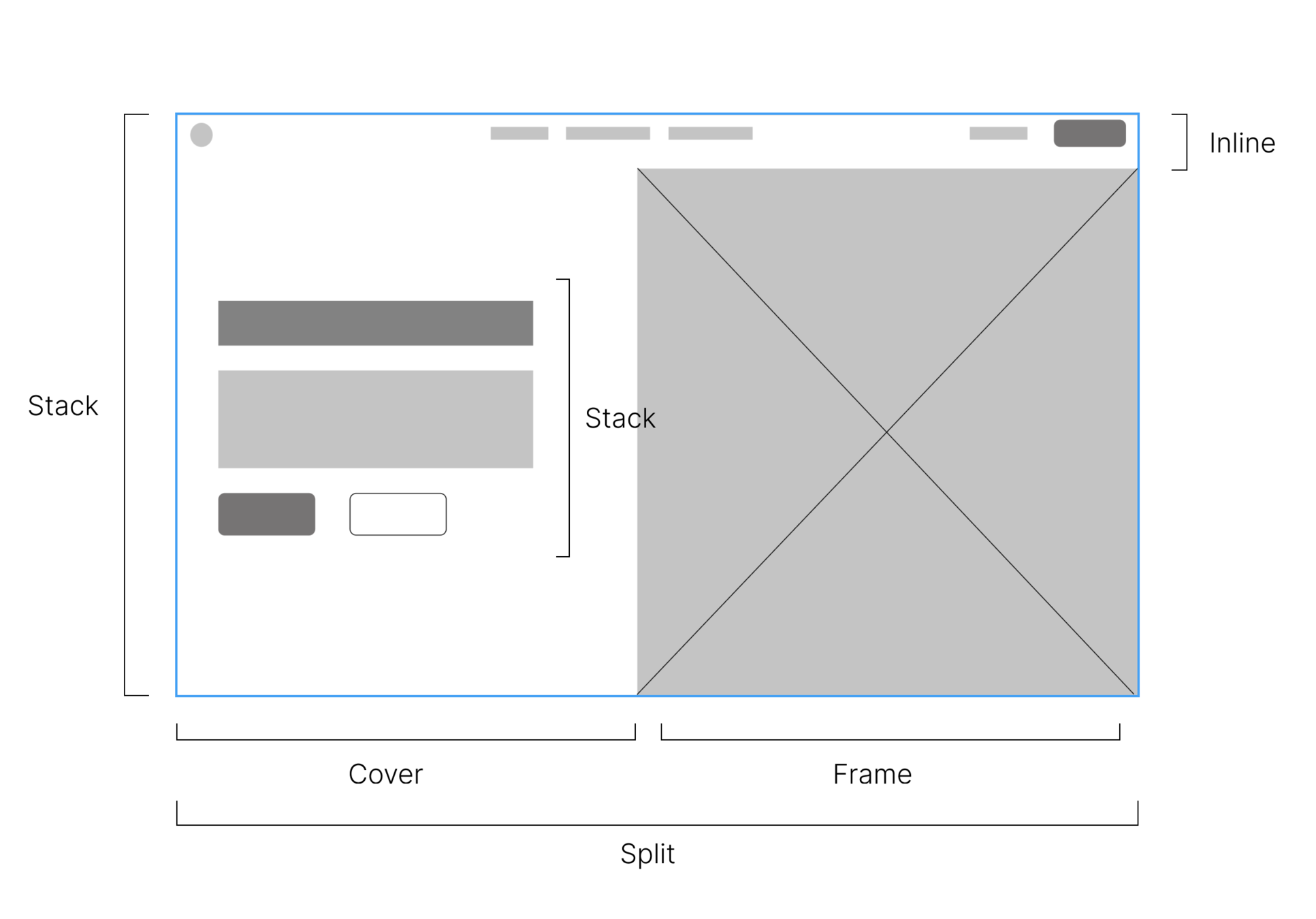
In JSX
export function Hero() {
  return (
    <Stack>
      <Inline>{/* */}</Inline>
      <Split>
        <Cover>
          <Stack>
            <h1>{/* */}</h1>
            <p>{/* */}</p>
            <Inline>
              <button>{/* */}</button>
              <button>{/* */}</button>
            </Inline>
          </Stack>
        </Cover>
        <Frame>
          <img />
        </Frame>
      </Split>
    </Stack>
  );
}
Layout Primitives can be used across our app.
- A Signup form
- A Blog Post Feed
- A Feature Page
- etc
If tooling and methodologies don't help, how do we create composable layouts?
Encapsulated CSS
The key to compositional layout
What is Encapsulated CSS?
Encapsulated CSS is a term I use to summarize the rules of how to apply CSS in a composable way.
The focus isn't on naming schemes, but on CSS properties themselves
Based on the programming principal of Encapsulation
Why Encapsulated CSS?
The biggest enemy to composing layouts is a component with built-in opinions on how it should be laid out.
The rules of Encapsulated CSS will help you avoid layout conflicts.
What is Encapsulation?
Encapsulation involves grouping related things and restricting access to those things, except through appropriate channels.
For Example
import React from "react";

React.createElement();
React.useState();
React.useEffect();
// etc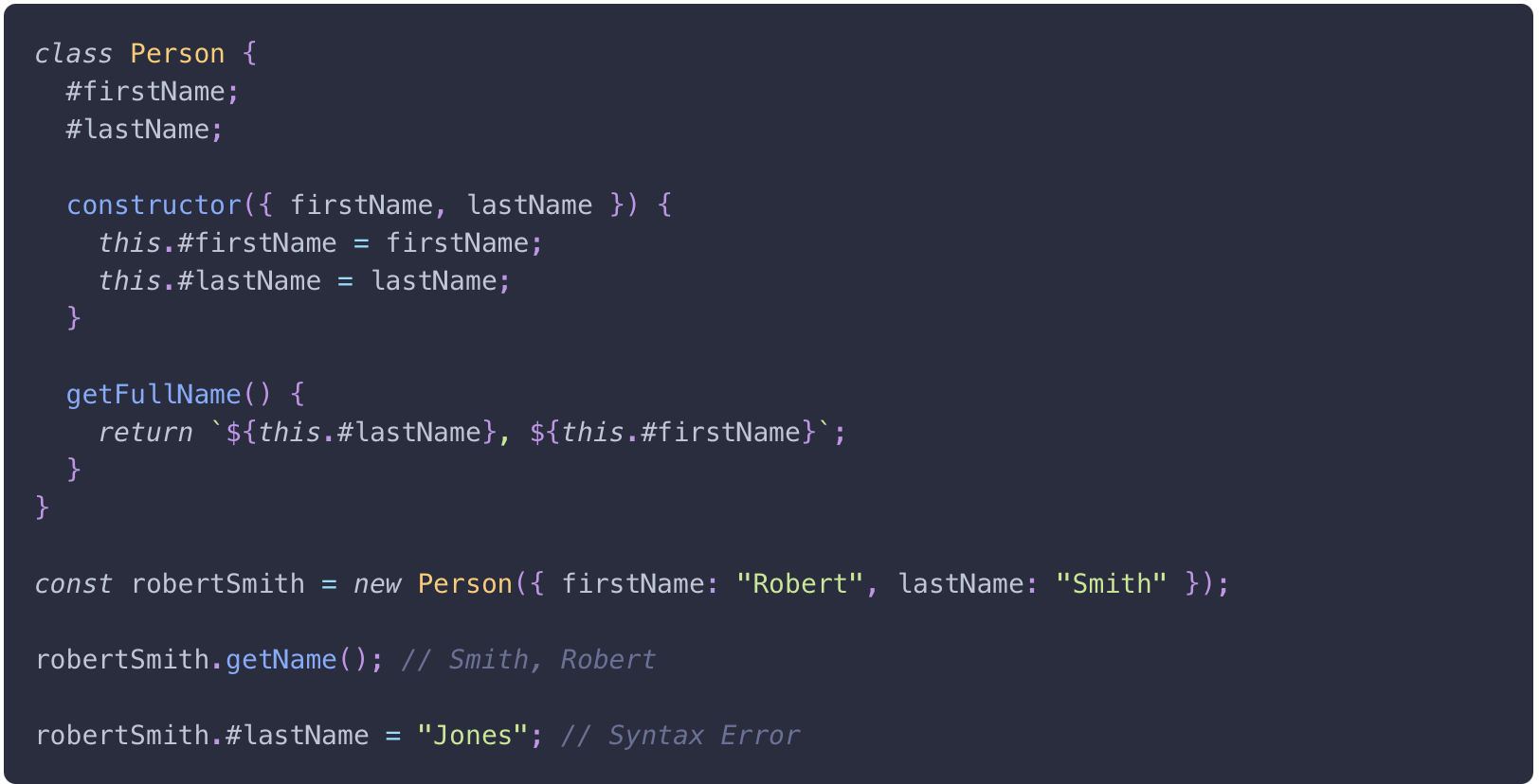

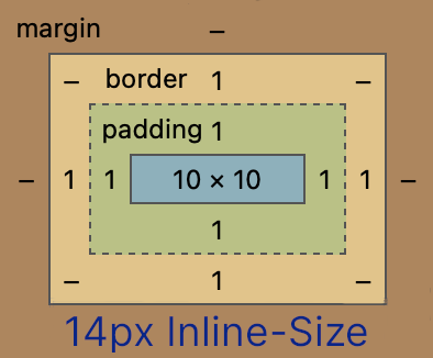
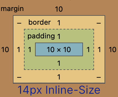
Where is the boundary of related properties in CSS?
The Two Principles of Encapsulated CSS
1. Elements do not lay themselves out
/* Not ok to set on the component */
.my-class{
  display: inline;
  width: 100px;
  margin-top: 2rem;
  position: relative;
}
(Layout properties === position, size and margin)
The Two Principles of Encapsulated CSS
2. Elements style themselves and layout only their immediate children.
/* Ok to set on the component */
.my-class{
  border: 1px solid #08228c;
  color: #4c6ef5;
  padding: 3rem;
  font-family: sans-serif;
}

.my-class > * {
  margin-block-start: 1rem;
  min-height: 50vh;
}
Applying The Principles
Normal Flow
We could use props
export const Component = (props) => {
  return (
    <div style={{ minWidth: props.minWidth }}>
      {/* Component content goes here */}
    </div>
  );
};

<Component minWidth={300} />;
It becomes unweildy very quickly
<Component
  width="50%"
  minWidth={300}
  height={500}
  display="inline-block"
  marginLeft="0.5rem"
  marginRight="2rem"
/>
*Use sparingly and only for components that specifically are used for layout.
Normal Flow
Direct child combinator
.parent > * {
  margin: 1rem;
}

.parent > h1 {
  display: inline-block;
}
This tool allows us to select any or all of the parent container's immediate children.
CSS Flexbox / Grid
//flex-container
<div style={{ display: "flex" }}>
  <div /> {/* flex-item */}
  <div>
    <div /> {/* not a flex-item */}
    <div /> {/* not a flex-item */}
  </div>
</div>

//grid-container
<div style={{ display: "grid" }}>
  <div /> {/* grid-item */}
  <div>
    <div /> {/* not a grid-item */}
    <div /> {/* not a grid-item */}
  </div>
</div>
Both Flexbox and Grid create containers that layout their direct children
CSS Flexbox / Grid
.parent{
  display: grid;
  gap: 1rem;
}

.parent > p {
  place-self: center;
}
Both Flexbox and Grid follow the rules of Encapsulated CSS very well.
A few flex and grid properties must be set on the direct children.
A Contrived Blog Post Componet
export const BlogPost = (props) => {
  return (
    <article className="blog-post">
      <h2 className="blog-title">{props.blogTitle}</h2>
      {props.paragraphs.map((paragraph, i) => {
        return <p key={i}>{paragraph}</p>;
      })}
    </article>
  );
};
Following Encapsulated CSS
.blog-post {
  padding: 1rem;
}

.blog-post > h2 {
  margin-bottom: 3rem;
  max-width: 75%;
}

.blog-post > p + p {
  margin-top: 2rem;
}

.blog-title {
  text-transform: uppercase;
  font-size: 1.5rem;
  color: darkgray;
}
What about Layout Components?
Layout Components shouldn't try solve every potential layout
The rules Encapsulated CSS will help you when you need to build those one-off layout situations.
What makes a good layout component?
Solves common layout patterns
i.e. Any abstraction should be worth it
What makes a good layout component?
Should be focused on the problem it solves and not how it does it.
i.e. We don't want to make "FlexBox" Components or "Margin" Components
What makes a good layout component?
Stylable
i.e. They expose the `className` and/or `style` props
What makes a good layout component?
Should not break accessibility
i.e. Should not keep you from using the correct semantic HTML
The polymorphic `as` prop is a good solution for this
A Few Examples
(The examples will be using styled-components, but these can be recreated using any tooling, even just vanilla CSS.)
Stack
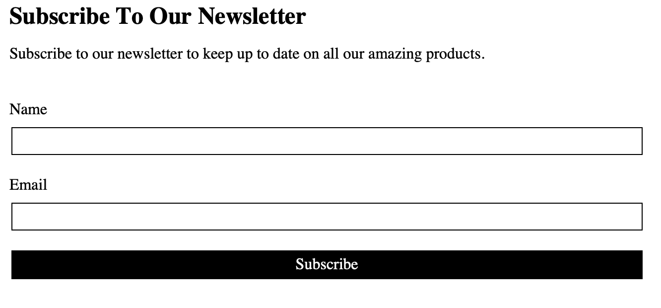
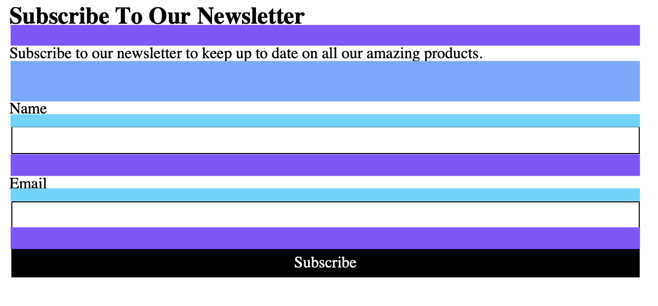
Stack
const spacingMap = {
  xs: "0.125rem",
  sm: "0.25rem",
  md: "0.5rem",
  lg: "1rem",
  xl: "2rem",
  xxl: "4rem",
};

const Stack = styled.div`
  display: grid;
  gap: ${(props) => spacingMap[props.gutter] ?? spacingMap.lg};
`;
Stack
export default function Subscribe() {
  return (
    <Stack as="section" gutter="xl">
      <Stack as="header" gutter="md">
        <h2>Subscribe To Our Newsletter</h2>
        <p>
          Subscribe to our newsletter to keep up to date on all our amazing
          products.
        </p>
      </Stack>

      <Stack as="form">
        <Stack as="label" gutter="sm">
          Name
          <input type="text" />
        </Stack>

        <Stack as="label" gutter="sm">
          Email
          <input type="text" />
        </Stack>

        <button>Subscribe</button>
      </Stack>
    </Stack>
  );
}
InlineCluster
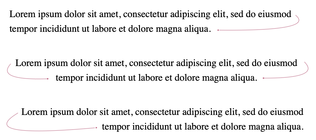
InlineCluster


InlineCluster
const justifyAlignMap = {
  start: "flex-start",
  end: "flex-end",
  center: "center",
};

const InlineCluster = styled.div`
  display: flex;
  flex-wrap: wrap;
  gap: ${(props) => spacingMap[props.gutter] ?? spacingMap.lg};

  justify-content: ${(props) =>
    justifyAlignMap[props.justify] ?? justifyAlignMap.start};

  align-items: ${(props) =>
    justifyAlignMap[props.align] ?? justifyAlignMap.start};
`;
InlineCluster
export default function MenuBar() {
  return (
    <Menu>
      <InlineCluster as="nav" gutter="lg" justify="end" align="center">
        <a>Product</a>
        <a>Features</a>
        <a>Marketplace</a>
        <a>Company</a>
        <a>Log in</a>
      </InlineCluster>
    </Menu>
  );
}
Learn More


Thank You React India

@travisWaithMair
non-traditional.dev