What We Learned Fixing Accessibility in a Real Product: Lessons from LOFT Loyalty
Travis Waith-Mair
Dev Lead Community Rewards
Fun Facts About Me
- 4 kids
- 3 Girls and 1 Boy
- Ages 16 to 23
- Wife from New Zealand
- I LOVE Smoking food in my Traeger
- I can speak Thai and get by in Spanish
Time for a Dad Joke
Why did the button need to go to therapy?
It wasn't getting the focus it deserved
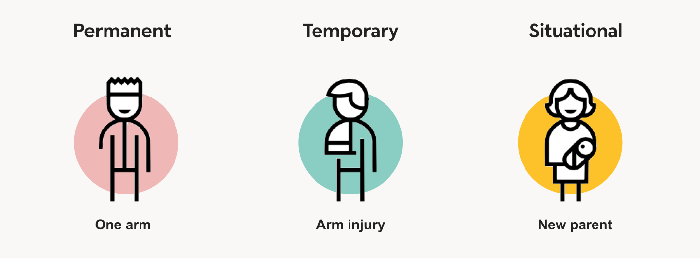
Accessibility
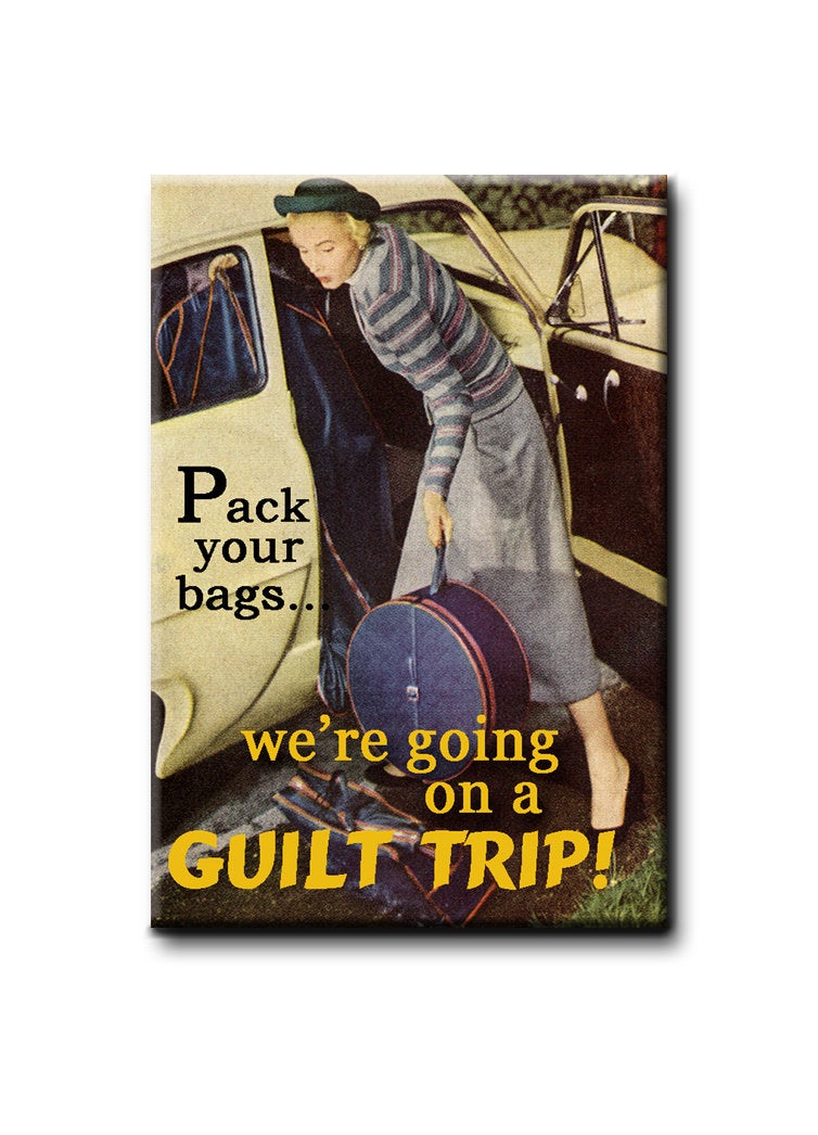
Not Another Accessibility Guilt Trip
“If you’re not making it accessible, you’re excluding users.”
“Accessibility is not a feature — it’s a requirement.”
“Accessibility is for everyone.”
“The Web is for all people, on all devices, in all contexts.”
Cliche things said in Accessibility talks
The Problem isn't the desire to do it

The problem isn't why, but how
"Doing aria wrong is worse than no aria at all"
That's true for everything
Using Web sockets wrong is worse than not using it at all
Using the Singleton Pattern wrong is worse than not using it at all
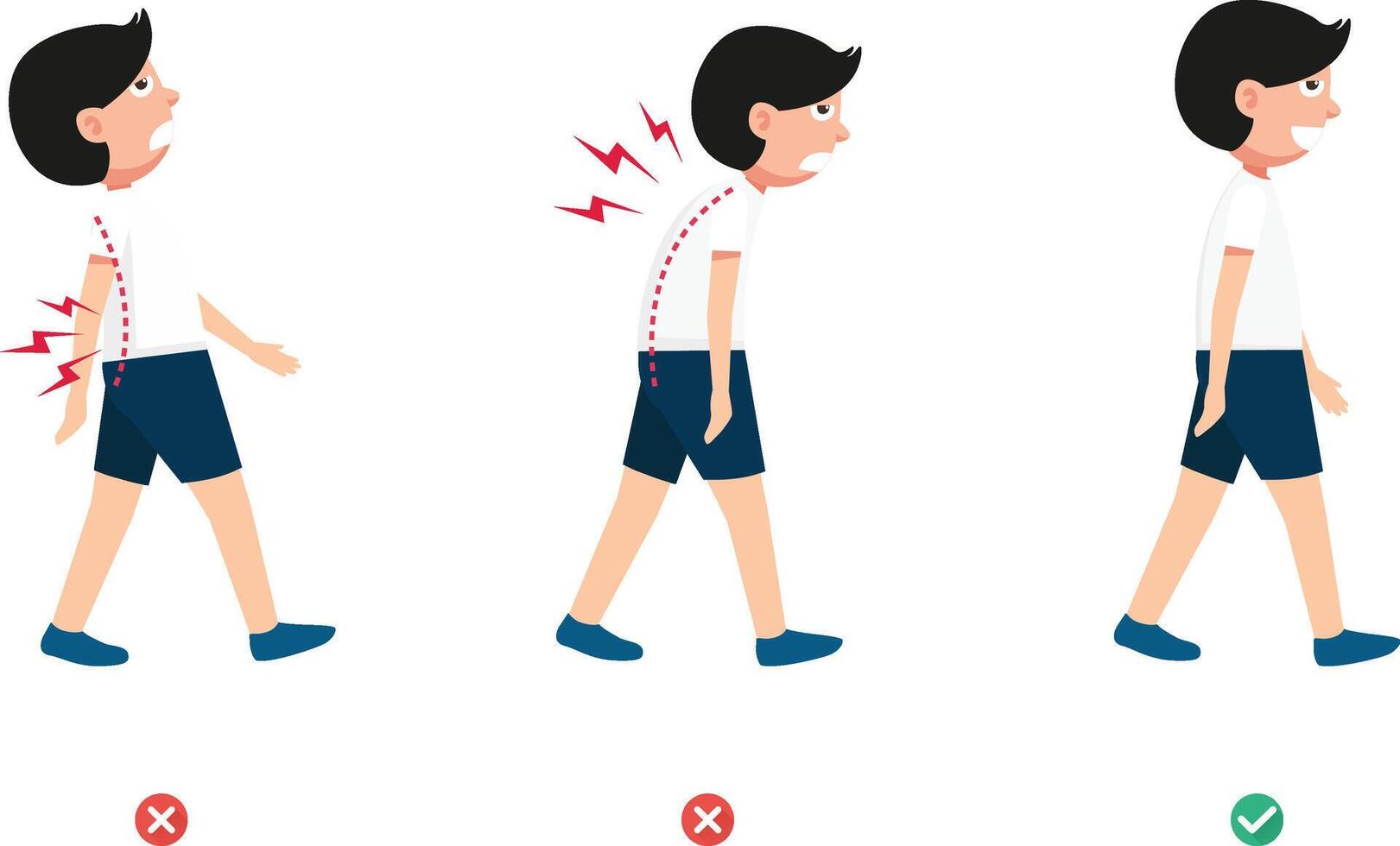
Walking wrong is worse than not walking at all
We are going to make mistakes
Not trying is worse than not trying at all
LOFT Loyalty is learning
Page Properties
lang attribute
<html lang="en">
  <!-- Content -->
</html>
The lang attribute helps assistive technologies correctly interpret and pronounce text, ensuring users understand the content as intended.
Zooming and Scaling
<meta
  name="viewport"
  content="width=device-width, initial-scale=1.0, maximum-scale=1.0, viewport-fit=cover, user-scalable=no"
>
Early mobile browsers struggled with poor support for responsive layouts and inconsistent CSS rendering, relying on fixed-width "desktop" assumptions that often caused unpredictable zooming and resizing.
Zooming and Scaling
<meta
  name="viewport"
  content="width=device-width, initial-scale=1"
>
Blocking zoom disables important accessibility features, making it difficult for users—particularly those with low vision—to enlarge content for readability.
Page title
A clear page title helps users of assistive technologies quickly identify their location and improve navigation and accessibility.
HTML > Aria
What is Aria?
Attributes that provide extra accessibility information to assistive technologies when native HTML isn’t enough
aria-label="Close"
aria-live="polite"
aria-disabled="true"
aria-selected="true"
aria-checked="false"

role="button"
role="dialog"

title="Help"
alt="George Washington Crossing the Delaware"
for="username"
id="tooltip-1"
Aria is to HTML what Casting is to TypeScript
const castedNumberAsString = 77 as unknown as string<div role="button">
Not a Button
</div>
<div role="button">
	Not a Button
</div><button>
Is a Button
</button>- role="button"
- Keyboard support
- Enter and Space on KeyUp
- tabindex="0" for focus
Requirements for a button
<Typography
  variant="subtitle2"
  component="span"
  onClick={onNextStatusClick}
>
	{nextStatusText} Status
</Typography>
Problem
<Button
 variant="text"
 onClick={onNextStatusClick}
>
  <Typography
    variant="subtitle2"
    component="span"
  >
	{nextStatusText} Status
  </Typography>
</Button>
The Fix
If you have to use Aria
Images
alt attribute
Short description of an image that is read aloud by assistive technologies when the image isn’t visible
<img
  src="dog.png"
  alt="Jack Russell jumping in the air"
>
alt attribute
A good `alt` text should communicate what is missed if you cannot visually see the image
<img
 src="chart.png"
 alt="Line chart showing sales rising 20% in Q4"
>
What alt text would you give?
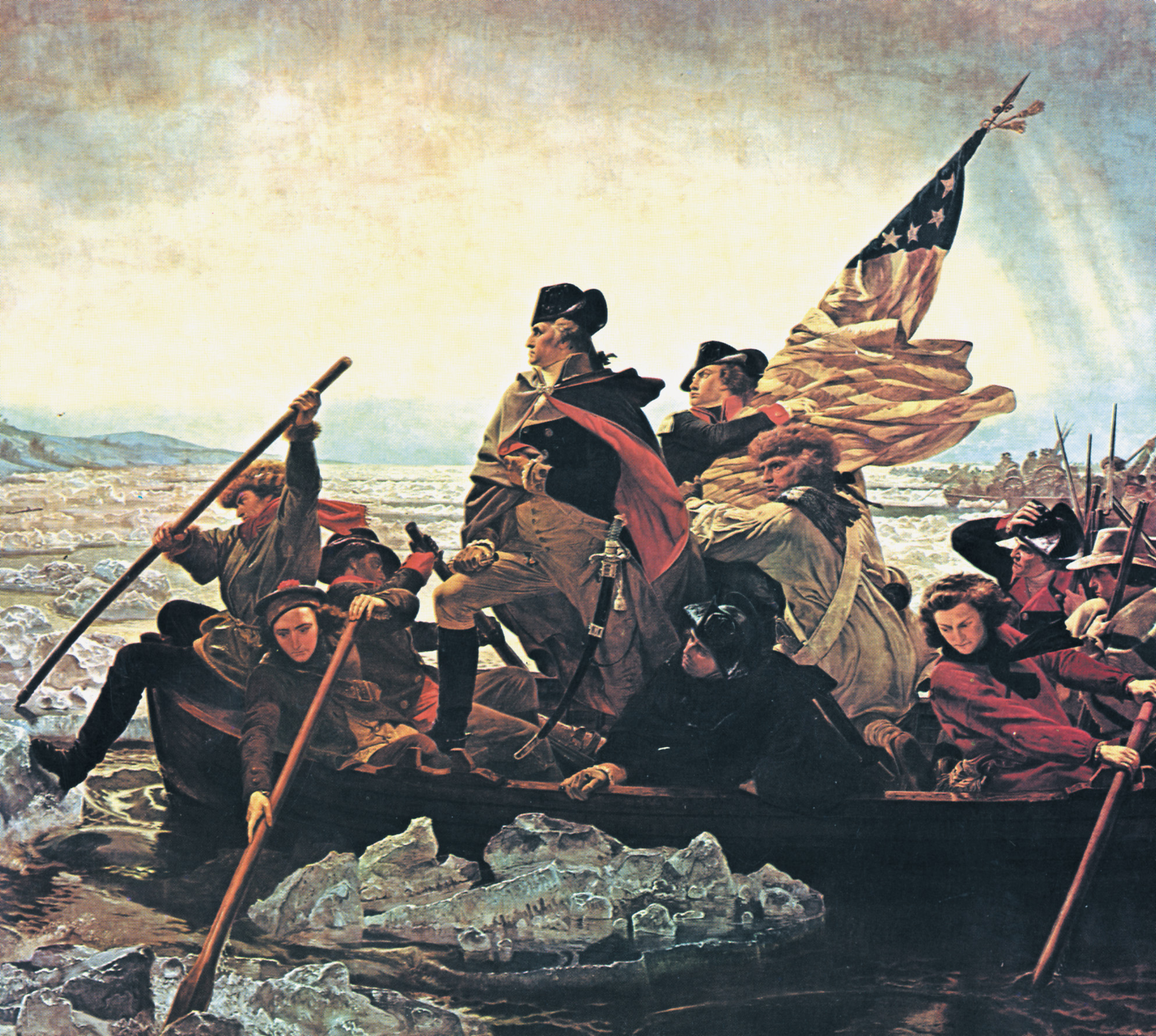
Historical Bio
"George Washington standing in a boat leading Continental soldiers across the icy Delaware River during the Revolutionary War."
A page about the artist
"'Washington Crossing the Delaware' by Emanuel Leutze, showing a dramatic, heroic composition with Washington at the center."
A museum Catalog
"'Washington Crossing the Delaware,' oil on canvas by Emanuel Leutze, 1851."
alt Text Golden Rule
Good questions to ask:
-
If there was no image, what would I say instead?
-
Does this help the user?
-
Is the text short, accurate, and contextual?
Describe the meaning lost without the image
Bring product in on the conversation
You ALWAYS need an alt text, but...
alt text can be empty
Only when an image is strictly decorative
<img src="confetti.png" alt="">Redundant Text
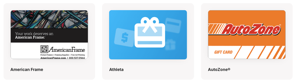
<GiftCardImage alt={displayName} src={rewardCardImageUrl} />
<Typography>{displayName}</Typography>
Redundant Text
<GiftCardImage alt="" src={rewardCardImageUrl} />
<Typography>{displayName}</Typography>
It's not broken right?
Empty or Hidden things
The Accessibility Tree
The accessibility tree is the semantic structure of the page used by assistive technologies, beyond just the visual elements.
If it’s not meaningful in the accessibility tree, it’s not meaningful to users.
Empty tags create confusion
 <Typography variant="h6">
   {contentTitle}
</Typography>-
Creates ghost structure in the accessibility tree
-
Screen reader announces: “Heading level 6” with no content
-
Breaks navigation for users who jump by headings
Fix: Don't render empty tags
{contentTitle && (
  <Typography variant="h6">
   {contentTitle}
  </Typography>
)}
Icon Buttons

<IconButton onClick={handleFilter}>
  <SearchIcon />
</IconButton>

<IconButton onClick={handleFilterCancel}>
  <CloseIcon />
</IconButton>
Icon Buttons
<IconButton onClick={handleFilter}>
  <SearchIcon />
  <VisuallyHidden>Search</VisuallyHidden>
</IconButton>

<IconButton onClick={handleFilterCancel}>
  <CloseIcon />
  <VisuallyHidden>Clear Search</VisuallyHidden>
</IconButton>
export function VisuallyHidden({ style, ...props }: BoxProps<"span">) {
return (
<Box
component="span"
style={{
position: "absolute",
clip: "rect(0, 0, 0, 0)",
border: 0,
width: 1,
height: 1,
margin: -1,
padding: 0,
overflow: "hidden",
whiteSpace: "nowrap",
wordWrap: "normal",
...style,
}}
{...props}
/>
);
}aria-label is interpreted differently across screen reader and browser combinations, and in some cases:
-
It may be ignored if conflicting naming mechanisms exist
-
It may not update properly when changed dynamically
-
Its support varies across mobile vs. desktop and different screen reader/browser pairings
-
Translation tools like google translate are likely to ignore attributes
Why aria-label isn’t always reliable
Complicated Form
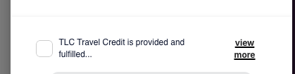
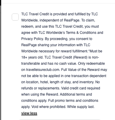
Complicated Form
Screen readers we just want the full text
Visually we want to hide the full text unless chosen
<label>
   <VisuallyHidden>{fullText}</VisuallyHidden>
   <span aria-hidden="true">
     {expanded ? fullText : truncatedText}
     <button onClick={()=>toggleExpansion()}>
       view {expanded ? "less" : "more"}
     </button>
   </span>
</label> 
What can I do to get started
Accessibility isn’t a destination — it’s a habit.
Start small. Improve continuously.
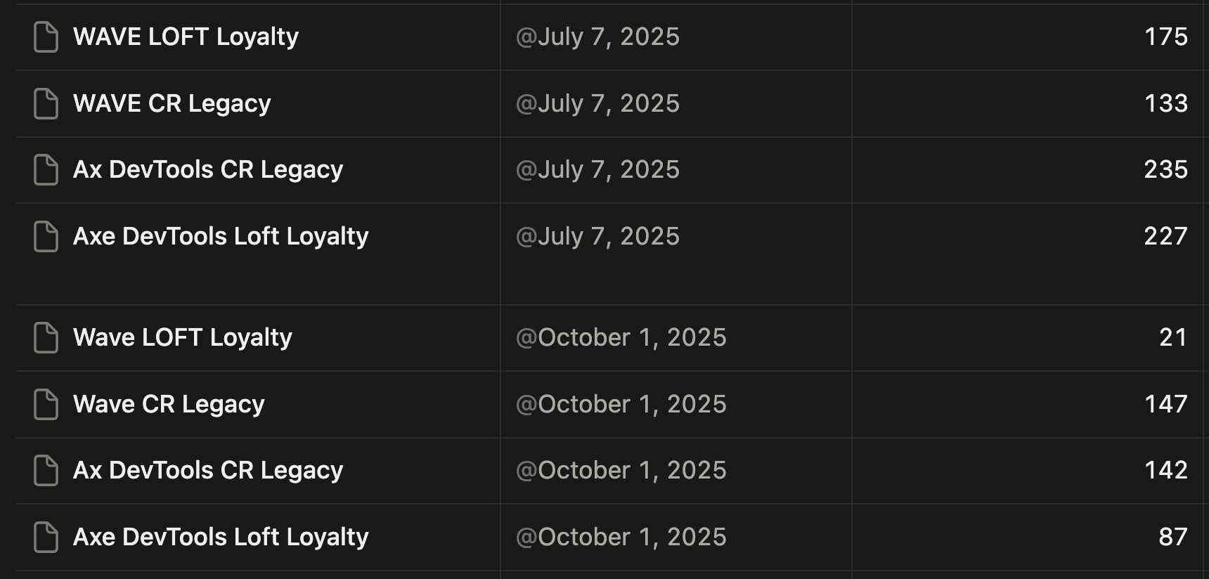
Audit yourself regularly
We have set a quarterly audit schedule to start
You might do it more often or less often. What matters is that you start.
Triaging Findings
Treat accessibility issues like other bugs:
-
Prioritize user impact
-
Fix violations first and warnings next
-
Track accessibility tickets in your normal workflow
-
Tickets typically are low effort
Accessibility shouldn’t live in a separate backlog.
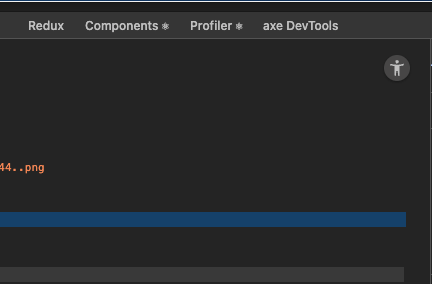
Free* Tooling
Chrome Extensions:
-
axe DevTools — Automated checks with actionable results
-
WAVE Evaluation Tool — Visual indicators on-page
*axe has a paid upgrade, but free tier is still powerful
Just Start Somewhere!
Question
(Thank you Steven for showing that you need a warning slide)