Analysis of Magazine Covers
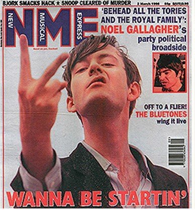
MASTHEAD - The name of the magazine is the key to selling it, placed in the top left corner because when it is placed on shop shelves this will be shown and customers will be able to see it
TAGLINE - Used bold text this is to stand out to the customer when they're picking it up it is also a sort of verbal interpretation of the main image and helps to solidify what the article is about.
MAIN IMAGE - The main image depicts Noel Gallagher swearing at someone or something and reflects his 'bad boy' attitude, almost as if he doesn't care
COLOURS - The colours used contrast highly with each other with the white background it clearly distinguishes what the individual on the cover is doing, the heavy use of red and black have quite dark connotations again feeding into this 'bad boy' character.
PRICE - Positioned here because it isn't a main selling point for the magazine it is something they will look at after they have been lured in by the rest of the magazine.
ANCHORAGE TEXT –Enlightens the buyer towhat is inside themagazine other than thefocus film. Here it tells usthat interviews withfamous names within thefilm industry are insideand this sells themagazine if the mainimage doesn’t.
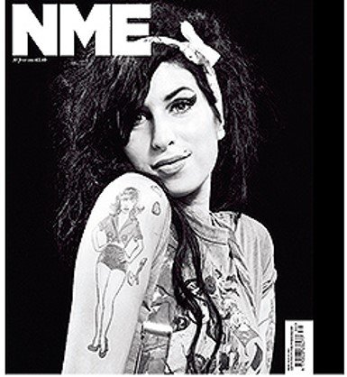
MASTHEAD - The name of the magazine is the key to selling it, placed in the top left corner because when it is placed on shop shelves this will be shown and customers will be able to see it
TAGLINE - There is no tagline for this cover as it was released as apart of Amy Whinehouse's death it shows the image speaks enough for itself and will still entice customers.
MAIN IMAGE - The main image is a nice photo of Amy smiling as sort of a tribute to her compared what was typically written about her in magazines which was often quite negative.
COLOURS - There is a simple black and white colour scheme it makes the image stand out much more due to the high contrast, and Amy is very bright in the image again shown the artist in a sort of positive light.
PRICE - Positioned here because it isn't a main selling point for the magazine it is something they will look at after they have been lured in by the rest of the magazine.
ANCHOR TEXT - There is no other text shown on the cover this is again a tribute rather than including various other stories across the front cover it is solely dedicated to Amy. And is enough for the customer to by it still regardless of not knowing what else is inside.
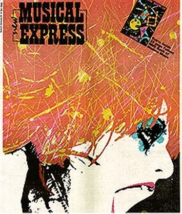
MASTHEAD - The name of the magazine is the key to selling it, placed in the top left corner because when it is placed on shop shelves this will be shown and customers will be able to see it
TAGLINE - There is no tagline for this cover this may be due to the intensity of the cover being able to grab the readers attention regardless and as such does not need further information.
MAIN IMAGE - The main image is very artistic an illustration of a main shouting and very expressionist with the random lines of yellow. It could be related to the person in the image as they are screaming and the illustration appears quite sporadic and angry.
COLOURS - There is a range of colours shown within the cover this could again be linked to the sort of unpredictable nature of the person featured in the image.
PRICE - The price isn't shown on the magazine this may be because the magazine is well established and readers already know or if it perhaps is featured on the back.
ANCHOR TEXT - There is no other text shown on the cover this again could be due to the main image taking all the attention.