Animating SVG with CSS and JavaScript

SVG ... what?
Scalable Vector Graphics
-
Animating with CSS
- Transition & Transform & Rotate
- Keyframes Animation
- Demo: Alien Ship / Letter Drawing
-
Animating with CSS and Javascript*
- Demo: Fullstack
Text
* we will not cover details on this
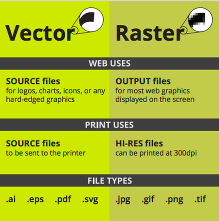
Vector
Made of mathematical calculations that form objects and lines.
Resolution-independent: Can be printed at any size/resolution.
Easily convertible to raster
cons: It is not the best format for photographs or photo-like elements with blends of color.
Raster
Made of pixels
cons: It cannot be scaled up without losing quality.
Depending on the complexity of the image, conversion to vector may be time consuming.
CSS'ing SVGs
<svg xmlns="http://www.w3.org/2000/svg" viewBox="0 -50 400 200">
<g class="gear">
<circle class="gear-bg" fill="#39ADD1" cx="200" cy="50" r="90"></circle>
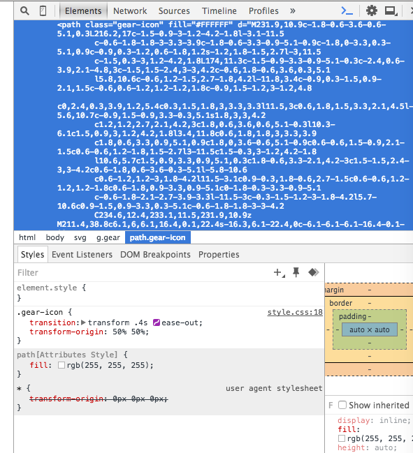
<path class="gear-icon" fill="#FFFFFF" d="M231.9,10.9c-1.8-0.6-3.6-0.6-5.1,0.3L216.2,17c-1.5-0.9-3-1.2-4.2-1.8l-3.1-11.5
6,1.
......... (mathematical calculations....more about this)
2.7-3.9-3.3l-11.5-3c-0.3-1.5-1.2-3-1.8-4.2l5.7-10.6c0.9-1.5,0.9-3.3,0.3-5.1c-0.6-1.8-1.8-3-3-4.2
C234.6,12.4,233.1,11.5,231.9,10.9z M211.4,38.8c6.1,6,6.1,16.4,0.1,22.4s-16.3,6.1-22.4,0c-6.1-6.1-6.1-16.4-0.1-22.4
S205,32.5,211.4,38.8z"></path>
</g>
</svg>
Before CSS: SVG Presentation Attributes
gear.svg
Shared with CSS |
SVG-Only |
|---|---|
|
|
clip-rule, flood-color, flood-opacity, stop-opacity, kerning, tech-anchor, color-profile, color-rendering, fill, fill-opacity, fill-rule, marker, marker-end, marker-mid, marker-start, stroke, stroke-width, stop-color, lighting-color, enable-background, dominant-baseline, color-interpolation-filters, color-interpolation, glyph-orientation-horizontal, glyph-orientation-vertical, shape-rendering, baseline-shift, alignment-baseline, stroke-miterlimit, stroke-linejoin, stroke-linecap, stroke-dashoffset, stroke-dasharray, stroke-opacity |
In SVG2, more presentation attributes will be added.
CSS recipe
Transition: <property> <duration> <time-function> <delay>
Defaults to all
Defaults to ease
Defaults to 0
example:
.gear-icon {
transition: transform .4s ease-out;
transform-origin: 50% 50%;
}

Animating SVGs with CSS
Using CSS Transitions
Rotate & Scale

Source: Treehouse

Checkout time functions in Dev tool !
transform-origin: SVG vs HTML
transform-origin (default value)
HTML Elements (div, ::before, etc.)
SVG Elements (circle, rect, etc.)
50% 50%
(the center of the element itself, calculated relative to its box model)
0 0
(top left corner of the SVG canvas, not of the element itself)

transform-origin: SVG vs HTML
Example: 45deg Rotation
<!DOCTYPE html>
<div style="width: 100px; height: 100px; background-color: orange"> </div>
<svg style="width: 150px; height: 150px; background-color: #eee">
<rect width="100" height="100" x="25" y="25" fill="orange" />
</svg>
Setting transform-origin in SVG using CSS
- Using percentage values: The value is set relative to the element's bounding box, which includes the stroke used to draw its border.
- Using absolute values: The origin is set relative to the SVG canvas.
Setting transform-origin in SVG using CSS
Example

<!DOCTYPE html><style>
div, rect { transform-origin: 50% 50%; }
</style>
Using CSS Animations & Transforms
Keyframes
Keyframe Animation
Text
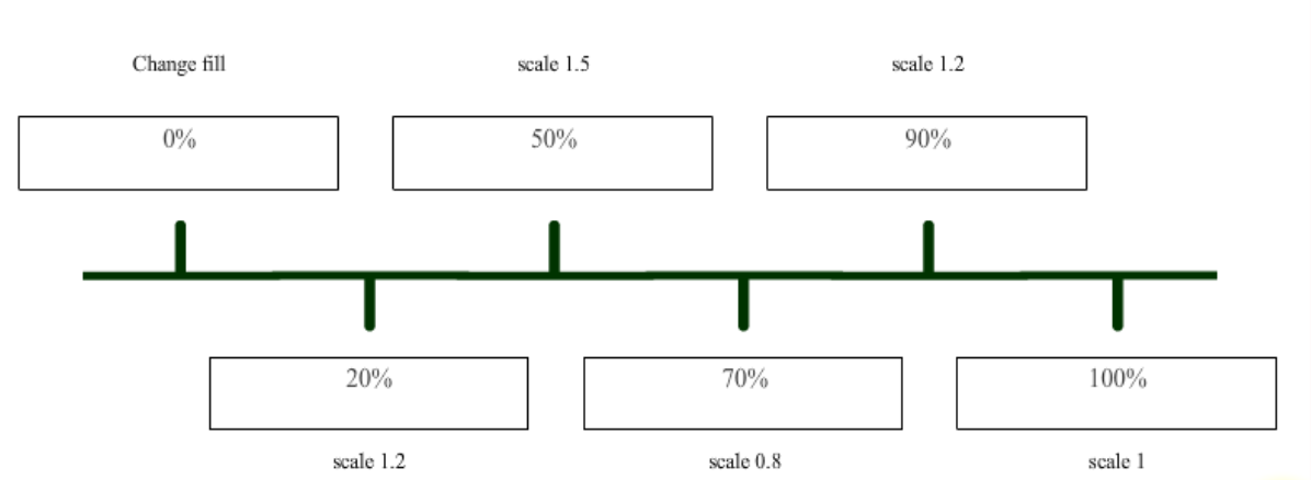
The list of transitions should happen over the course of the animation
Example: bouncing shape
codepen source

Demo: Alien Ships
<svg xmlns="http://www.w3.org/2000/svg" xmlns:xlink="http://www.w3.org/1999/xlink" version="1.1" x="0px" y="0px" viewBox="0 0 450 250" enable-background="new 0 0 450 250" xml:space="preserve" class="svg ufo-building">
  <g class="ufo-building-float">
    <g class="building">
      .........
      <g class="building-body">
       .......
      </g>
      <g class="building-flames">
        .......
      </g>
    </g>
    <g class="ufo-big">
      ........
      <g class="ufo-big-lights">
       .........
      </g>
    </g>
    <g class="ufo-small">
      .........
    </g>
  </g>
</svg>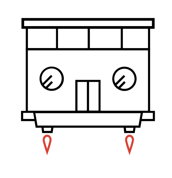

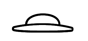
"building"
"ufo-big"
"ufo-small"
All three are grouped in the "ufo-building-float" class
index.html
keyframes
@keyframes ufo-building-float {
  0%   {transform: translateY(0)}
  25%  {transform: translateY(-25px)}
  75%  {transform: translateY(25px)}
  100% {transform: translateY(0)}
}

.ufo-building-float {
  animation: ufo-building-float 5s linear infinite;
}

@keyframes ufo-big {
  0%        {opacity: 0}
  15%, 70%  {opacity: 1}
  85%, 100% {opacity: 0}
}

@keyframes ufo-small {
  0%, 10%  {opacity: 0}
  25%, 85% {opacity: 1}
  100%     {opacity: 0}
}

.ufo-big {
  animation: ufo-big 5s ease infinite;
}

.ufo-small {
  animation: ufo-small 5s ease infinite;
}


@keyframes ufo-big-lights {
  0%        {fill: #000}
  20%       {fill: #fbcb43}
  40%, 100% {fill: #000}
}

.ufo-big-lights-light {
  animation: ufo-big-lights 2.5s ease infinite;
}

.ufo-big-lights--2 {animation-delay: .2s}
.ufo-big-lights--3 {animation-delay: .4s}
.ufo-big-lights--4 {animation-delay: .6s}
.ufo-big-lights--5 {animation-delay: .8s}


@keyframes building-flames {
  0%   {transform: scale(1, 1)}
  50%  {transform: scale(1, 1.1)}
  100% {transform: scale(1, 1)}
}

.building-flames path {
  fill: #d84437;
  animation       : building-flames .15s ease infinite;
  transform-origin: center top;
}
Moving up and down
hide and show
style.css
Animate Recipe
@keyframes kfName {
  0%        { <property> : <value>; }    //from here
  20%       { <property> : <value>; }
  40%, 100%  { <property> : <value>; }   // to here
}

<property name / animate target> {

        animation: kfName <duration> <delay> <iteration>; //iteration can be infinite / finite

}
Creating the Illusion
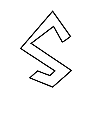
<svg viewBox="0 0 500 500" xmlns="http://www.w3.org/2000/svg">
  <defs/>
  <path class="letterS" d=" ...... "/>
</svg>


svg {
    display: block;
    margin: 2em, auto 0;
    width: 70%;
}

@keyframes offset {
	100% {
		stroke-dashoffset: 0;
	}
}

.letterS {
    fill: #FFF;
    stroke: #000;
    stroke-width: 2;
    stroke-dasharray: 800;      // in JS: pathclassName.getTotalLength()
    stroke-dashoffset: 800;
    animation: offset 5s linear forwards;
}
index.html
style.css
And animating other attributes that simply cannot be set/styled/changed via CSS..
Animating SVG with Javascript
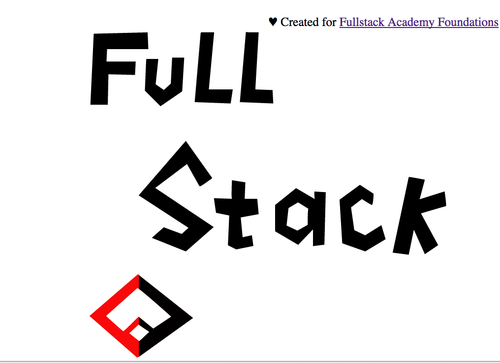
Demo: Fullstack drawing
Sources
<Library>
Javascript: Snap
<Tool>
Creating SVG: Adobe Illustrator / Boxy SVG (Chrome Extension)
<Course/Tutorial>
1. SVG Basics (Treehouse)
2. Web Animation (CodeSchool)
3. Animating SVG with CSS (Treehouse)

Questions?