Promo Poster Analysis
Colours
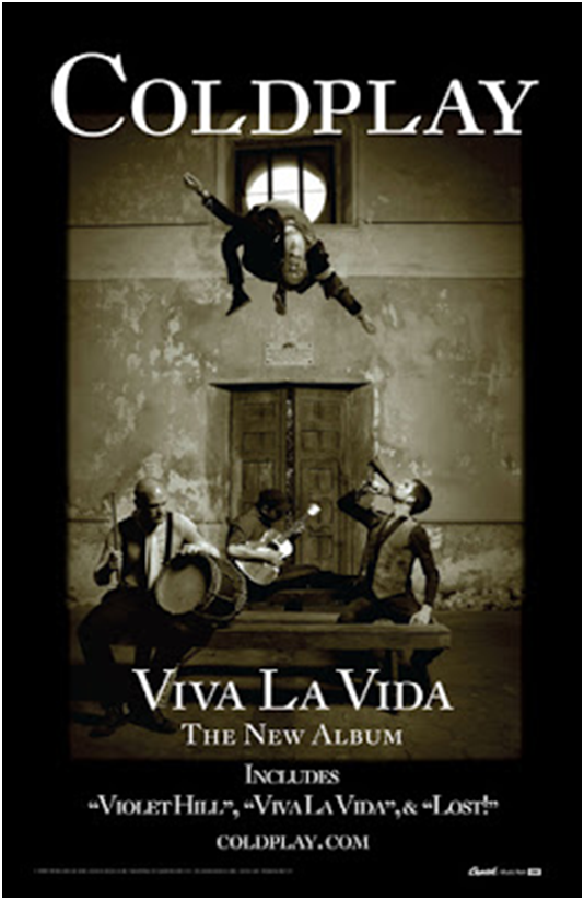
The colour scheme of the poster is black and white, which connotes simplicity because of the lack of colour. This matches the Indie genre because it is supposed to be all about the music and stereotypically they don't have massive budgets. Furthermore black and white effects are often used with Indie music videos and so the audience can immediately tell this is for an Indie band and so pre-existing fans of the genre would be more likely to buy the album.

Font
Only one font is used for the main information on the poster, including the band's name and some of the tracks. It is a serif font which connotes the idea of being more formal and old-fashioned, which matches the ideas created through the mise-en-scene and black and white photo. Therefore, this creates entropy because usually bands try to seem current and fashionable. The reason they may have done this is to cause some mystery about the band, so people would be more likely to want to listen to their music because they seem different.

Text
The band's name is at the top of the poster and is in a larger font size than the rest emphasising how the band is what's most important. An interesting thing to note about the written content is there is no mention of a date for release of the album. This would create more mystery and hype about the new album because more people will start talking about it which will create a buzz about the album. The title of the album "viva la vida" is Spanish for "live the life" this in itself will cause interest because it's not English and so is entropic. Other features included on the poster: website, record label, tracks on the album (fans of one song may buy the album).

Image
While the image is of the band which is very typical it is also quite entropic because it's not immediately obvious what is going on; especially because Chris Martin is in mid-air for no apparent reason. The mise-en-scene is also rather entropic because they aren't wearing the stereotypical casual clothes of the Indie genre they instead are wearing quite formal clothing like a waistcoat. This again connotes the idea of the old-fashioned and renaissance era feeling. The use of old instruments like the drum and horn, h further adds to the font and title of the album to suggest a rebellion feel about the poster. This is could be because they are rebelling against convention with their new album or just because it is something new that's not been done before.
