(very basic)
intro to
CSS ANIMATion
properties*
- animation-name
- animation-duration
- animation-timing-function
- animation-delay
- animation-iteration-count
- animation-direction
- animation-fill-mode
- animation-play-state
animation: name duration timing-function delay iteration-count
           direction fill-mode play-state;
*note that for browser compatibility, you need -webkit, -moz, etc. versions
properties
- animation-name
- animation-duration
- animation-timing-function
- animation-delay
- animation-iteration-count
- animation-direction
- animation-fill-mode
- animation-play-state
animation: name duration timing-function delay iteration-count
           direction fill-mode play-state;
Specifies the name of the keyframe you want to bind to the selector
properties
- animation-name
- animation-duration
- animation-timing-function
- animation-delay
- animation-iteration-count
- animation-direction
- animation-fill-mode
- animation-play-state
animation: name duration timing-function delay iteration-count
           direction fill-mode play-state;
Specifies how many seconds or milliseconds an animation takes to complete
properties
- animation-name
- animation-duration
- animation-timing-function
- animation-delay
- animation-iteration-count
- animation-direction
- animation-fill-mode
- animation-play-state
animation: name duration timing-function delay iteration-count
           direction fill-mode play-state;
Specifies the speed curve of the animation
properties
- animation-name
- animation-duration
- animation-timing-function
- animation-delay
- animation-iteration-count
- animation-direction
- animation-fill-mode
- animation-play-state
animation: name duration timing-function delay iteration-count
           direction fill-mode play-state;
Specifies a delay before the animation will start
properties
- animation-name
- animation-duration
- animation-timing-function
- animation-delay
- animation-iteration-count
- animation-direction
- animation-fill-mode
- animation-play-state
animation: name duration timing-function delay iteration-count
           direction fill-mode play-state;
Specifies how many times an animation should be played
properties
- animation-name
- animation-duration
- animation-timing-function
- animation-delay
- animation-iteration-count
- animation-direction
- animation-fill-mode
- animation-play-state
animation: name duration timing-function delay iteration-count
           direction fill-mode play-state;
Specifies whether or not the animation should play in reverse on alternate cycles
properties
- animation-name
- animation-duration
- animation-timing-function
- animation-delay
- animation-iteration-count
- animation-direction
- animation-fill-mode
- animation-play-state
animation: name duration timing-function delay iteration-count
           direction fill-mode play-state;
Specifies what values are applied by the animation outside the time it is executing
properties
- animation-name
- animation-duration
- animation-timing-function
- animation-delay
- animation-iteration-count
- animation-direction
- animation-fill-mode
- animation-play-state
animation: name duration timing-function delay iteration-count
           direction fill-mode play-state;
Specifies whether the animation is running or paused
@keyframes
Another property! It specifies the changes made during the animation. (no @keyframes = no animation)
@keyframes
.animate {
    animation: colorshift 5000ms ease;
}

@keyframes colorshift {
    0% {background: red;}
    25% {background: yellow;}
    50% {background: blue;}
    75% {background: green;}
    100% {background: red;}
}
*note that for browser compatibility, you need -webkit, -moz, etc. versions
@keyframes
.animate {
    animation: colorshift 5000ms ease;
}

@keyframes colorshift {
    from {background: red;}
    25% {background: yellow;}
    50% {background: blue;}
    75% {background: green;}
    to {background: red;}
}
from = 0%
to = 100%
*note that for browser compatibility, you need -webkit, -moz, etc. versions
transition
- transition-delay
- transition-duration
- transition-property
- transition-timing-function
Good for something like a property change on hover
transition: property duration timing-function delay;*note that for browser compatibility, you need -webkit, -moz, etc. versions
timing-functions
- linear
- ease
- ease-in
- ease-out
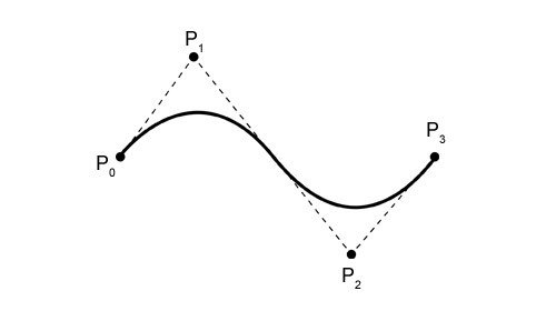
- cubic-bezier(n,n,n,n)
Bezier Curve
you don't have to write your own css!
including -webkit, -moz, etc. versions!
animate.css
bounce flash pulse rubberBand shake swing tada wobble bounceIn bounceInDown bounceInLeft bounceInRight bounceInUp bounceOut bounceOutDown bounceOutLeft bounceOutRight bounceOutUp fadeIn fadeInDown fadeInDownBig fadeInLeft fadeInLeftBig fadeInRight fadeInRightBig fadeInUp fadeInUpBig fadeOut fadeOutDown fadeOutDownBig fadeOutLeft fadeOutLeftBig fadeOutRight fadeOutRightBig fadeOutUp fadeOutUpBig flipInX flipInY flipOutX flipOutY lightSpeedIn lightSpeedOut rotateIn rotateInDownLeft rotateInDownRight rotateInUpLeft rotateInUpRight rotateOut rotateOutDownLeft rotateOutDownRight rotateOutUpLeft rotateOutUpRight hinge rollIn rollOut zoomIn zoomInDown zoomInLeft zoomInRight zoomInUp zoomOut zoomOutDown zoomOutLeft zoomOutRight zoomOutUp slideInDown slideInLeft slideInRight slideInUp slideOutDown slideOutLeft slideOutRight slideOutUp
to use:
bower install animate.css
necessary class:
animated
optional class:
infinite
to use:
<button class="animated infinite bounce">Bouncy!</button>in HTML:
resources
w3schools.com
http://www.hongkiat.com/blog/css-cubic-bezier/
http://cubic-bezier.com/
what's the deal with
ng-animate??
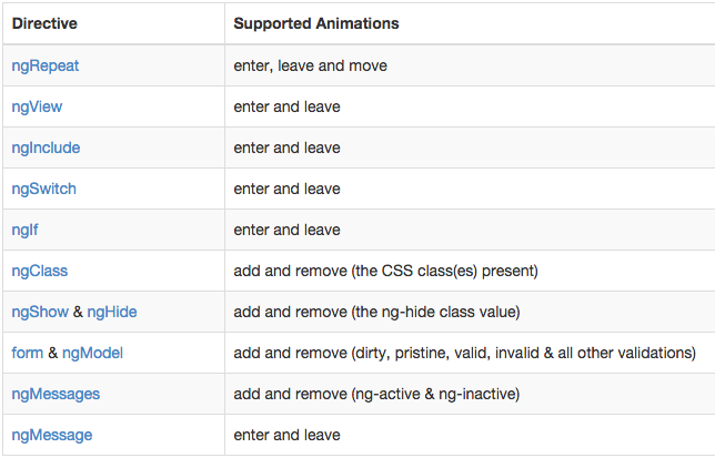
ngAnimate is a module that provides support for JavaScript, CSS3 transition and CSS3 keyframe animation hooks within existing core and custom directives.
DEMO!
NG-animate

to use:
bower install angular-animate
be sure to include in app.js...
angular.module('app', ['ngAnimate']);
how to use
<button ng-click="hidenow=true">Hide the text</button>

<p ng-hide="hidenow" ng-animate="'fade'">I'm a-gonna disappear!</p>
.fade-hide {
animation: fadeout 600ms ease;
}
@keyframes fadeout {
from {opacity: 1;}
to {opacity: 0;}
}in HTML:
in CSS:
