Digipak Analysis
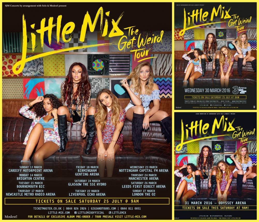
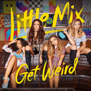
Get Weird Front cover
Little Mix have a very colourful album cover and it infers to the audience that they have bright and bold personalities, it also links to the album title as the colour assortment clashes and is very abstract. The colour continues into their clothing to portray this message further and makes it more suitable for their target audience. The clothing is also more covering than what they usually wear, so they aren't giving off many bad messages to the people that buy the CD.
The posing on the sofa gives the aesthetic of being free and relaxed, however, the oppositional reading is that they are trying to be sensual due to their facial expressions and poses. This view would most likely come from parents of the target audience as they believe that they could become a bad influence on them.
The typography is a sans serif font and looks like it has been graffitied onto the page or painted, keeping the idea of being casual and relaxed going.

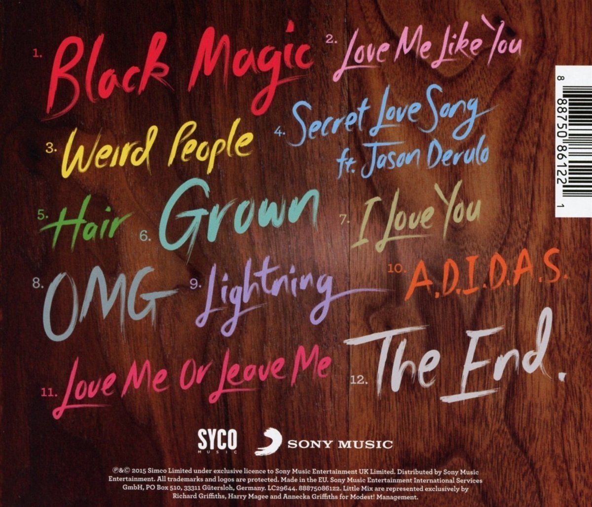
Get Weird Back cover
Little Mix carry on the aesthetic of being fun and casual as the colouring and typography is continued. The background of the back cover is no longer a picture of the girls, but a wooden background with just the song titles scattered around. The typography of the songs are the same as the typography on the front, sans serif and look painted on. Each song title is a different colour to section them off and also make it easier for the audience to read. The copyright information and barcode is very small so that it doesn't distract the reader from the overall look of the back cover.

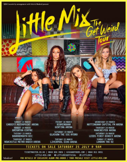
Get Weird magazine advert
The adverts within the magazine follow the same typography and images that the album had to carry on the style that has been branded throughout. This means the audience begin to associate certain fonts and image styles with the band and the group become more embedded into their thoughts. The dates at the bottom of the pages are placed right at the bottom of the photo as to not cover any of the image, which is the part of the advert that the audience will be most drawn to. The image itself has again got colourful clothing like the album cover to attract people to look at it and also to showcase that they are fun. The playfulness of their poses creates a welcoming impression and will make the audiences want to go and see them live. The bright yellow colour also gives off a warm impression and makes them seem like they are joyful.
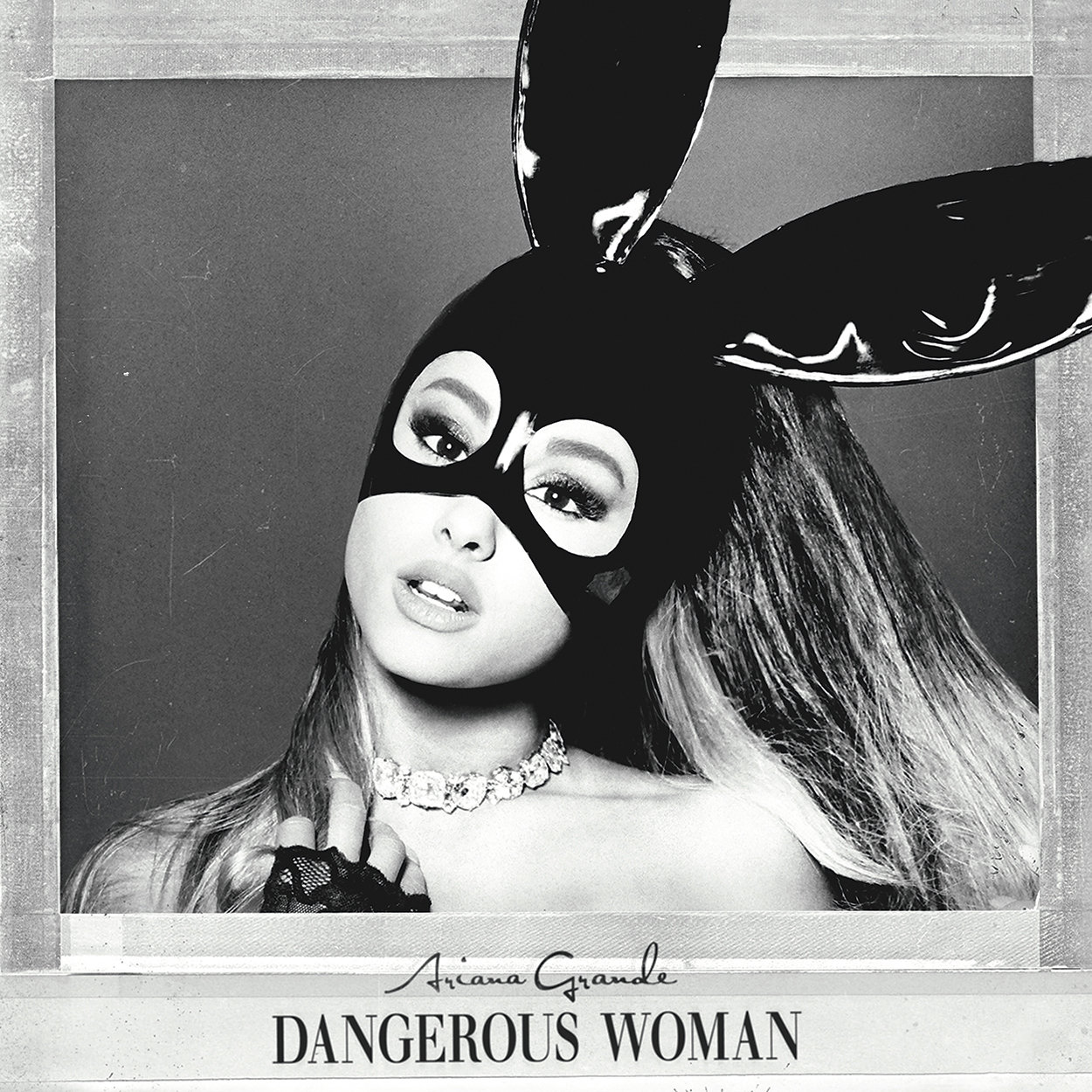
Dangerous women front cover
The front cover shows a simplistic colouring and layout. The image itself shows Ariana Grande in a black masked pair of rabbit ears and a diamond choker. It isn't shown whether or not Grande has anything on the top half of her body as it is showing from her shoulders upwards. The preferred reading is that she is confident in herself to not be covered up from head to toe, however the oppositional reading is that she is over sexualising herself to her young target audience. The mask gives off the idea that she is hiding something and that she is mysterious and the fact that her lips are parted and are the main feature on her face shows a sense of sensuality. The serif font of the album title makes it seem more sophisticated, however, the hand written name gives a personal touch to the album. The way that the ears are bursting out of the frame insinuate that she is trying to get out of the box of typical pop artists.

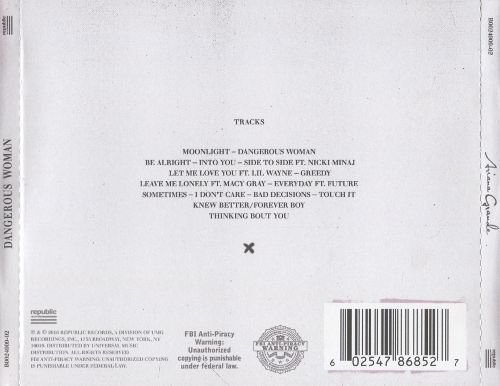
Dangerous women back cover
The style of simplicity is followed through to the back cover as their is lots of blank space and the writing is very neat. The black and white theme is continued onto this page and the lack of colour shows sophistication. The serif font furthers this and the lack of writing filling the page makes it easier to look and read over. However, the lots of blank space may be seen as boring to younger audiences as this is her target audience. The personal touch of the signed name is carried on to the back of the page to keep up the connection between Grande and the buyer. The copyright necessities are kept small at the bottom of the page to not detract from the song titles.
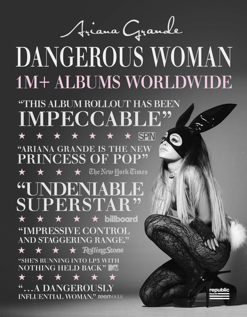
Dangerous women magazine advert
The magazine advert follows the same black and white theme that the album covers had followed. The advert has no information on what the album has on it, only the reviews from big magazine and newspaper companies. They are high reviews, all being four or five stars and they all talk really positively about the music and the artist. The image used is of Ariana dressed in a rabbit costume. The preferred reading is that she is playful, however the heels and lace tights can cause an oppositional that she is sensual. This could be inferred as this because people might link her with being a playboy bunny, which are seen to be sex icons. The way she is looking up shows a sense of vulnerability as she is below what she is looking at.
COMPARISON
The themes that each of the albums follow are very different. Get weird follows the abstract, colourful theme yet Dangerous Women follows a high level of sophistication and has no colour in it, except for the extremely pale pink in the magazine advert. Each of the albums have very different music so the colour schemes and themes indicate the type of music. A similarity between the two albums is that they are both using their sensuality to promote their music. The oppositional reading of this is that people think the artists can't sell their music without being sexualised.

What will I
take away?
From the research I have done, I have understood that male gaze theory plays a big part within female artists promotional material. I want to take parts of this away and put into my own product as this is what sells well to contemporary audiences and I believe this will help to create a popular product. I also want to take away the bright colours from the Little Mix products as I believe that this gives off a better impression for my target audience and is more fun and appealing to look at. However, I will take away from the Ariana Grande poster the typography layout as although our target audience is teenagers and young adults, they like to act mature and I feel by mixing both maturity and fun will create a positive and successful product.