Question Seven
Text
Looking back at your preliminary task, what do you feel you have learnt in the progression from it to the full product?
Front Covers:
Front Cover Comparisons:
Text
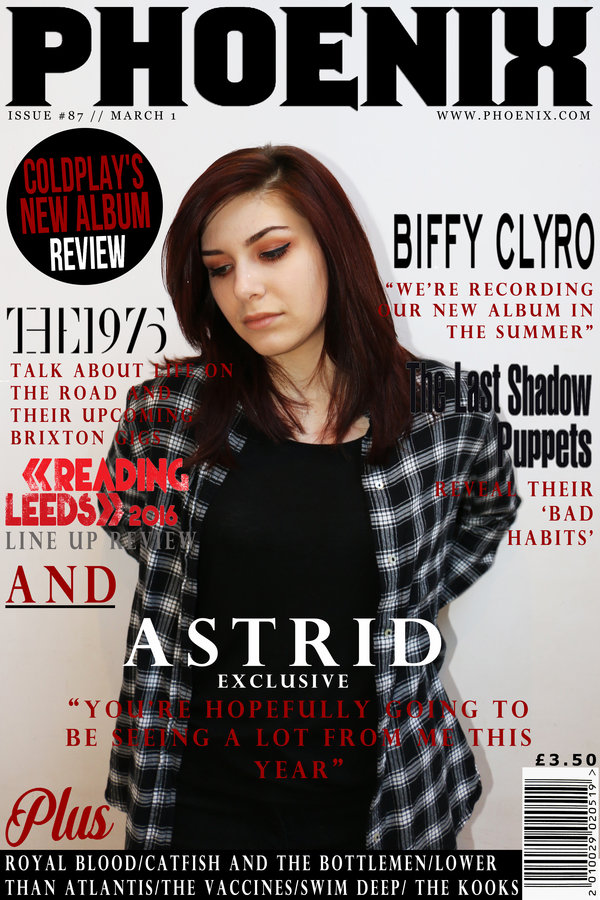
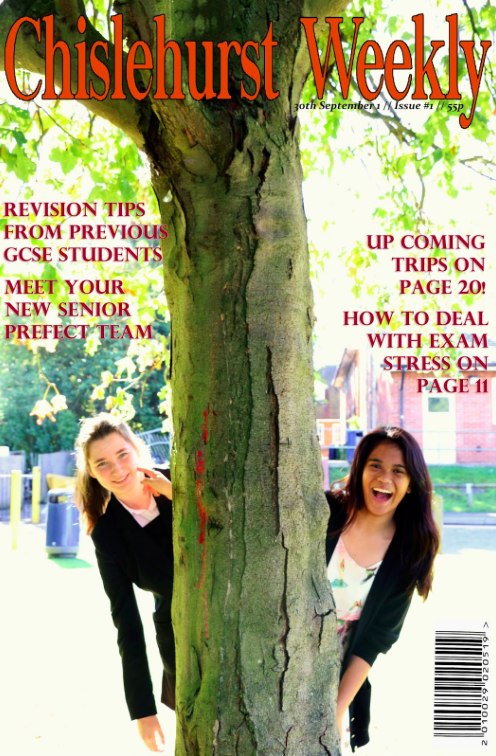
I believe that they is a clear contrast between my school magazine front cover and my music magazine front cover. My music magazine front cover looks realistic and professional due to the fact I carried out a vast amount of research and planning before constructing the product. I think that my school magazine front cover looks very basic in comparison this is because it doesn't follow enough of the conventions such as a puff or strap-line; these features would have helped to fill up more of the cover.
Compared to the main image on my music magazine, the image doesn't look as professional. This is because it was taken outside, and I had used the wrong setting on my camera which made the photograph over exposed which ruined the image. I was also too zoomed out which meant that there was lots of empty space on the school magazine cover. This contributed to making it look basic and simple. However for my music magazine I made sure that my cream was on all of the right seeing before taking the photographs to ensure that they wasn't over exposed. I also took the front cover main image in a studio location against a white background using artificial lighting to improve the quality of the photographs and make them appear more professional.
Front Cover Comparisons:
Text
Another difference between my school and music magazine front cover is the amount of detail. I spent more time paying attention to details on my music magazine front cover, for example; I added a website address, a rand go fonts, shapes and thought about spacing. I feel like the name "Chislehurst Weekly" isn't very reflective of a magazine and instead is more reflective of a newspaper. This is likely to put off the young target audience from buying the school magazine which suggests that I was unsuccessful in creating a school magazine which would appeal to my audience. The colours that I used on my school magazine front cover don't compliment each other particular well in comparison to the red, black and white colour scheme that I followed on my music magazine. I also feel like the colour scheme on my school magazine could be interpreted as gender biased because I used orange and pink; this might attract less males to the magazine.
From creating my music magazine front cover I have been able to identify the flaws of my school magazine front cover. It is evident that my school magazine cover doesn't follow enough of the conventions to make it successful. The cover is also too empty; there is a lot of blank space on the page because of the lack of the conventions that I followed. The cover also appear rather dull and uninteresting due to the black of buzzwords and cover0lines.
Contents Pages:
Contents Page Comparisons:
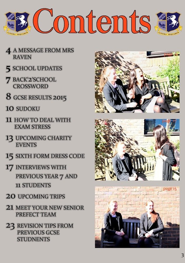
Once again I feel like there is a huge contrast between the school and music magazine contents pages. My preliminary contents page follows a very simple and basic layout which lacks professionalism and sophistication. My school magazine contents pages follow little, if any conventions, which adds to its simplicity which also makes it rather dull and not aesthetically pleasing. The colour scheme between the school magazine front cover and contents page isn't the same, which ruin the fluency between the products making them almost seem like they are for two separate magazines. When designing my school magazine I had little knowledge of the use of colour and the colour wheel which explains why my colour choices don't compliment each other. However for my school magazine I did further research on the use of colour and its connotations which allowed me to have a better colour scheme fore my music magazine.
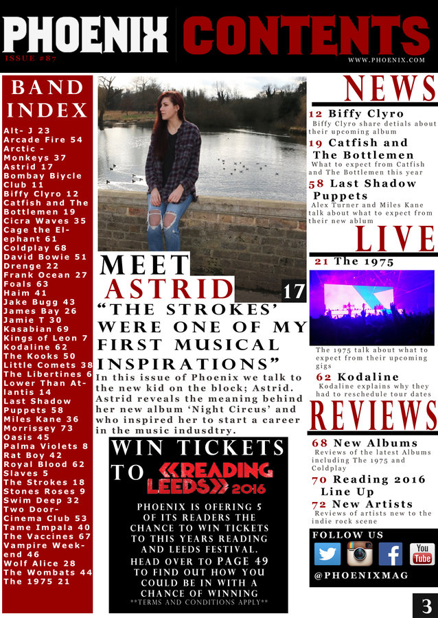
I feel that on my preliminary contents page I didn't use the space effectively which resulted in there being large gaps between text and images as well as there being empty space. In contrast my music magazine contents page has minimal empty space but still doesn't look crowded or busy. This is because I used many conventions and used a layout inspired by NME.
Contents Page Comparisons:
When planning the contents page for my school magazine I didn't do it in as much depth as I did for my music magazine. I feel like the lack of planning shows that I wasn't fully prepared and didn't have a lot of ideas when it came to designing my school magazine. Because of the lack of planning I did for my school magazine I wanted to make sure that I did a lot of planning for my music magazine to make sure that it was professional. Therefore I did a questionnaire, focus group, mood boards, hand drawn designs and found contents pages and front covers that inspired my own ideas. When designing my music magazine I considered things such as spacing sizing, style and colour in much more depth which allowed me to create a more stylish and professional magazine. I used more conventions on my music magazine contents page such as subheadings and article summaries; these conventions made my contents page more informative than my preliminary contents page.
On my school magazine contents page I did follow some conventions such as having a 50:50 ratio of images:text. However these images featured the same models and costumes as each other and the main image on the front cover. This made the appear quite repetitive. Therefore on my music magazine I included a main image with a different outfit to the front cover and a smaller image of a gig.
Time Management and Planning:
During the process of creating my school magazine I found it difficult to manage my time efficiently because I did not have a clear schedule or plan when it came to taking the photographs I needed and constructing the final product on Photoshop. This meant that I had to complete the work in a short amount of time which led to it being rushed which I feel is reflected in the quality of my work.
I wanted to make sure that this did not reoccur whilst constructing my music magazine therefore I made plan and schedules before hand so that I could manage my time well and not be rushed. I arrange the location, dates and times for taking the photographs with the model so that we had a good schedule. I also researched and went to my chosen locations before conducting the photoshoot to make sure that they were appropriate for what I wanted and had some good backgrounds that I could use in my photos. I also planned all of the outfits and makeup that I wanted to use before the photoshoots happened so that I was fully prepare for them. This is unlike what I did for my school magazine where I had to improvise last minute with locations and outfits because I hadn't made schedule which caused my photoshoots to become rushed.
What I have Learnt?
I feel like my skills have improved massively from creating my preliminary task to my music magazine. I now feel a lot more confident and comfortable using software such as Adobe Photoshop. When I first started creating my preliminary task I struggles using photoshop and wasn't sure of the advanced features that it had to offer. However after researching these tools and features I was able to use them on my music magazine to make it look more professional.
Overall I have learnt about how the style and sign of a magazine can be reflective of its genre which will therefore help to attract its target audience. I have also learnt that magazined are closing connect to their audience which is impacted by the magazines features as well as its publisher. Before starting this course I had very little knowledge about music magazine due to the fact that I hadn't read one before. However since researching them, I have become rather interesting in their features and content and therefore plan to read more in the feature.