BEM
Block‑Element‑Modifier

Our problems
1) The complexity of any edits.
2) The strong dependence of styles on the structure of the DOM-tree.
3) Unstructured, confused, intersecting and duplicate styles.
4) Very long and specific selectors, which grow even more with every edit.
5) The role of the class is not clear. It is not possible to quickly understand the structure of HTML by class.
6) The functionality (JS) depends on the styles, because defined by the same classes.
Note: In WordPress + Bootstrap / Foundation, we initially can never use pure BEM. We will have minimal deviations from the methodology.
BEM
.block__element --modifier
BEM stands for Block, Element, Modifier:
-
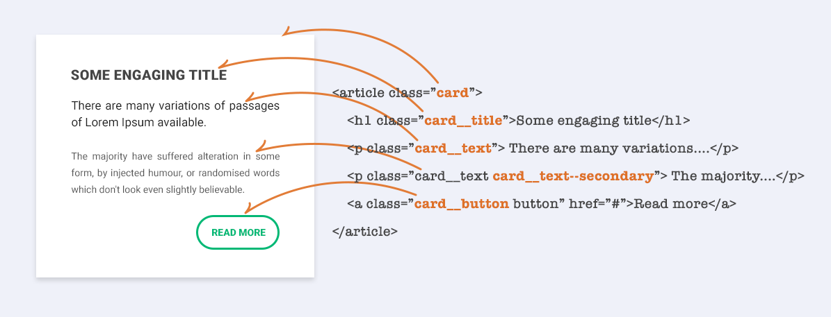
Block: This 'block' class is used to signify a component, or a standalone object on the page. Block classes are usually short nouns which define the component.
-
Element: An element always lives within a block, it's a single part of a component that together with others, make up the block's features. Element classes are prefixed by the block's class, followed by double underscores. For example .block__element.
-
Modifier: You may often find yourself repeating multiple components, or blocks that do very similar things but with slight alterations. Maybe Box 1 has a blue background whereas Box 2 has a red background. This is where modifiers come into play, adding an extra hook in our CSS to give that one specific block some extra bits of styling. Modifier classes are prefixed once again by the block's class, but followed this time by double hyphens, for example .block--modifier. They can also be prefixed by the element class if the modifier is specifically modifying that, rather than the entire block, for example .block__element--modifier. I like to reference this as "Block Modifiers vs Element Modifiers".
BEM
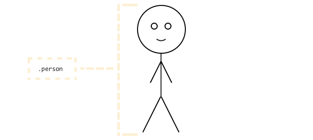
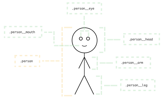
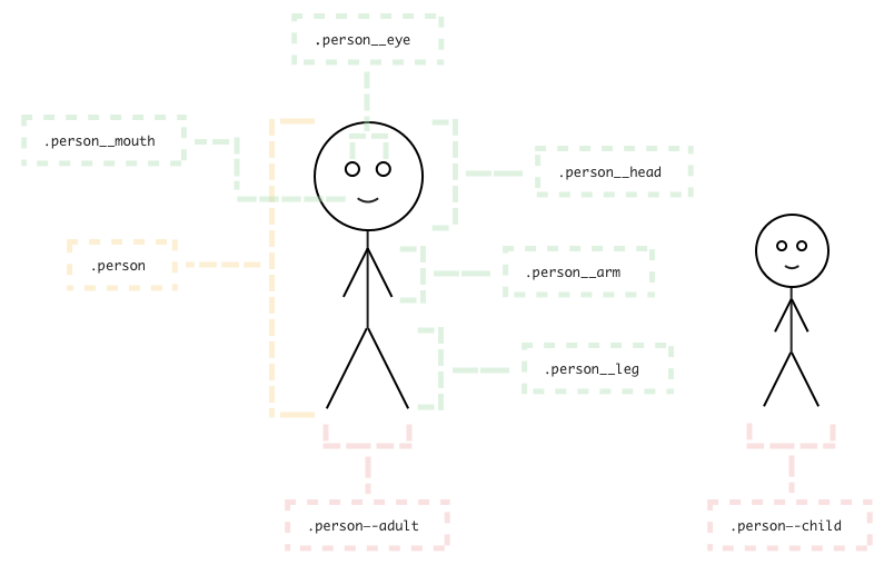
.block
.person
BEM
.block__element
.person__arm
BEM
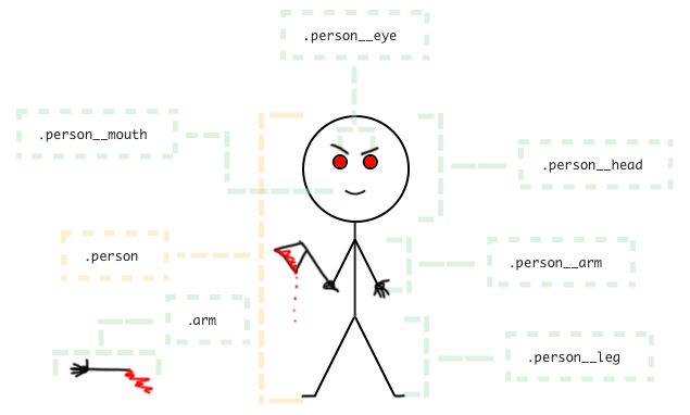
.block
the element .person__arm we do as a separate(!) block .arm
BEM
WRONG! .block__element1__element2
WRONG! .person__arm__finger
RIGHT .person__finger
BEM
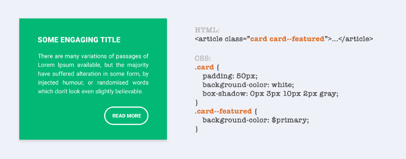
.block__element--modifier
.person--child or .person--adult
.person__arm--broken
BEM
WRONG! .block__element--modifier1--modifier2
WRONG! .person--adult--female
RIGHT .person--adult .person--female
BEM in HTML
The adult woman with a broken left hand:
<div class="person person--adult person--female">
...
<div class="person__arm person__arm--left person__arm--broken">...</div>
...
</div>
The boy with a healthy left hand:
<div class="person person--child person--male">
...
<div class="person__arm person__arm--left">...</div>
...
</div>
BEM in SCSS
.person {}
.person--adult {}
.person--child {}
.person--black {
  background-color: $brown;
}

.person__head {}

.person__eye {}

.person__mouth {}

.person__arm {}
.person__arm--left {
  left: 0; right: auto;
}
.person__arm--right {
  right: 0; left: auto;
}
.person__arm--broken {}

.person__leg {}

.person--black .person__dick {
  transform: scale(1.25);
}
BEM & selector specificity
BEM & selector specificity
BEM & selector specificity
The class name is always unique.
All styles are attached to the class name.
Very little specificity of the selector.
The code is very easy to make changes.
BEM Mix
<nav class="menu">
  <a class="link menu__item" href=""></a> <!-- It's like: link + menu__item -->
  <a class="link menu__item" href=""></a>
  <a class="link menu__item" href=""></a>
</nav>
Use a mix of the `link` universal block and the `item` element of the `menu` block:
With the mix of the two BEM entities, you can now implement the basic link functionality from the `link` block and additional CSS rules from the `menu` block, and avoid code duplication.
The link functionality is already implemented in the link block, but the menu links have to differ visually from the links in the text.
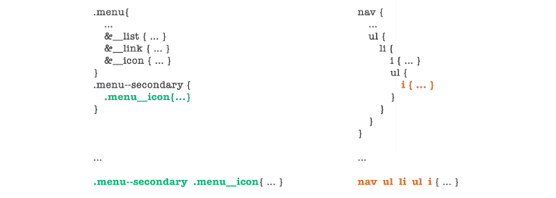
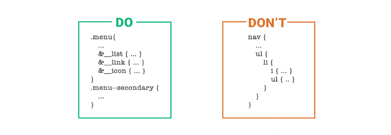
BEM and '&' in SCSS
Better
Can cause problems
.section {
  &-hero {
    &__title { color: red; }
  }

  &-ribbon {
    &__title { color: green; }
  }

  &-highlights {
    &__title { color: blue; }
  }
}

.footer {
  &__title { color: magenta; }
}
.section-hero {}
.section-hero__title { color: red; }

.section-ribbin {}
.section-ribbin__title { color: green; }

.section-highlights {}
.section-highlights__title { color: blue; }

.footer {}
.footer__title { color: magenta; }
If you use & for part of a class name you totally can't use fast search/replace in the style file (when you copy code from the browser debugger). And the code is harder to read.
Try to find in the code below 'section-highlights__title' (imagine the file is large).
These will not found: 'section-highlights__title', 'section-highlights'. These will give a lot wrong positions: '&__title', '__title', 'title'.
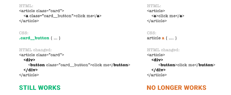
Class name for JS
<div class="hero"> <!-- BAD! -->
  <h2 class="hero__title"></h2>
  <div class="hero__content"></div>
  <a class="hero__link hero__link--accented"></a> <!-- <---Look-1! -->
</div>
Use js- prefix for any class names witch hook by JavaScript.
Don't use any js-class-name for styling in the SCSS, except next state classes beginning with prefixes: is- or has- (for example is-active, has-loaded).
// Unwanted relationship between styles and scripts
$('.hero__link').on('click', function() {});

// And not universal effect hook
$('.hero__link--accented').on('mouseenter', function() {});
<div class="hero"><!-- GOOD! -->
<h2 class="hero__title"></h2>
<div class="hero__content"></div>
<a class="hero__link js-popup js-accent-effect"></a> <!-- <---Look-2! -->
</div>// Just for popup
$('.js-popup').on('click', function() {});
// You can use this effect for others element too
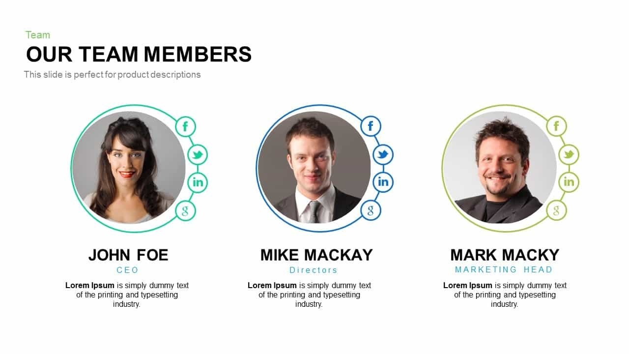
$('.js-accent-effect').on('mouseenter', function() {});For example we have a mock-up with section "Our Team Members" and another with section "Our Leadership Team" which is partial different, but has members too. Let's name it.
We will focus & show class names only, but mention a bit of block's structure. We will use BEM, but it's not important, all works for any naming convention. (Note: Use scroll in the code).
// Common junior's way. Note: It's WRONG!
// Often a junior developer "copy-past"-reflect the section content to class names.

// --------------------------------------------------------------------------------
// Our Team Members
// --------------------------------------------------------------------------------

.our-team-members {

  .our-team-members__member-item {

    .our-team-members__member-item-photo { ... }

    .our-team-members__member-item-name { ... }

    .our-team-members__member-item-position { ... }

    .our-team-members__member-item-text { ... }

    .our-team-members__member-item-socials {
        // And a junior developer often try to reflect 1:1 DOM structure to styles.
        // Many-many-many nesting levels
        // OMG! O_o It already looks like a story
        .our-team-members__member-item-socials-item { ... }
    }

  }

}

// --------------------------------------------------------------------------------
// Our Leadership Team
// --------------------------------------------------------------------------------

.our-leadership-team { ... }

.our-leadership-team__leader-item { ... }

// ... etc the same to above code
Why is that bad? (Note: Use scroll in the code).
// --------------------------------------------------------------------------------
// Our Team Members
// --------------------------------------------------------------------------------

// 'our' is totally 'empty'-word, and 'members' has weak and repetitive meaning
.our-team-members {

  .our-team-members__member-item {

    // All is very/super long
    .our-team-members__member-item-photo { ... }

    // member == item
    // Looks like 'member' needs to be a block, not an element
    .our-team-members__member-item-name { ... }

    .our-team-members__member-item-position { ... }

    .our-team-members__member-item-text { ... }

    // Looks like 'social' needs to be a block, not an element
    // We can have .socials {} in the header or footer, etc
    .our-team-members__member-item-socials {
        // Many levels nesting is the pure evil!
        .our-team-members__member-item-socials-item { ... }
    }

  }

}

// --------------------------------------------------------------------------------
// Our Leadership Team
// --------------------------------------------------------------------------------

// Many classes with the same styles - repeating yourself is very bad!
.our-leadership-team { ... }

.our-leadership-team__leader-item { ... }

// ... etc the same to above code
First, you can use Google Translate (as a extension too) for looking for good (short & clear) words for class names.
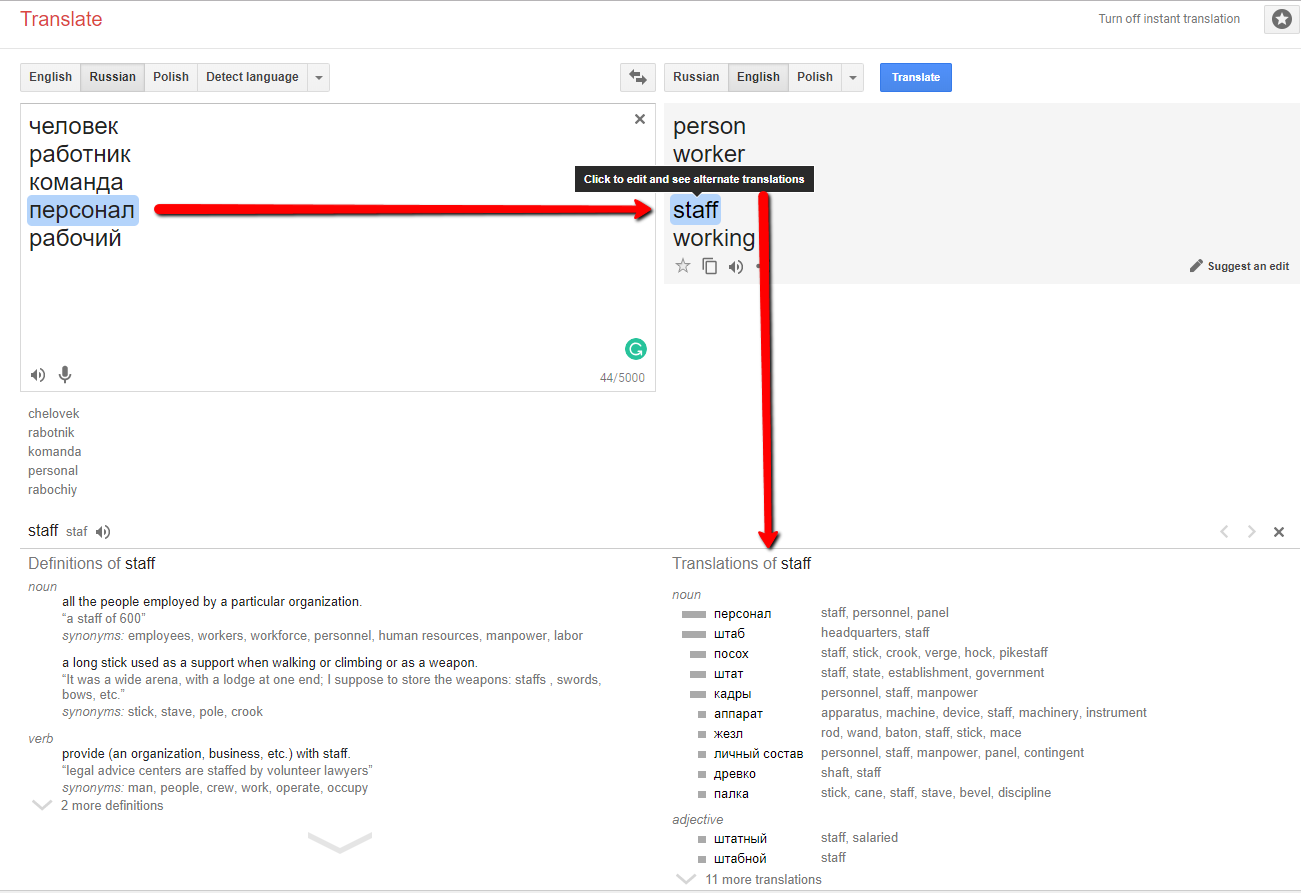
Let's try name that all.
// These are various names

.employee {} // good, but a bit long and it isn't applicable to customers etc
.employees {}

.individual {} // too long & strange for our goals
.individuals {}

.worker {} // too special
.workers {}

.person {} // good, but doesn't have a plurale form "-s"
.person-list, .people {}

.member {} // not clear and strange for our goals
.team, .team-members, .our-leadership-team {}

// Let's stop on that.
// Because 'person' is abstract and we can use it on diffetent context
// (for C-lavel, employees, customers, etc)

.person {}

.person__photo {}

.person__name {}

.person__role {}

.person__desc {}
How can it be more right way?
// We try to create universal blocks for the website

// --------------------------------------------------------------------------------
// Person. Universal person's representation on the website (photo, name, etc)
// --------------------------------------------------------------------------------

.person {}

.person__inner {}

.person__photo {} // or 'thumbnail'

.person__name {}

.person__role {} // 'role' is shorter than 'position'

.person__desc {} // or 'description', 'content', 'text'

// It's just a container for .social {} items
.person__socials {
  // It's a separate universal 'social' BEM block with own slyles
  .social {}
}

// It's class-modificator of .person, it changes .person on any context
.person--famous .person__name { font-size: 2em; color: $color-accent; }

// --------------------------------------------------------------------------------
// Our Team Members
// --------------------------------------------------------------------------------

.staff {} // short & clear$ it can be .team {}

.staff__inner {} // it's a container/wrapper of the staff content

.staff__something {} // Something in the .staff section

.staff .person {} // Optional changes for a .person in .staff

// --------------------------------------------------------------------------------
// Our Leadership Team
// --------------------------------------------------------------------------------

// If "Our Leadership Team" is similar to "Our Team Members"
// we make just a class-modificator .staff--leadership
// That class add some changes to the standard .staff styles

.staff--leadership { ... }

.staff--leadership .person {} // Optional changes for a .person in .staff--leadership
HTML code of our sections (just base parts).
<section class="staff">
    <div class="staff__inner">

    <div class="staff__something"></div>

    <div class="staff__list">
        <div class="person">
            <div class="person__photo">
                <div class="person__socials">
                    <div class="social">Facebook</div>
                    <div class="social">Instagram</div>
                    <div class="social">Twitter</div>
                </div>
            </div>
            <h4 class="person__name">Jone Water</h4>
            <p class="person__role">Plumber</p>
            <p class="person__desc">Lorem ipsum etc...</p>
        </div>
        <!-- etc -->
    </div>

    </div>
</section>

<section class="staff staff--leadership">
    <div class="staff__inner">

    <div class="staff__list">
        <div class="person--famous"> <!-- a famous person is a bit different -->
            <div class="person__photo">
                <div class="person__socials">
                    <div class="social">Facebook</div>
                    <div class="social">Instagram</div>
                    <div class="social">Twitter</div>
                </div>
            </div>
            <h4 class="person__name">Jone Big Doe</h4>
            <p class="person__role">CEO</p>
            <p class="person__desc">Lorem ipsum etc...</p>
        </div>
        <!-- etc -->
    </div>

    </div>
</section>

<section class="customers">
    <div class="customers__inner">

        <div class="person">
            <div class="person__photo"></div> <!-- no socials -->
            <h4 class="person__name">Janet Doe</h4>
            <p class="person__role">CEO The Company</p>
            <p class="person__desc">Lorem ipsum etc...</p>
        </div>

        <!-- etc -->

    </div>
</section>
BEM with NO-BEM Frameworks
(Foundation or Bootstrap )
<section class="something">
  <div class="something__inner">

    <div class="something__element">
      <h4 class="something__title">Jone Water</h4>
      <p class="something__description">Plumber</p>
      <a href="#" class="something__button btn btn-primary">Click me!</a>
    </div>

  </div>
</section>
Use the most part of frameworks classes as is without any changes. Look to "something__button btn btn-primary" below:
But you can use @extend and create class-synonyms as here:
.button {
  @extend .btn;
}

.button--primary {
  @extend .btn-primary;
}

// or extend standard framework classes
.btn--hero {}
Conclusions:
1) All selectors are short & clear.
2) All are block and independent (easy modifications).
3) We can use 'person' block in many contexts.
4) There is one place where we edit 'person' styles.
5) But we can change it with modifier classes.
6) Our code doesn't look like shit now! Profit.
BEM
Please, look at the example on Codepen.
Links:
1) A CSS naming convention overview
2) BEM Naming
4) 5 Reasons To Use BEM (a.k.a. why is BEM G.R.E.A.T.)
Addition, more advanced:
1) BEMIT: Taking the BEM Naming Convention a Step Further
2) BEM and ITCSS for CSS Architecture: BEM + ITCSS = BEMIT