Введение в Best Practices для начинающих веб-разработчиков
Take it easy:
There is no the one true way,
but there are best practices
"Людей всё больше - надежды всё меньше..."
Tabulation
This is subjective developer's choice
You can use for tabulation 2 or 4 and Tab or Space.
But we recommended use two space and enable "Display hidden characters"
(PHPStorm: Settings -> Editor -> General -> Appearance -> Show whitespaces).
The code will look like here:
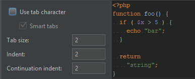
PHPStorm: You always can use Ctrl+Alt+L for formatting selected code by your Code Style settings (Settings -> Editor -> Code Style). It can be set different for IDE and each project.
Naming conventions - Vars & Functions
PHP
Use only snake_case.
JS
Use only CamelCase.
function get_user_full_name() {

  $user_first_name = 'John';
  $user_last_name = 'Doe';

  return ($user_first_name . ' ' . $user_last_name);
}
function getUserFullName() {
var userFirstName = 'John';
var userLastName = 'Doe';
var $users = $('.user'); // Use $ for JQuery vars
return (userFirstName + ' ' + $userLastName);
}SCSS/CSS
Use only kebab-case (it's from Lips).
// Use only dashes & lowcase, so $this-is-var-name

// Bootstrap 4 code
$link-color:             theme-color("primary") !default;
$link-decoration:        none !default;
$link-hover-color:       darken($link-color, 15%) !default;
$link-hover-decoration:  underline !default;
HTML
Use only kebab-case or BEM.
<!-- Classic -->
<div class='entry'>
  <div class='entry-header'>
    <h5 class='entry-title accent'>Text</h5>
    <!-- ... -->

<!-- BEM -->
<div class='entry'>
  <div class='entry__header'>
    <h5 class='entry__title entry__title--accent'>Text</h5>
    <!-- ... -->
Naming conventions - Function prefix
get_, set_, is_, has_, the_
Try always use these prefixes.
The name reflects the content
// Get any data (must to return data)
function get_something() {
  /* ... */
  return $something;
}

// Set any data
function set_something( $new_value ) {
  /* ... */
  $something = $new_value;
}

// Check something for conditional
function has_something() {}
function is_something() {
  /* ... */
  return $something_bool;
}

// Make something & output it (WP style)
function the_something() {
  /* ... */
  echo $something;
}

// Don't duplicate the code!!
// Use brand-prefixes or namespaces
// Or general [verb]_something()
function output_something() {}
function echo_something() {}
function update_something() {}
// !!! Don't do this !!!
function get_something() {
/* ... */
echo $html_surprise; // error: unexpected output
// error: there isn't return value
}
$data = 'Live!';
function output_something() {
/* ... */
if ( is_something_strange() ) {
$data = 'Die!'; // error: unexpected data changes
}
echo $data;
}
// error: the function name is obscure (isn't clear)
function left_top_coner() {}
// JS. The same error
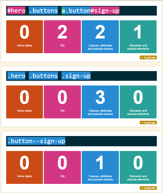
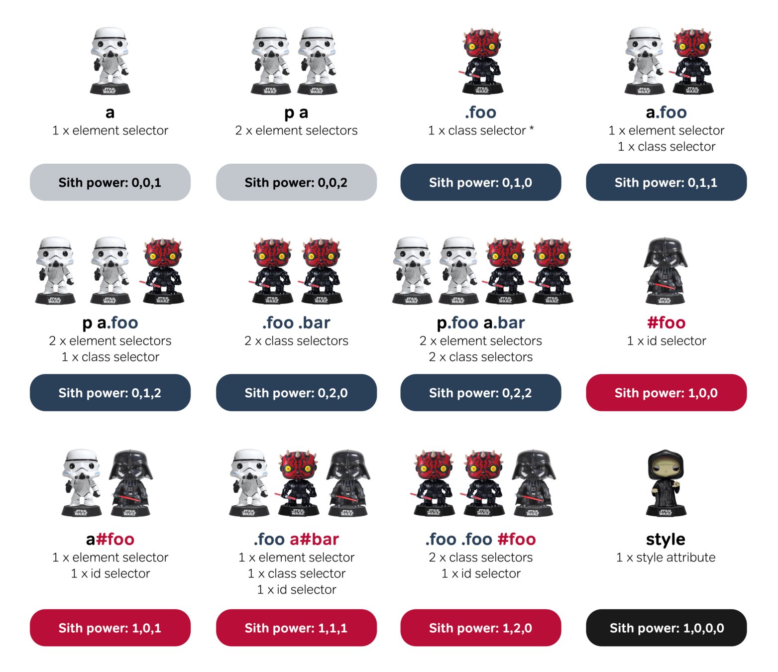
function bumpIt() {}Specificity of SCSS selectors
Specificity Calculator
https://specificity.keegan.st
This is a good analogy
(с) CSS Specificity Wars by Andy Clarke 2018
!important
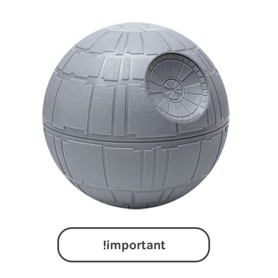
Just don't use it at all!
SCSS selectors
Bad & Ugly!
Try always avoid:
Good!
Use good code style:
// [1] useing !important
.title { color: red !important; }

// [2] useing id
#id > a { color: red; }

// [3] private styles on common tags
table td { color: red; }

// [4] deep nesting
.bull {
  .shit {
    .and-other {
      .guano {
        .is-guly {
          color: red;
        }
      }
    }
  }
}

// [5] bad or not universal class names
.red-dot-before-title {}
.active, .with-content {}
.lorem-ipsum-item {}
Normal
Just normal:
// [1] use !important only if you tried
// all other methods,
// and make it more specific
.section-hero > .title {
  color: red !important;
}

// [2] use id only if you tried
// all other methods
// or you need override 3rd party code
#id > a { color: red; }

// [3] use tags only for general styles
img { max-width: 100%; height: auto; }

// [4] normal nesting is 1-3 levels
.bull {
  .guano {
    .is-guly {
      color: red;
    }
  }
}

// [5] use universal class names
.decore-before-title {}
.is-active, .has-content {}
.product-item {}
// try don't use !important at all
// or add more specificity for selector
.home .section-hero > .title {
color: red;
}
// try don't use id at all
// or use id as attribute
.nav-item[id="id"] > a { color: red; }
// use tags only for general styles
// for others needs use classes
img, .thumbnail-image { border: none; }
// good nesting is 1-2 levels;
.hero {
.title {
color: red;
}
}
// but better use BEM
.hero {}
.hero--dark {}
.hero__title {}
.hero__title--centered {}
.hero__content {}Ordering of SCSS properties
There are two approaches: alphabetical order and importance of properties. We recommend the second one.
.parent {
    // Positioning: Where and How?
    display: block;
    box-sizing: border-box;
    overflow: hidden;
    position: relative;
    z-index: 1;
    top: 0;
    left: 0;
    // Box Model: From Outside to Inside
    margin: 10px auto;
    padding: 10px;
    max-width: 1920px;
    max-height: 1080px;
    width: 1000px;
    height: 300px;
    // Text: family, sizes and than styles
    font-family: sans-serif;
    font-size: 16px;
    font-weight: 700;
    line-height: 1.4;
    text-transform: uppercase;
    text-align: right;
    // Appearance: How it looks.
    // From Inside to Outside (by frequency of use)
    // ...
// Appearance: How it looks.
// From Inside to Outside (by frequency of use)
color: #ffd700;
background: #99CCFF;
border: 10px solid #33CC99; // Note: Actually it's a part of box model, so you can put it above after padding
outline: 1px solid #000;
box-shadow: 5px 5px 10px rgba(#000, 0.5);
// Other
cursor: pointer;
user-select: none;
&:after { // Some styles }
&.second { // Some styles }
// After variations of parent styles
.child {
p {
// Some styles
margin: 0;
padding: 0;
font-size: 50px;
line-height: 260px;
text-align: center;
vertical-align: middle;
color: orange;
text-shadow: 3px 3px 3px rgba(#000, 0.5);
}
}
}BEM (Block, Element, Modifier)
BEM is G.R.E.A.T.: Global, Readable, Adaptable, Tough
<!-- BEM: `entry` block -->
<div class="entry">
  <!-- `entry__header` element in the `entry` block -->
  <div class="entry__header">
    <h4 class="entry__title">
      <a href="#" class="entry__link">Title</a>
    </h4>
    <p class="entry__subtitle">Subtitle</p>
    <p class="entry__meta">Meta</p>
  </div>
  <div class="entry__content">Content</div>
  <div class="entry__footer">
    <p><a href="#" class="entry__link">Read More</a></p>
  </div>
</div>

<!-- Not BEM -->
<div class="entry">
  <div class="header">
    <h4>
      <a href="#">Title</a>
    </h4>
    <p class="subtitle">Subtitle</p>
    <p class="meta">Meta</p>
  </div>
  <div class="content">Content</div>
  <div class="footer">
    <p><a href="#">Read More</a></p>
  </div>
</div>
// BEM
.entry {}
.entry__header {}
.entry__title { font-family: 'Special', sans-serif; }
.entry__link { color: blue; }
.entry__meta { color: gray; }
.entry__content {}
.entry__footer {}
.entry--short .entry__content { display: none; }
// Not BEM & wrong
.entry {
.header {
p.meta { color: gray; }
}
h4 {
font-family: 'Special', sans-serif;
a { color: blue; }
}
.content {}
.footer {
a { color: blue; }
}
}Naming conventions - Class name for JS
Good
Bad
<div class="hero">
  <h2 class="hero__title"></h2>
  <div class="hero__content"></div>
  <a class="hero__link hero__link--accented"></a>
</div>
Use js- prefix for any class names witch hook by JavaScript.
Don't use any js-class-name for styling in the SCSS, except next state classes beginning with prefixes: is- or has- (for example is-active, has-loaded).
If you delete some js-class all styles will still present.
If you change/delete some styles class functionality will still present. Cool!
// Unwanted relationship between styles and scripts
$('.hero__link').on('click', function() {});

// And not universal effect hook
$('.hero__link--accented').on('mouseenter', function() {});
<div class="hero">
<h2 class="hero__title"></h2>
<div class="hero__content"></div>
<a class="hero__link js-hero-link js-accent-effect"></a>
</div>// Just for hero click
$('.js-hero-link').on('click', function() {});
// You can use this effect for others element too
$('.js-accent-effect').on('mouseenter', function() {});'&' as part of class names in SCSS
Good (direct hit of search)
Can cause problems
.section {
  &-hero {
    &__title { color: red; }
  }

  &-ribbon {
    &__title { color: green; }
  }

  &-highlights {
    &__title { color: blue; }
  }
}

.footer {
  &__title { color: magenta; }
}
.section-hero {}
.section-hero__title { color: red; }

.section-ribbin {}
.section-ribbin__title { color: green; }

.section-highlights {}
.section-highlights__title { color: blue; }

.footer {}
.footer__title { color: magenta; }
If you use & for part of a class name you totally can't use fast search in the style file (when you copy code from the browser debugger). And the code is harder to read.
Try to find in the code below 'section-highlights__title' (imagine the file is large).
These will not found: 'section-highlights__title', 'section-highlights'.
These will give a lot wrong positions: '&__title', '__title', 'title'.
Prefixes
You can use prefixes in class names & vars.
One-letter abbreviations approach requires agreement in the team, so we don't recommend using the abbreviations without having a Style Guidelines.
// Long style ----------
// $color-
$color-brand-primary: #ddd;
$color-brand-primary-dark: #666;
$color-brand-secondary: #fff;

// $font-
$font-family-main: 'Open Sans', sans-serif;
$font-size-base: 1rem;

// $size-
$size-logo-height: 50px;

// transition-
$transition-base: all .2s ease-in-out;

// Short style ----------
// $c-
$c-brand-primary: #f00;
// $f-
$f-family-main: 'Open Sans', sans-serif;
// $s-
$s-logo-height: 50px;
// tr-
$tr-base: all .2s ease-in-out;
// You can use prefixes for HTML class names
// Just for example

// Utility (!important here is normal)
.u-display-none { display: none !important; }

// Object (object can be used in different contects)
.o-grid {}
.o-cell {}
.o-media {}

// Component (block/module of the website)
.c-hero {}
.c-section {}

// or maybe Modules
.m-map {}

// Actually you can shorten any common word
.s-hero {} // section Hero
.s-highlights {} // section Highlights
BEM + ITCSS = BEMIT
ITCSS (Inverted Triangle CSS) - Scalable and Maintainable CSS Architecture for large projects
@import "settings.global"; // $spacer: 1rem;
@import "settings.colors"; // $color-brand-primary: #f00;

@import "tools.functions";
@import "tools.mixins";

@import "generic.box-sizing"; // html
@import "generic.normalize";

@import "elements.headings"; // h1
@import "elements.links"; // a
@import "elements.forms";

@import "objects.wrappers"; // o-wrapper
@import "objects.grid"; // .o-grid, .o-cell
@import "objects.media"; // .o-media

@import "components.site-nav";
@import "components.buttons"; // .c-btn, .c-btn--primary
@import "components.hero"; // .c-hero
@import "components.carousel";

@import "trumps.clearfix";
@import "trumps.utilities"; // .u-display-none
@import "trumps.ie8";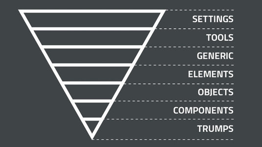
<section class="o-section c-hero c-hero--left">
  <div class="o-wrapper">
    <div class="c-hero__wrapper">
      <div class="o-grid ">
        <div class="o-grid__cell u-6of12-tablet">
          <h1 class="u-text-alpha">
            <div class="c-anaglyph-text" data-text="Text"></div>
          </h1>
          <!-- ... -->
More examples - Bad & Good
Good
Bad
// 1
p.accent, .section-hero, .section-ribbon, .section-footer {
  color: red;
}

// 2
.page-id-254 { color: red; }

// 3
.home .section:first-of-type { margin-right: -100px; }

// 4
.benefits {
  h3 { color: red; }
}

//5
.basic-btn_without-bg { background: transparent; }
// 1
.accent,
.section--accented { color: red; }
// 2
.page--accented { color: red; }
// 3
.section--shifted-right { margin-right: -100px; }
// 4a
.benefits {
.title { color: red; }
}
//4b
.benefits__title { color: red; }
//5a & 5b
.btn.hollow,
.btn--hollow { background: transparent; }Tips
-
Do not reinvent the wheel, imitate the best.
-
Choose a methodology and follow it.
-
Use linter for automatic code verification.