Ancillary Drafts
Digipak Inside
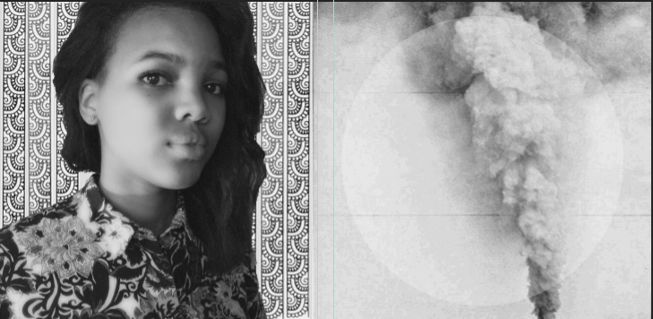
Initially I was going to have the inside of my digipak black and white so it would correspond with the music video.
Magazine Advert

I decided against this advertisement because the artist picture I had used was the same as the artist picture on the front cover.
Digipak Inside
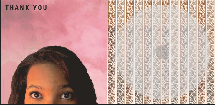
I didn't like how this looked but I did like the background of the panels so I ended up using them on my final piece.
Digipak Inside

There wasn't really anything I didn't like about this, it was actually going to be my final digipak inside but I decided against it in the end as I prefered something else.
Digipak Outside
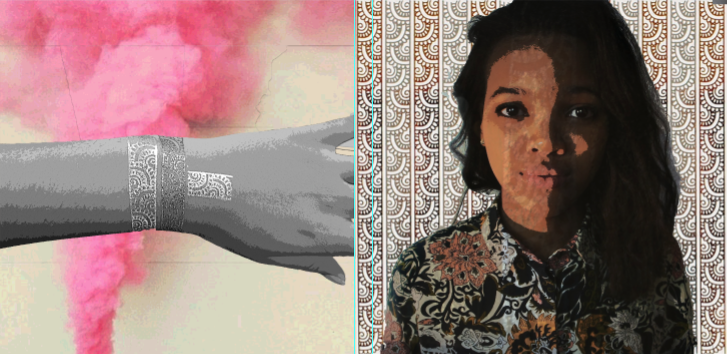
I liked how the right panel looked but not the left. This was when I was experimenting with different images to find the ones I liked and wanted to use in my ancillary.
Magazine Advert

This was a contender for my final piece for the magazine but I didn't end up using it because I wanted the artist hand tattoo to be in it as it is her synergy.
Magazine Advert

This was another possibility for my final advert but I ended up not going with it because the eyes didn't really look like they were looking at the digipak (and I wanted it to look like that).
Magazine Advert

I couldn't get the different layers (components) of this digipak to look right. Some of the layers look a bit random.
Magazine Advert

It was between this advert and my final piece in the end, as I prefered how this one looked but the other advert featured the artists synergy, which made me choose that one other this one.
Digipak Inside
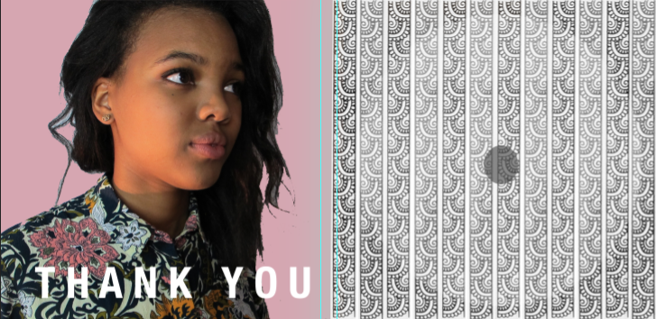
It was between this and my final inside piece for my digipak. I choose the other one over this because the artist synergy (her hand tattoo was featured)
Digipak Inside
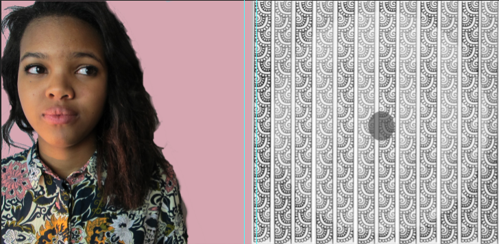
I though this picture of the artist looked awkward placed here.
Digipak Inside
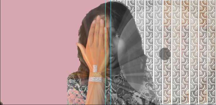
Since the music video featured black and white and colour, I was originally going to play on this in my digipak. It was only that the space on the left panel here looked to empty and the CD would be placed over part of the image in the right panel.
Digipak Inside
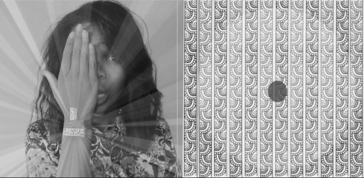
I thought this looked boring.
Digipak Inside
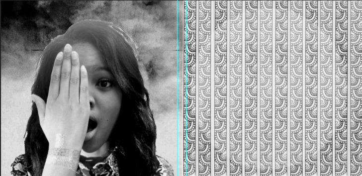
The left panel here I felt looked weird and to artificial. You could see the artist hand tattoo very well either.