TYPOGRAPHY
101
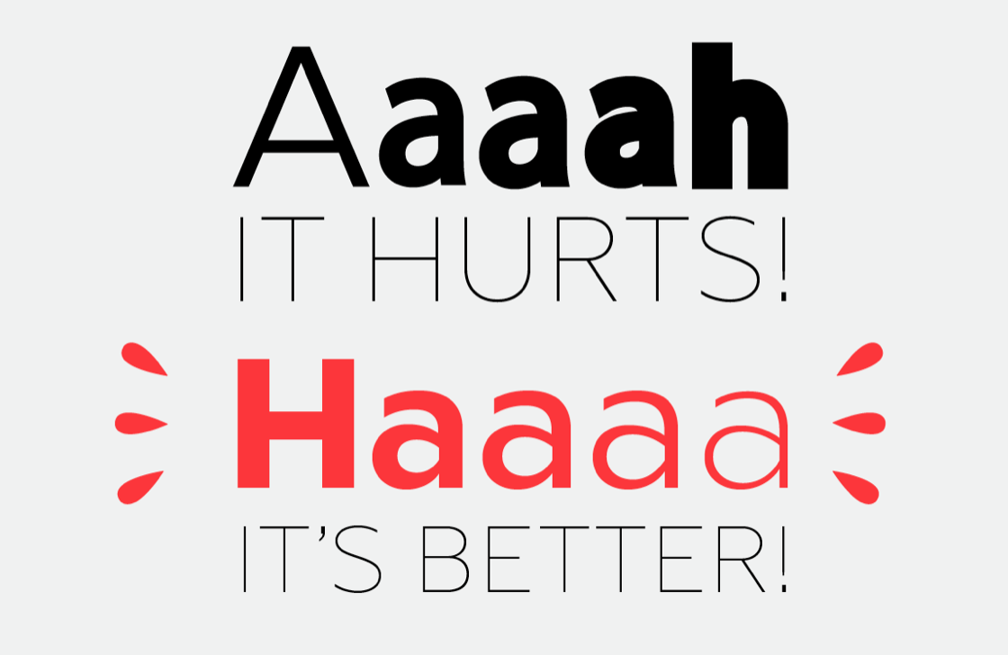
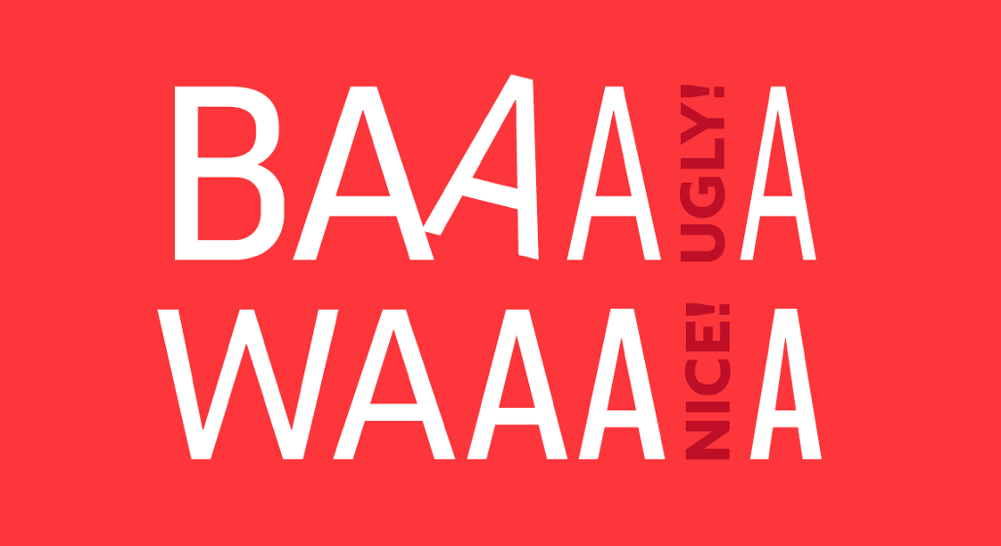
You shall not deform
There are so many font families with several weights and styles, so why do some of you insist on bolding manually?
1
This post originally appeared on the Fontyou blog,
You shall not deform
Instead of deforming the typeface, select something that is already condensed or ultra condensed.
1
This post originally appeared on the Fontyou blog,
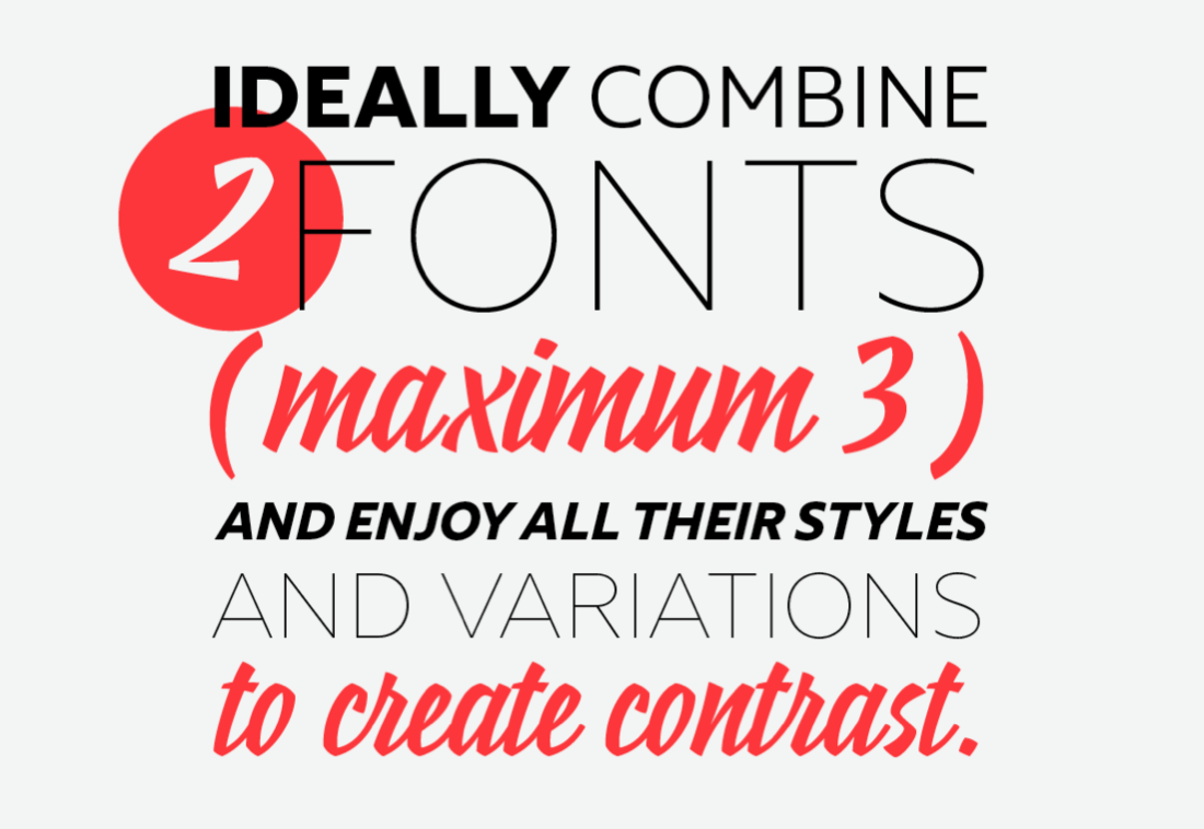
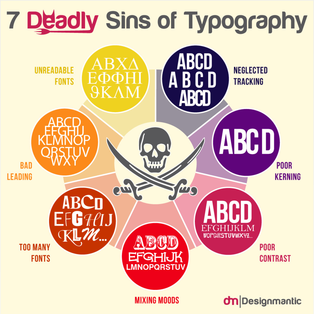
No more than two fonts
you shall combine
Ideally, combine two fonts, (okay, a maximum of three) and enjoy all their styles and variations to create contrasts.
2
This post originally appeared on the Fontyou blog,
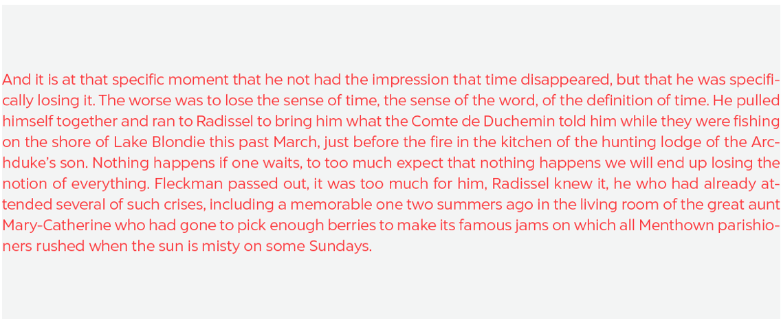
Too short or too long
lines you shall avoid
The lengths of lines considerably influence the reading and the understanding of the word.
3
This post originally appeared on the Fontyou blog,
Too short or too long
lines you shall avoid
Short lines will show a jerky feel, while extra
long lines will strain your eyes.
3
This post originally appeared on the Fontyou blog,
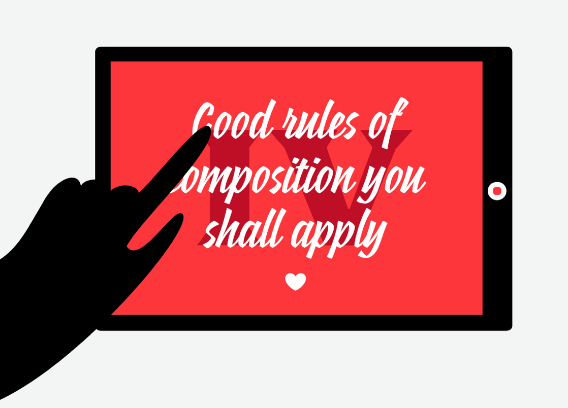
Good rules of composition
you shall apply
Justification is about the letters distribution on the lines. You can change the space between words and between letters for easy reading.
4
This post originally appeared on the Fontyou blog,
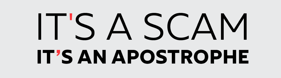
Of fake friends you
shall beware
The double quote mark should not be confused with
the double prime (second).
5
This post originally appeared on the Fontyou blog,
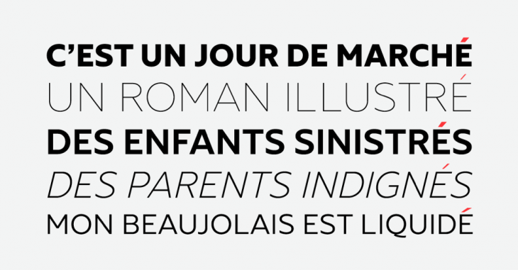
Accent marks on uppercases
you shall put
For international languages that contain accent marks, remember to retain them for uppercase letterings.
6
This post originally appeared on the Fontyou blog,
Abbreviations you
shall learn
Abbreviation can be practical when it comes to
condensing space in graphic designs.
7
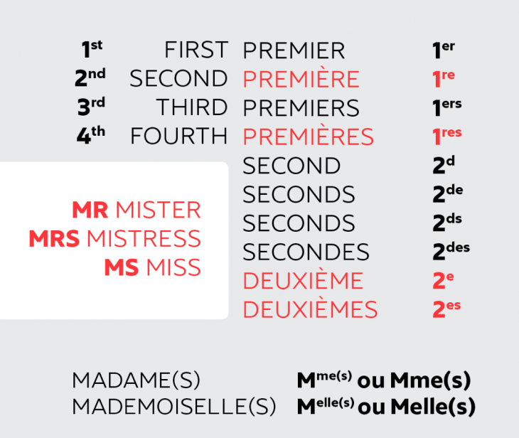
This post originally appeared on the Fontyou blog,
Spaces you shall respect
In French, there is a thin space (espace fine insécable) before every punctuation composed of two exclamation marks (i.e., ?!)
In English, there are no spaces before punctuation. Easy!
8
This post originally appeared on the Fontyou blog,
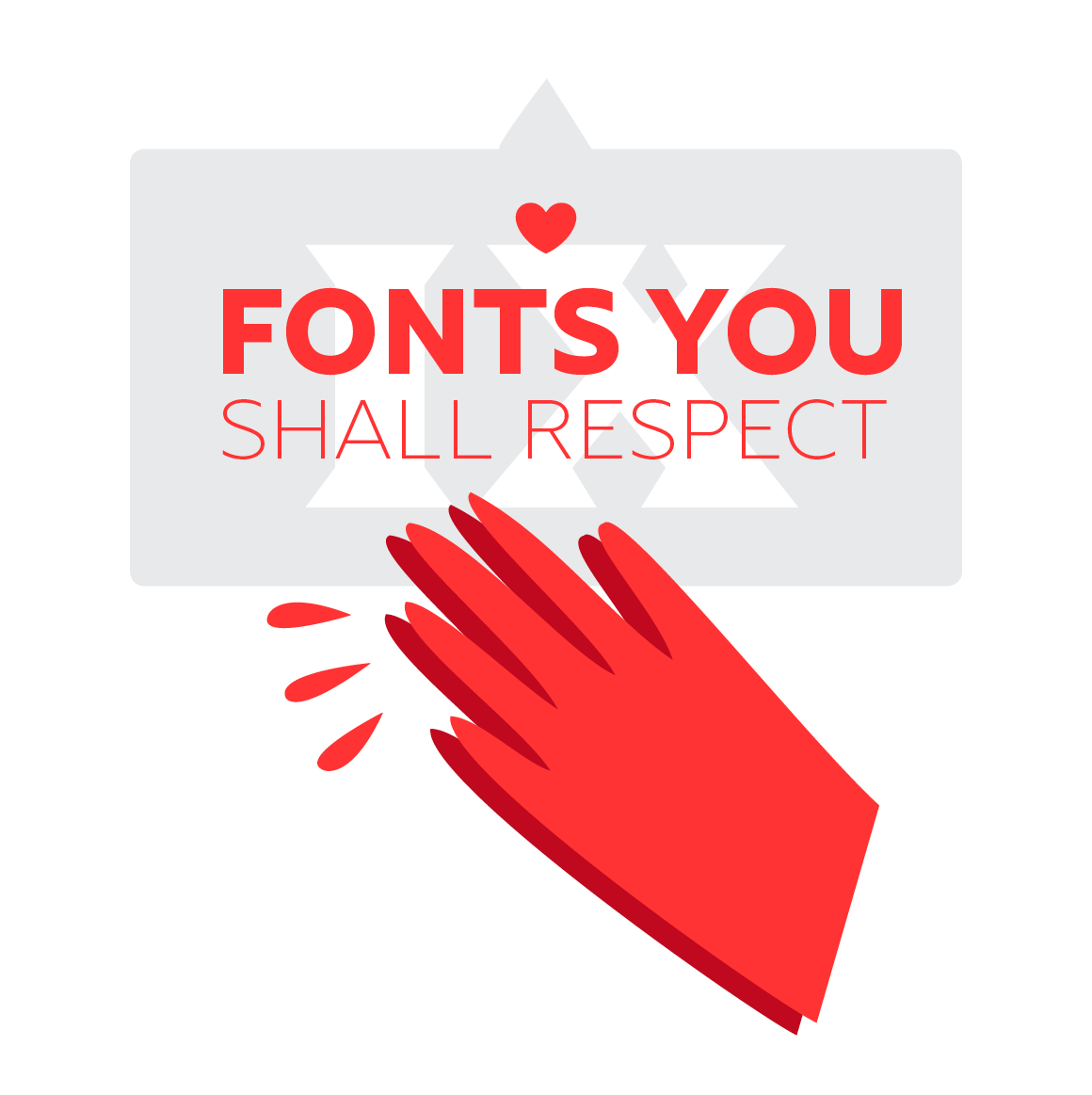
Fonts you shall respect
Fonts are like baby animals, rare pearls and protected natural species – you must take care of them and show some r-e-s-p-e-c-t.
9
This post originally appeared on the Fontyou blog,
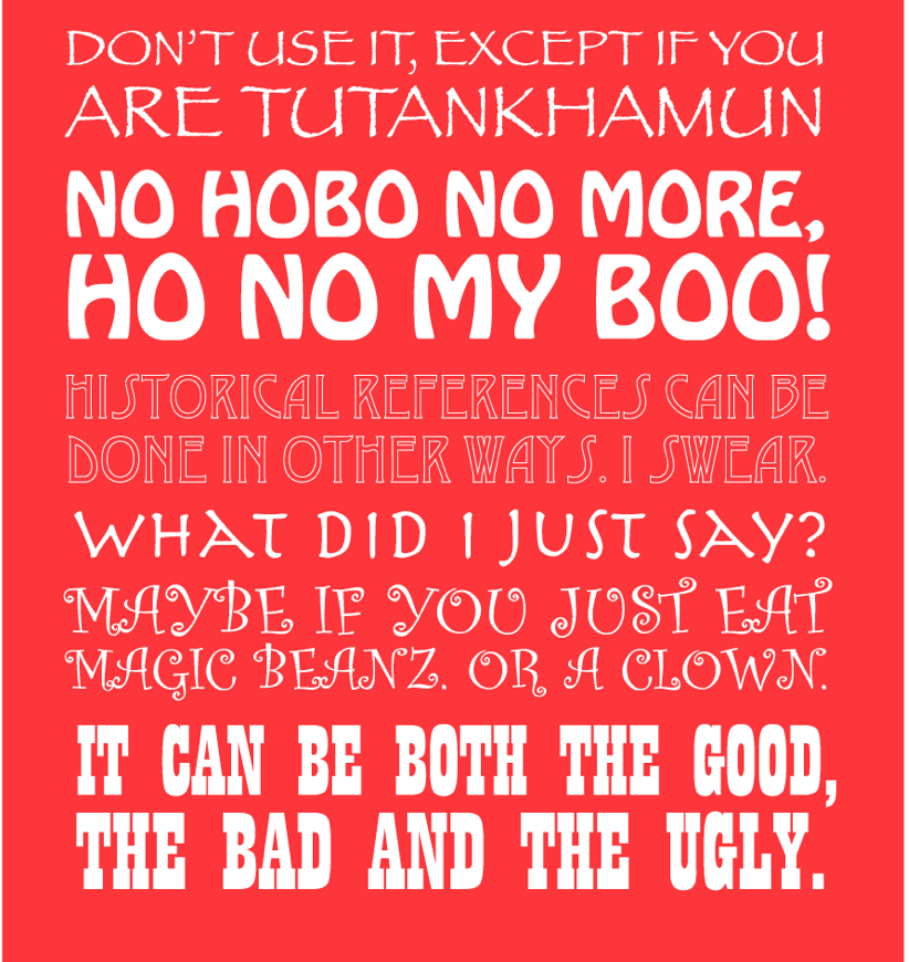
These fonts you shall
never use!
This is not an order, this is just a best friend’s advice!
10
This post originally appeared on the Fontyou blog,
You shall not deform
Instead of deforming the typeface, select something that is already condensed or ultra condensed.
1
