DPS Analysis
K-Pop
Heading and subheading:
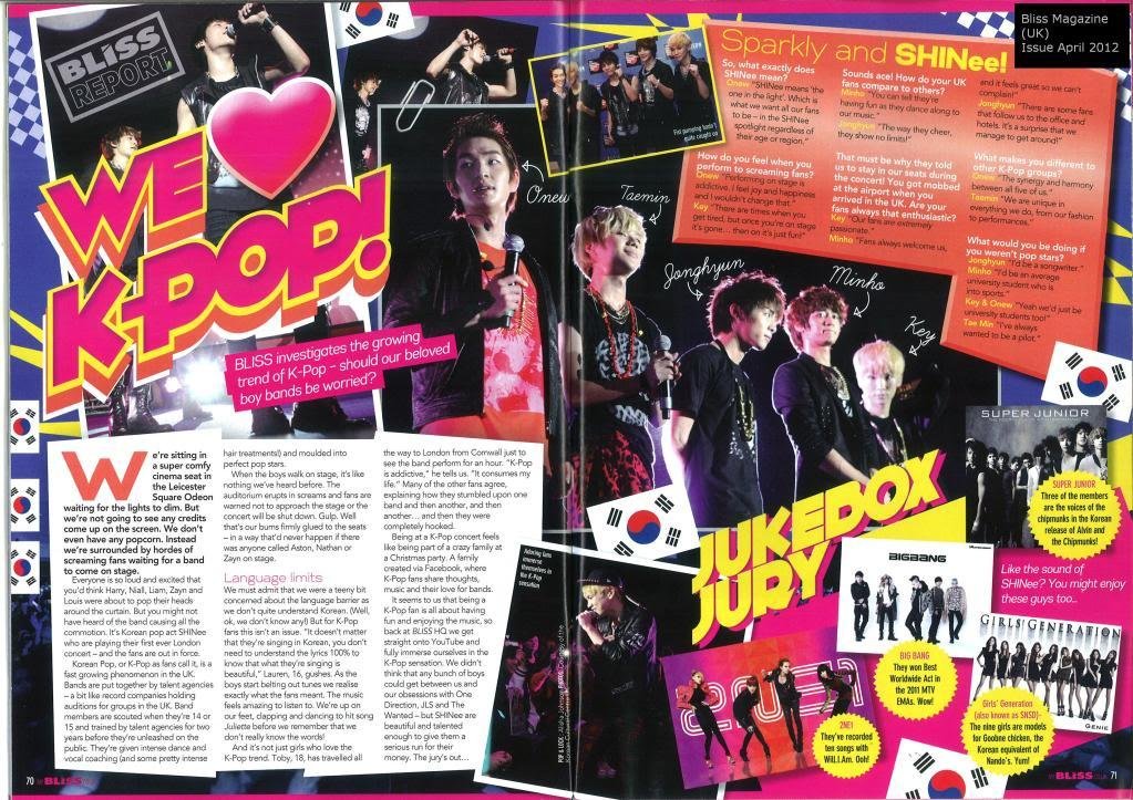
The heading of the magazine is the biggest font on the page, therefore it stands out, especially with the colour scheme of the pink and yellow. The subheadings also stand out as well, with the bright colours which also help us to know what they are.
Relationship to the left and right hand side:
Both the left and right hand side have pictures as well as writing, which can shows equality between both of the sides. However there are more pictures on the right hand side and more writing on the left hand side, which can show which side has more dominance on what.
What is the article about?
The article is about K-Pop and the bands which are quite popular. There are small interviews of one band as well as some facts on different bands in the K-Pop industry.
Target Audience:
I think this magazine target audience is aimed for a young age group such as 11 to 14 year olds. This would be a good target audience as they are quite young and they would like bright colours and things which are all over the place as it would catch their attention.
The house style (stylistic – language and visual design-) rules of publication:
The style of the publication is all over the place, which may show that this magazine is for a young audience, as the colours are also bright which attract a young audience. The pictures on the page are spread out from both the left and right hand side, which shows that the editors would want the target to not only read but also relate them to the pictures there.
Ratio of pictures to editorial:
The pictures on the page are all spread out on the page, with captions of what the band members are called. Also they relate to the text on the page with the bands who are having a small interview and the main article with the pictures being the band from a gig and in action
Colour scheme:
The colours used in this DPS are quite bright and ‘in your face’. The main colours used are pink, yellow, blue and white. As it is a K-Pop, maybe this magazine wants to attract a younger audience with these colours.
Indie
Relationship to the left and right hand side:
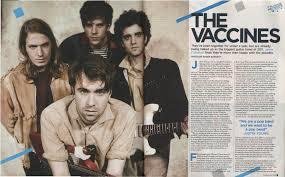
The left hand side has the main picture of the band, with their instruments as they stare into the camera. On the right hand side you see the quotes, text and the main interview of the band. This is unusual as the normally the picture is on the right and the text is on the left, therefore this shows that this magazine wants to go out of the normal way of publishing a magazine which goes with the rules..
Heading and subheading:
The heading of the article is basic and simple as it just says ‘The Vaccines’ which suggests that it is a band as there are 4 people on the page looking towards the camera, with their instruments. There are no subheadings however, there are letter which stand out, where the text it which suggest that a new topic may have started.
Target Audience:
The target audience of this article might be people from the ages of 18 to 30. I think this because the pages are layed out in an organized way, compared to the K-Pop DPS as well as a clear picture of the band and what the article is going to be about.
The house style (stylistic – language and visual design-) rules of publication:
On these two pages I can see that they are split into six sections, two sections being the interview while the other four being the main picture of the band. As well as this the heading crosses over into the 2 sections where the text is as well as the overview of what the article is going to be about.
Ratio of pictures to editorial:
There is a main picture on the left hand side and no other pictures seen on the page which closes the attention the band itself and nothing else.
Colour scheme:
The colour scheme is quite neutral with the main colours being blue, black and a dirty grey/yellow. It resembles the band well as they are an indie band the colours show them as not too hardcore as well as not to pop.
What is the article about?
The article is about a band called ‘The Vaccines’ and their journey as well as what they have been up to since the year 2011.