Our recent work:
Restaurant
Start-up
eCommerce
Use the arrows to navigate
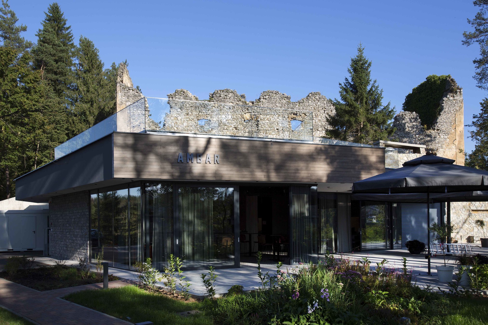
Restaurant Ambar
move down to discover more
The project involved:
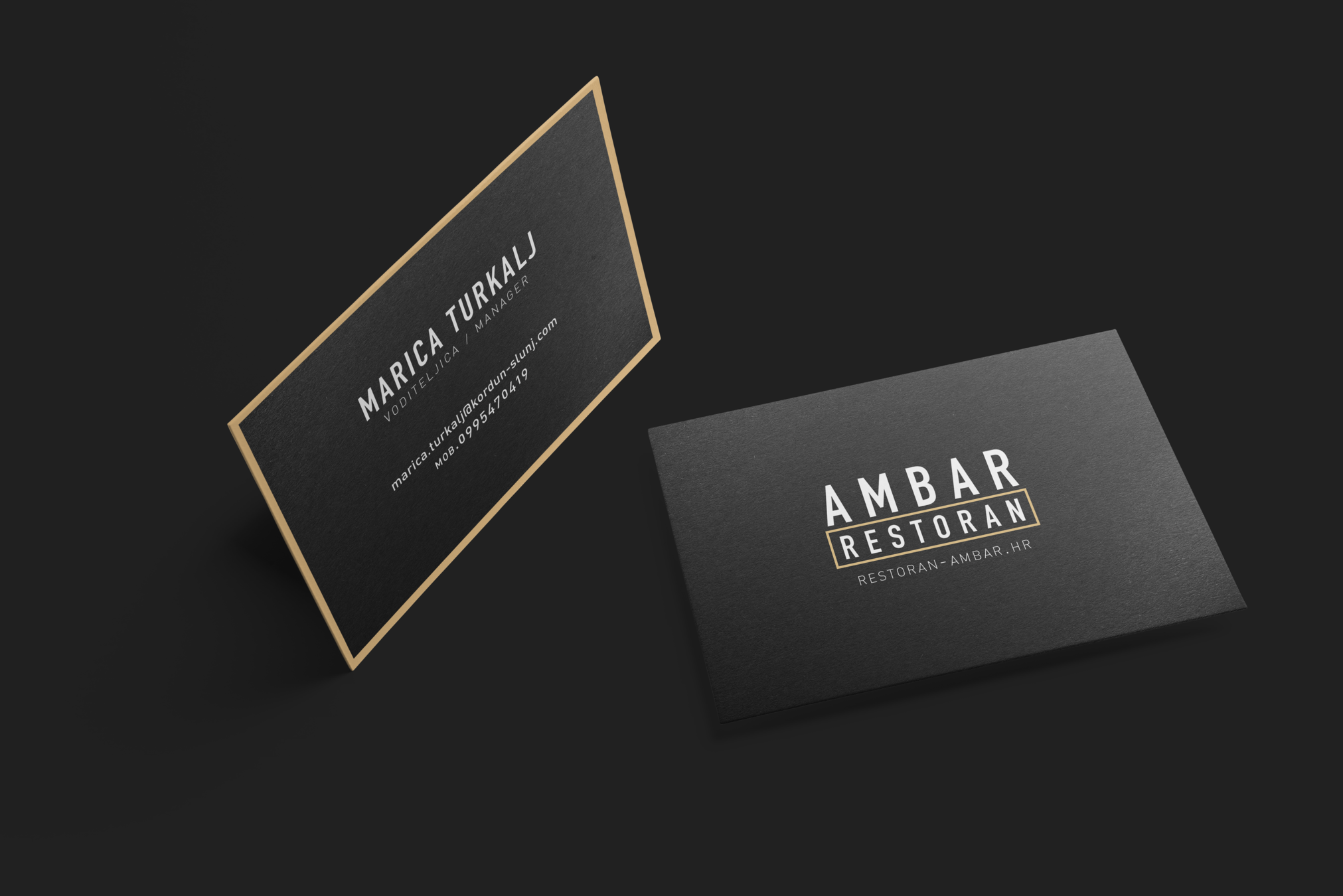
Brand Identity Design
Web Design
Website Copywriting
Social Media Strategy

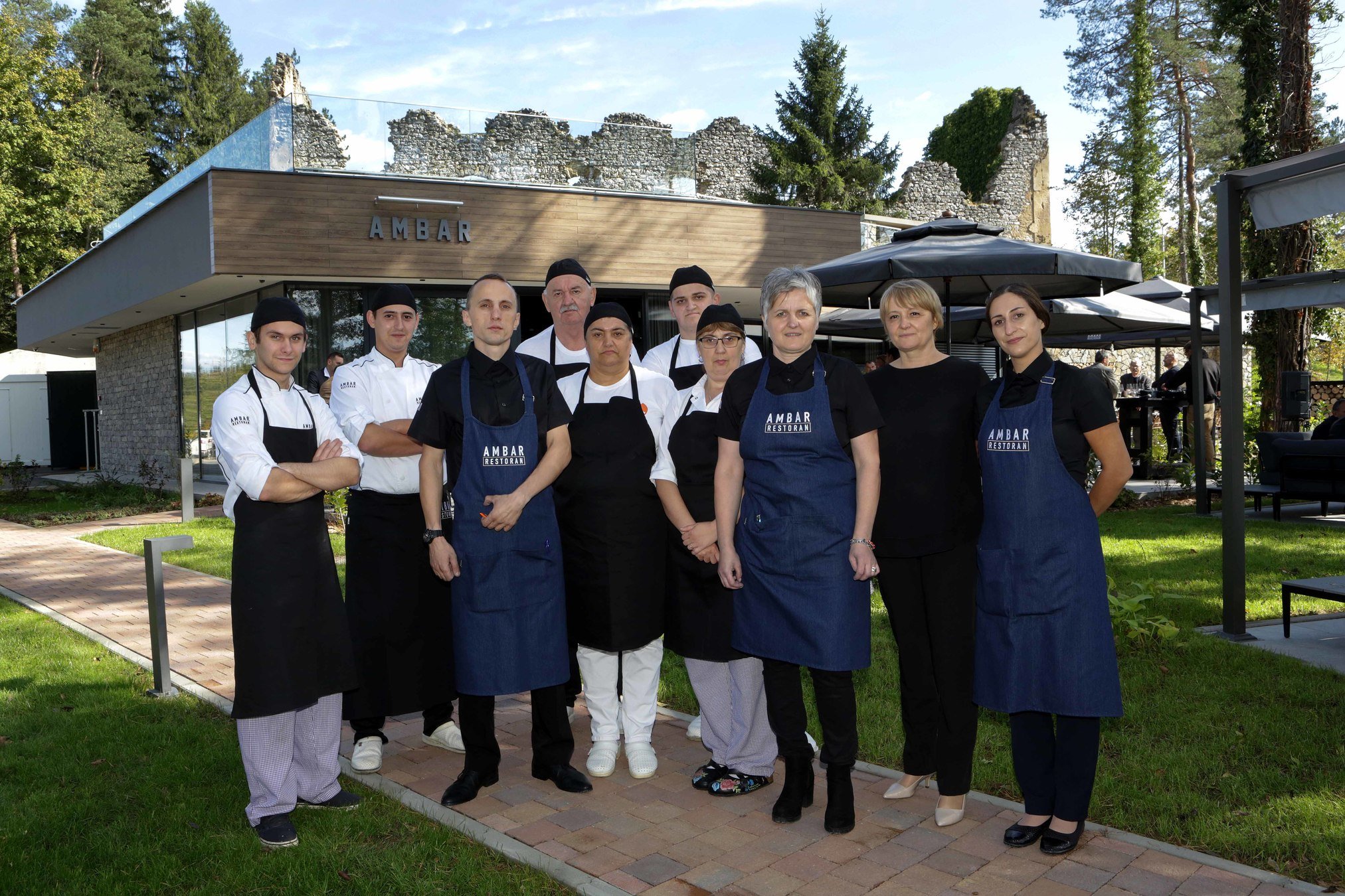
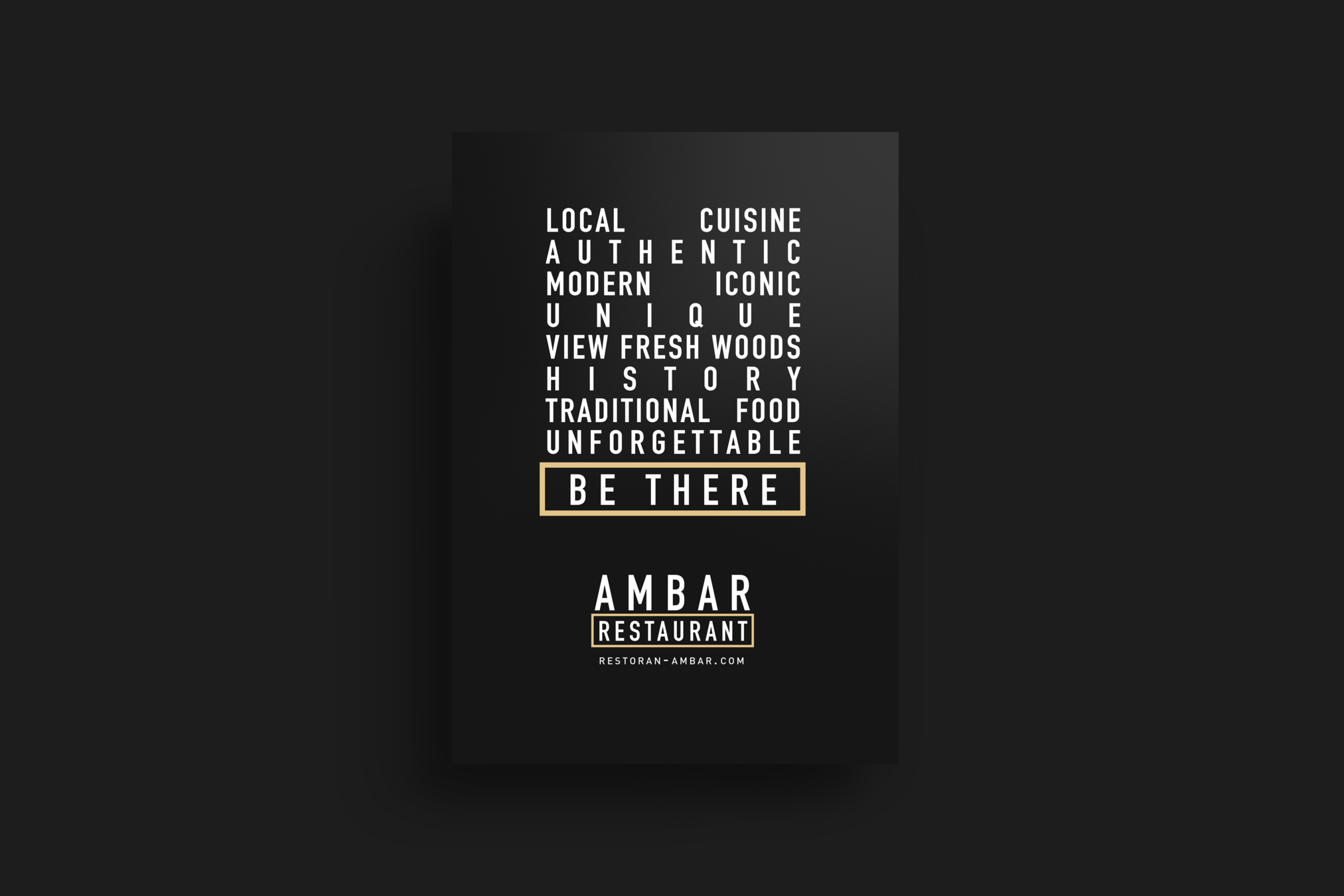
Located under 200-year-old ruins of Napoleon's Magazine on top of a hill in a small town of Slunj, with the million EUR investment in its architecture and in collaboration with Croatia's best chef, Mate Jankovic - Ambar is set to be one of Croatia's finest restaurants.
Restaurant Ambar
Logo
Visual identity is a combination of justified text, representing the fortress above the restaurant and a golden rectangle, representing the restaurant's visual appearance. Justified text and the golden rectangle are used as the main graphic elements throughout the identity. By combining the modern design elements with the historic elements of the restaurant we wanted to create a brand that lives and breathes Croatian culture.
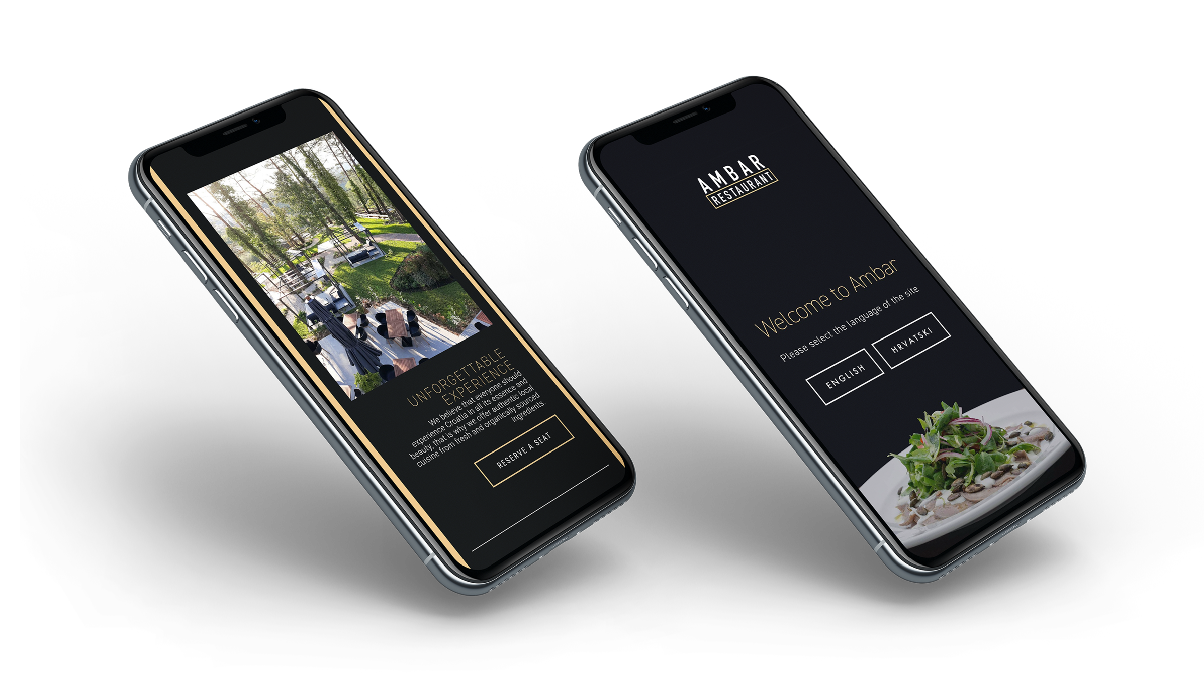
Web design - restaurant-ambar.com
next project
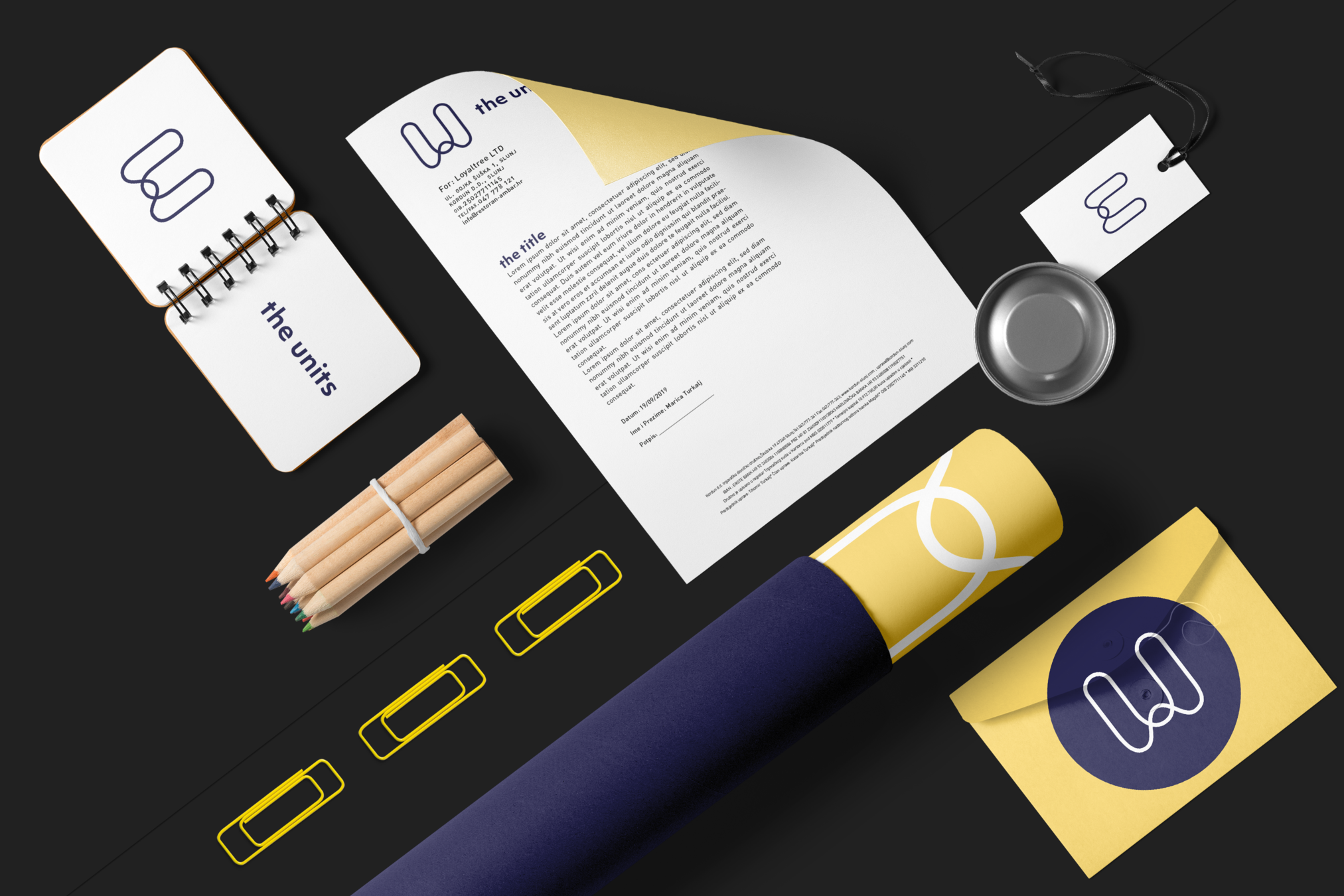
The Units
move down to discover more
The project involved:
Brand Identity Design
Web Design (Still in development)
Website Copywriting
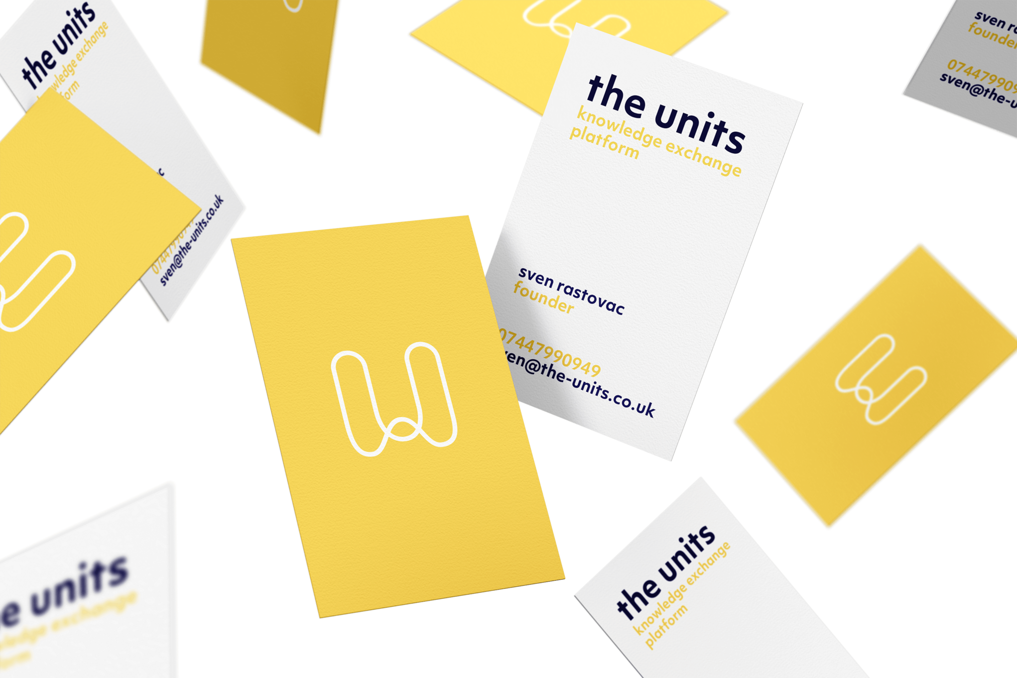
The-units is a startup, located in the UK, connecting businesses with universities to work together on live projects. The idea is to give students the experience needed once they graduate and start looking for a job, while at the same time connecting businesses with creative and hard-working individuals.

the units
Logo represents the connection between 2 big institutions (Universities and Businesses) that are connected with a smaller entity - the student.
Logo
move right to discover more
Website
The online platform is used as an advertising tool for universities and businesses as well as project management tool for the projects.
<html>
<head>
<h1>Being coded as we
speak</h1>
</head>
</html>
Neers
move down to discover more
The project involved:
Brand Identity Design
Web Design
Social Media
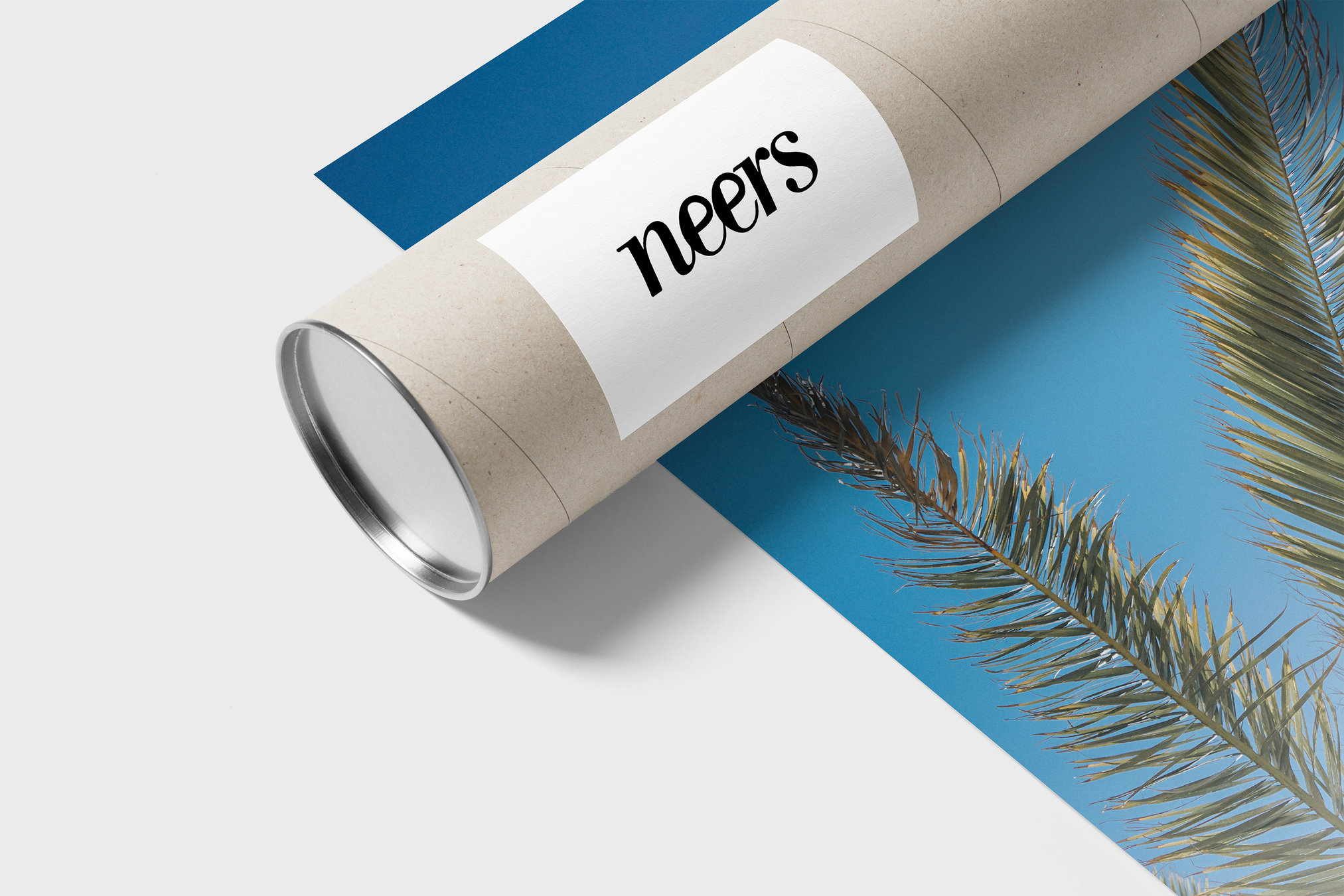
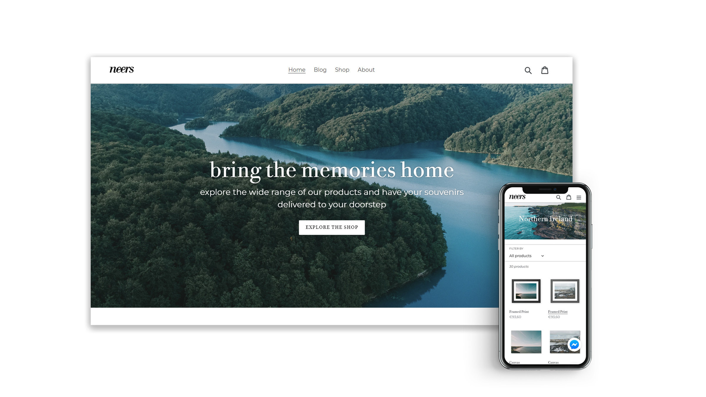
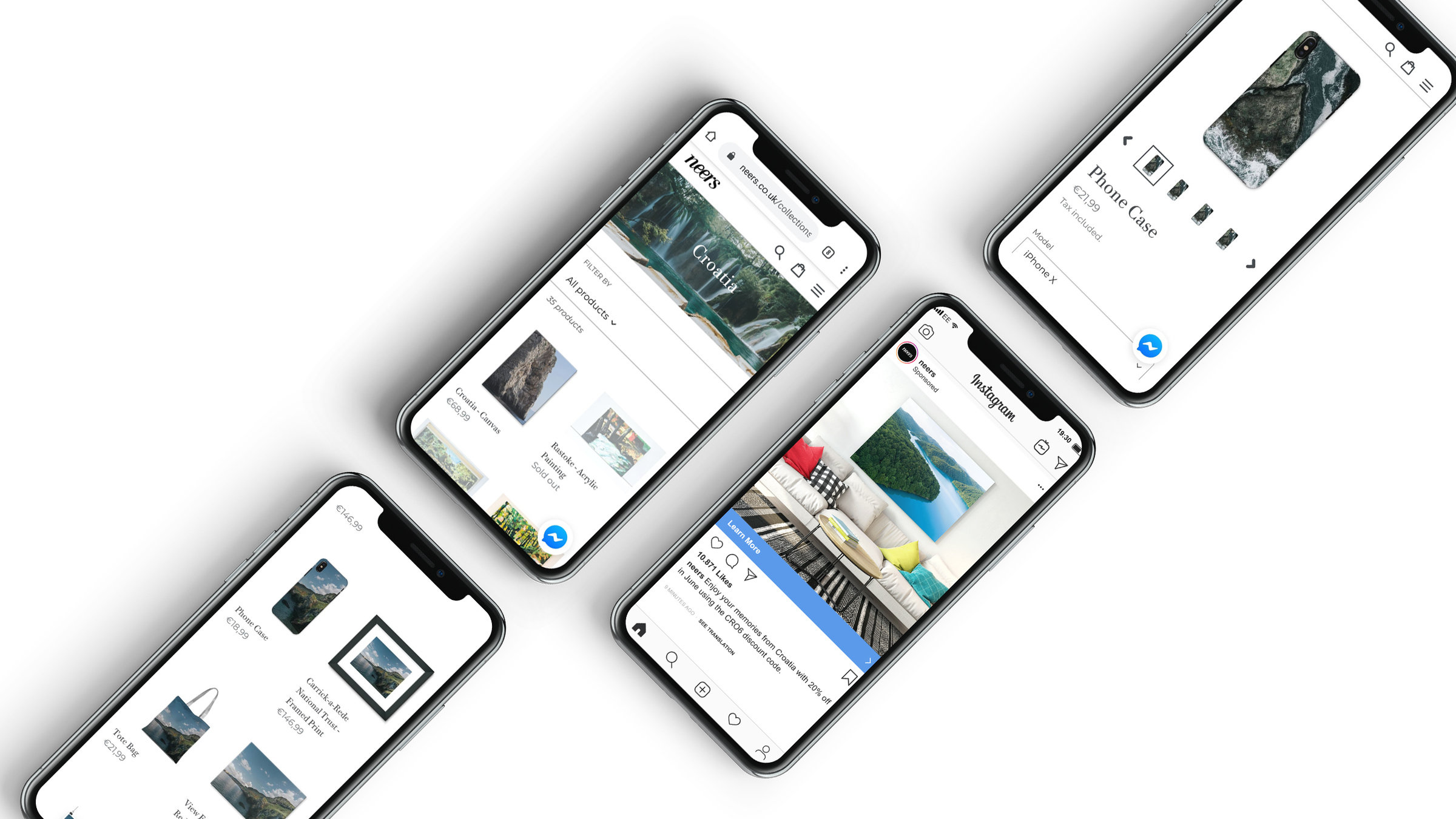
neers.co.uk is an online souvenir shop that connects travellers with the locations they visited. Wordmark is altered by inserting location pins with letters "e" which represents the connection between the 2 different locations - the place the customer visited and their home. The website was built using Shopify app, with slight changes in HTML and CSS.
With travel bloggers coming out of our ears, when working with Neers we had to create a brand that will touch the audience on a deeper, emotional level. The idea was to remind the audience why they loved visiting a certain place and give them something (in this case a canvas or a framed print) that will decorate their walls and be a constant reminder of their favourite memories created while travelling. Also, ‘Neers’ is short for Souvenirs.
the story
move right to the final page
That's it!
Hope we impressed you!
Please reach out through the quick questionnaire below.
Or contact us directly at:
sven@loyal-tree.co.uk
Or go back to the Homepage
Send an inquiry
You discovered the secret slide!
We just love curious people. You won a cuppa coffee with us (on us) with a free audit of your social media profile!
Contact us at:
mia@loyal-tree.co.uk
Or go back to the Homepage