Why conferences
are awesome?


Time for learnings!!!
Disclaimer
Technical blah blah blah incoming.
Feel free to disconnect if you find it boring!
Bryan Liles
on running Ruby apps
Programmers should at least understand DevOps
Immutable infrastructure
Shot the server
in the head!


https://www.youtube.com/watch?v=xytTA4dKaP0
Mark Dalgleish
on CSS Modules
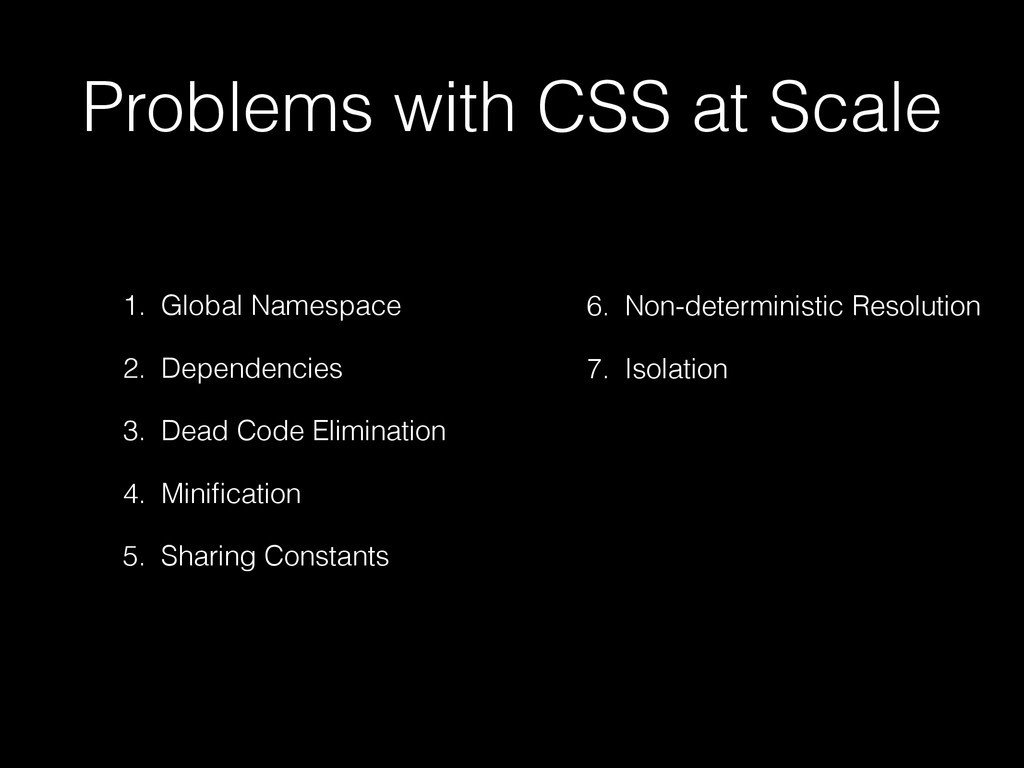
Biggest problem with CSS
(IMHO)
BEM

CSS Modules
to the rescue
Before - BEM
/* components/submit-button.css */
.Button { /* all styles for Normal */ }
.Button--disabled { /* overrides for Disabled */ }
.Button--error { /* overrides for Error */ }
.Button--in-progress { /* overrides for In Progress */

<button class="Button Button--in-progress">Processing...</button>
After
/* components/submit-button.css */
.normal { /* all styles for Normal */ }
.disabled { /* all styles for Disabled */ }
.error { /* all styles for Error */ }
.inProgress { /* all styles for In Progress */

/* components/submit-button.js */
import styles from './submit-button.css';

<button className={styles.normal}>Submit</button>
<button className={styles.disabled}>No go!</button>

/* Gets compiled to /*
<button class="components_button__normal__abc5436">
<button class="components_button__disabled__def1231">
Composition!
We love composition, much functional
.common {
    /* font-sizes, padding, border-radius */
}
.normal {
    composes: common;
    /* blue color, light blue background */
}
.error {
    composes: common;
    /* red color, light red background */
}
.components_submit_button__common__abc5436 { /* font-sizes, padding, border-radius */ }
.components_submit_button__normal__def6547 { /* blue color, light blue background */ }
.components_submit_button__error__1638bcd { /* red color, light red background */ }
import styles from "./submit-button.css" // returns
styles: {
common: "components_submit_button__common__abc5436",
normal: "components_submit_button__common__abc5436 components_submit_button__normal__def6547",
error: "components_submit_button__common__abc5436 components_submit_button__error__1638bcd"
}.some_element {
font-size: 1.5rem;
color: rgba(0,0,0,0);
padding: 0.5rem;
box-shadow: 0 0 4px -2px;
}$large-font-size: 1.5rem;
$dark-text: rgba(0,0,0,0);
$padding-normal: 0.5rem;
@mixin subtle-shadow {
box-shadow: 0 0 4px -2px;
}
.some_element {
@include subtle-shadow;
font-size: $large-font-size;
color: $dark-text;
padding: $padding-normal;
}.element {
composes: large from "./typography.css";
composes: dark-text from "./colors.css";
composes: padding-all-medium from "./layout.css";
composes: subtle-shadow from "./effect.css";
}Themes!
/* component/theme-a.css */
.outer { background: green; }
.inner { color: blue; }

/* component/theme-b.css */
.outer { background: red; }
.inner { color: yellow; }

/* component/index.js */
export default class Component {
  constructor(theme) {
    this.theme = theme;
  }
  render() {
    var theme = this.theme;
    return '<div class="' + theme.outer + '">' +
      '<div class="' + theme.inner + '">' +
      '</div></div>';
  }
}

/* application */
import themeA from "component/theme-a.css";
import themeB from "component/theme-b.css";

import Component from "component";

// use the Component
new Component(themeA);
new Component(themeB);
Why don't we use it right away?