Building a Covid19 Dashboard with Phoenix LiveView
Mafinar Khan | @mafinar | mafinar.ca
What are we going to do?
- Checkout a Covid19 Dashboard Made with Phoenix LiveView
- Look into some code
- Discuss some code
What are we going to see
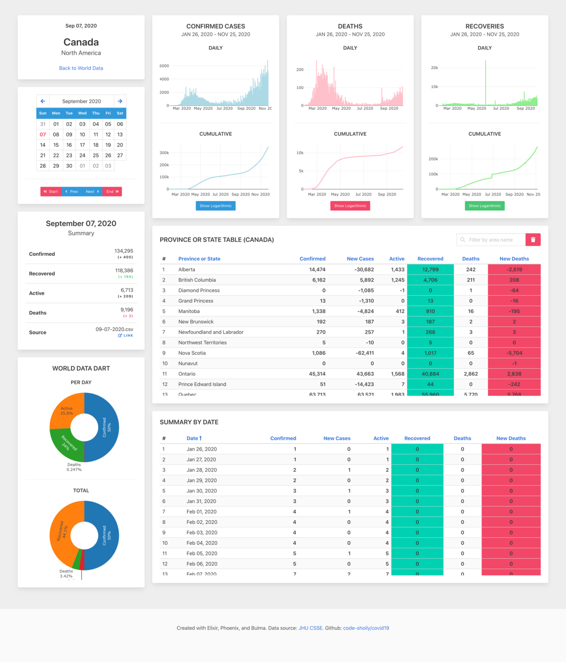
A dashboard that shows data on Covid19
What does it do?
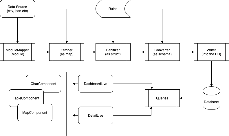
- Pulls data from various dataset (Currently only John Hopkins)
- Updates Postgres Database with that data
- Presents information
- Worldwide cases, deaths, recoveries on-
- Heat Map
- Chart
- Tables
- Above data per country
- Sorting/Filtering of data by date and other attributes
- Comparison of data (TBD)
- Worldwide cases, deaths, recoveries on-
Why did I do this?
- To learn about LiveView with hands on experience
- To keep my Elixir claws sharpened
- To have a stab at Covid19 data exploration
Please read the disclaimer on the repository's README
How does it look like?

What I learned
- How components and views fit together
- JS Hooks and integrating charts, maps, tables etc
- Making a date picker with LiveView
- Navigations
- Helpful way to organize code
- Value of trial and error, trials mostly
Demo and Walkthrough Time!!!
Near Future Plans
- Decouple Components
- Identify and modularize commonly used UI modules
- Add dynamically addable charts for States and Provinces
- Improve Caching
- Optimize Queries
- Add map on detail view
Future Plans
- Make data source pluggable and browsable
- Add comparison page to compare multiple sets of data
- Animation on Heat-map
- Downloadable Reports
- More ...