Design for Beginners
Munch 'n' Learns
Marko Aleksic
UX Designer
www.markiz.io
Marko Aleksic

UX DESIGNER
WWW.MARKIZ.IO
MUNCH 'N' LEARNS
Design for Beginners
Design is creation of something. Design is bringing order in chaos and bringing chaos in order. Design is making something beautiful.
What is Design?
QUESTION I
Beauty is the ultimate term. Everybody has different perception of beauty but creating beautiful design can be learned.
What is "beautiful"?
QUESTION II
Design for the web is a creation of something useful with user in mind where content comes over form.
But what is design for the world wide web?
QUESTION III
There are Rules and Guides that can help you design better.
Rules and Guides
FOLLOW THESE
Don’t disregard readability/legibility for aesthetic reasons.
Readability/Legibility
RULE I

Have purposeful hierarchy of elements.
Hierarchy
RULE II

Use proper alignment of text.
Don't use justified alignment on the web.
Alignment
RULE III

Keep your text size lengths short (between 600-800px)
Text Width
RULE IV

Try always to use some form of the grid.
Grid
RULE V

Design for the proper audience.
Audience
RULE VI

Don’t think of whitespace as empty space
Whitespace
RULE VII

Be consistent through the project.
Consistency
RULE VIII

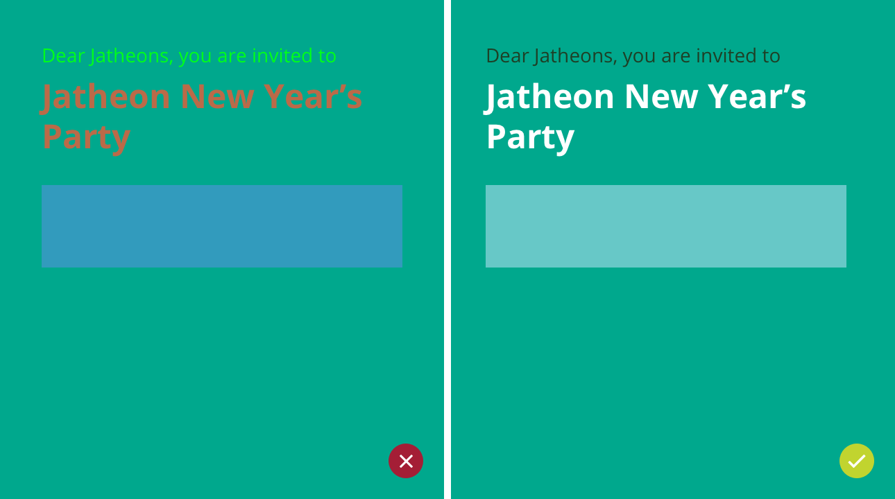
Do watch which colors you pair together.
Pairing colors
RULE IX

Don’t use more than 2,3 fonts.
Too Many Fonts
RULE X

Never use headlines fonts for body text.
Body Font
RULE XI

Never change original proportions of a font.
Stretching font
RULE XII

Don’t use these two on the ever.
Comic Sans and Papyrus
RULE XIII
Use Photoshop for raster images, Illustrator for vector, etc.
Use Right Tools
RULE XIV

Consider the medium for which you are designing
Medium
RULE XV

Do watch your grammar, be detailed and always proofread
Grammar, Spelling, Punctuation
RULE XVI

Marko Aleksic

UX DESIGNER
WWW.MARKIZ.IO
THE END