lightshow.js
Martin Schuhfuss – @usefulthink
more precisely,
lightshow.css
lightshow.css
.front-truss .left-1 {
  color: white;
  brightness: 1;

  animation: colorfade 10s infinite;
}

@keyframes colorfade {
  from { brightness: .5; color: #e10079; }
  to { brightness: .8; color: #051add; }
}
everything* running in the browser
- one large css-file with made-up properties
- light-fixtures represented by DOM-nodes
- css-code is interpreted by the browser
- everything controlled via element-classnames
*(except the communication with the external interfaces)
WebMIDI controlling CSS
- every button controls a css-class
- triggers (on while pressed) or switches (press on/press off)
how?
HTML
<device-root>
  <device-group class="front-truss">
    <device class="movinghead left-1"
        type="quantum-profile"
        channel="1:246"></device>
  </device-group>
</device-root>
turns out, browsers will just accept this as "HTML"
(might use real custom elements at some point)
CSS
.front-truss .left-1 {
  color: white;
  brightness: 1;

  animation: colorfade 10s infinite;
}

@keyframes colorfade {
  from { brightness: .5; color: #e10079; }
  to { brightness: .8; color: #051add; }
}
this still needs a bit of trickery, we'll get to that in a minute
add some JS...
const device = document.querySelector('device');
const channel = device.getAttribute('channel');

setInterval(() => {
  const currStyle = getComputedStyle(device);

  setLightControlValues(channel, {
    color: currStyle.color,
    brightness: currStyle.brightness
  });
}, 33);
DMX512
- serial protocol for professional lighting equipment
- data is sent at around 30 FPS
back to that CSS
.front-truss .left-1 {
  color: white;
  brightness: 1;

  animation: colorfade 10s infinite;
}

@keyframes colorfade {
  from { brightness: .5; color: #e10079; }
  to { brightness: .8; color: #051add; }
}
two problems with that
- we can't just make up CSS properties and expect them to just work.
.front-truss .left-1 {
  color: white;
  --brightness: 1;

  animation: colorfade 10s infinite;
}

@keyframes colorfade {
  from { --brightness: .5; color: #e10079; }
  to { --brightness: .8; color: #051add; }
}
but there are custom-properties:
two problems with that
we can't just make up CSS properties and expect them to just work- custom-properties + transitions/animations (currently) don't work in any browser
.lightpanel .x2.y1 {
  --brightness: 1; left: 1px;

  animation: colorfade 10s infinite;
}

@keyframes colorfade {
  from {
    --brightness: .5; left: .5px;
  }
  to {
    --brightness: .8; left: .8px;
  }
}
but here's a workaround:
use a css-property that can be animated as a replacement.
the final solution
- parse lighting-CSS (using rework parser)
- AST-transform: custom-properties + fallbacks
- serialize CSS / inject into page
getComputedStyle()
- Animation-Frame: use to get final values for all parameters
- re-map fallback-properties to lighting properties
- send via DMX to devices
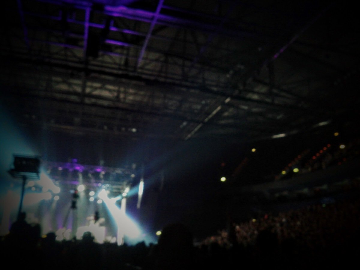
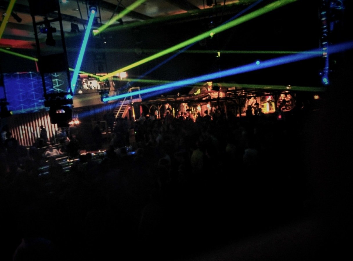
preparing a show...
introducing: dmxpen
- live-editor for device-dom and light-css
- minimalistic pre-visualization using aframe
- the reason why i wanted everything to run in the browser
Code: https://github.com/beyondscreen/
Say hi: @usefulthink