Flexbox
Maketų kūrimas
Parengė: Martynas Kašelionis
From zero to hero
Trumpai
Flexbox - tai efektyvus būdas kuri maketus (angl. layout).
Privalumai:
- Vertikalus ir horizantalus blokų lygiavimas
- Vietos užpildymas ir paskirstymas neskaičiuojant
- Dinaminis blokų rikiavimas
- Geras suderinamumas su išmaniais įrenginiais
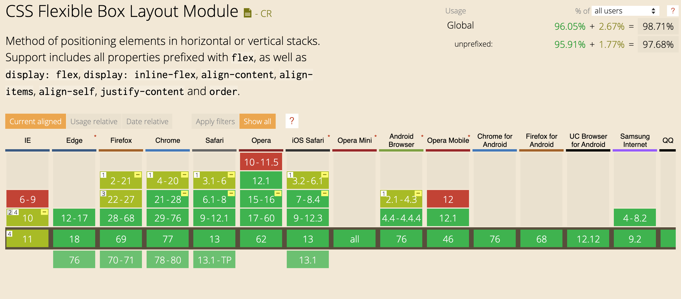
Naršyklių palaikymas
Kada naudoti ?
„Flexbox“ išdėstymas yra tinkamiausias UI komponentams ir nedidelio mastelio maketams, tuo tarpu „Grid“ išdėstymas yra skirtas didesnio mastelio maketams.
Terminalogija
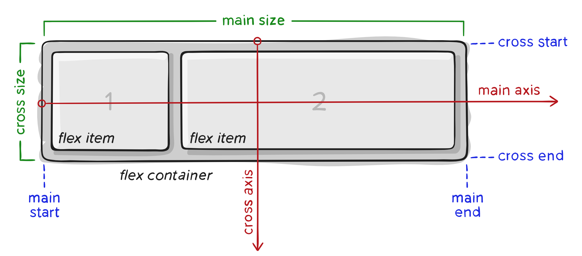
Terminalogija
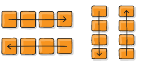
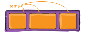
- main axis - pagrindinė flex konteinerio ašis. Nebūtinai horizontali, nes tai priklauso nuo flex-direction ypatybės
- main-start | main-end - elementai, kurie yra child (flex-items) patalpinti konteineryje, kurių išdėstymas prasideda nuo main-start ir baigiasi main-end.
- main size - flex-item plotis ir aukštis
- cross axis - ašis, kuri eina statmenai per pagrindinę (main-axis) ašį.
- cross-start | cross-end - flex linijos yra užpildomos flex elementais konteineryje pradedant cross-start ir baigiant cross-end
- cross size - flex elemento plotis ir aukštis cross axis atžvilgiu.
Konteineris
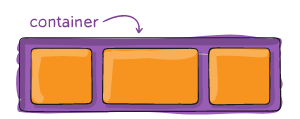
Konteineris
display: flex;
apibrėžia flex konteinerį.
Ir įjunia flex rėžimą visiems "child elementams"
.container {
  display: flex;
Konteineris
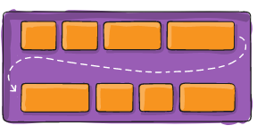
flex-direction
.container {
  flex-direction: row | row-reverse | column | column-reverse;
}
Konteineris
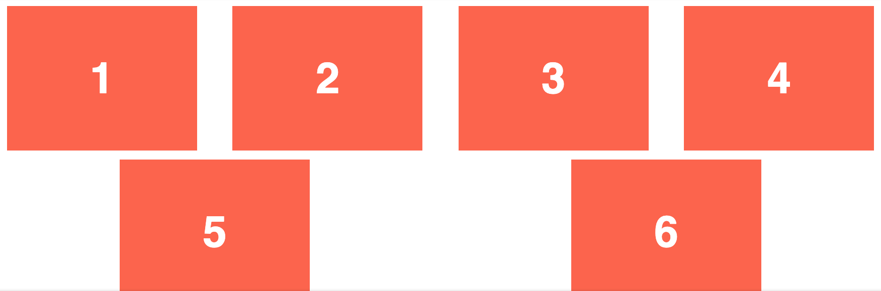
flex-wrap
.container{
  flex-wrap: nowrap | wrap | wrap-reverse;
}
Konteineris
flex-flow
shorthand'as direction ir wrap
.container{
  flex-flow: <‘flex-direction’> || <‘flex-wrap’>
}
Konteineris
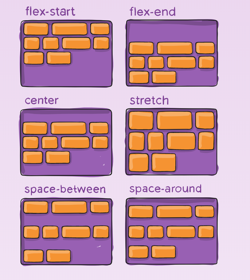
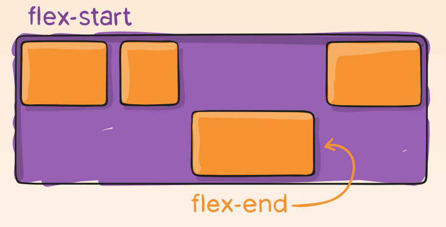
justify-content
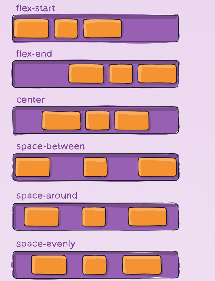
.container {
  justify-content: flex-start | flex-end | center | space-between | space-around | space-evenly | start | end | left | right| unsafe;
}
Konteineris
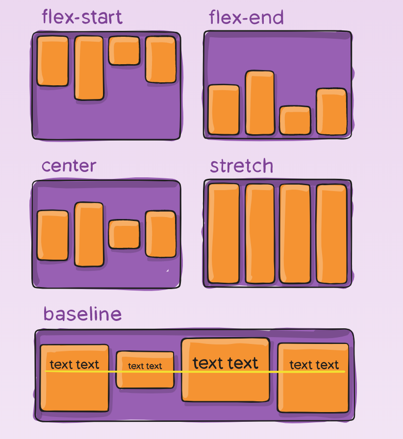
align-items
.container {
  align-items: stretch | flex-start | flex-end | center | baseline | first baseline | last baseline | start | end | self-start | self-end + ... safe | unsafe;
}
Konteineris
align-content
.container {
  align-content: flex-start | flex-end | center | space-between | space-around | space-evenly | stretch | start | end | baseline | first baseline | last baseline + ... safe | unsafe;
}
Elementas
Elementas
order
.item {
  order: <integer>; /* default is 0 */
}
Elementas
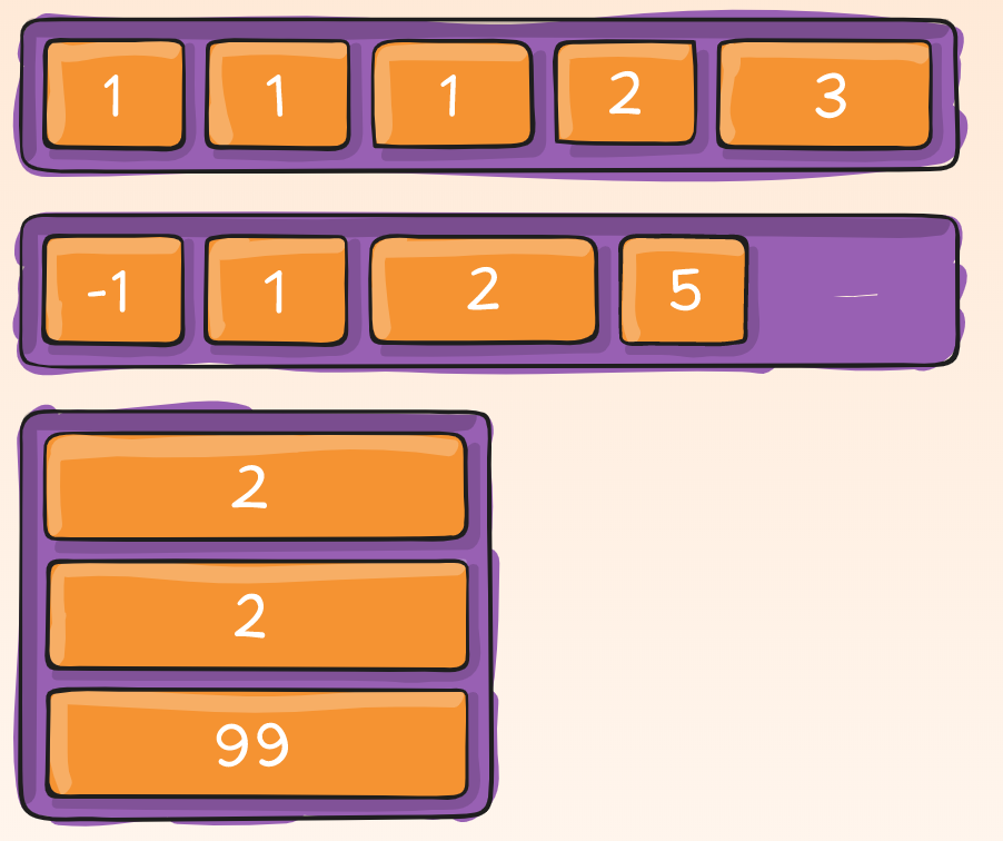
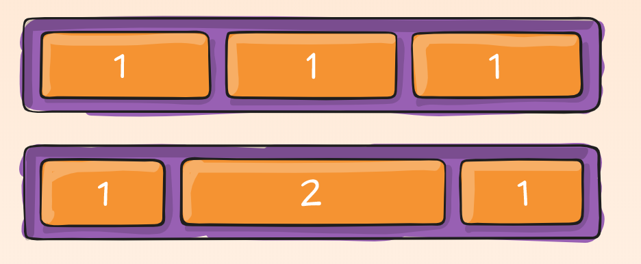
flex-grow
.item {
  flex-grow: <number>; /* default 0 */
}
Elementas
flex-grow
.item {
  flex-grow: <number>; /* default 0 */
}
Elementas
flex-shrink
Flex elementui apibrėžiama galimybė susitraukti
.item {
  flex-shrink: <number>; /* default 1 */
}
Elementas
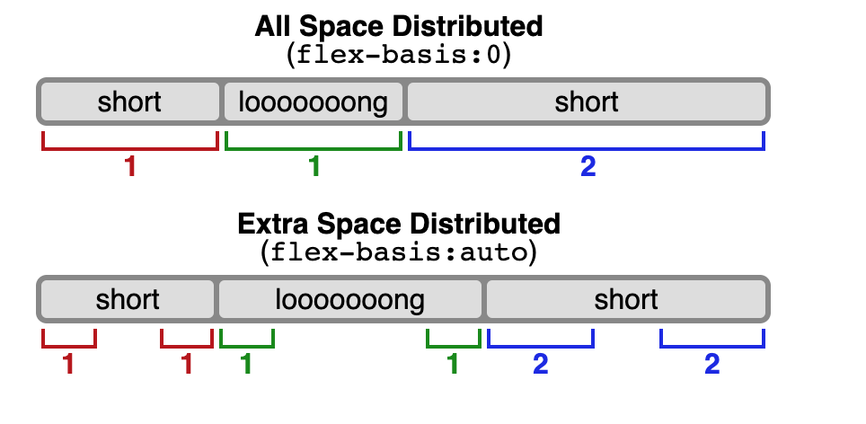
flex-basis
Apibrėžia numatytąjį elemento dydį prieš paskirstant likusią vietą.
.item {
  flex-basis: <length> | auto; /* default auto */
}
Elementas
flex
Shorthand'as flex-grow, flex-shrink ir flex-basis
.item {
  flex: none | [ <'flex-grow'> <'flex-shrink'>? || <'flex-basis'> ]
}
Elementas
align-self
.item {
  align-self: auto | flex-start | flex-end | center | baseline | stretch;
}
Elementas
align-self
.item {
  align-self: auto | flex-start | flex-end | center | baseline | stretch;
}
Demo
.parent {
  display: flex;
  height: 300px;
}

.child {
  width: 100px;
  height: 100px;
}
Demo
.flex-container {
  /* We first create a flex layout context */
  display: flex;

  /* Then we define the flow direction
     and if we allow the items to wrap
   * Remember this is the same as:
   * flex-direction: row;
   * flex-wrap: wrap;
   */
  flex-flow: row wrap;

  /* Then we define how is distributed the remaining space */
  justify-content: space-around;
}
Demo
Demo
.navigation {
  display: flex;
  flex-flow: row wrap;
  /* This aligns items to the end line on main-axis */
  justify-content: flex-end;
}
Demo
.wrapper {
display: flex;
flex-flow: row wrap;
}
/* We tell all items to be 100% width, via flex-basis */
.wrapper > * {
flex: 1 100%;
}
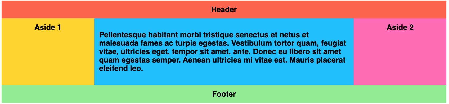
/* We rely on source order for mobile-first approach
* in this case:
* 1. header
* 2. article
* 3. aside 1
* 4. aside 2
* 5. footer
*/
/* Medium screens */
@media all and (min-width: 600px) {
/* We tell both sidebars to share a row */
.aside { flex: 1 auto; }
}
/* Large screens */
@media all and (min-width: 800px) {
/* We invert order of first sidebar and main
* And tell the main element to take twice as much width as the other two sidebars
*/
.main { flex: 2 0px; }
.aside-1 { order: 1; }
.main { order: 2; }
.aside-2 { order: 3; }
.footer { order: 4; }
}Demo