Improving the Vitals Screen.

Goals
1
Perform Research & Testing
2
Improve Navigation
3
Improve Visual Hierarchy
After I was given the task to improve the Vitals screen, I already had a few ideas for a few improvements. Nevertheless, I wanted to perform a quick research and some testing.
Research & Testing
No particular problem needed to be solved, so I decided to perform a secondary research to come up with an idea for an improvement.
I wanted to understand better how a Due Diligence is performed. I learned that stability of the company in recent years and company's competitors were two of the major factors. Ideas were coming from everywhere but in the end, I decided to try and illustrate a clearer picture about a company recent stability (3-5 years).

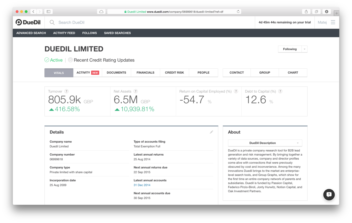
Quickly after testing DueDil I noticed something. The presentation of the vital information on top of the screen was nice, but I found out that clicking on any of these information took me to the Financials screen.
The result was exactly the same as clicking on the Financials link. Therefore, clicking on this info brings no value to the user.
This, combined with the research I did, lead to an idea how this space could be used better.
Maps & Scrolling Problem
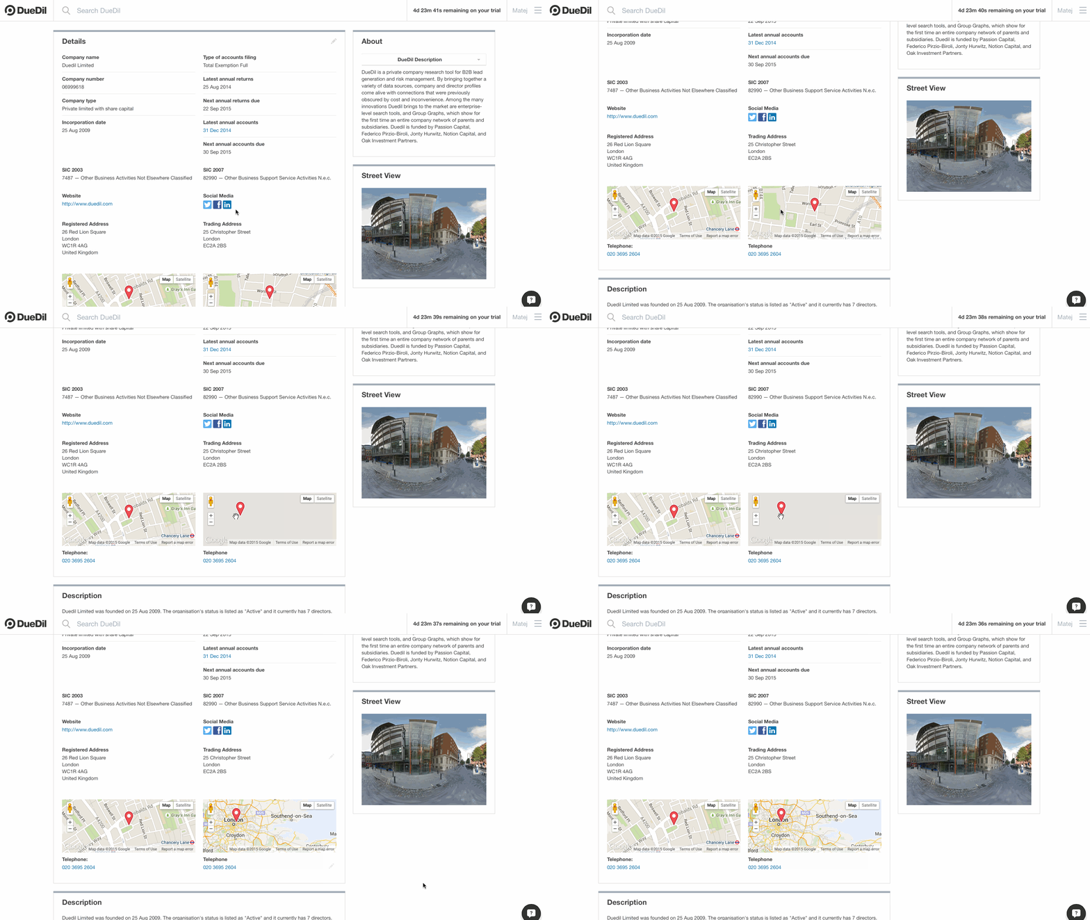
Scrolling down the page was almost always disturbed by the map zooming out. Once the mouse cursor is over a Google map, scrolling starts to zoom out the map instead of scrolling down the page.
The users have to move the mouse cursor around the map and only than can they resume scrolling.
Battleplan
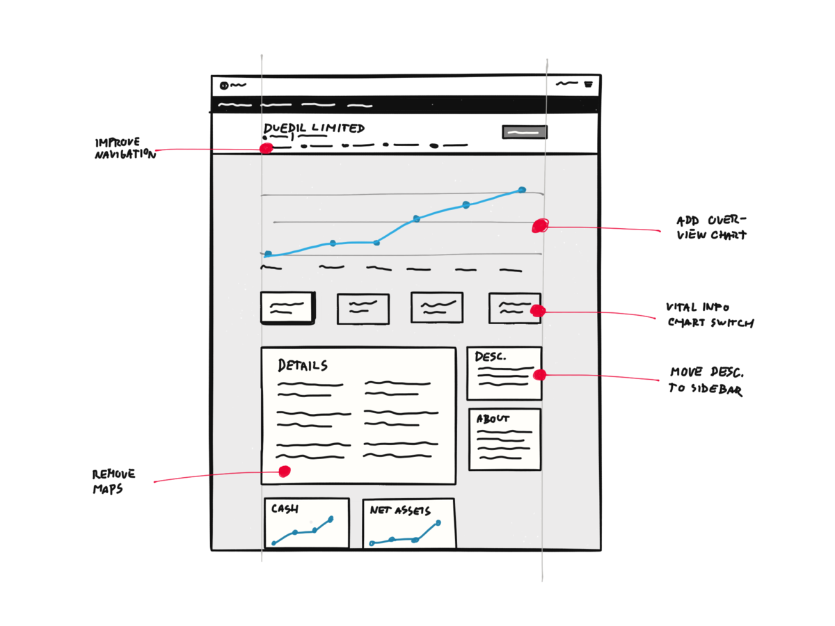
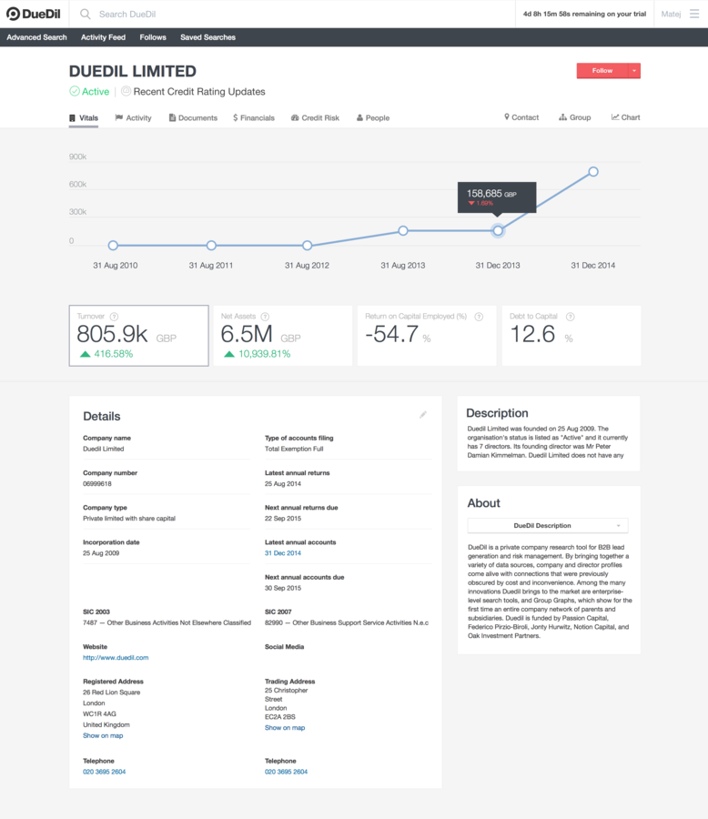
After research and testing I came up with a few improvements. I wanted to add a chart for the vital info boxes on top of the screen. The chart would show the selected vital info for the last few years. This way, the person doing a company check would immediately get an idea about its' stability.
Maps Solution
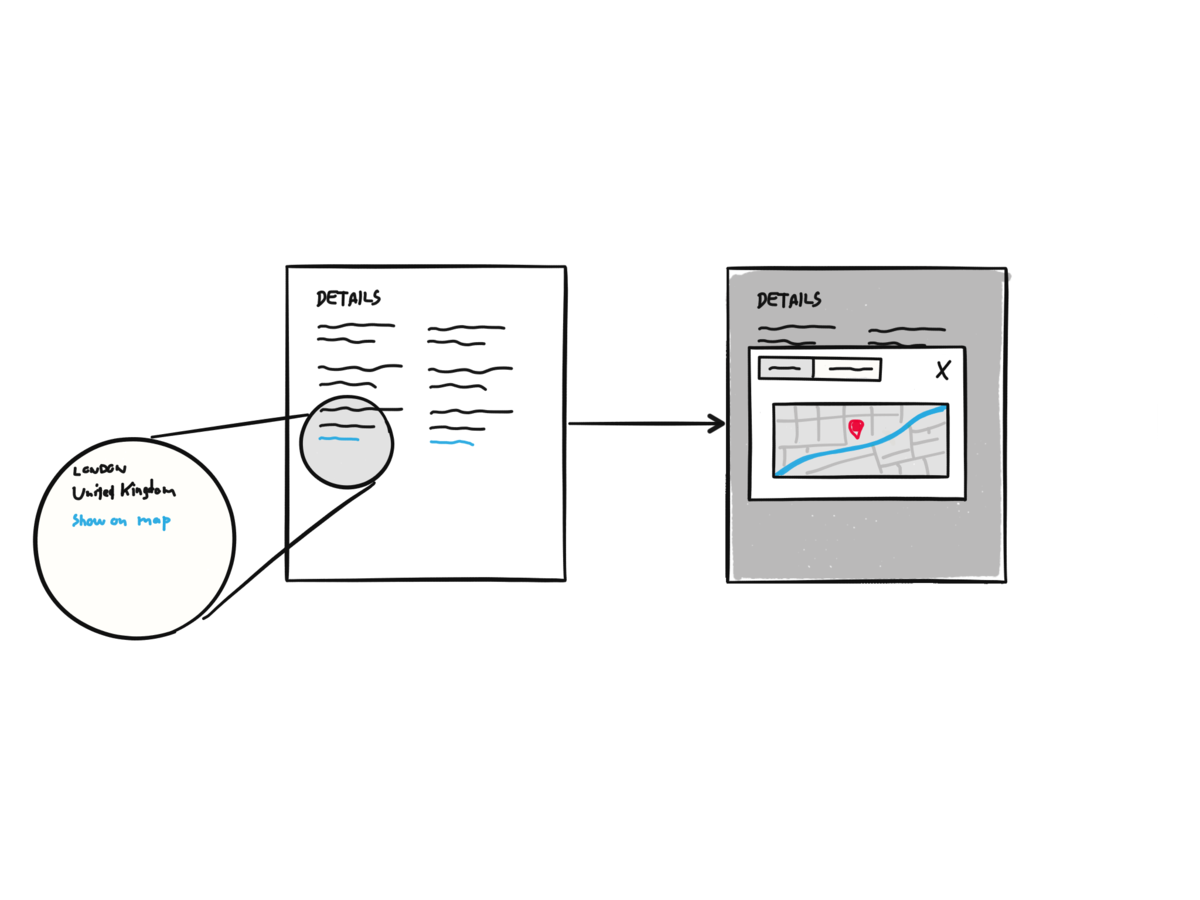
Removing the maps clears up space for other more important info and it doesn't disturb the scrolling anymore. Placing a link Show on map below each address would open a modal window.
The maps in original size were hard to use as well. Overall, the maps brought more problems to the users than value.
Navigation Improvements
Navigation is one of the most important parts of UX design. There was something about DueDil's navigation that I thought could be improved.

All-Caps
Can you work out any of the words on the sign?
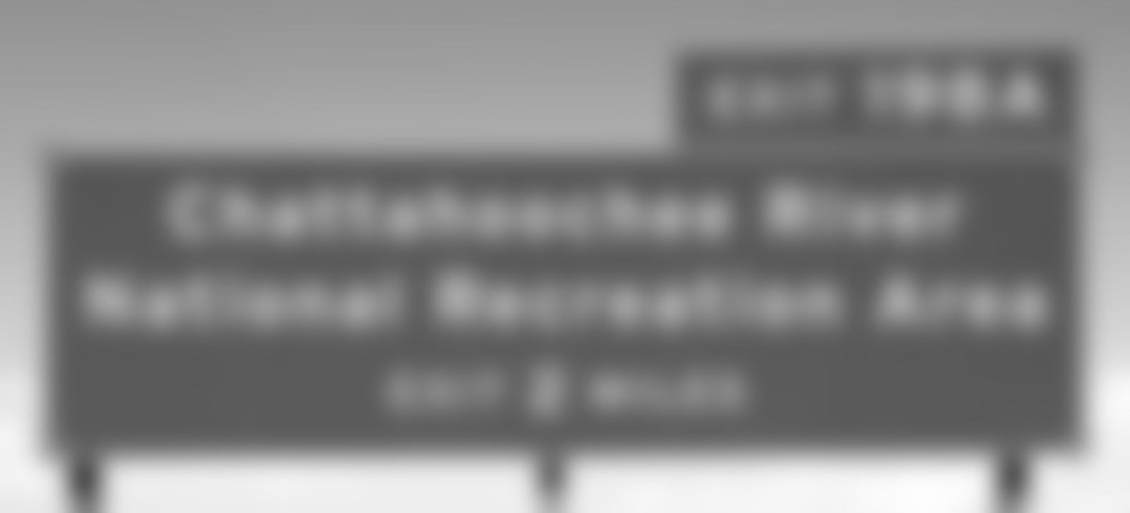
Mixed Case
How about now?

There it is.
Quick Readability Test
All-caps were proven to be harder to read and it's usually best to avoid them for navigation elements.

Humans are pattern recognising machines. All-caps don't provide a good enough pattern contrast, therefore, recognising the pattern on the left is harder than the one on the right (source).
All-Caps vs Mixed Case
Peripheral Vision
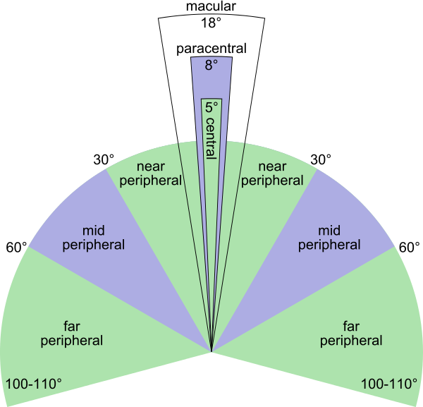
What's up with the blurred text test? Human macular vision (sharp) consists only around 7% of overall vision. Peripheral vision (blurred) is the other 93% of our vision (source). Recent case studies show that we use peripheral vision a lot more than it was thought.
Macular vision can only focus on one navigation element at a time. This means that most of the other navigation elements will be spotted by the peripheral vision (source).
Icons
Using icons can improve the usability of a system. They're much more memorable and recognizable than words alone, so they work as a great complement to the UI. They work best when combined with text labels (source).
DueDil has a lot of navigation elements, that's why I thought adding icons next to them will help users recognize them quicker.
New Navigation
Removing the all-caps and adding icons next to the navigation elements improves the possibility to recognise the navigation element with the peripheral vision. This leads to users perceiving a UI as easier to learn and use (milliseconds count).
Improve Visual Hierarchy
The user interface in DueDil is very clean. Dark Helvetica on light background looks very professional and trustworthy. But in my opinion, the UI lacks contrast that would make the visual hierarchy clearer.
Another Blur Test
Original
The name of the company and the tabs stand out the most. The rest gets kinda lost.
Proposed
Applying a light gray background makes the header (company info & tabs) and the vital info squares stand out.
Final Solution
1
2
3
4
5
New, improved navigation (added icons, removed all-caps)
1
Added a chart for the vital info (up to 6 years)
2
Clicking on vital info now brings up more details about it.
3
Moved the description to the sidebar.
4
Removed the maps, replaced them with links.
5
Maps View
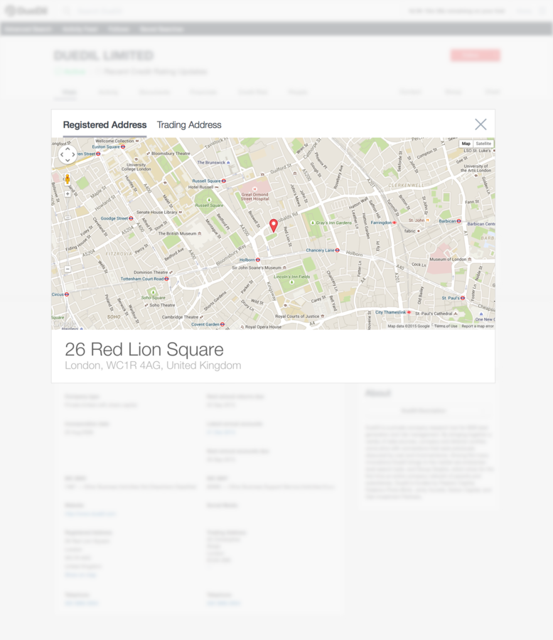
Switch between Registered and Trading Adresses
1
1
2
Bigger/easier to use & navigate map.
2
Currently chosen address details.
3
3
Thanks
All the designs were made using Sketch and I loved every minute of it. I would love to spend a lot more.