Flex Box
By: Matthew Poulson
HTML
Semantic meaning
- order
- hierarchy
- structure
- relationships
CSS
Style
- look
- feel
- layout
Responsibilities
"The CSS3 Flexible Box, or flexbox, is a layout mode providing for the arrangement of elements on a page such that the elements behave predictably when the page layout must accommodate different screen sizes and different display devices."
- MDN: Using CSS flexible boxes
- http://html5doctor.com/lets-talk-about-semantics/
- http://html5doctor.com/downloads/h5d-sectioning-flowchart.pdf
Div Soup
Solution: Use the appropriate html5 element
Tables for layout
Solution: use Flex-box or css grids
CanIUse
Flexbugs
Syntax
https://css-tricks.com/snippets/css/a-guide-to-flexbox/
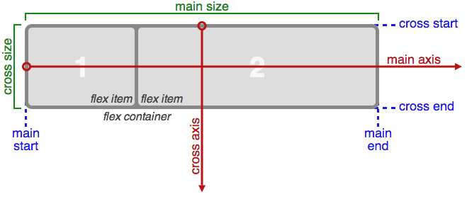
Terminology
display: flex | flex-inline
Defines a flex container
flex-direction
Determines the direction flex items are placed
Options:
- row (default)
- row-reverse
- column
- column-reverse
flex-wrap
Determines if flex items will be on one line or wrap to multiple lines. Also determines the direction the will wrap
Options:
- nowrap (default)
- wrap
- wrap-reverse
flex-flow
Shorthand flex-direction and flex-wrap
justify-content
This defines the alignment of the flex children along the main axis.
Options:
- flex-start (default)
- flex-end
- center
- space-between
- space-around
align-items
This defines the alignment of the flex children along the cross axis.
Options:
- flex-start
- flex-end
- center
- baseline
- stretch (default)
align-content
This defines the alignment of the lines(row or column) along the cross axis.
Options:
- flex-start
- flex-end
- center
- space-between
- space-around
- stretch (default)
order
Alters the order of the flex item
Options:
- any integer
flex-grow
Determines if and how much the flex item can grow
according to leftover space in the parent
Options:
- any positive integer
- default: 0
flex-shrink
Determines if and how much the flex item can shrink according to the needs of the parent
Options:
- any positive integer
- default: 1
flex-basis
Determines starting size of the flex element
Options:
- length
- auto (default)
flex
Shorthand for flex-grow, flex-shrink, and flex-basis
Default: 0 1 auto
align-self
Allows the alignment of a flex element to be overridden
Options:
- flex-start
- flex-end
- center
- baseline
- stretch
Examples
Center element
Simple Nav
Sticky Footer
Re-Order
Basic Layout
References
- https://css-tricks.com/snippets/css/sticky-footer/
- http://caniuse.com/#search=flex
- https://css-tricks.com/snippets/css/a-guide-to-flexbox/
- https://css-tricks.com/centering-css-complete-guide/
- Zoe Gillenwater: https://www.youtube.com/watch?v=_98SE8WUvLk
- http://flexboxfroggy.com/
- https://drafts.csswg.org/css-flexbox/
- https://developer.mozilla.org/en-US/docs/Web/CSS/CSS_Flexible_Box_Layout/Using_CSS_flexible_boxes
- https://www.sitepoint.com/are-we-ready-to-use-flexbox/