Inclusive Design Fundamentals
For Desktop and Mobile Web
CSUN 2017
Caitlin Geier, Matt Isner, Dennis Lembree
- Introductions
- Schedule overview
- White board
- #CSUNATC17
Welcome
-
Level of content
-
Shift left
- Importance of templates, style guides, pattern libraries
Strategy & Topics
Visual Information
How It Affects People
- People with learning disabilities
- People with low vision
- People who are colorblind
- Blind people
It hurts:
It helps:
Color as Information
Help users learn by:
Using color as an additional form of information
Don't forget:
Provide the same information in a non-visual format!
What Not To Do (and why!)
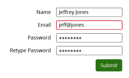
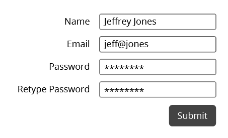
Red outline for error
Colorblind view
Good Example
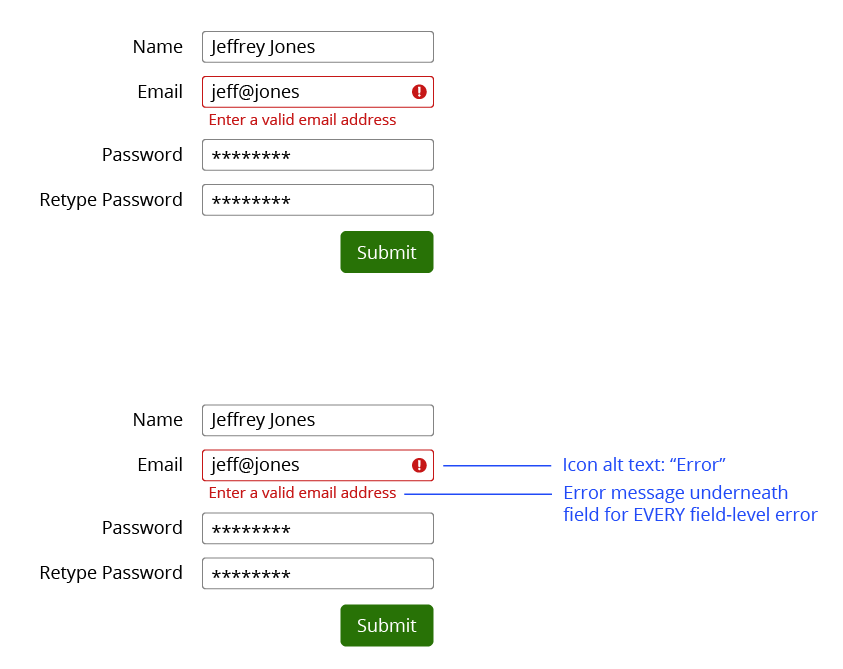
Testing for color blindness
Photoshop / Illustrator - Proof Setup
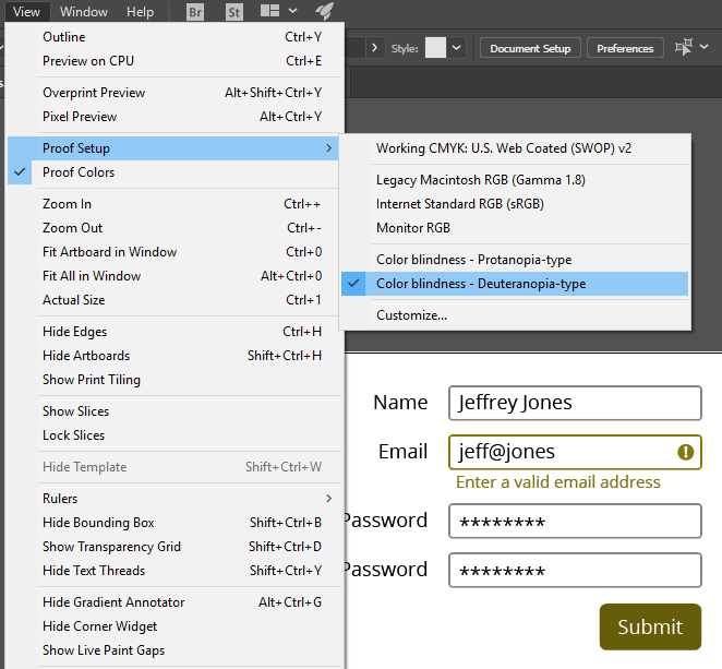
View > Proof Setup > Colorblindness
Nothing for Sketch yet
Testing for color blindness
Colblinder Color Blindness Simulator
Link to: Colblindor Color Blindness Simulator

Testing for color blindness
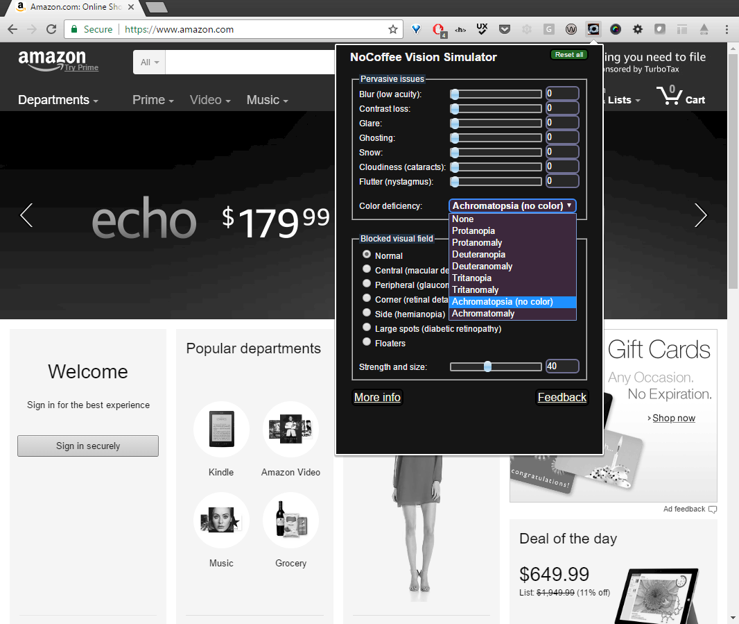
NoCoffee plugin for Chrome
Link to: NoCoffee in the Chrome Web Store
Links
How do users know what is and isn't a link?
Old School
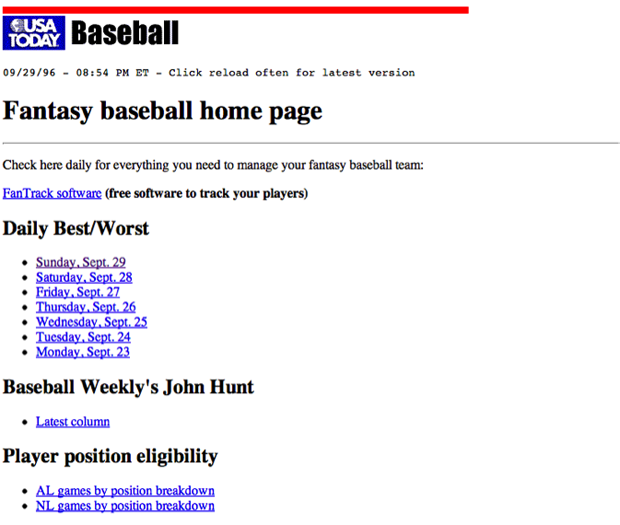
Blue = link
Purple = visited
Nowadays
CSS = link designs to infinity
- Color
- Bold / Italic
- Underline
- Borders
- Background images
- Hover states
- And more!


Keys to identifying links:
Affordances
Does it look like a link?
Differences
What does it look like compared to body text?
Link Text
Can you tell where it goes?
Visual Focus
What is it?
Visual Focus Indicator:
A visual marker which calls attention to the element on a web page which the keyboard currently has in focus.

Visual Focus Tips
- Visible for all interactive elements
- Different from surroundings
- Can be same as hover!
- Don't obscure element
- Define in designs / pattern library
A good example: WebAIM
Visual Characteristics
How are elements described?
Visual Characteristics
- Color
- Size
- (Shape)
- Location

"Click the big green button in the upper right to sign up"
How do you convey visual features to blind users?

"Click the green sign up button to get started"
- Type of element
- Descriptive name
Using Pattern Libraries
- Consistent link design
- Visible focus
- Guidelines: use of color, language
Exercise
In WCAG
Images
How It Affects People
- Blind users cannot see an image
- Visually impaired users have trouble seeing an image
- Users' cognitive ability
- on-screen alt text may benefit users who prefer text (over chart, infographic)
Provide Alternative Text
- Required when needed
- For web, use alt "attribute" for inline images
- Easy principle to learn; difficult to master
Other Benefits
- Low-band users / images off
- Text browsers
- Broken image link
- Search engine optimization
In the WCAG Specification
Informative Images
- Photographs
- Icons
- Screen shots
- Logos
- Simple diagrams
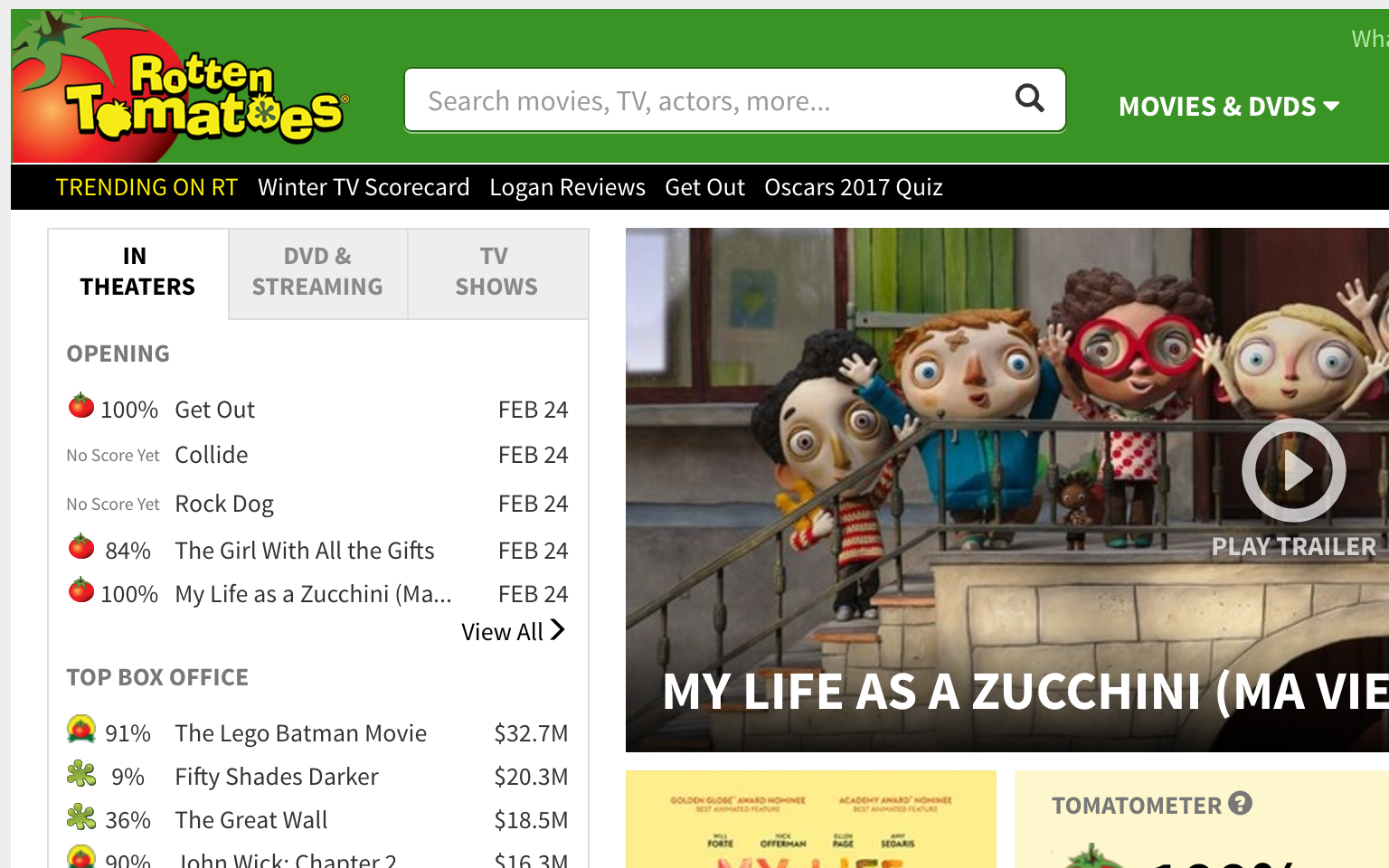
Linked Images
- Alt text required
- Focus on purpose of link

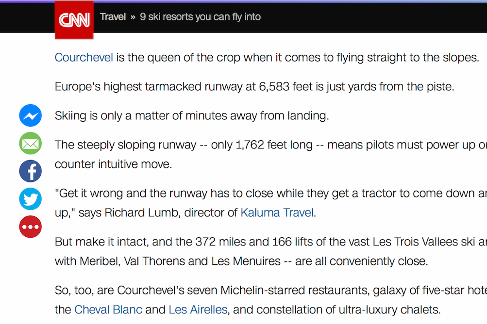
Complex Images
- Charts and graphs
- Infographics
- Comic strips
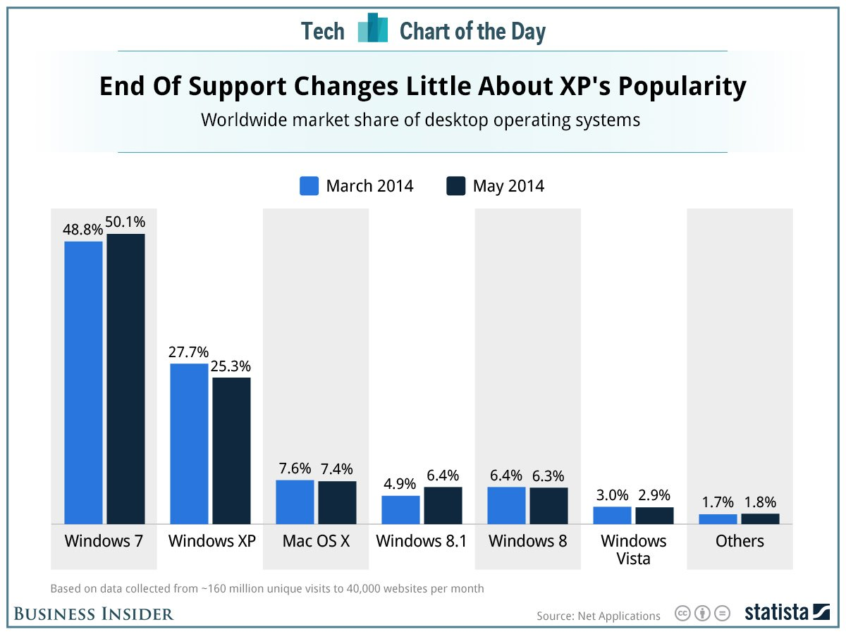
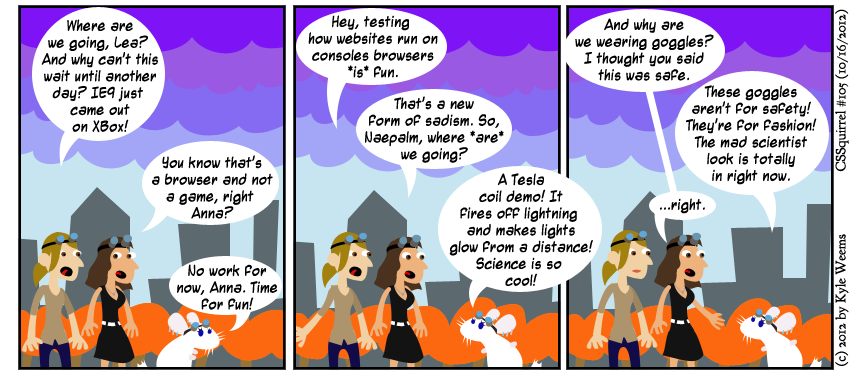
When Alt Text is Not Needed
- Captcha—use alternative output mode
- Redundant/duplicate content
- Decorative imagery

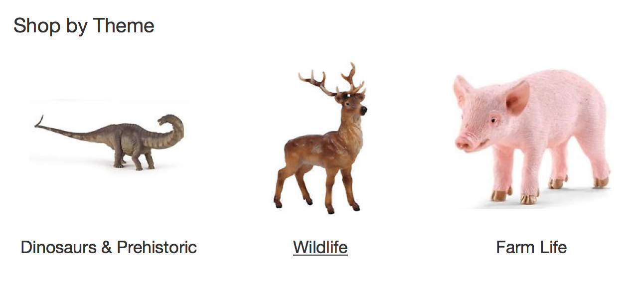
Flowcharts
- http://bit.ly/alttreewai (by W3C WAI)
- http://bit.ly/alttree4 (by 4 Syllables)
Writing Alt Text
- Present the CONTENT and FUNCTION of the image
- Be accurate and succinct
- Avoid phrases such as “image of…”
Exercise
Color Contrast
How it Affects People
Insufficient color contrast hurts:
- People with low vision
- People with colorblindness
- Elderly people
What WCAG says:
| What is it? | Attributes | Contrast Ratio |
|---|---|---|
| Body text | Under 17pt | 4.5:1 |
| Large / bold text | Over 18pt OR bold | 3:1 |
What WCAG doesn't say
...but is good to do anyway
- Contrast above 3:1 for icons
- Contrast above 3:1 for focus indicators
What is a contrast ratio?
Contrast ratio = a measurement of the difference in luminance between the background color and foreground color
How to test the contrast ratio of a design
Plug color hex codes into a tool:
- WebAIM Color Contrast Checker (web)
- Colour Contrast Analyser (Mac and PC)
- Tanaguru Contrast-Finder (web, provides color recommendations)
Watch out for...
Text on top of images... and videos!
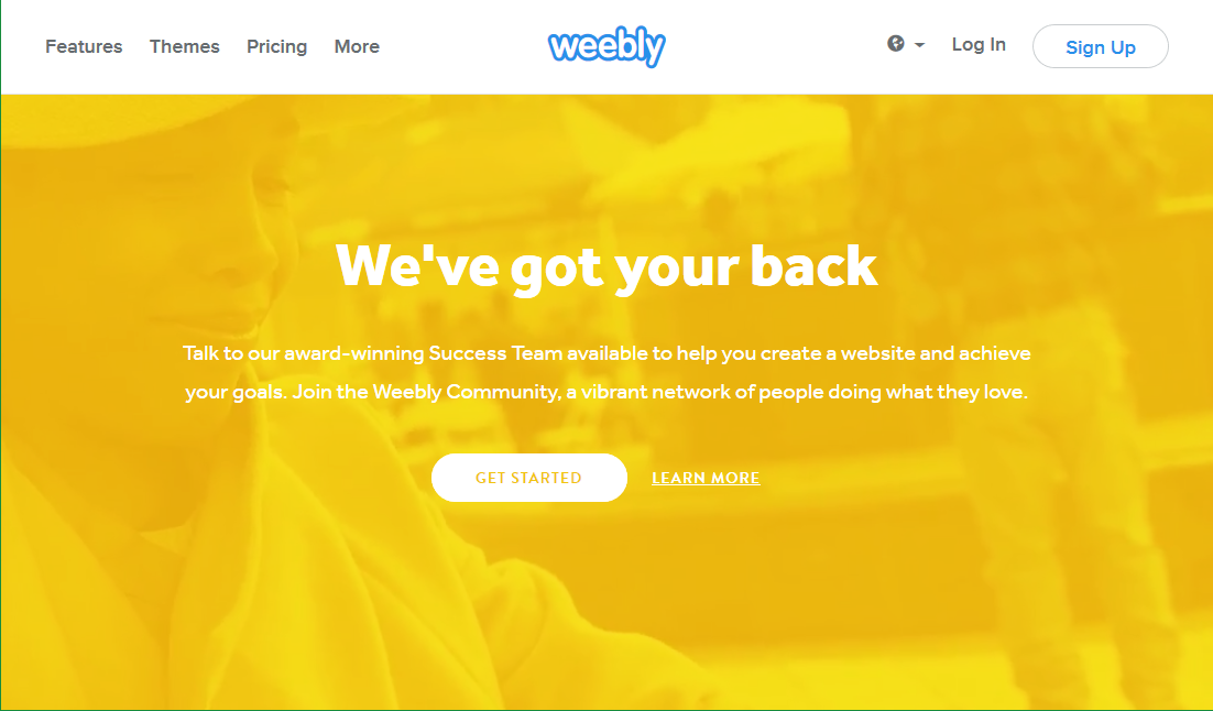
Watch out for...

Hover / focus states
Watch out for...
Placeholder text
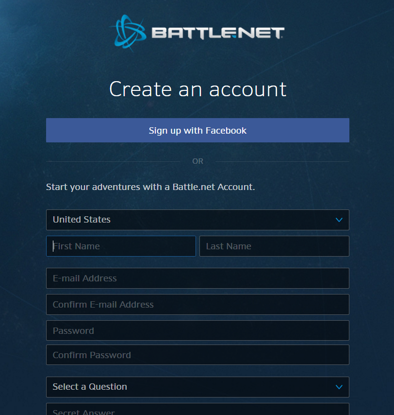
...which you should try to avoid anyway
Watch out for...
Charts and Graphs

Exercise
In WCAG
BREAK
Page Structure
How It Affects People
- Enables screen reader users to navigate more easily
- Allows sighted keyboard users to navigate more easily
- Skipping blocks of links & repetitive content
- Skipping to desired content
Other Benefits
- Readability
- Graceful degredation
- Search engine optimization
In the WCAG Specification
Techniques
- Headings
- Landmarks
- Skip links
- Titles on frames
Headings
Describe sections of content
Headings
- Use one H1 per page
- Brief, succinct text
- Properly nested
- H1 > H2 > H3 etc.
- meaning, visual, programmatic
- Use semantic markup (H elements)

H1
H2
H2
H2
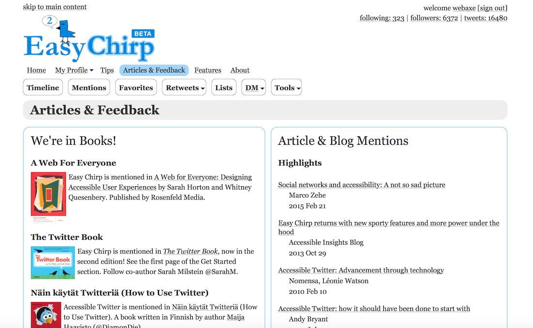
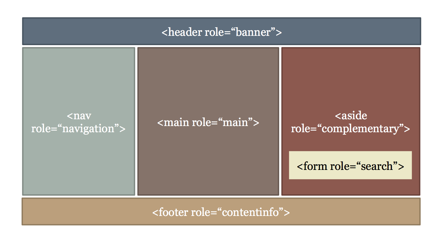
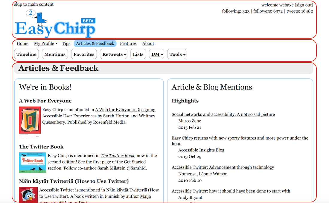
Landmarks
Define the main portions of a webpage
(such as header, main, footer)
Landmarks
- HTML5 structural elements
- ARIA landmark roles
- They work in tandem (for the most part)
Skip-Links
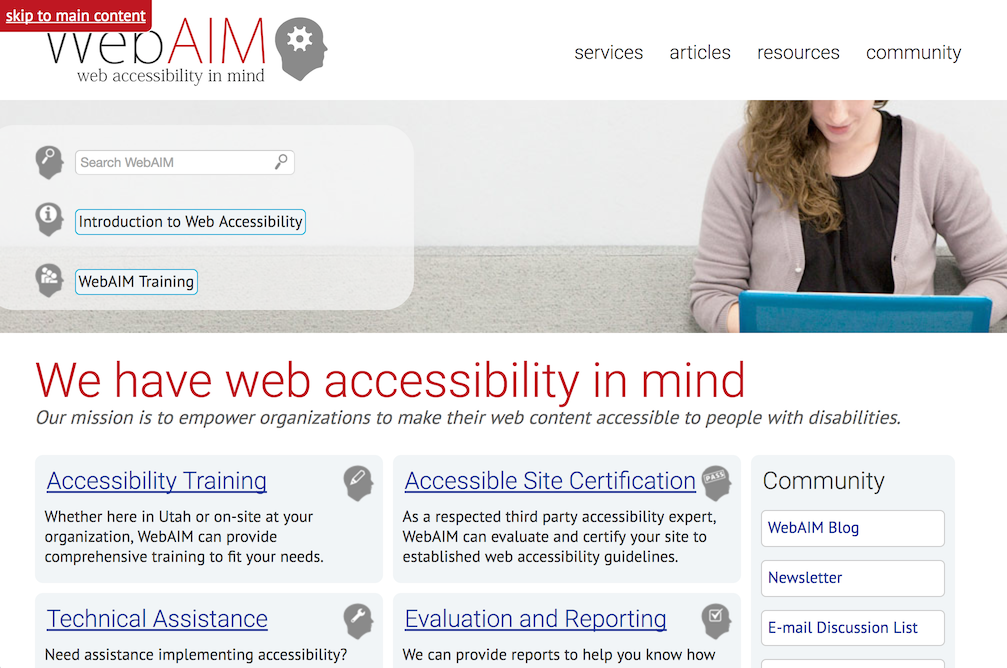
a mechanism to bypass blocks of content/links
assists the keyboard user in navigating to areas of the page without numerous tab presses
Skip-Links
- provide for large blocks of links
- may be visually hidden until focused
- important for sighted keyboard users
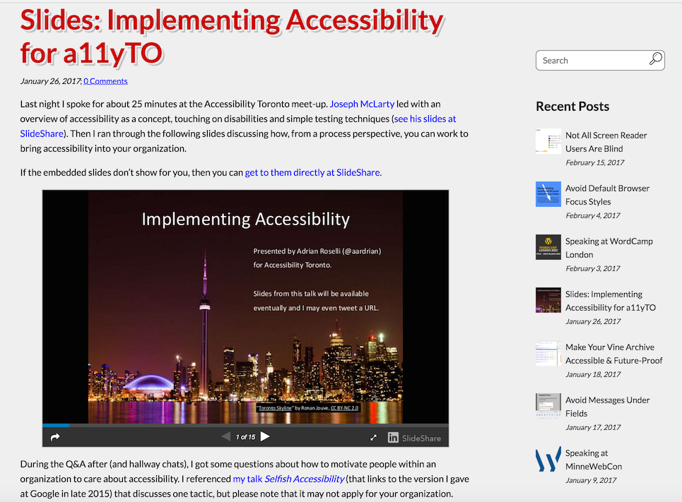
Titles on Frames
- Short text description of "framed" content
on web page - <iframe> <frame>
Exercise
Navigation
How it Affects People
- Difficult for users to understand content
- Users may not find the feature they're looking for
- Taxing to user memory
When navigational elements aren't clear and consistent...
What are navigational elements?
Anything that gets you from one place to another.
(on the web: menus, links, buttons)
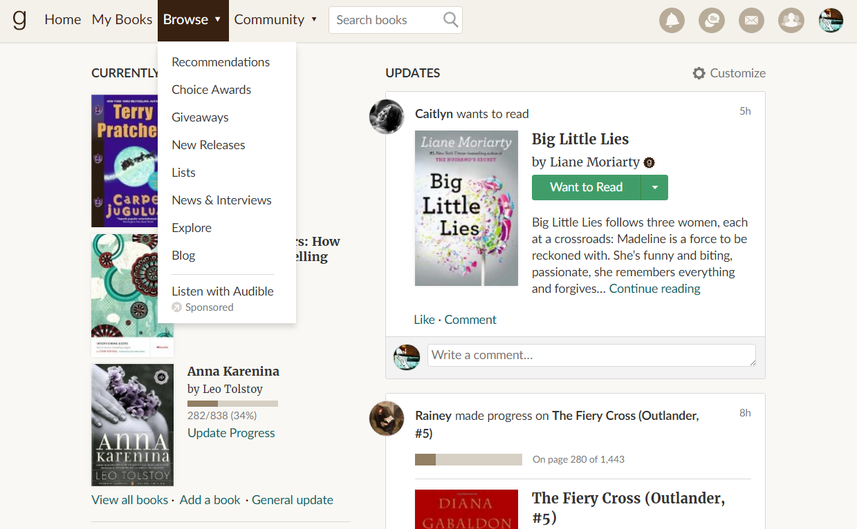
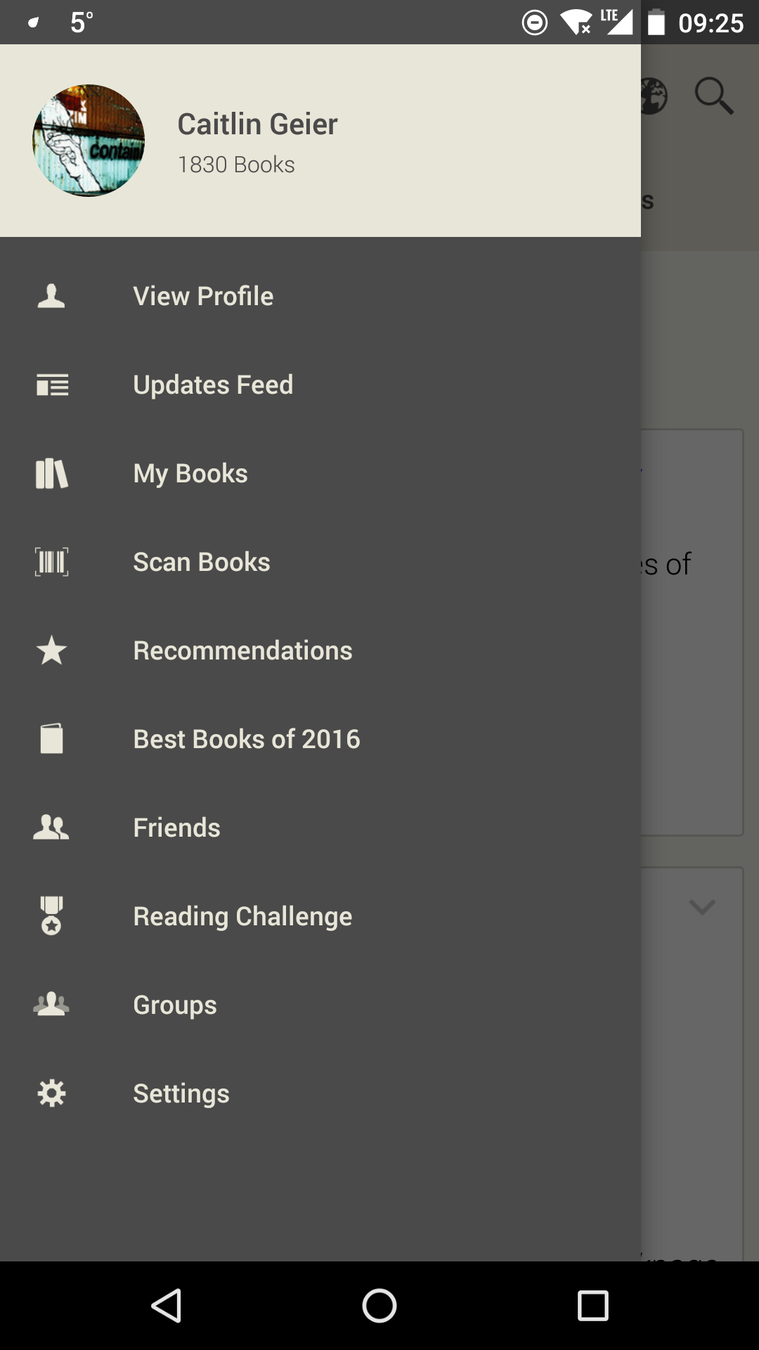
Examples from: Goodreads website, Goodreads Android app
Consistent Navigation
=
Consistent Language
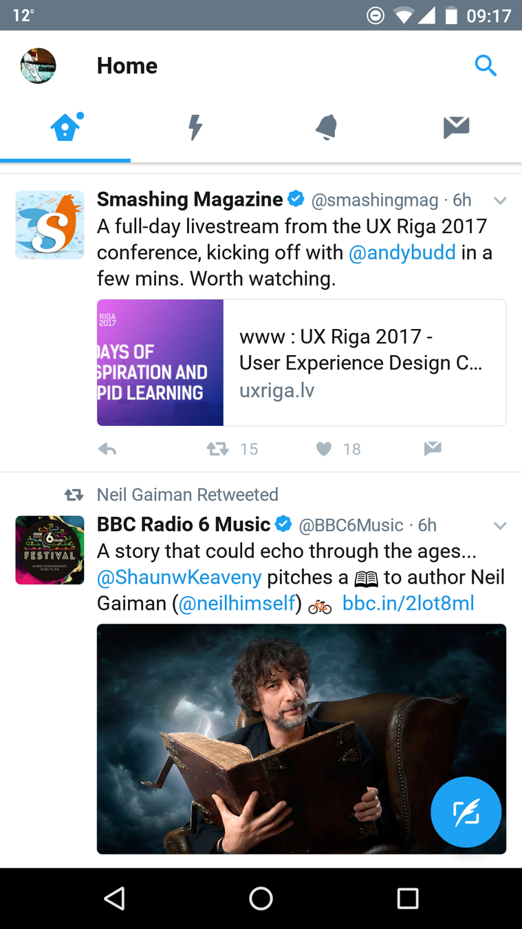
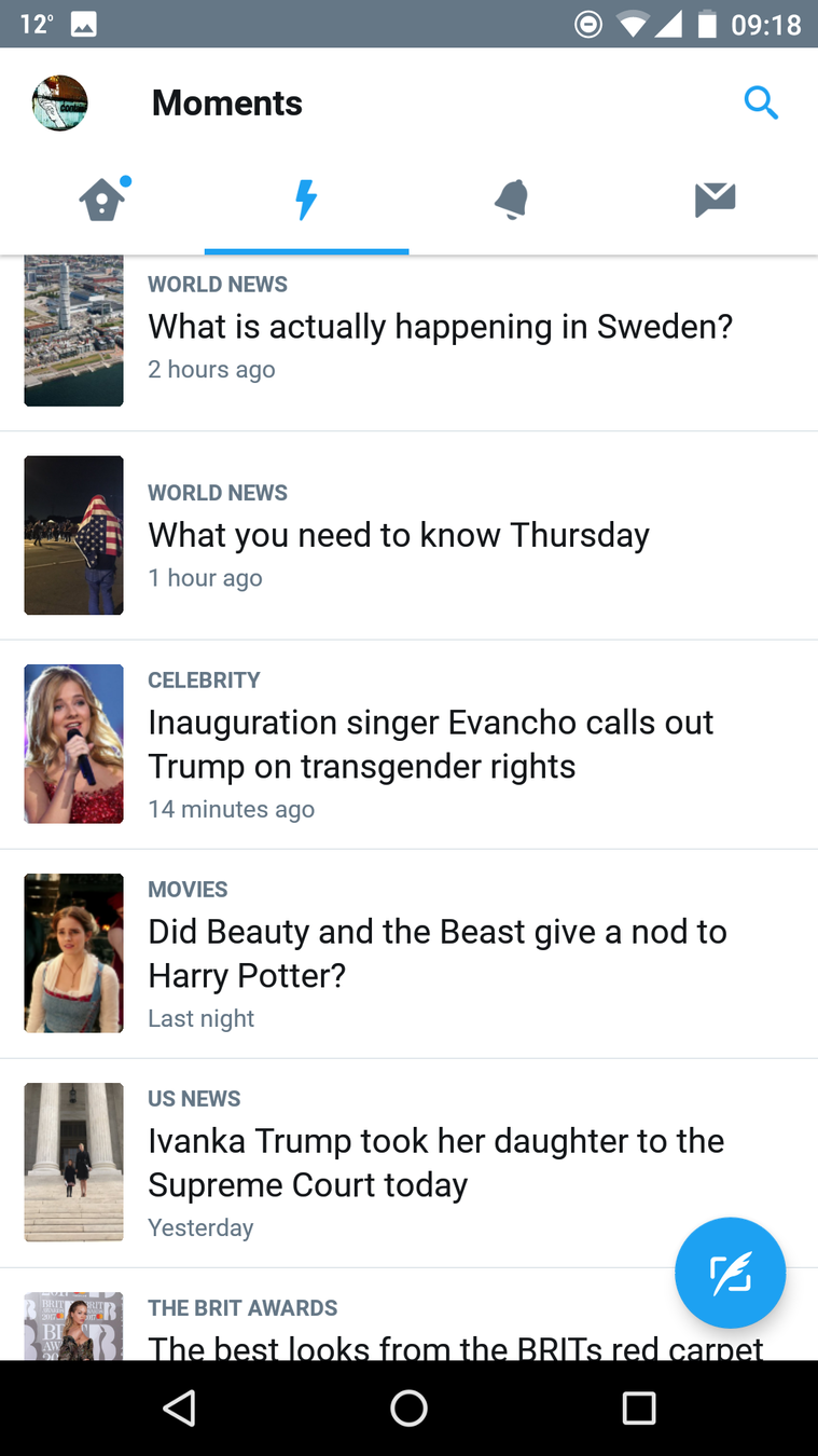

When designing navigation, think about:
- Labels
- Order is important
- Multiple means
- Descriptive link text
Labels
- Consistent in multiple places
- Clear and concise
- Consistent icons
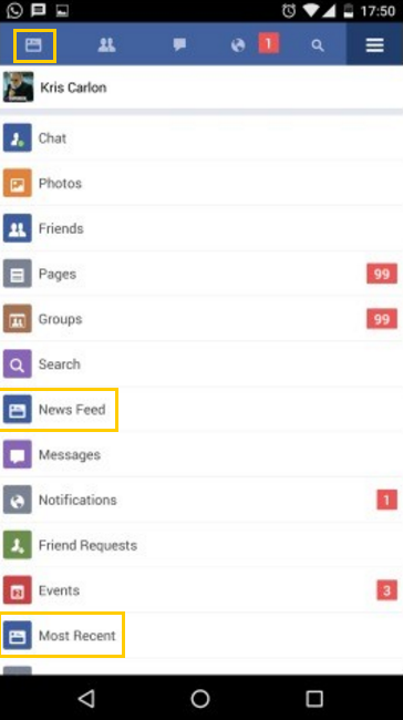
Example from: Facebook Lite
Order is important
- Keyboards
- Recognition
Human memory = bad
Multiple means
Aside from the menu, does the site have at least one of these things?
- Search (preferably global)
- Site map
- Table of contents
- Links to related pages
- All pages linked from home (small site / app)
Descriptive link text
Using descriptive text means:
- Better call to action
- Knowing where you're going
- Better searchability (i.e. SEO)

Smashing Magazine: "Links should never say Click Here"
Exercise
In WCAG
LUNCH
Content Order
How It Affects People
- The meaning of the page can change dramatically, or become incomprehensible, when using assistive technology
- It can be very difficult to reach a desired location using the keyboard
If reading order isn't properly defined...
Reading Order
Shape the user's experience by specifying the intended reading order for the content you design. Don't allow implementation accidents to hijack your design intent.
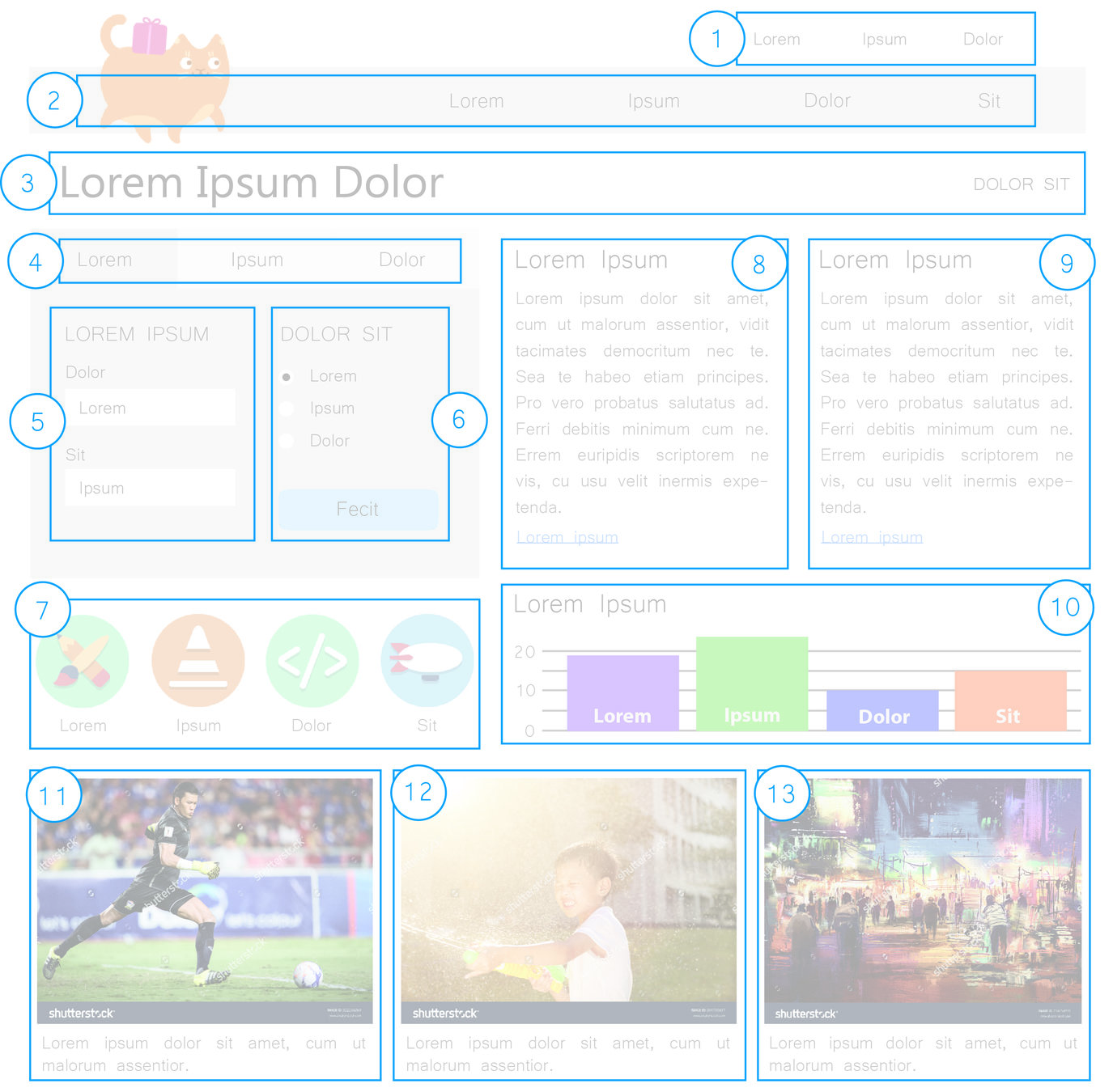
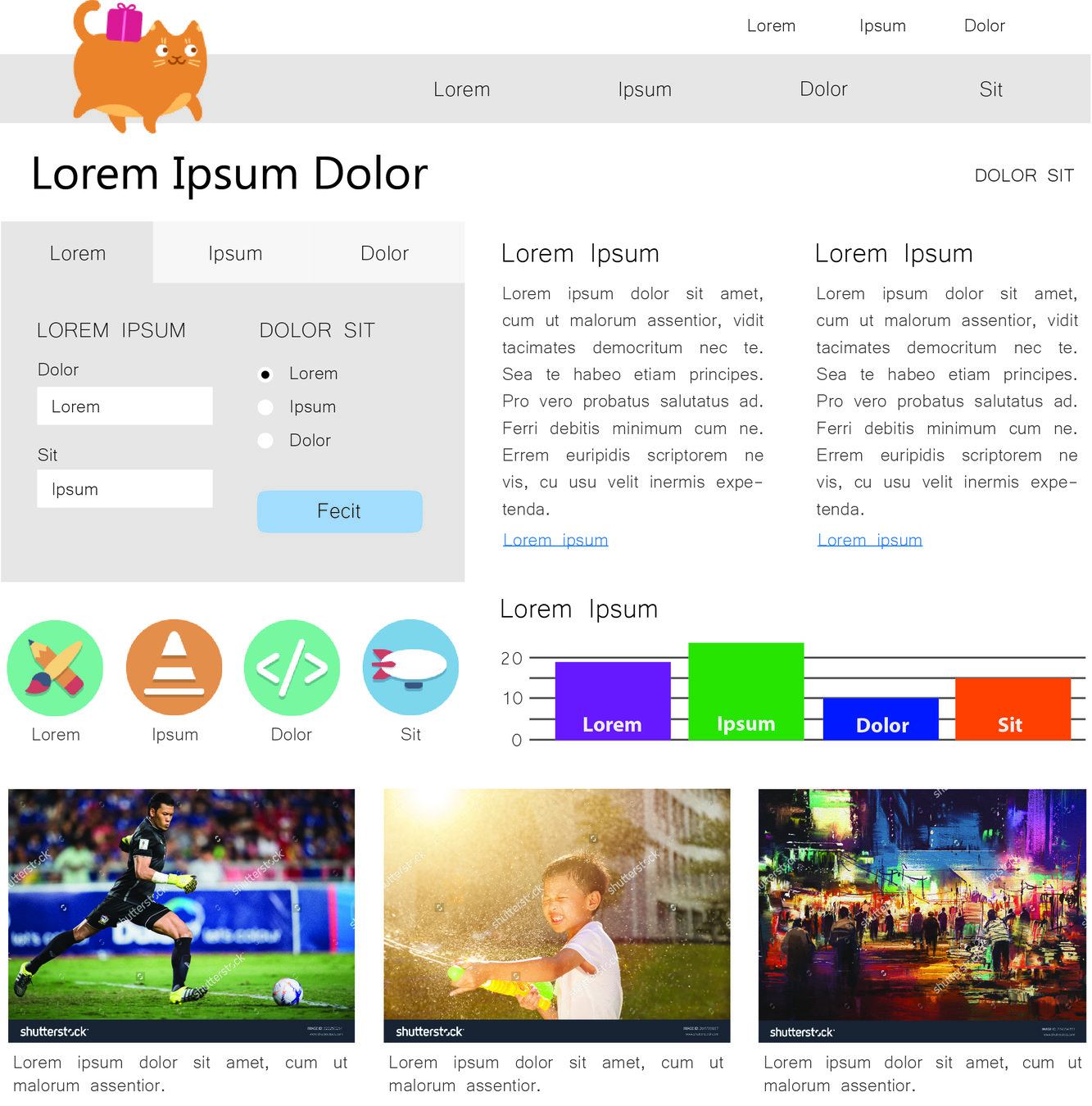
Multi-Column Text Content
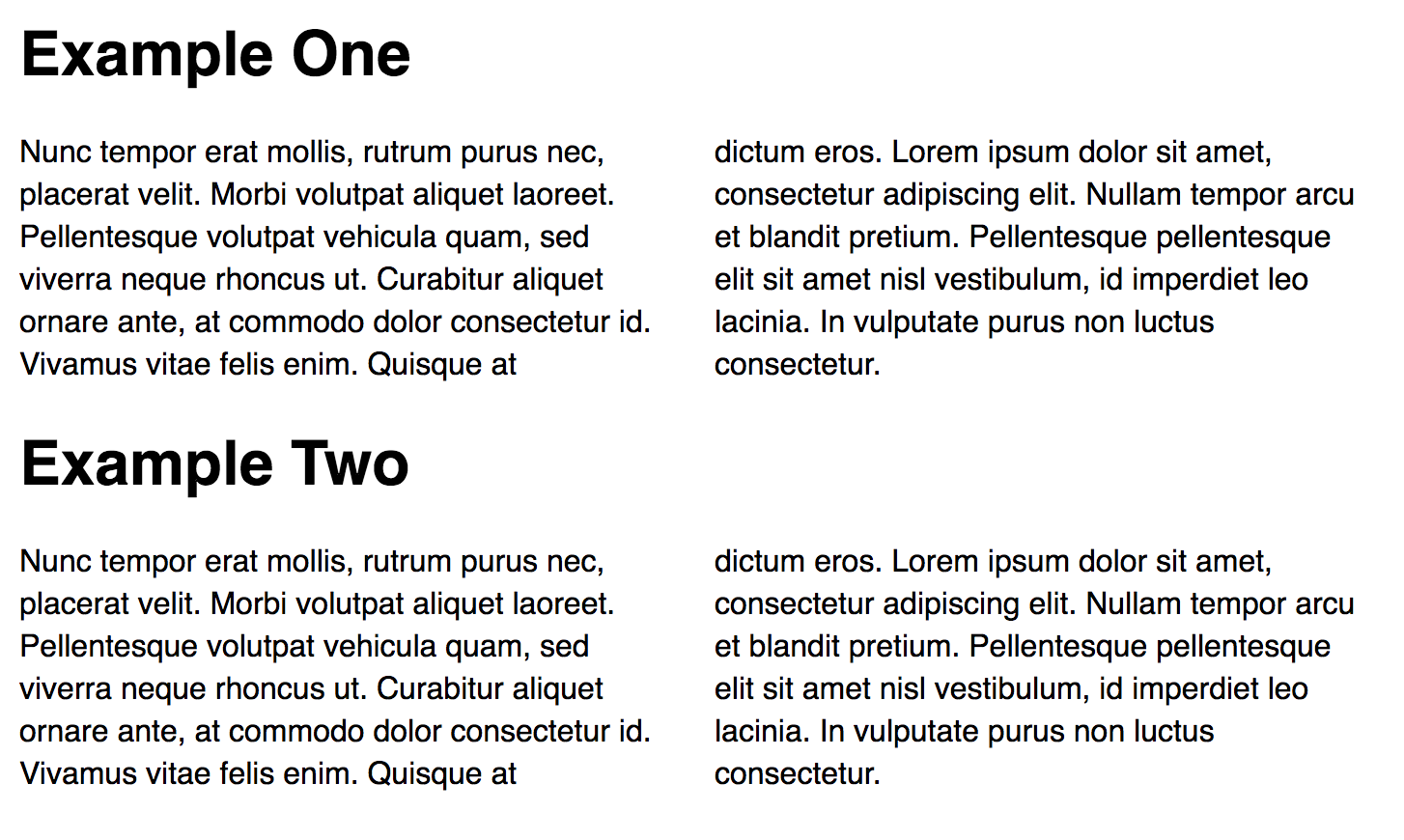
Navigation/Focus Order
- Specify focus order in your designs
- Try to match focus order to visual order, unless an exception is intentional
Focus Order vs Visual Order
Content order should match visual order whenever possible.
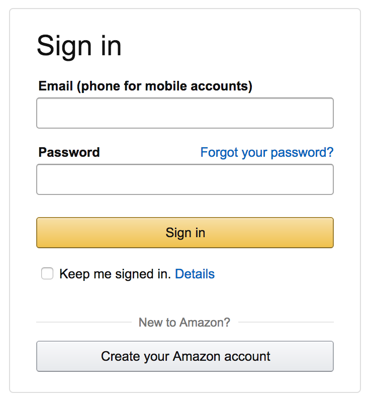
Exceptions are sometimes ok.
Responsive Layouts
- Specify reading and focus order for each layout in a responsive progression
- Double-check that layout changes don't alter the page's overall meaning
Templates and Style Guides
- Utilize layout templates and style guides as often as possible
- When using templates, follow their conventions - don't bend them to your will
- Once you've solved a reading order problem, consider adding the pattern to your style guide
Whitespace
Don't use whitespace characters for visual formatting
Exercise
In WCAG
-
1.3.2 Meaningful Sequence
- Reading Order
- Finding Added Content
- 2.4.3 Focus Order
-
3.2.3 Consistent Navigation
(already discussed)
Forms
How it Affects People
Forms can be dangerous for users when:
- Labels and instructions aren't clear or visible
- Error messages are vague and hard to find
- There's no chance to review information before submitting
Labels
- Close to the field
- Descriptive
- Visible all the time!
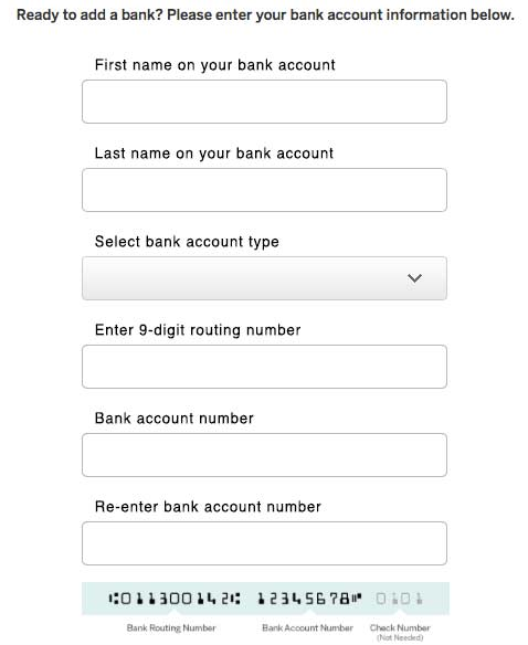
Group Labels
When to use:
- Radio buttons
- Checkboxes
- Segmented information
- Related fields


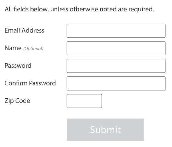
Required Fields
How do you know?
Required field indicators
- Asterisks
- Part of the label
- High-level message
- Error message (not recommended)
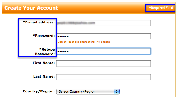
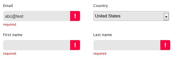
Use one or more of the following:
...Or mark optional fields!
Keys:
- Be consistent across fields
- Define symbols
- Be obvious
Help!
- Clear, simple language
- Examples of correct input
- Close to field
(I need somebody)
Use when the label is not enough.

Drupal image upload
Error Messages
- Clear, simple language
- Error state obvious
- Help user fix it!
Last line of defense
Ideally, give user as much info as possible BEFORE validation

Drupal image upload
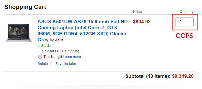
Review Before Submission
Allow users to review inputted data before they submit the form when the form:
- Starts a financial transaction
- Creates a legal commitment
- Ends a student test or exam
But... why?
Because you can't easily recover from some mistakes!
Pattern libraries help!
- Placement of labels, help text, error messages
- Describe when and how to use
- Define conditions for data review
Exercise
In WCAG
Data Tables
About Name-Value Pairs
name: John Doe
age: 37
gender: male
About Name-Value Pairs
Technically is accessible via multiple paradigms:
- data table
- list
- definition list
- paragraphs
What's a data table?
organized data with logical relationships using grids

How It Affects People
- Blind users cannot see the relationship of data
- Users with cognitive disability may have difficulty [visually] interpreting the data
In the WCAG Specification
?
| Tacos | |||||
Meal Schedule
| Mon | Tue | Wed | Thu | Fri | |
|---|---|---|---|---|---|
| Breakfast | |||||
| Lunch | Tacos | ||||
| Dinner |
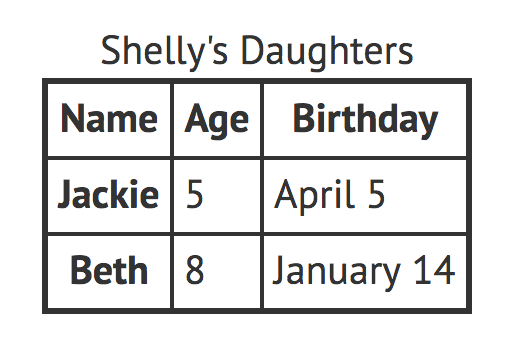
Techniques
- Provide a title (<caption>)
- Provide row & column headers (<th>)
- Design visually distinct headers
- Provide a summary of the data in preceding text
Techniques (cont.)
- Never nest data tables
- Avoid complex data tables
- Multiple header rows
- Merged cells
- Markup semantically
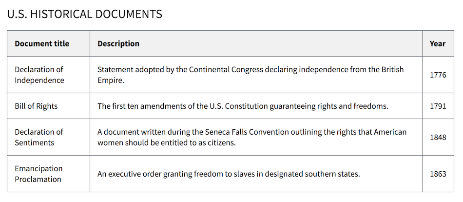
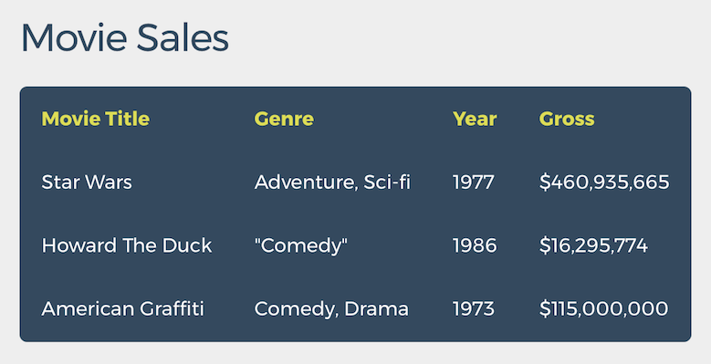
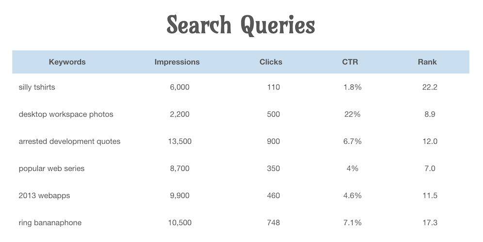
Code Example
<p id="tableDesc">The following table displays the number of employees
and the foundation year of some imaginary companies.</p>

<table aria-describedby="tableDesc” tabindex="0">
    <caption>Company Data</caption>
    <tr>
        <th scope="col" abbr="Company">Company Name</th>
        <th scope="col" abbr="Employees">Number of Employees</th>
        <th scope="col" abbr="Founded">Year Founded</th>
    </tr>
    <tr>
        <th scope="row">ACME Inc</th>
        <td>1000</td>
        <td>1947</td></tr>
    <tr>
        <th scope="row">XYZ Corp</th>
        <td>3000</td>
        <td>1973</td>
    </tr>
</table>
Exercise
BREAK
Dynamic Content
How It Affects People
- Newly inserted content can easily go unnoticed
- Modal interactions can become very confusing
- Client-side form validation can be rendered useless
- Automated widgets can run amok
If dynamic content isn't handled properly...
Remote Updates
Dynamic updates in remote parts of the page generally fall into two categories:
- Those that require immediate user action
- Those that provide general information
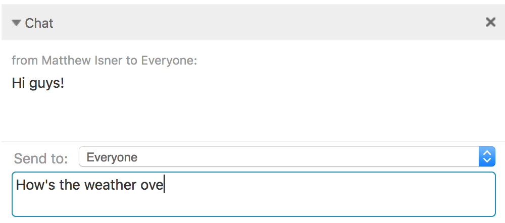
1) User's focus
2) Text appears
Text
Text
"Remote" Doesn't Always Mean "Far Away"
Modals
- While open, hide background page from AT
- Constrain focus within the modal
- When dismissed return focus to the trigger
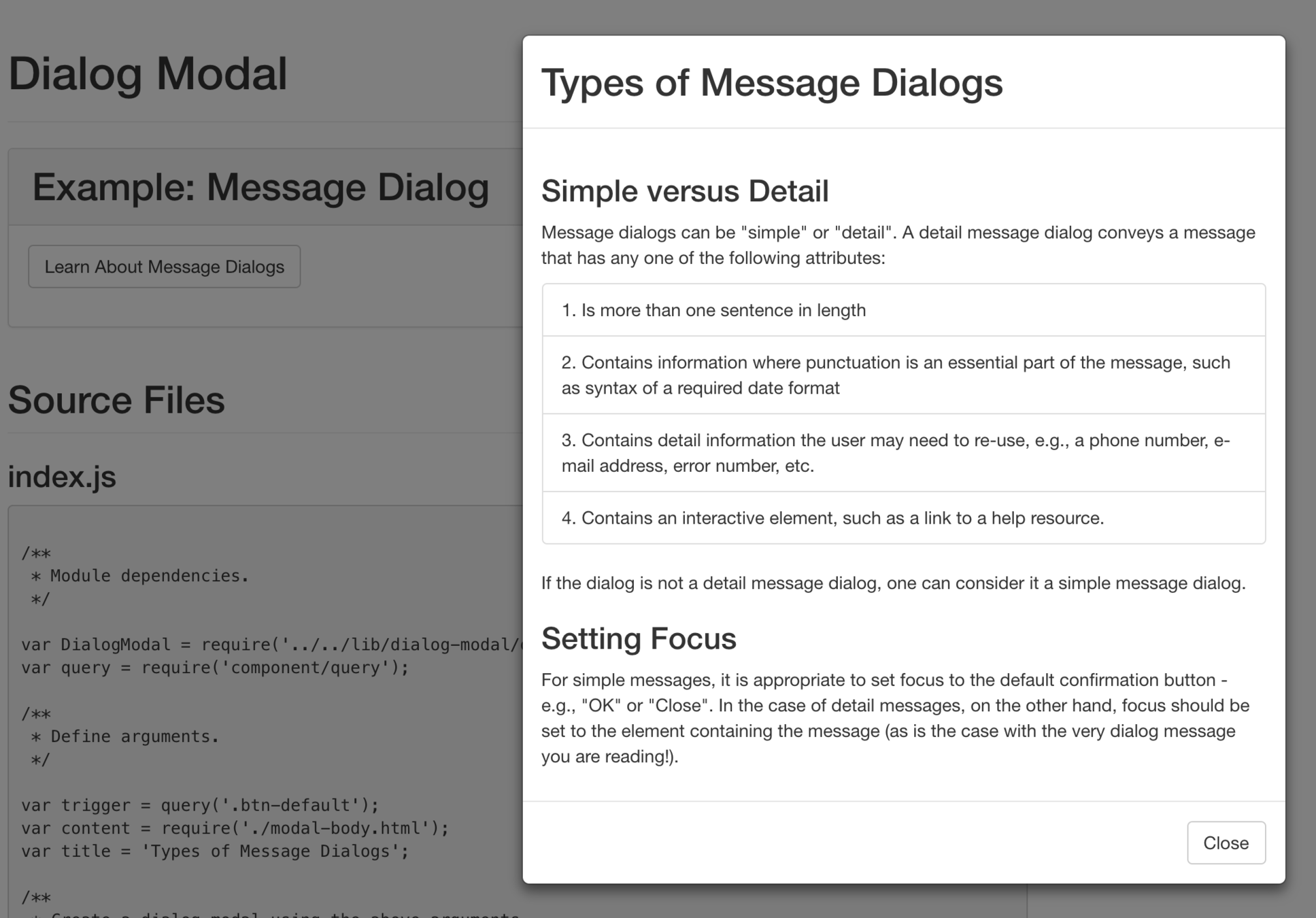
Client-Side Form Validation
- Don't validate input fields on "blur"
- Specify the corresponding input field for each validation message
Widgets That Keep Moving
- Provide a mechanism to pause, stop, or hide
Exercise
In WCAG
-
1.3.2 Meaningful Sequence
- Finding Added Content
-
2.2.2 Pause, Stop, Hide
- Pause, Stop, or Hide Content
- Automatically Updating Content
- 2.4.3 Focus Order
Custom Controls
How It Affects People
Poorly designed and implemented custom controls...
- Are often impossible for assistive technology users to use
- Are often very difficult, if not impossible, for keyboard users to use
Role
- what it is
- Indicates how the control will function
Name
- what to call it
- Provides a unique identity that distinguishes the control from other controls with similar functionality
State
- temporary
- "expanded", "selected", "pressed", etc.
Value
- what data it contains
- May be entered by the user, or inherent to the control
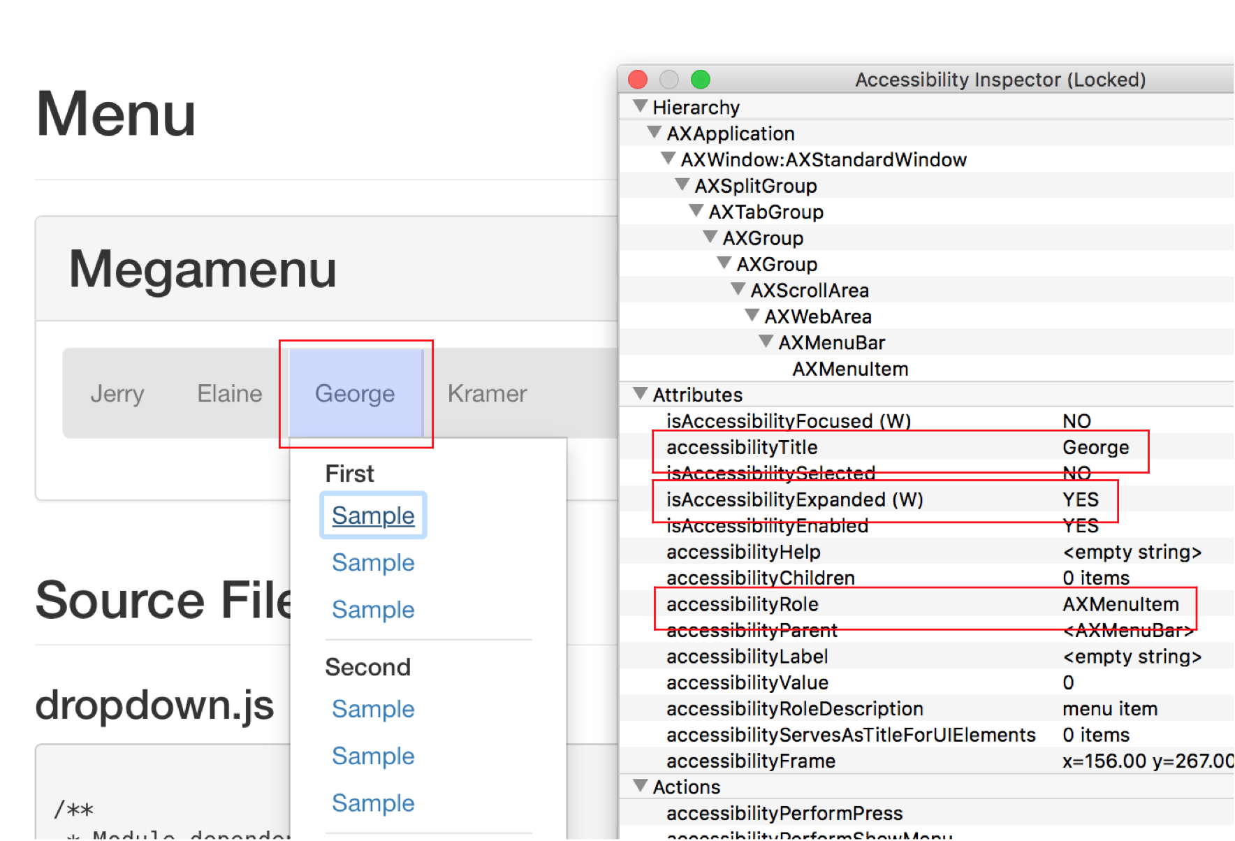
Under the Hood
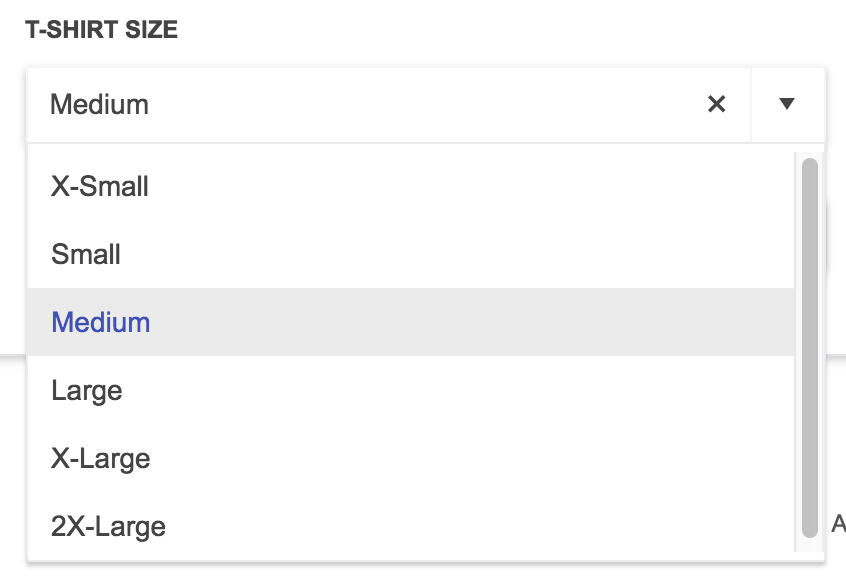

role: "combobox"
name: "T-SHIRT SIZE"
value: ""
state: "collapsed"
value: "Medium"
state: "expanded"
role: "option"
value: "Medium"
state: "selected"
Exercise
In WCAG
-
4.1.2 Name, Role, Value
- Name, Role, Value
- Custom Controls
Wrap-Up
Wrap Up
- Review items on white board
- Discuss secondary topics
- multimedia, page title, personas, etc.
- Questions
- Distribute hand-outs
Questions from beginning
-
how to design for big data
-
specification of requirements from design to front-end
-
universal design and learning
-
interaction design
-
what’s new in design - new tech, new interactions
Contact Us
Matt Isner
Dennis Lembree
Caitlin Geier
isnerms@gmail.com
geier.ac@gmail.com