Handle media in the modern web

Maya Shavin
This talk is about...
- Image & the Web
- The importance of images in performance
- How to load images responsively
- How to optimize images

Images in the Web
Logo
Banner
Story-teller
Icons
Non-text description

Images are
everywhere
And loading them responsively & optimizedly is not easy...
Image types

+ AVIF (2020)
Most popular
(Big in size)
Great for icon, animation
Most optimized
Not fully supported
New
Efficient & light-weight


Why loading images responsively are important?
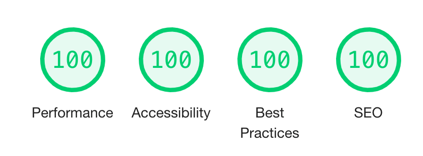
Google LightHouse Metrics


3
secs
How to load images responsively

Using <img> responsively
srcset
Device sizes-based
Resolution-based
<img
  srcset="example-480w.jpg 480w,
          example-800w.jpg 800w"
  sizes="(max-width: 600px) 480px,
          800px"
  src="example-800w.jpg"
  alt="Example">
<img
srcset="example-320w.jpg,
example-480w.jpg 1.5x,
example-640w.jpg 2x"
src="example-640w.jpg"
alt="Example"><img src="example.png">
Download
Decode
Render


Browser
Download
Decode
Render
<img srcset="...">
Browser
Choose the right
image
Using <img> responsively
srcset
Pre-defined set of images to chose per device size/resolution
Less waste resource to download
Native solution
Using <picture> when you can
The Art Direction problem
<picture>
  <source type="image/svg+xml" srcset="example.svg">
  <source type="image/webp" srcset="example.webp">
  <img src="example.png" alt="Example">
</picture>
Full-details image for large screen
Cropped/Shrink image (more focus) for small screen
Using CSS to load image
Media query to define breakpoint
@media screen and (max-width: 16em) { ... }
@media screen and (max-width: 32em) { ... }
@media screen and (max-width: 41em) { ... }
CSS logical function (url(), image-set())
background-image: image-set(
  url(icon1x.jpg) 1x,
  url(icon2x.jpg) 2x
);
But are they optimized?
The answer is No
The optimization problem
No cache image for CSS url() function (Chrome)
Download (preload) happens before CSS parsing
No EXACT match for device size (serve a 800w for a 700w or less)
High resolution image means heavy in bytes
All images downloaded despite of visibility on page
Different image types are meant for different usage
How to optimize your images?
Use the right format
Using SVG for complex icons
Scalable Vector Graphics
Light-weight
Stylable using CSS
Semantic
Inline and accessibility-support

Using JPG for photos
Using PNG/WebP for better quality and compression ratios
Lazy-loading images
<img loading="lazy" >
On-demand loading
Speed up initial page loading and rendering time
Automate image optimization
Image size compression without reducing quality (lossy/lossless)
Automatic run-time image optimisation with Cloudinary 😉


1200x800
1MB
1200x800
300kB
500x500
crop: thumb
500x500
{gravity: auto}
500x500
Hokusai effect
{radius: max, dpr: auto, art effect: hokusai}
500x500
Stamp effect
{e_red: 50, e_vectorize: 2:0.2 }
https://res.cloudinary.com/mayashavin/image/upload/v1/maya_shavin.jpg
https://res.cloudinary.com/mayashavin/image/upload/w_500,h_500,c_thumb/v1/maya_shavin
https://.../image/upload/w_500,h_500,c_crop,g_auto/v1/maya_shavin
https://.../image/upload/w_500,h_500,c_thumb,r_max,dpr_auto,g_auto,e_art:hokusai/v1/maya_shavin.png
https://res.cloudinary.com/mayashavin/image/upload/q_auto,f_auto/v1/maya_shavin
https://.../image/upload/w_500,h_500,c_thumb,r_max,dpr_auto,g_auto,e_red:50/e_vectorize:2:0.2/v1/maya_shavin.png
Take action
Use srcset and relative sizes to help browser to render the right image
Use <picture> for specifying images per device type only.
Use SVG for complex icons and animation
Lazy-load whenever you can
Leave the automation of image optimization to Cloudinary!
console.log(Maya)

Senior Frontend Developer
Core maintainer of StorefrontUI
NuxtJS Ambassador
Everything about Frontend/Web


Further reading
THANK YOU!